
Visit Library for MBP Pro eBooks |
A month after I talked about adding text-based watermarks and the Autopilot feature to the MBP Fine Art Border Tools plugin for Adobe Photoshop, today, I’m proud to announce three more new features that pretty much round out the majority of all the ideas I originally had for FAB Tools. There will doubtlessly be a few more incremental updates, but those of you that are completely uninterested in this product will be pleased to hear that we’re pretty much done with these updates for now and will be returning to regular episodes from next week.
Having said that, the Martin Bailey Photography Podcast has always been about sharing what I’m up to, and this is the result of another month of hard work at the computer, so I’m really just continuing to share what I’m up to. Besides, I’m really proud of what I’ve created here, and from the sales reports, I know that there is a percentage of you that agree with me.
Another thing that I’ve been really happy about is that users and potential owners have been key in driving these latest three features, all of which were on my list, but I honestly didn’t think two of these were even possible with the current Photoshop plugin framework. Not wanting to disappoint people though, when these features came up, it prompted me to take a deeper dive, and come up with some innovative ways to build what people want, so let’s jump in and talk about them.
So, the first feature which is a new Presets module is available right now, as it was actually released a week ago version 1.2.0 and has already passed Adobe’s review. The second two features which are the ability to change the color of the frames and automatic text from your image data are still in review but should be available within the next few days. The Presets module enables you to store and recall all of the settings in the four main modules, including the new features that I’m adding. There are checkboxes to initially select which modules you want to include in your Preset, and when you restore a preset, you can deselect modules if you only want to restore a particular module.
So, for example, say you’ve set up a Web Frame with a specifically sized border, and vertical offset, and perhaps also added a graphic watermark as well as a text-based watermark, you can now go to the Preset panel and save all of these settings in a single preset, so the next time you want to apply the same settings, you don’t have to try to remember or keep notes of what you did. It’s all restored from the preset file with two clicks. The first click to select your preset, and the second to restore it.
Here is a series of screenshots to illustrate this. As you can see on the left, you can give your preset a short name that appears in the Select a Preset pulldown list once added, and there is a longer Preset Description field that you can use to make notes about the preset, as you can see I did in the middle screenshot. When you first go to the Presets screen and there are no other presets saved, you will automatically be asked to create your first preset. Once you have a preset saved, you can select it from the Pulldown, as you can see in the third screenshot.
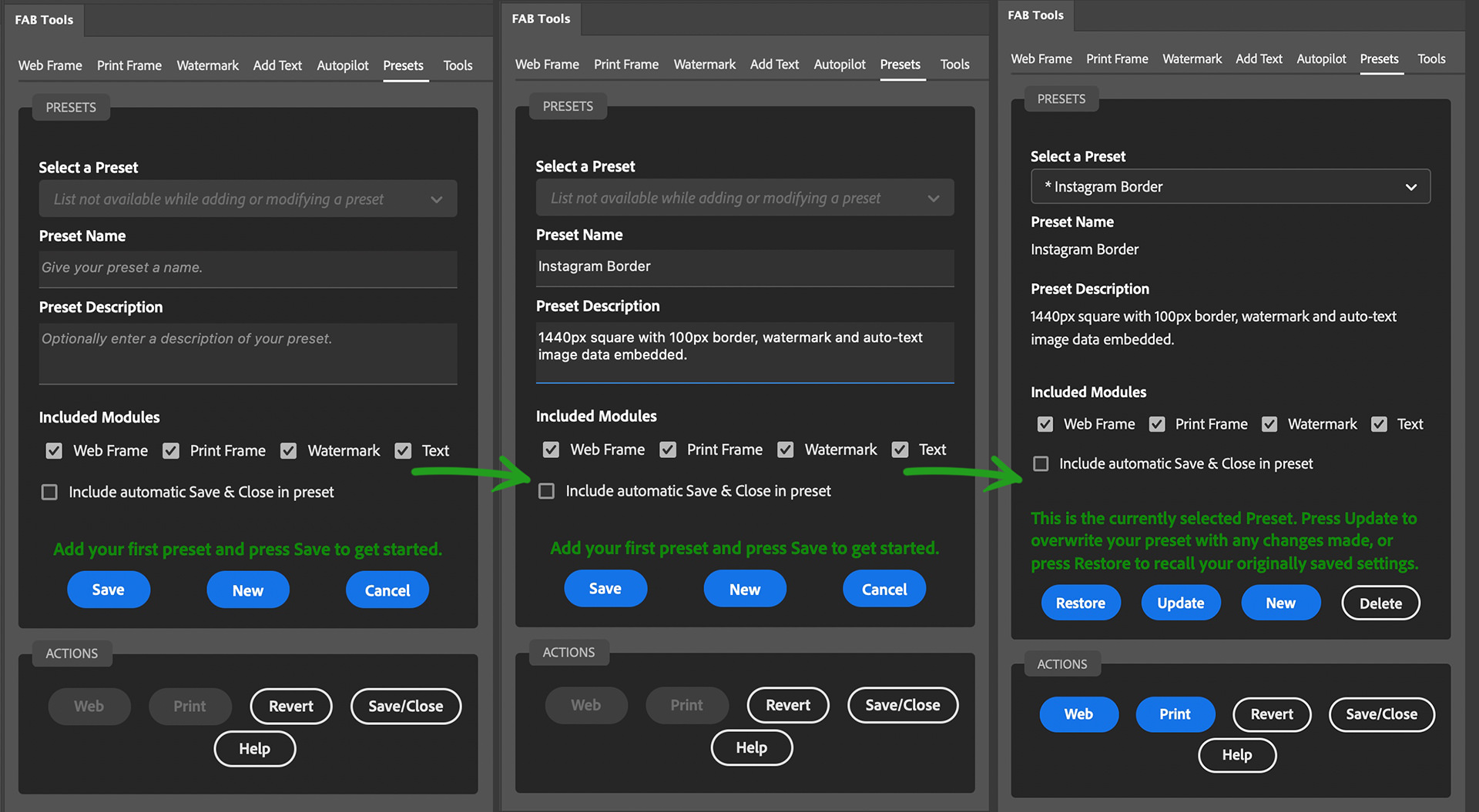
Note too that the preset that you create will be marked with an asterisk in the list to show that it’s based on the current settings. In this state, if you make any changes to your settings you can simply hit the Update button to automatically update the preset with your current settings. The same goes for a restored preset. If you need to change any preset previously saved, just hit the Restore button, and make your changes, then hit Update to save them. And of course, if you just want to restore a preset for use, the Restore button will do that. You can also see the Included Modules checkboxes there too, which enables you to decide which modules to include, and which to restore. If you only want the settings for a specific module, you can deselect the others, when saving and restoring a preset.
Also note that if you include a Text Watermark that you delete after saving your preset, it will also be restored along with your preset. The same goes for graphic-based watermarks as long as you are on the same computer. If you copy your settings to a different computer, you can still restore your settings and presets, but you will have to delete the graphical watermark from the Watermarks page and relink it because the token that Photoshop creates will be different. Apart from that though, the settings are transferable if you work on multiple computers. There is a link to the settings folder in the Tools module if you need to do that.
Print Frame Presets
As I use FAB Tools in my own photography, especially with the addition of color settings that we’ll look at shortly, I’ve found the presets very useful for recreating the same style of frame. I’ve also been positioning the FAB Tools logo as I created some of the new marketing graphics, and being able to save the precise positioning of the watermarks has been incredibly valuable and time-saving too. Another area that is greatly improved through the presets is the creation of print frames.
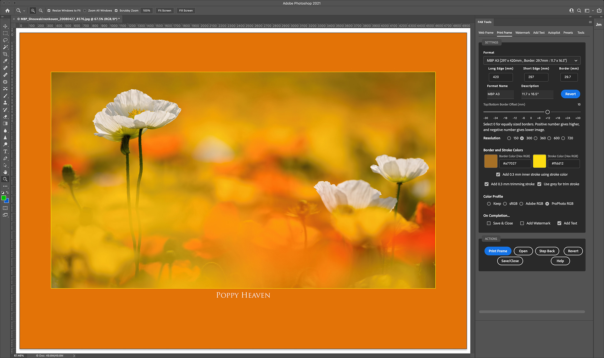
As an example, here is a print frame I added to an image, and made a few changes to a Custom A3 media format, and adjusted the Border Offset both for better visual balance and to make room for the image title, which, by the way, was automatically populated from the information embedded in the image file using the new Auto-Text feature which we’ll also look at in more detail shortly. If you need to recreate these frame proportions and offset again later, you can now simply save a preset with a name that you’ll recognize and include a description so that you know what you’re going to restore, and you can then recall these settings at any time in the future. Even if you change the Custom A3 media these exact settings will be restored along with your other settings, making the plugin much more useful.
Color Your Frame!
So, as you’ve seen, we can now change the color of the frame that you apply to both Web and Print Frames. Say, for example, you want to frame an image and move away from the standard white frame that we’ve had so far, all you have to do is open your image and click on the colored square on the left of the two which is the Border color, and you can select a color using the regular Photoshop color patches and sliders, but your mouse pointer will change to a picker so you can also sample any color your want from your image, as you see in this screenshot.
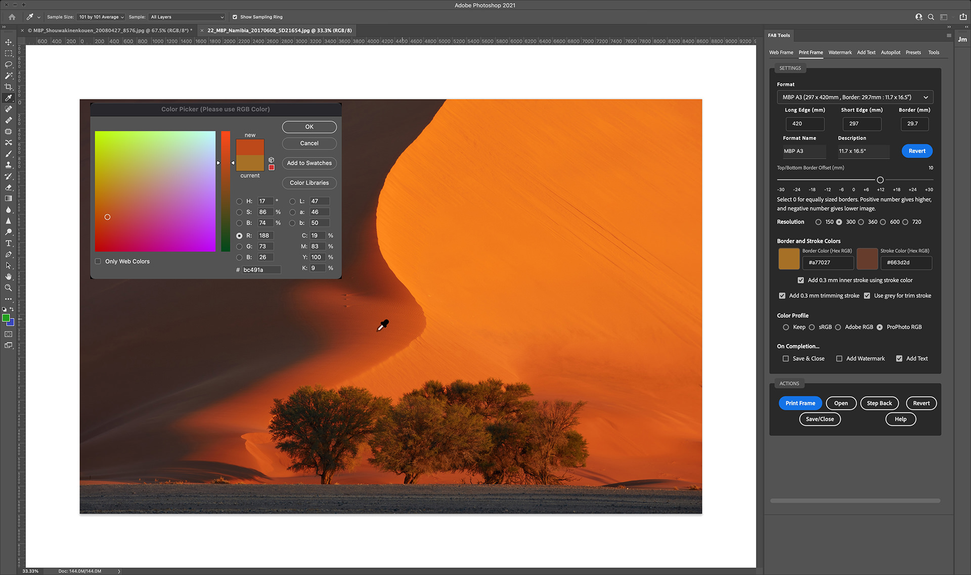
Here is a Web Frame with different colors sampled to illustrate a different point. If you look to the right of the Border color picker in the previous screenshot, you’ll also see a second color picker for the Stroke color. Until now, the outer stroke which is added to images has used the secondary or background color in Photoshop, but some people found this confusing, and even I forgot to change the color a few times, so I took this opportunity to take control of that, in two further steps. To begin with, you can now select the Stroke color using this color picker, but because we can now change the color of the main border, I figured we might need a way to separate the border from the image, and so there is now a checkbox below the new color pickers that enables a 1-pixel stroke between the resized image and its border, which uses the color you selected.

The second checkbox is to decide whether or not you want to add an outer stroke, and there is a third checkbox to simply use a mid-grey for the outer stroke, as you may not need it to be the same color as your inner stroke. In this example image, I selected the bright orange as a highlight color, and you can see it more distinctly along the bottom and left edges, where the darker areas of the image are. It’s very subtle, and I toyed with the idea of enabling the user to selected a larger border, but it looked very tacky, so I used my own design sense to keep this simple. You can also see that I selected the grey stroke color for the outer stroke, although a second bright orange stroke didn’t look too bad either.
Use Cases
Before we move on to the Auto-Text Feature, I wanted to share a couple of use cases for these colored borders, so that you can understand my thinking behind this. First of all, I simply think that it can extend the control you have over your work as an artist. I have always thought of Fine Art Borders as being mainly white, and in most fine art circles that is probably still the case, but as we know, there are no hard and fast rules in art, and I know that a wide variety of creatives are starting to use FAB Tools in their work, and for the sake of a few additional controls, it was possible to extend the usability of the product. I have found it to be a lot of fun and an additional creative release to be able to easily change the color of my frames like this, and I’ll provide more examples as we move through the rest of this post. So the first use case is to extend the possibilities for an adventurous creative.
The second use case is a real-world use case from the person that asked about changing the color of the border, and that was someone that works as a bulk-shooter, that had been requested to provide over a hundred photos of school students with a navy blue border, I imagine to match the schools official color. Unfortunately this time around they had to manually change the color because they had a deadline, but in the future, they’ll be able to process the images in bulk with just a few clicks. Note too that if you have a specific color with an RGB Hex code, you can simply enter or copy and paste that code into the field to the right of each color picker, and know that you have the exact color you need in place. You can also paste your code into the Photoshop color picker that opens when you click the colored square, but be sure to stay in RGB color mode, as the colors will get messed up if you switch to a different color mode. Unfortunately, there is currently no way to programmatically stop you from doing that, so please just be careful not to change it.
Auto-Text is Here!
OK, so let’s move on to the final new feature in these two recent releases, and that is Automatic Text! I’d already finished this feature when the request for colored borders came in, but to extend the school photo use case a little here, if you do similar event shooting and need to add, for example, the name of the person in each shot, you can now add that name or whatever information you need to, into the Caption or Description field of your photo, and with Automatic Text turned on in the Add Text module, you can now add that in your chosen font completely automatically. This will enable the school photo shooter that contacted me to fulfill a request that they had received to add student’s names to each photo, but they had to refuse because it would have been too much work. With Automated Text and Batch Processing via Autopilot, you could process a hundred photos with a colored frame and the names of each student completely automatically with a few clicks, and we’d be talking just two to three minutes to process the images. Of course, you would need to add the names to the photos manually, but that is much quicker than registering a new text watermark for every photo.
As an example, let’s throw everything we’ve got at my photo of the beautiful Kegon Falls in the Nikko area of Japan. I love the early summer fresh greens in this photo, so let’s play with them a little. To start with, I’ve selected a darker green, sampled from the photo, as the main border color. This, I feel, helps to give the final piece some added depth, as we look through the deeper green at the lighter greens in the actual image. To compliment that though, I selected a fresher light green for the inner stroke, and I’ve left that green active for the outer stroke too, rather than making that a mid-grey.
In the Watermark module, I selected an adapted version of the logo I’m using to market FAB Tools and opted to add it to the bottom left corner, and nudged it up by 8.8% and to the left by 0.5%. Without any nudging, the logo would sit perfectly aligned to the bottom of the inner frame, but I wanted to adjust it so that the top half of the logo overlaps with the image, and moving it to the left just a half a percent makes the foot of my kneeling man overlap with the bottom of the left side stroke.
In the Add Text module, I first added a watermark and selected a font from the pulldown. Note that currently, it is not possible to use just any font installed in Photoshop or on your computer. The fonts in the pulldown list need to present on your computer, but unfortunately, at this point, you are limited to the 17 fonts I’ve registered for use. If there are any other fonts that you believe are available by default that you would like me to add, please let me know. Here’s a screenshot to illustrate this process.
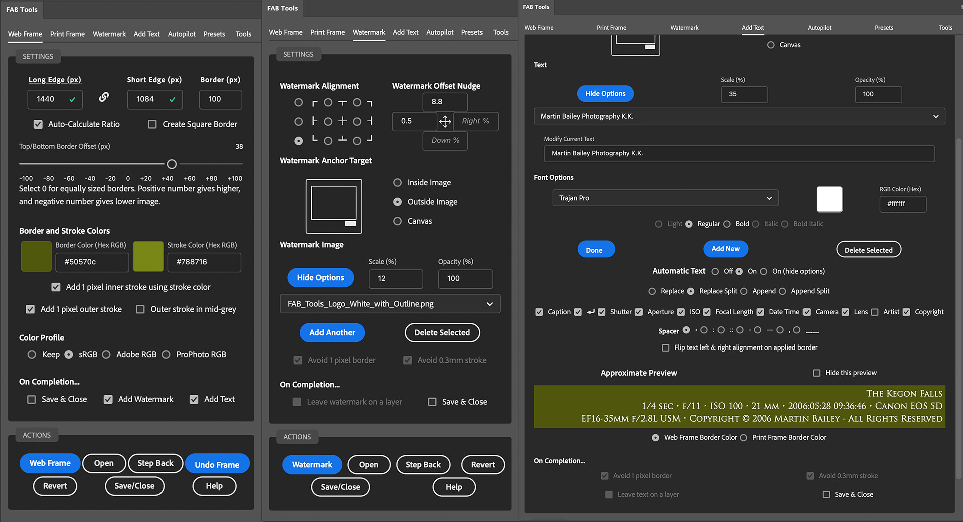
Note that I’ve made it possible to drag the plugin panel out very wide now so that you can make the most of the new Preview that I’ve included for the new Automatic Text. I’ve left the font options visible here too so that you can see that, but generally, once you’ve added your text string and selected your font and styling, you can click Done and then the Hide Options button to reduce those options down to just the text pulldown list.
Below the font settings are the new Automatic Text settings. There is a lot in here, especially when the window isn’t so wide, because the various data checkboxes are wrapped to two or three lines. Still, I’ve tried to be inventive and keep the options to a minimum while still providing adequate usability. For example, in addition to simply turning the Automatic Text on and off, there is a third option to leave the Text active but hide all of the options. The same goes for the preview box. If you don’t need that, there is a Hide this preview checkbox, so you can collapse all of this down to just two lines when you are not using it.
We are using most of it right now though, so take a look at the options we have. Firstly, let me explain the Replace and Append options. The Replace option simply replaces the text that you entered when you created this particular text watermark. These options are not tied to the saved watermark text as such, but they use the font that is saved with the text, so if you intend to override the text with the Replace or Replace Split options, you can simply use the text as a label remember your font settings by. The difference between Replace and Replace Split is that the Split option breaks down the text into two or three lines. If you look to the right of the checkbox that says Caption, there is a carriage return symbol. This adds a carriage return after the Caption if you need to do that. The next two lines that you see in this preview are wrapped intelligently based on the length of the Caption or your Text Watermark if you choose the Append or Append Split options.
The Append and Append Split options work in exactly the same way, but the text is appended to your watermark text, so in this example, the first line would be Martin Bailey Photography K.K. because that’s what I added as my watermark text. That though, along with the options you select, is all that is saved in the plugin. The rest of the text is all information that is embedded in the image and placed here automatically when you open an image. Then there are the Spacer options. This is the character or characters used between each item in the list of shooting information. If you do not choose one of the Split options and simply Replace or Append, all information will be in one or two long lines with the Separator between every element.
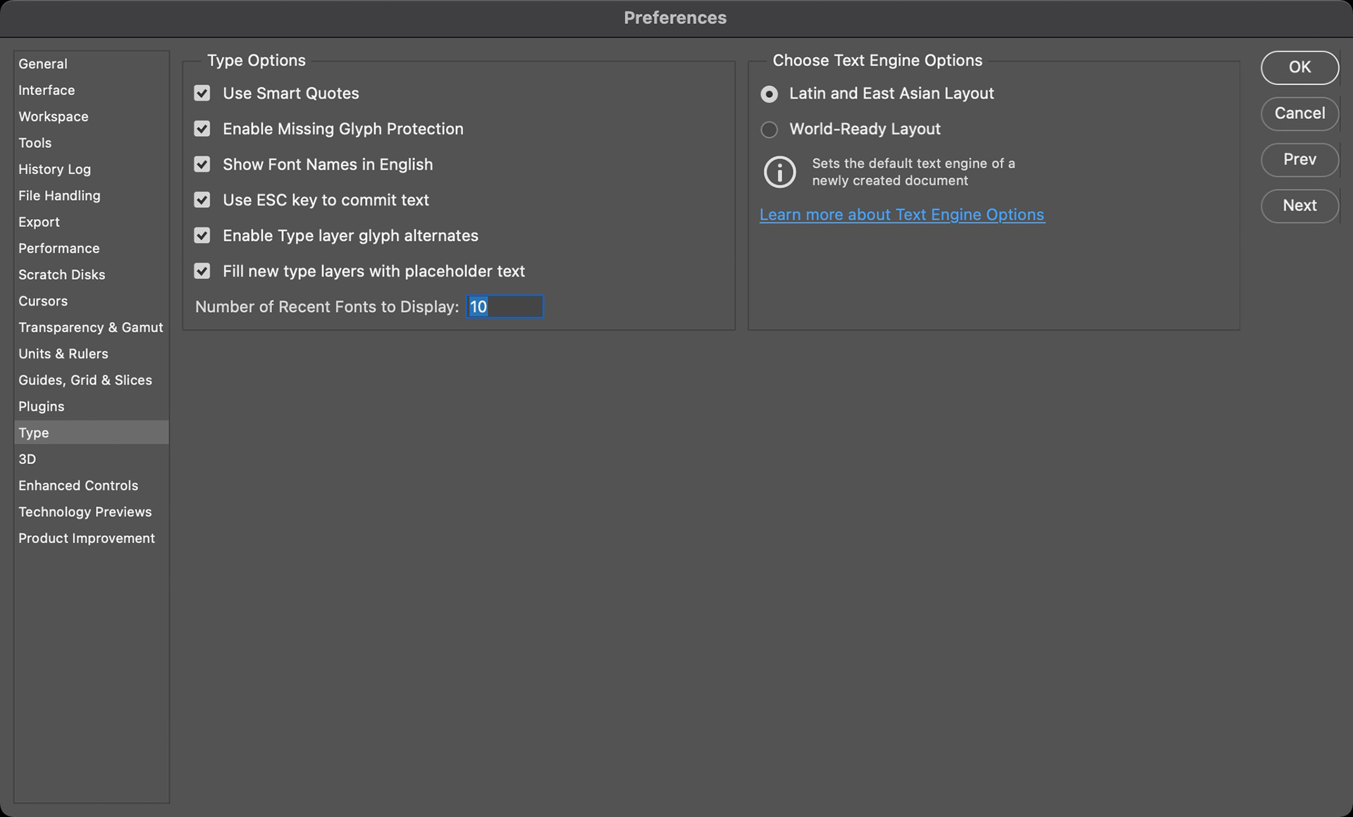
The final option to Flip text left & right alignment on the applied border is a workaround to overcome a problem with Photoshop. If you use the World-Ready Layout under the Photoshop > Type preferences, when you apply your text watermark, the left and right alignment for the left and right sides will be reversed. So, say you have your text on the right side, it would be left-aligned, not right-aligned. That may be a valid requirement so I’m happy to leave this here, but generally, this is to overcome what I consider to be a problem for anyone that uses World-Ready Layout. Another problem related to this is if you do use World-Ready Layout and you have a period at the end of your watermark text, that period will be mysteriously moved to the beginning of the sentence. I could fix this with code, but first I’m going to see if this is a bug in Photoshop and I’ll update my code later if it is not. Should you fall foul of that problem though, unfortunately, the only way to overcome that at the moment is to select the Latin and East Asian Layout rather than World-Ready.
The final option at the bottom of the Automatic Text area is the option to select either the Web Frame border color or the Print Frame border color for use in your preview. This preview and its related options are actually also now used for the regular Text Watermark so you can make use of this even if you are not using Automatic Text, to check what your text will look like before applying it to your image. So that you can see what this all looks like in a resized and framed image though, here is the output photo using the settings that we just covered.
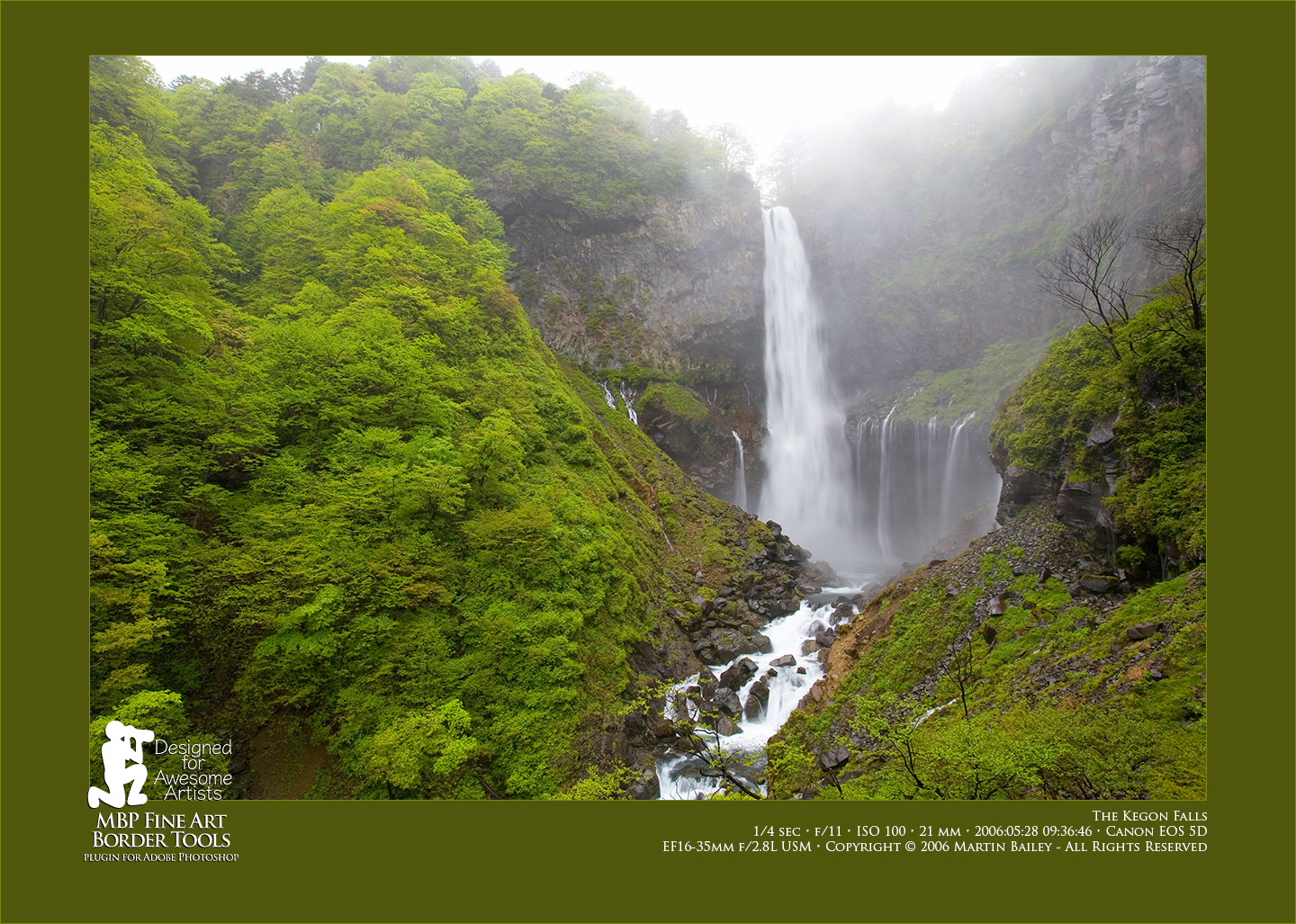
Note that the width of the automatic text is governed by the Scale setting for your text. In the above screenshot, I had it set to 35 but changed it to 42 for the final frame to increase the size of the text a little bit more. I use Scale as a percentage of the width of the image to create maximum flexibility when changing sizes. For example, for my eBook that accompanies these posts for paying MBP Pro Members, I needed a much higher resolution image, so I simply doubled the size and the watermarks remained perfectly positioned as you see here. It also helps when we process square or portrait orientation images, allowing the watermarks to resize as necessary.
Note too that while you are getting your scaling and positioning locked down, I find it useful to apply the frame and watermarks all from the Watermark or Add Text modules, by right-clicking the shortcut menu at the top right corner of the plugin panel. In there you’ll find an Apply Web Border and Apply Fine Art Border option, among others, so if you want to make a quick change, just hit the Revert button under the Actions section at the bottom of the plugin, and use the shortcut menu to apply the frame again. Of course, you need to have the Add Watermark or Add Text checkboxes checked under the Framing module to automatically apply everything you want, but it’s quicker than going back to the Framing module every time you want to make a change.
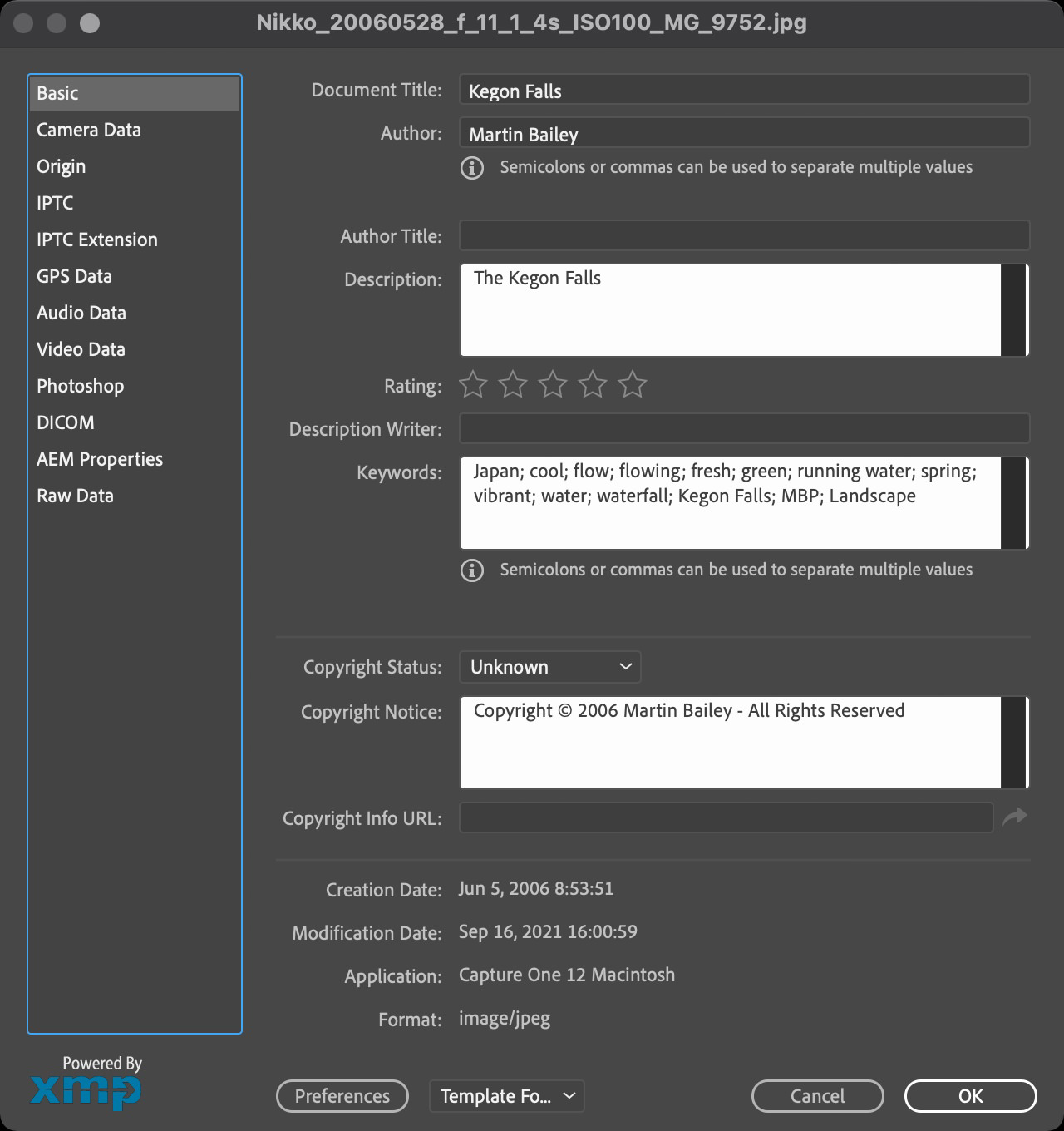
One last thing that I wanted to mention about the Automatic Text feature is that in general, you will probably be entering your text in your content management or image editing software. I enter all of my descriptions and keywords etc. in Capture One Pro, but you could do the same in Lightroom or pretty much any other similar program. If however, you come to add some text to your image in Photoshop and realize that you don’t have any caption text entered, you can select File Info from the Photoshop File menu and enter whatever you want to embed into the border into the Description field.
Note that the Title fields are not used. I can’t get them from the document information, so this must go into the Description field to be picked up. In Capture One Pro, I add this information to the Description field under IPTC – Content in the Metadata panel, so you may have to experiment a little to find out where to add this in your base editing program. Here is a screenshot of where you can add it in Photoshop though, where I added the words “The Kegon Falls”. Note too that I will probably change the word Caption to Description in a future update because it seems more programs are using the word Description. Also note that if you do update this information in Photoshop, you have to save and close then reopen your image for the change to be picked up.
Under the Hood
In addition to the visible changes that I’ve mentioned today, I’ve actually completely rebuild some of the core functions in the MBP Fine Art Border Tools for this release, to keep it ticking along nicely as I increase my demands on its performance. These have actually made things so much quicker that I added a quarter of a second pause option to the Autopilot mode, and I found that also my four-year-old Mac Book Pro used to need 1 or 2 seconds between actions, it will now run in batch with just a quarter of a second pause, so if you are processing in batch mode, you will see big improvements in performance so give it a try.
Note too that considering all the work that I’ve put into developing FAB Tools over the last five months, and considering that there is now more than four times the number of features in my initial release, I’ve decided to increase the price from $26 to $36. I believe that even $36 is not a lot of money for everything that you now get in FAB Tools. Also note that the price increase is tied to the Adobe Review of the latest version, so if you listen to this on or shortly after Sept 16 2021 you may still be able to buy FAB Tools for $26, but failing that, I hope you agree that $36 is still a fair price. Either way, you can check out the plugin on the Adobe Exchange Marketplace here and if you want to check the current feature set much into the future, you can check that out on the product page here.
Video of Features to Oct 2021
Show Notes
Adobe Exchange: https://mbp.ac/fabtmp
Product Page: https://mbp.ac/mbpfabt
Subscribe in iTunes to get Podcasts delivered automatically to your computer.
Download this Podcast as an MP3 with Chapters.
Visit this page for help on how to view the images in MP3 files.

Quality work, as usual. I am on the fence of purchasing.
Thanks Christian!
I’m really enjoying working on and working with FAB Tools. I think it adds so much to an image to have it nicely framed and I’m loving the new auto-text.
I put together a video that I just embedded at the bottom of this post to work people through the latest new features. Maybe that will help you jump off the fence. 🙂
Let me know if you have any questions.
Regards,
Martin.
I made the jump today. Next, I will watch your tutorial videos again to see if they can answer all my questions. Looking forward to making the first prints using this tool.
Cheers,
C.
Excellent! Thanks Christian! If you have any questions, please drop me a line.