Today we’re going to take a look at the winning images from the April MBP and WebSpy Photography Assignment, with members’ back-stories and I’ll be adding my own comments and thoughts on the images as usual.
The April Photography assignment is the penultimate assignment of this current six month batch of assignments that we are grouping together to find the winner who amasses the most votes to take away one of five amazing prizes that our sponsors WebSpy have been kind enough to provide. These include a 320GB Sanho HyperDrive COLORSPACE UDMA portable storage unit for the first prize, a Lensbaby Composer with a case as the second prize, and then the next three winners will all receive an X-Rite ColorChecker Passport, to enable you to set accurate custom white balance in the field and then create RAW Profiles for your cameras in post processing, for true color accuracy in your digital workflow.
(Note: If you prefer to listen, there is an audio player at the bottom of the post.)
Last month I thought that our friend Dan Newcomb, the winner of the first six month WebSpy assignment, was going to steam on home with this six month assignment too, but there are a few people that are really giving Dan a run for his money, so let’s take a look at the winners of the April Assignment, and see where we stand in the running for this batch of six, with just one month to go. By the way, the May assignment which is now in its third week, is on Flowerscapes, so if you haven’t got your image bagged and uploaded to the members’ gallery yet, please do so before the end of May.
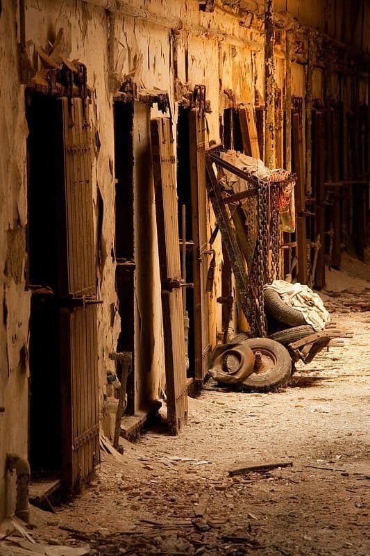
So, we’ll start as usual with third place for the April 2010 Assignment, which was won by Dennis Brennan with the amazing image “Relics of the Chain Gang”. Dennis has kindly provided a back-story, so I’ll read that out first (in the Podcast), and then give my thoughts of the image too.
As soon as the April assignment theme of Urban Decay was announced, I knew where I’d go to get my shot. Eastern State Penitentiary is an old American prison located in the city of Philadelphia, Pennsylvania. The prison closed in 1971 and was left empty for almost 20 years. It has since been reopened to the public as a historic site and a great place to make some interesting photographs. I’d been there shooting several times in the past couple of years – usually with HDR images in mind. Last summer I photographed the same cell block, but included much more of the hall and ceilings in the composition. With this image, I wanted to show more of the decaying detail in both the old cell doors and that curious cart learning against the wall. The soft light coming through the skylights, falling directly on that section of the hall, creates such an interesting mood in this spot. Composition is a bit tricky as the end of the hall is barred off. You have to shoot through the bars – almost as if you were in a cell! It took a bit of maneuvering, but I managed to get the 70-200 positioned in place between the bars without the lens hood. While I did bracket the exposures for this scene, I also shot it with a single exposure in mind. The single exposure turned out to be my favorite and it looked good enough to use without much post at all (a little saturation, a very subtle vignette and some overall clarity). Thanks so much for the votes. It really is quite an honor to place with so many great images submitted. And as always, thanks to our gracious host for another fun monthly theme!
As usual, you’re more than welcome Dennis, and thank you, for continuing to get involved, and submitting such great images.
It’s nice to have somewhere like this close by, and spring to mind, for an assignment on urban decay. You really made an excellent job of capturing the scene, and the back-story really helps to give an idea of your thought process and the troubles that you had actually lining up the shot through the bars. I thought initially that you’d done a sepia monotone conversion, until I looked into the shot and saw the orange rope on the cart, which I think by the way, adds a lot to the image. With the color making it stand out, it really adds an additional element of interest.
The doors are kind of sad. Although I’d like to think that the people that stayed behind them had good reason to be there, it’s a fact that society can also put people into situations where they do things that wind them up in a place like this, and I can just imagine the amount of turmoil going through the minds of some of the people that spend portions of their lives behind these bars. I love, as you say, the way the light catches the center of the wall and the cart here, and the way the light tapers off into the distance, really enhancing the mood greatly. The subtle vignette really helps too, so congratulations once again Dennis, for getting third place, and for capturing a great image for the April assignment.
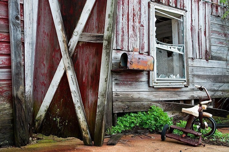
In second place is, we once again have cheshirecat, or Elise with another wonderful image, “An Untold Story”. Here’s Elise’s back-story:
The decay theme was subject matter outside my comfort zone as it was something that I had never attempted before. I started soon after the theme was announced and actually traveled quite a distance to find decay. I found it in many places and in some that were relatively close to home. The farm I selected did not seem to be abandoned when viewed from the country road. I was a little nervous about going onto what I thought was private property, but I decided to park on the road and walk down the driveway. A posted sign indicated it was state property so I felt a little more comfortable exploring. Signs of decay were everywhere… An old decaying farmhouse and numerous barns, an old rusting car that I discovered in a field was what I had originally envisioned for this theme. But it was the tricycle, with the missing wheel, that drew me to the barnyard to shoot this scene. It seemed to be the most important element to include. Having barns on three sides made the lighting and angle of composition a little more awkward for me. It took three visits to get all of the elements of decay into the image. This particular one was taken following a rainstorm when everything was still quite damp. I tried a conversion to black and white, but the color version held more of the decay details.
Well, congratulations on a great image Elise. Your back-story is great too. I’m impressed that you went to such lengths for this assignment and actually went back to this spot three times for the image. Having not seen the others it’s hard to tell how much better this one is, but as you say, that damp feeling that you have captured here does help to enforce the decay theme, and one of the things that stood out to me was the splashes of red paint still on the walls of the building. I can see how a black and white conversion might have taken that away, though I would also like to see what could be done while playing with the red channel, and maybe playing on that color separation. The only other reason I would have also liked to have seen a black and white version, is to remove the splash of bright green in that foliage behind the tricycle. Red and green contrast well together though, so I don’t think it detracts from the color version at all though.
I also agree that your honing in on the tricycle with the missing back wheel was a key factor in the success of this image. Placing it way down in one of the corners is another factor, and in fact one of the compositional techniques that I am planning to include in a follow up to my composition Podcasts that I released a few months ago. It would have been tempting to put the trike on one of the third intersections, using the rule of thirds, but as we know, rules are made to be broken, and doing so here works very well in my opinion, so well done on that too. I also like the way you created a bit of a frame with the wooden pillar along the left side, and the unbroken slab of concrete across the bottom, and even the foliage dangling down on the right side, give the eye something to stop at as you scan the scene, preventing the eye from running out of the image and losing the viewer’s interest. All great additions to a great image, so congratulations on second place Elise.
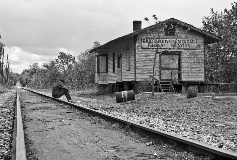
And finally, the winner of the Urban/Rural Decay assignment is Tom Maugham with a really nostalgic and somewhat thought provoking image “Waiting for the Train”. Before we take a look at Tom’s back-story, I also wanted to read the caption that Tom assigned to the image in the assignment gallery. Tom wrote “A weary traveler waits by an abandoned freight station for a train that will never come”. Some people say that images don’t need captions and that they should stand alone, but here, as with the Title, “Waiting for the Train”, the caption gives us a chance to add our own artistic interpretation of the scene, and in my opinion can add so much to the image. While creating the photograph itself we are creating art, and by our selection of lens and how we frame the scene, the aperture we select for the required depth-of-field and the shutter speed of course. We are also making artistic decisions when we select how we process the color in post processing, and there are countless other artistic decisions that come into play when making and processing an image. In my opinion, the selections of a title and caption are simply an extension of this process. We don’t have to be totally lead by them of course, and we can choose to ignore these textual additions altogether, but this is a great example of how the title can really enhance the image, and the experience of viewing it, and the feelings that it invokes, so thanks for taking the time to think of the title and caption too Tom.
We also hear that this is the first time Tom has entered an image for the assignment and was thrilled to come first, which is great. Congratulations Tom! Here’s the back-story:
This is truly an abandoned freight station. The Raritan River Railroad is no more and all its operations (what little there were left) have been absorbed into Conrail. A train comes through a couple of times a month to deliver plastic pellets to a nearby window factory but that’s it. I’ve taken many pics here over the years and thought it a natural setting for this theme. I took many more shots in April but it wasn’t until I added the human element that things clicked.
The ‘weary traveler’ is actually me. I put on my old army field jacket and a hat and triggered my camera with a remote control. There is a lawyer’s office and parking lot just to the right and I got some very interesting stares from lawyers and clients alike. But it was fun! Thanks to everyone who voted for me and for the nice comments on the picture page.
So, once again, we have an example of someone that went the extra mile to add something to the image, and that was a key factor in the success of the image, without doubt. I love the way the left track is almost perpendicular, even though it results in the end of the tracks leading out of the image near the edge of the shot. Again, there would be the temptation to put this point on the left third line, but Tom chose not to, to the benefit of the image, I’m sure. We do see that tom sat roughly on the left third line of course, whether intentional or not, which is also a nice comfortable compositional technique. I also like how the station building and the line of trees in the background as well as the telegraph poles on the left, all lead our eyes into the vanishing point at the end of the railroad tracks as they head out of the scene into the distance. The little bit of cloud close to the horizon is nice, as is the black and white conversion, though I personally would have been tempted to darken the sky a little, to maybe add some more drama. I also see a little speck of dust on the sensor just above the top left corner of the station building, which would be nice to remove, but these are minor nit-picks in a great shot.
Congratulations on visualizing and executing to create a wonderful, timeless image Tom, and thanks for getting involved in the assignment.
If you want to see the number of votes that everyone received, you can go to the scores page, which I’ll link to in the show-notes. Also, at the bottom of that page is a graph with the grand totals, for all of the first five assignments in this six month batch. We can see that Dan, or Mr. Nikon is still in the lead with 127 votes, but with two good placings, Elise or cheshirecat has stormed into second place, with 114 votes. Dennis Brennan has won once and placed third twice, which has put him just two votes behind Elise with 112 votes. Just behind Dennis in fourth place is Super Digital Girl or Leslie Granda-Hill with exactly 100 votes, and then in fifth place with 60 votes is Zodiaci, otherwise known as Allen ONeal. Of course, this could all change with this last assignment for May 2010, with the theme of Flowerscapes. Do try to grab yourself a nice Flowerscape shot, and enter it into the assignment gallery at mbpgalleries.com, and see if you can’t nudge yourself into the top five for the six month batch of assignments, and scoop one of the great prizes that we have on offer, courtesy of our sponsors WebSpy.
Podcast show-notes:
Music from Music Alley: http://www.musicalley.com/
Audio
Download the Enhanced Podcast M4A files directly.


Martin, thanks for your nice comments about my shot and more importantly for hosting this site. It was a great pleasure for me to compete and an honor to win against so many great images. I’m looking forward to competing in many more of your competitions.
Best regards,
Tom Maugham
Tom, you’re very welcome. Thanks very much for submitting such a great image, and once again, congratulations on the win! Very well deserved!
All the best!
Martin.
Martin,
My thanks, also, for hosting such a great site. Each monthly theme has been a great learning experience for me. I appreciate your thorough assessment of each placing image. It will help me incorporate the best techniques into my photography. I am looking forward to participating in this month’s challenging “flowerscape” theme and the competition with the many great images that will be posted by the community.
Thanks again.
Elise
Thank you too Elise.
It really is my pleasure to organize and host this assignment. I totally enjoy seeing the images that are entered, and almost certainly learn from you guys as well.
The Flowerscape theme is fun. I was out last weekend, and hope to do the same this weekend. It’s one of my favorite subjects, and I can’t wait to see what everyone does with it. 😀
Regards,
Martin.