Visit Library for MBP Pro eBooks |
Although it took a few days, or weeks, longer than I’d hoped, I am really happy to be able to announce today that my latest iOS app, PhotoClock Pro has just gone live on the Apple App Store! And, at just $7 I’m starting with a 12.5% discount, saving you a dollar for the first week to celebrate the launch. The price will go to a still very reasonable $8 from April 8, 2022, but I think it’s worth every penny at either price and today I’m going to share with you information on all of the major features of PhotoClock Pro with lots os screenshots and a couple of video captures. I am incredibly proud of what I’ve built over the last three months, so I have been really looking forward to being able to share full details with you.
My Dream App – Hopefully Yours Too!
For many years I’ve wanted an app that does what PhotoClock Pro does, which is in essence, to provide an analog clock on my iPhone or iPad screen and display images behind the clock. The basic design was relatively easy to complete, but as I worked on PhotoClock Pro I started to want more and more features, and have actually added one more feature in version 1.1 which I put in for review today, and I’ll show you that shortly as well. The base price, which as I say, I’ve set at $6.99 for the first week of sales, gets you the fully functional app. I added the Pro designation to the name because many of the features are pro-level, more than a regular consumer app, but that’s how I like to work.
You can add as many images as you like, although I will warn you that if you try to add more than 50 or so the app may crash, depending on the spec of your device. The method defined to limit the number of images imported doesn’t work, although I’ll keep working on this area. For now, though, try to limit imports to 50 or fewer images at a time. In addition to your own images, as we’ll see, the app actually comes with In-App Purchases that enable you to buy additional Background Image Packs of my photos, if you want to use them. Most photographers though and probably many people are going to just use their own photos, so the optional image packs are completely optional and can be hidden when you don’t need to see them. So as not to unnecessarily take up space on your device with my images, apart from multiple app icons that you can choose from, there are no images actually stored inside PhotoClock Pro when you buy it. They are only downloaded and stored on your device if you buy them. Even the thumbnails for the Background Image Packs are only downloaded as you need them, so out of the box PhotoClock Pro is a relatively lean 50MB download.
Here is a series of three screenshots that I’ve captured to show you the ten image packs that I’m launching with, and you will also notice a My Image folder at the top of the list. If you don’t want to see my image packs, just tap the eye icon in the top right corner and they’ll collapse away, leaving just the user albums visible. We start off with one album for you to load your own image into, but as you can see in the right-most of the three screenshots, you can slide the albums to the left to reveal an option to create a new album. When you no longer need an album, you can slide it to the right to delete the album and all of the images inside it.
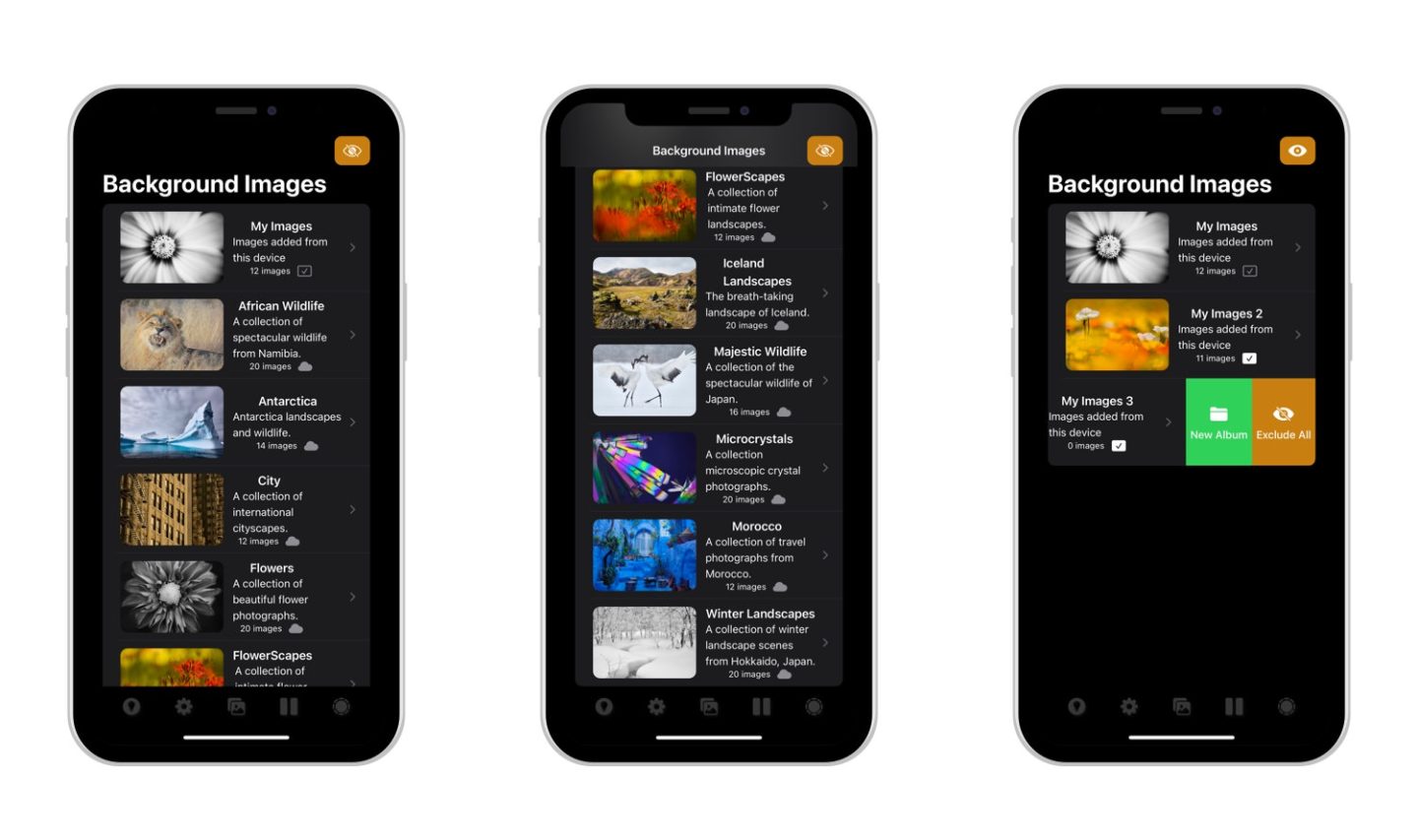
Image Management
When you tap on an album you go inside to see a list of thumbnails showing what each image looks like and provides a few more options via the management panel at the top of the list and by sliding the images themselves. In the user albums, if you tap the pen in the top right corner you can edit the album name and description, to help you organize your albums as I’ve organized the image packs. If you enter an image pack that you don’t yet own, you will see a button at the top of the list to buy the pack, as you can see in this screenshot of my FlowerScape pack. Note too that there is a cloud icon below each image title showing that the pack is not yet downloaded. Once you buy an image pack it will be automatically downloaded and all images marked as Included, meaning that they will be included in the slideshow behind the clock, which we will get to very soon.
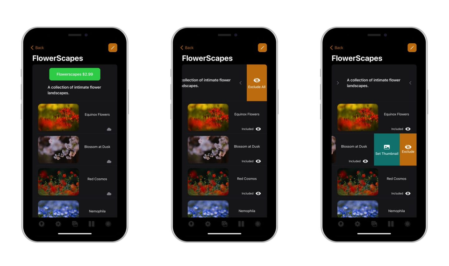
As you can see in the center of these three screenshots, if you swipe the band above the list of thumbnails there is an option to exclude all images in that set from the slideshow. If you swipe there again, they will all be reincluded in the slideshow. You can also swipe the top band to the right to delete all images in the folder. Swiping on each individual image includes or excludes that image. There is a second image swipe option that enables you to change the master photo for any of the albums. Unfortunately at this point, you have to close and reopen the Image Manager for that change to take effect.
To get into the Image Manager you just have to tap the center icon in the bottom toolbar. Note that the bottom icons dim and become almost completely transparent after seven seconds, so that they don’t obscure the background images in the slideshow. They are still easily visible while the Image Manager or Settings screens are displayed, but can be difficult to see while images are displaying, depending on the contents of the image, so you may need to tap down there to un-dim them when you need to change an option.
OK, so I created a short video capture of PhotoClock Pro on the iPad, running through the twelve images in the FlowerScapes image pack with the default clock showing, and I’ve embedded that here for you to check out. Of course, you can change the duration of the slides from 3 seconds to 5 hours, via a pulldown list in the settings, and you can also simply pause the background image by tapping on the Play button right of the center button at the bottom of the screen.
The default clock is one of 12 preset themes. There were originally going to be ten themes, but then the Ukraine situation arose, so I added a theme called Ukraine Pride using the yellow and blue national colors, and eleven themes felt clunky, so I added one more to make it twelve. Then I realized that it would be nice to be able to create additional groups of themes, so I added that feature, but an empty second theme also felt clunky so I added seven more. Then I realized I could simply enable the creation and deletion of themes to your heart’s content, and because you might at some point decide that you just want all of the default themes back, I added an option to reset all of the themes back to their default twelve and seven in two groups. Because there are so many options, there are a lot of pull-down menus that save space, and I added two sections that collapse down until you hit the gear icons, to the right of the Clock Theme Groups section and the Background & Frame options.
Here are four more screenshots, with the two on either side showing all of the options on the settings screen, the second showing the theme management options, and the third showing what I internally called the theme maniac options, and they are where you can change the color of the clock hands and digits, etc. At the top of the Settings screen, you’ll find the most commonly used settings for the clock itself. As you can see, you can change pretty much everything about the clock, including the color and opacity of the background, the color and thickness of the frame, and whether you use Arabic numbers or Roman numerals. If the writing is a bit small in the screenshot click on it to open it up in the Lightbox for a better view.
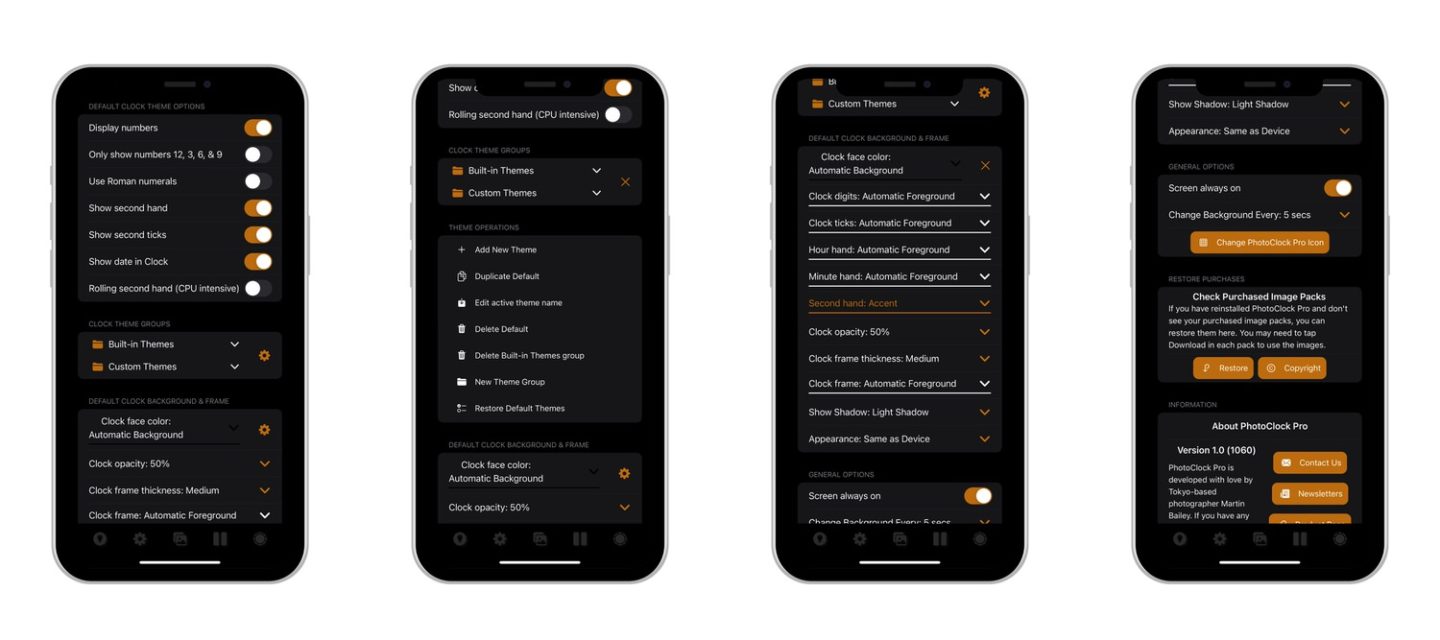
At the bottom of the third screenshot, you’ll also see that there is an option to force the screen of your device to always stay on if you want it to. With that option active you can of course still lock your screen manually, and it will stay off, but unless you do manually lock your screen, it will stay illuminated so that you can always see the clock. This is useful if you want to keep it displayed on your desk, or even as a night clock beside your bed. You may not want to keep the screen on full time using your main iPhone, but if, like me, you have some old devices hanging around, this is a great way to give them a second life, rather than pushing them to the bottom of a drawer.
Just below that is a button to open the icon browser, where you can choose from 19 icons using the twelve default themes and another 7 copies of some of the themes with photos in the background. I like to roll the iPhone over to landscape orientation when looking at the icon browser because the 3D effect that I applied to the icons is more obvious in landscape mode. Just tap an icon you like and press OK to apply it and then when you close PhotoClock Pro you’ll find that it’s using your newly selected icon.
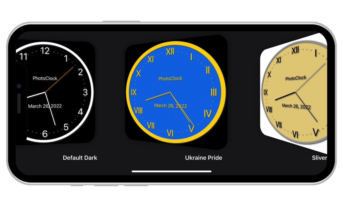
The themes are of course just ideas, so show you some of the possible combinations of settings. There are literally thousands of combinations that you could create, and although you’d get lost with that many, you can save anything that you create as well. Note that changes are saved as you make them, so you have to save a copy of something that you like before you start to modify it. I mentioned a new feature earlier that I added a new feature that will be released in the first update after the initial version goes live, and that is that you can now double-tap the clock to switch to the next theme. You can also long-press the clock to move through the theme groups. I did this mainly to make it easier to show you all the themes without going into the Settings screen every time to select a new theme. It enabled me to create this second video capture showing the themes and group names in a small notification at the top of the iPhone screen.
Moving the Clock
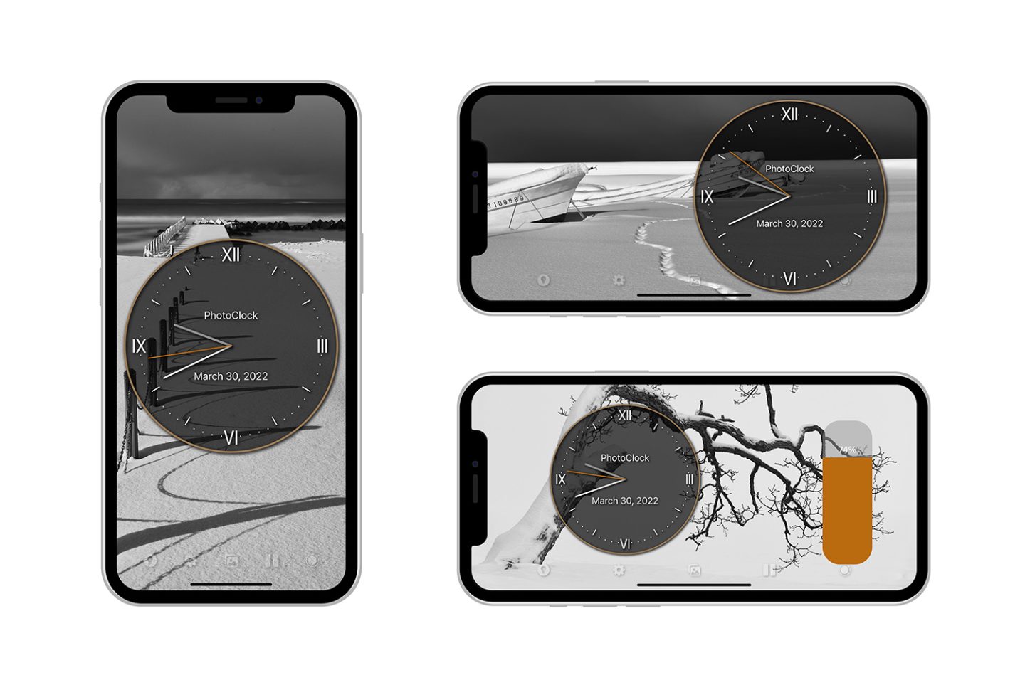
The right-most icon in the bottom toolbar changes the size of the clock. To move the clock you simply press and drag it. We remember where you place the clock for all of the orientations of the device, so you can have the clock in a different location for landscape and portrait modes, and we separately save the location for landscape and portrait orientation flat modes, for when you lay the device down. The clock generally starts in the middle although occasionally, if you install and first launch PhotoClock Pro with the device at a certain angle we can’t get the coordinates and it appears in the top left corner. Once you move it though, we’ll remember where it’s placed.
Screen Brightness
The lightbulb button on the left of the toolbar is to change the screen brightness. If you leave the Brightness slider at the bottom it will simply use the brightness set on your device. If you move the slider though you can change the brightness and we remember where you place it, so you can set it, for example, to a very dark screen for use in bed. When you close PhotoClock Pro though we set the brightness back to your original device brightness, so it doesn’t interfere with your usual settings.
OK, so I think that just about covers all the features of note in my latest software release, PhotoClock Pro. I am really excited to be able to put this out into the world, and really hope that you find it useful. I can imagine a professional photographer sitting at their desk with a client and an iPad sitting there running through some of the photographer’s best work, or a family with photos of old family holidays rolling through while they have dinner. I think PhotoClock Pro has the potential to become a major part of peoples’ lives, regardless of what you do for a living. It’s probably as useful on a personal basis as on a professional basis, so I’m really hoping that people like it. There are a few areas that I’d like to build out more and will work on them in due course. Before that, I’m going to start working on an Android version, and hope to have something for you within a few months. If you’d like to pick up a copy for iOS though, you can do that today, using the button below or the short link https://mbp.ac/aspcp
I do hope that you find PhotoClock Pro useful, and if you come up with an elegant, beautiful, or completely whacky clock with all of the customization options available to you, please do a screenshot or a value capture and share it online, and send me a link so that I can check it out.
Apple, the Apple logo, iPhone, and iPad are trademarks of Apple Inc., registered in the U.S. and other countries and regions. App Store is a service mark of Apple Inc.
Show Notes
You can buy PhotoClock Pro on the App Store here: https://mbp.ac/aspcp
For further details and the latest information, please check out our product page: https://mbp.ac/pcp
Subscribe in iTunes to get Podcasts delivered automatically to your computer.
Download this Podcast as an MP3 with Chapters.
Visit this page for help on how to view the images in MP3 files.



Martin, I just finished briefly going through your Photoclock post. My first reaction is a worthwhile app, if anything almost over-engineered. My MagSafe charger sits vertically beside my bed, which is where the app would be most utilized. Is it integrated with the iPhone alarm? It would be useful to have a tap to sleep mode where it would automatically go to a minimal brightness level or even go dark in a pre-set period of time (e.g. 30 min- 1hr?). A subsequent tap or double tap, would engage a slowly increasing degree of brightness to allow the eyes to adjust to the light. All of these comments are of course, without yet seeing or using your app. Wishing you continued success and safe journeys.
Hi Jamie,
Thanks for your comment! I totally agree. PhotoClock Pro is unashamedly over-engineered. 🙂
I have been looking into the best options to cover the sort of new features that you mention. I’ll definitely build that stuff in, but I’m thinking that I need to get to work on an Android version first. I’ll definitely add these at some point in the not too distant future though. Thanks for fleshing out your ideas so comprehensively!
Regards,
Martin.
Hi Martin,
I just wanted to say thank you for making the app.
By coincidence, I just finished making a camera clock and discovered your Photoclock which is perfect for it.
I could only add a few examples of the different clock options but thought you might be interested.
https://www.etsy.com/au/listing/1214234928/bedside-book-light-1-shutter-camera
I have been listening for year. Keep up the good work.
Regards
Danny
Hi Danny,
Wow! Thanks for sharing that, Danny! PhotoClock Pro looks excellent on your Camera Clock. I was a little confused at first, thinking that you’d ripped off my design and created your own app, but then as I looked through your examples, I realized it was my PhotoClock Pro. You stated that clearly, of course. I just didn’t read your comment carefully enough before going to take a look. 🙂
I’ve just submitted a new version for review that adds a few more design options, including Oversized numbers, which look really cute! I hope you find it useful.
Regards,
Martin.