
Minimalism—I almost made the title of this post just “Minimalism” but that’s a little bit open to interpretation, as it has a place in all visual arts, design, architecture and music, as well as a way of life in some cases. So, I added “in Photography” and this is still probably the shortest episode title I’ve given a podcast so far, so we’re off to a good start.
One of my popular mantras as I teach and do my own photography, is that a photograph is often more about what you take out, than what you leave in the frame. I’m not necessarily talking about physically adding or removing elements, although that might be the case in studio and still life work. I’m talking more about what we choose to photograph, the conditions in which we photograph, and how we choose to frame our subject.
Less is More
The phrase “Less is More” is used a lot here in Japan, where minimalism can be found in many of the arts, but also interwoven into every day life. Unchecked, I often used to try to include as much as I can into a photo or design, and even today I find myself whispering “less is more” as I frame up a scene.
I’ve mentioned before that quite often, as we approach a scene, there is usually just one or two elements that really excite us, attracting our attention. Finding ways to exclude or minimalize other distractions is often a challenge, although generally results in more pleasing photographs.
Today, I’m going to walk you through a series of example images, and discuss my thoughts on minimalism in photography as we view each image.
My Minimalist Awakening
I had a look through my image library, and although I can see traces of minimalism starting many years ago, as I recall my reactions to my work, I think I’d have to say that I first started to become aware of the beauty of minimalism as I made this photograph (below) of the tree that we visit in my Hokkaido Landscape tour. This was from 2009, when the landscape tour was just a part of my Hokkaido tours, not a dedicated tour as it is now.
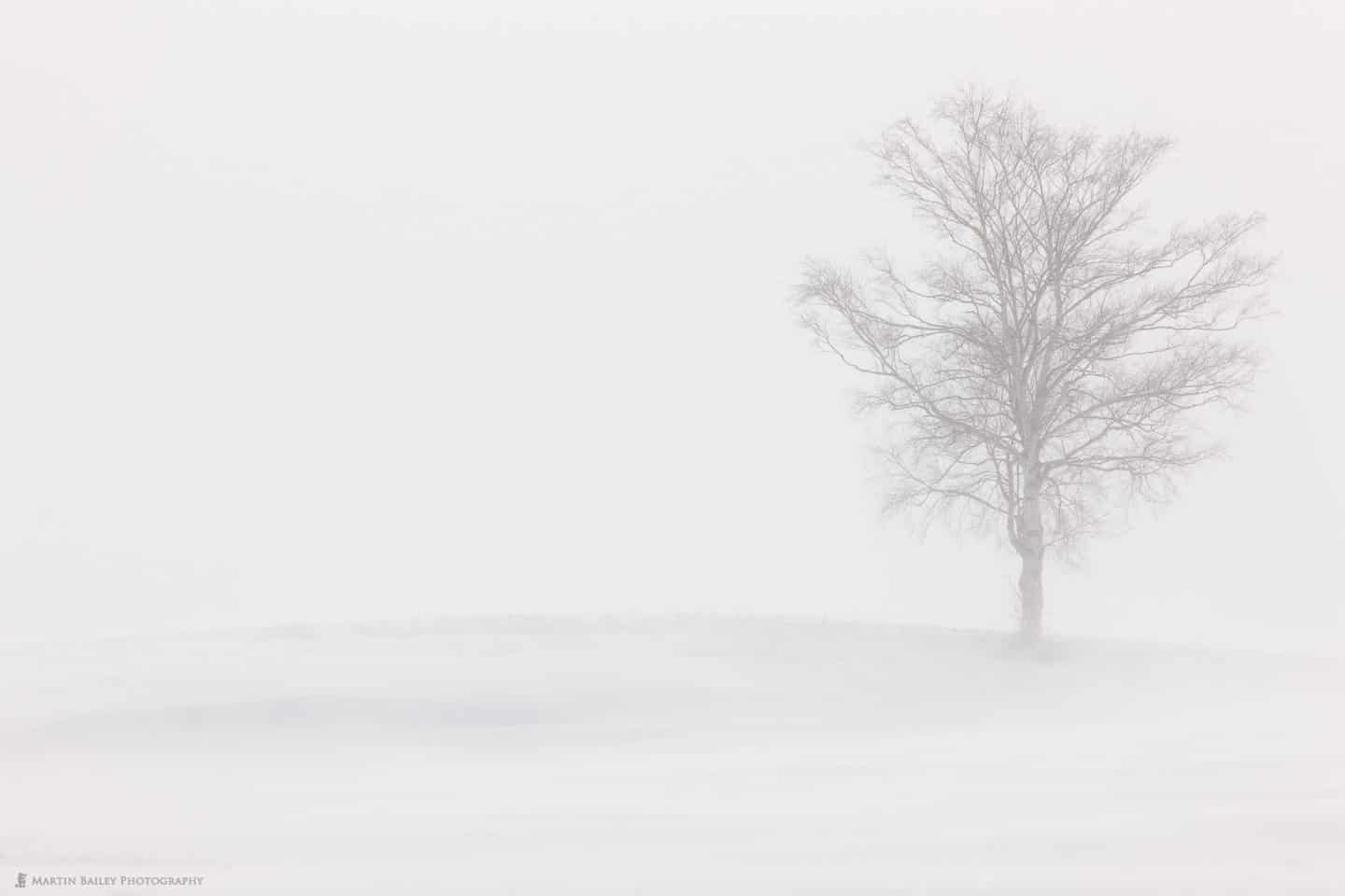
Lone Tree on a Hill
I remember standing out in a driving snow storm as I shot this, but I fell instantly in love with the effect that the snow had on the scene. The background was gone, the foreground reduced to a series of lines and texture, and the tree itself seems barely visible through my viewfinder. I put the tree on the far right of the frame, to emphasize the emptiness to the left, and also show the curves in the hill as it raises slightly, then drops off again towards the left edge of the frame.
All I did to this image in post was reduce the Blacks slider in Lightroom to -5, and I removed a red and white pole that was stuck in the snow to the right of the tree, to mark the edge of the road that runs in front of the tree, although you can’t see it from this angle, thankfully. I reduced the blacks slightly to bring out the form of the tree just a little, but I didn’t want to be able to see it any more than this, or the feeling would have been loss.
Wabi-Sabi
The Japanese concept of Wabi-Sabi, has in my opinion, strong connections to minimalism. Wabi-sabi in art essentially means “flawed beauty”. Japanese art is often based on the idea that nothing is permanent, perfect or complete, so if we flip that, wabi-sabi is about impermanence, imperfection and incompleteness.
To me, snow scenes are very much a part of my minimalist work, and as I think about this, it’s possible partly due to the impermanence, imperfection and incompleteness of the scene. The snow falls as the wind dictates, changes every time fresh snow falls, and then it’s gone come spring, giving way to a very different scene.
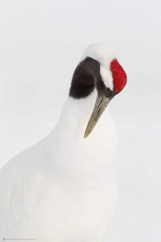
Tanchou Study #7
Since I first started to travel to Hokkaido in the winter in 2004, I found attempts at minimizing the beautiful form of the red-crowned cranes against their white background, but probably the first time I pulled this off the way I wanted to, was with this photo (right), that you might recognize the cover of my Making the Print ebook.
In this photograph, the head is totally pronounced, with that splash of red, but that and the brownish beak is really the only color in the photograph. The line along the back of the crane is much more defined than the front, which almost merges into the background, and this is another element that appeals to the minimalist in me.
The important thing in making this photograph of course, was ensuring that there was nothing else in the frame. I used a long 600mm lens, and luckily as the crane cranked its neck around like this, there were no other cranes in the frame.
Also, the decision to rotate the lens around in the lens collar for a vertical orientation helped, as the main lines of the subject are vertical too.
Of course, keeping the exposure nice and bright was also essential, and part of what makes all of the white tones very similar, and allows us to only see a certain amount of texture in the bird’s feathers.
Long Exposures in Minimalism
Although we’ll come back to some snow scenes, let’s look at a few examples from other seasons as well, like this one from Okinawa in the summer time. This little island made for a great minimalist subject when placed on the left side of the frame, because there’s nothing to its right, except the outcrop of land that you can see faintly in the distance coming into the frame from the right edge (below).

Tree, Rock, Sea
I actually find that little bit of land quite appealing, again, because it’s so faint it’s almost not there. I like it when you have to work to see some of the elements of a scene. The main reason that I consider this to be a minimalist photograph though, is the smooth water caused by using neutral density filters. I used an ND 400 and an ND8 neutral density filter to get a 64 second exposure, making the water smooth over in this way.
This is something that I find I do a lot when I’m in minimalist mode, especially in seasons other than winter. It just helps to reduce the scene down to its barest elements, in this case, the tiny island, its tree, and the distant promontory. I also recall just after this realizing that my wallet was still in my pocket as I waded out into the ocean for this shot, so at the next stop we had to spend some time drying my bank notes.
Minimalism in Color
My minimalist is excited by any scene that can be reduced down to not only the minimal amount of elements, but to a low number of colors, either just black and white, or like the crane shot that we looked at earlier, where we had mainly black and white, with a splash of red.
In Namibia last year, I noticed a sun bleached skull of an animal out on the edge of a sand dune, so I used my 100-400mm lens and zoomed right in to 400mm for this photograph (below). I was interested in the large expanse of deep orange sand, with these two white specks at first glance. Despite the size of the skull and the bit of bone above it, our eyes go instantly to these, because of their difference in color and lightness.
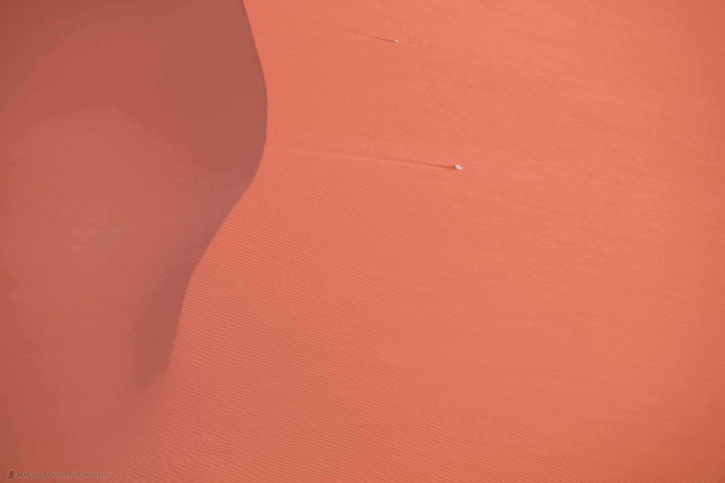
Skull on Dune
We then of course notice the comet trails that the wind has made in the sand, and then start to explore the texture in the surface of the dune, with the wind ripples, and for me at least, after that, my brain starts to recognize that the left third of the frame is in shadow, and I can jump in and notice some different texture over there.
In a photograph like this, our eyes and brains seem to zoom right in on the small detail first, then gradually work back out to the larger scene. This might not be the case if you are viewing the small web sized image, but try clicking on it and viewing the larger image. Also, with a large print, you can bet that people would walk up close and try to see what the white object is, before trying to appreciate the image as a whole.
In fact, you could say that there really is no image as a whole if it was just the ripples in the sand and the line of shadow. It might work, but I think the skull is the added element that we need to hold attention and give the image a reason to delve into the details. This to me is what minimalism is all about.
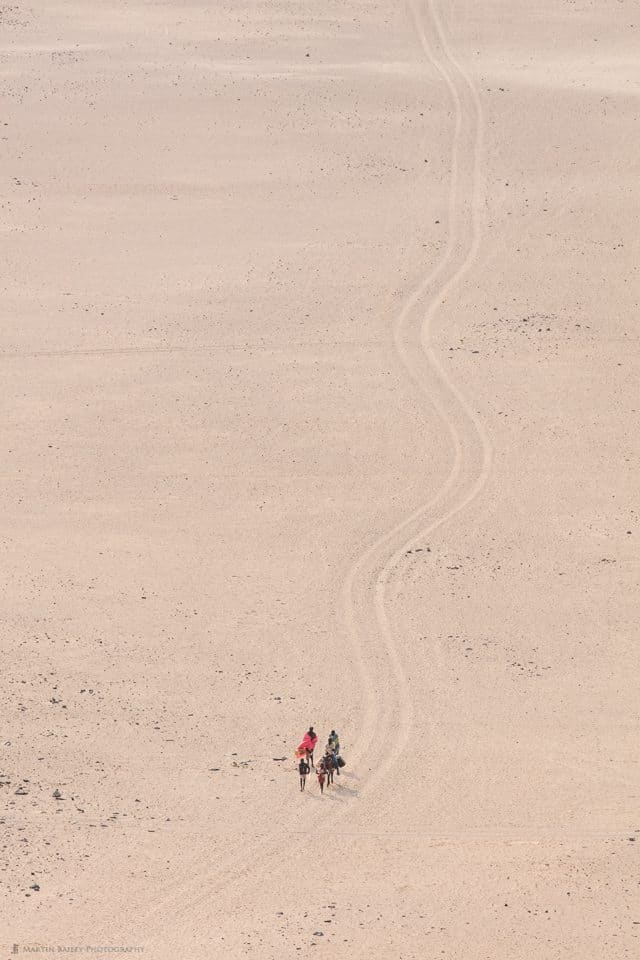
Himba People Fetching Water
Another example from Namibia is this photo of a group of Himba people walking across the desert to fetch water (right).
Of course, this has a minimalist aspect because the people are so small in the frame, yet recognizable. Again, in a large print, I can image people walking right up to this and noticing how the boy and girl at the front of the group are looking up at us as we photograph them from the top of a nearby hill.
It also though symbolizes minimalism for me, as these people have to walk a few miles each day to fetch their water. This is something that we take so much for granted in many countries and yet water is life-threatening scarce for these people.
I purposefully placed the group towards the end of the vehicle trails that they were walking along, hoping to put them symbolically closer to their water supply. If I’d framed this with the group towards the top of the frame, it could have told a different story, making them seem much further away from their water.
By the way, if you’d like to join me in Namibia in June 2017, check out our Namibia tour page.
Darken to Simplify
Another technique that I like to use to reduce the detail and minimalize my images is to darken down shadows and certain colors during the black and white conversion. Here you can see two photos of the Seljalandsfoss waterfall in Iceland. It is of course the same photo, but the one on the right is the original image, before I converted to black a white (below).
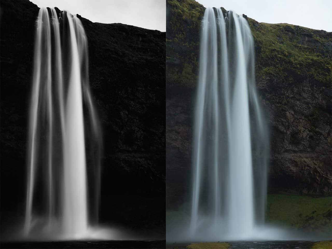
Seljalandsfoss Waterfall – Both Versions
Notice how I’ve used the green and yellow color channel information to darken just the greens in Silver Efex Pro, which makes the cliff side very dark. It also makes the two patches of grass at the bottom of the frame less noticeable as I they’re the same dark gray as the water in my final image.
The resulting photograph stops being about the greens that we see across most of Iceland, but simply about the tender shape that the streams of water make as they fall into the basin, some of them caught and blown off course by the wind. I’ve left some textures in the cliff side, but I’m sure you’ll agree it’s much more about the shape and form of the waterfall in my black and white version. Removing or making elements look less obvious can often be all that’s required to minimalize a scene.
Mist as an Aid to Minimalism
You might recall from my Winter Wonderland Tour travelogues a few months ago, that I’m particularly partial to a bit of mist, because it allows us to reduce the scene down to literally just the bare essentials. In this shot of three whooper swans flying towards us, we were out at dawn and treated with some beautiful early morning mist over the frozen Lake Kussharo in Hokkaido (below).
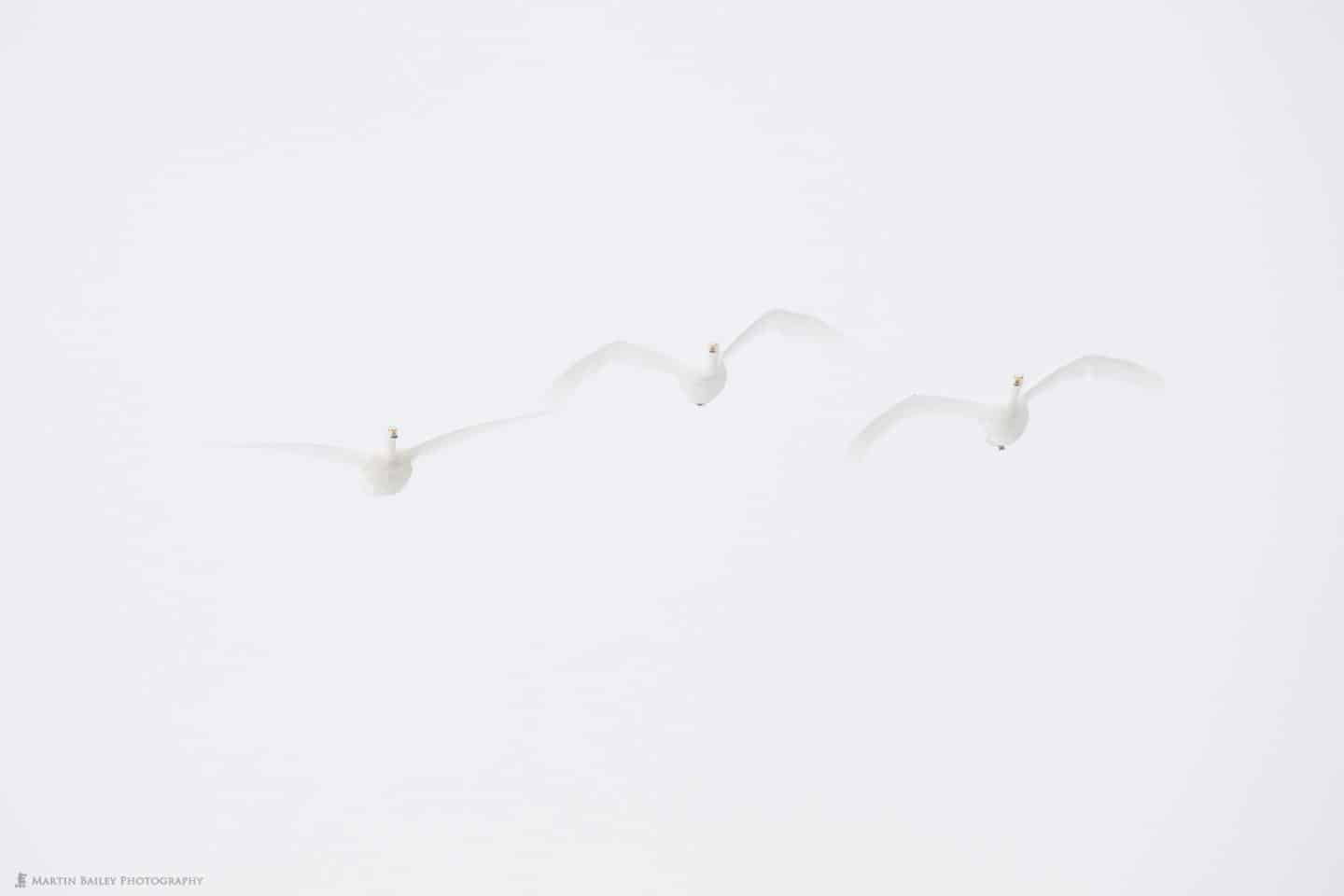
Three Swans in Mist
Without this mist, it’s still a beautiful scene, with the frozen lake and mountains in the distance, but it’s not minimalist. The mist takes away everything but the birds, and I love this. It’s like having wild swans with 2.5 meter wingspan flying for us in a studio space, in front of a giant roll of seamless with huge soft boxes providing the most beautiful soft light imaginable.
Background is King
To keep a scene to its most minimal, with only the necessary elements, I am forever conscious of the background. For this next photograph, I recall struggling to exclude some distracting elements in the distant background, that would have been a bit of an eyesore had I left them in. Of course, we can consider removing them in post, and with a white scene like this, that’s easy to do, even for an impatience post-processor like me, but when I can get a clean background in the field, I much prefer to do it in camera.
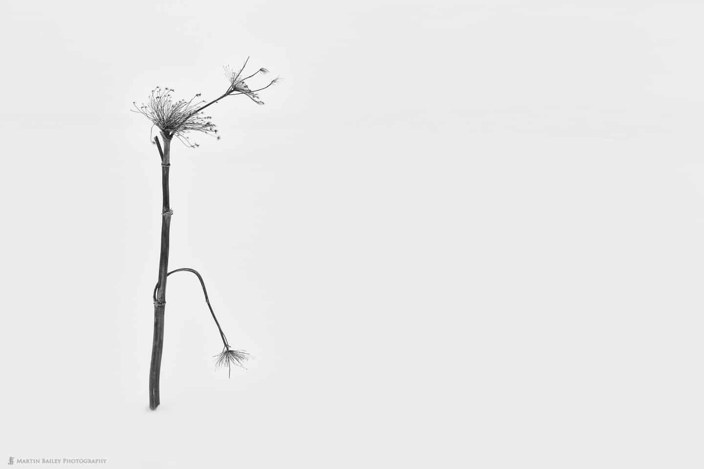
Stark Ballerina
Had I simply zoomed in more, there would have been less white space around dried plant, but I think that space is necessary to maintain the solitude and loneliness that I feel from this image. Without at least a certain amount of space around the subject, I feel as though it’s more just a still life photograph. Especially when it’s a dark subject against a light background, or visa versa. The crane photo that we looked at earlier works OK I think, because the majority of the crane is white, against the white background, maintaining the minimalism.
The point is though, that you can make or break a minimalist photo by not paying attention to the background. For any kind of photography, it is necessary to scene the edges of the frame, and ensure that nothing distracting is creeping in. If you have a textured or multicolored but out of focus background, experiment with the balls of bokeh and how you place them in relation to your main subject.
Open Your Mind to Nothingness
I saw the tree in this next photograph (below) as we drove through the hills in Hokkaido on my Landscape Tour there this year. We were already running late for our lunch, and the group was getting hungry, so we stopped on the way back, and I’m glad that we did. I ended up shooting this scene at 400mm, but even then it was a little too small in the frame for many of the group members to appreciate. I recall getting really excited about this tree as most of the group walked off down the road to shoot the closer trees.
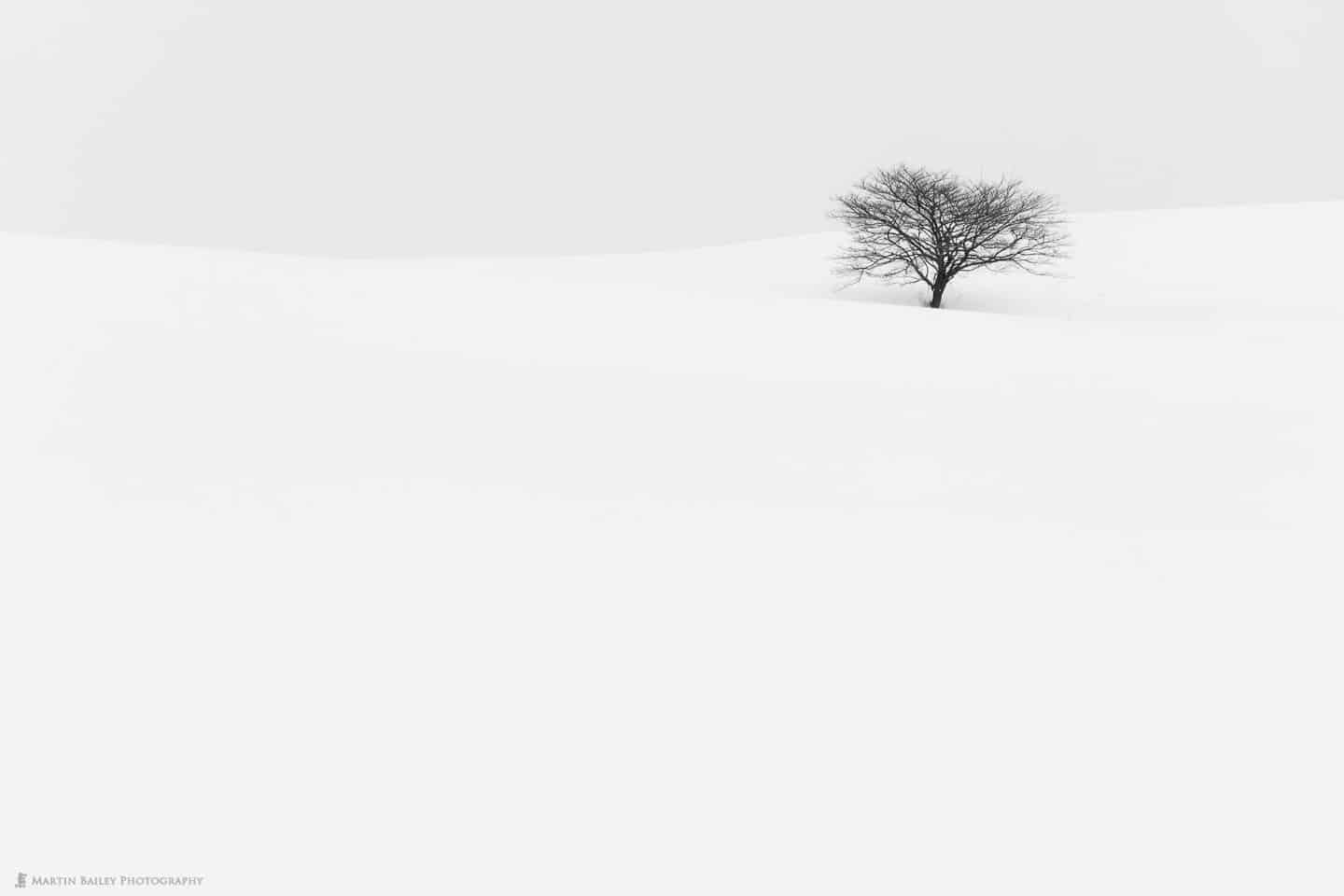
Tree in Hollow
The thing is that I believe we have to let go of the idea of the subject needing to take up so much of the frame sometimes. For me, this image works because of the large expanse of nothingness. The lines along the horizon and the gray sky above it break up the scene nicely. Also, because we can see the line of snow in front of the tree, defined by the shadow of the tree itself, we mentally extend that line out much further.
There is really nothing in the bottom two thirds of the frame, except snow, but we know that it’s snow and that it’s there as an extension of what we can see in the top third. It’s like we mentally fill in the gaps that are suggested by the detail that is included in the image, and this to me is one of the reasons that I love shooting winter snow scenes like this.
Again, the weather is crucial for this. Not only do we obviously need a good covering of snow, but without low cloud or mist in the background, there are hills, farmhouses, other trees and mountains in the background, all of which would make this scene not worth photographing in my opinion.
Three Million Dollar Minimalism
I was in two minds as to whether or not to include this last example photo, but let’s go ahead and look at it anyway. Shortly after photographing the tree that we just looked at, we were walking through the hills, back towards where I’d asked our bus driver to park the bus, and I couldn’t resist this photograph. I recall joking with some of the members of the group that this was my three million dollar photo (below).

Brow of Snow Covered Hill
I was referring to the photo Rhein II which sold for 4.3 million dollars a few years back, causing quite a stir. I said that I was going to print it at three meters wide and put it up for auction, all tongue in cheek of course. Deep down though, I’m actually really attracted to this photo. I thought it would remain a joke piece, but I’ve continued to like it, and come back to it every now and again, wondering what I should eventually do with it.
If we think about the actual elements of the frame, it’s one curved line, slightly above center. I was actually careful to get that line sharply focussed, so if you zoom in on this, there is a tiny line of texture across the crest of the hill. There are few other things that this could be though, so with one simple line, we can understand that we are looking at the crest of a snow covered hill, and the gray sky above it. Call me what you will, but I actually think that’s quite profound.
If there’s anyone out there with $3m to spare that feels the same way, drop me a line. I’m sure I could figure out some fancy printing process for you to brag about, and I’ll even through in free shipping! 🙂
Minimalist Ideals Improve Our Photography
As you’ve seen, much of my minimalist work seems to be centered around snow scenes, although I find it creeping into much of my work. I’ve selected these example images because they can mostly be considered minimalist photographs, but I think the idea behind minimalism can help us to improve all of our photography, not just minimalist work.
Although this might not be the case if your image might be about mayhem and confusion, generally, photographs benefit from only including the elements that are contributing to the image, or supporting the elements of interest by providing contrast or context. If something isn’t contributing to the photograph, the chances are it’s detracting from it. The fewer distractions you include, the more the viewer will be able to enjoy the beauty of the elements that you do include.
Show Notes
See our Tours & Workshops section for details of the tours on which I made all of these photographs.
Subscribe in iTunes for Enhanced Podcasts delivered automatically to your computer.
Download this Podcast in MP3 format (Audio Only).
Download this Podcast in Enhanced Podcast M4A format. This requires Apple iTunes or Quicktime to view/listen.

A post to savour, Maybe you should have called it “Min”.
Thanks Murray! Yes, “Min” would have been good. 🙂
I got maximum pleasure (and instruction) from your Minimalist post. Beautiful images and so informative. You do keep coming up with remarkable podcasts, Martin. Thanks.
Thanks Janet! I’m pleased you liked this episode too. Thanks for taking the time to post!
I’ve always enjoyed the use of minimalism in you photographs. A viewer’s eye does go to that which is different in an image.
I use minimalism, and lots of negative space, in my body abstraction work, in low key. I recently showed this image, link below, in a local art event. I was pleased in the often confused reaction 🙂
https://www.dropbox.com/s/issiotzi4zy527n/Sienna%20Luna%204-17-16-25.jpg?dl=0
Thanks Mark!
Great shot! Is it someone’s abdomen? It’s perhaps even harder to tell at the web size. Still, very beautiful. Thanks for sharing!
Thank you, Martin, for the encouraging comment. Yes, she was in profile facing camera left. This is back lit with a Westcott Ice Light and their barn doors.
Very cool Mark. Nicely done.
Do you have any more of this work posted online? If so, please share a link if that’s OK. I’d love to see more.
Thank you, again. The best place to start is my web site ( http://www.gsphotoguy.com ). There is an About page where I have links to the other locations where I post photographs. The best place is Flickr. My photostream contains many images NSFW but gives you a good idea of the ideas with which I’m experimenting.
Thank you so much for your interest, I’m honored you’ve asked.
Beautiful work Mark! I particularly like the one of the pregnant lady’s stomach with the strips of light. Very tastefully done. Thanks for sharing!
Thank you again, Martin. That was a west facing window, near sunset, and horizontal blinds. Katya was at 33 weeks then.
Great episode Martin. There are so many ways to apply a minimalism philosophy to all types of photography. Really helps the viewer to get straight to the focal point and appreciate the form and composure.
Thanks Michael! I’m pleased you enjoyed this episode. For sure, this isn’t just about landscape work.
Another great episode Martin. I always enjoy your explanations and your thoughts on photography. This one spoke to me in particular as I think more about simplifying my compositions. Still a ways to go but posts like this inspire me to continue on my journey.
That’s great Shane! I’m happy to hear that this one resonated with you. The temptation to include everything of interest is hard to ignore sometimes, but I really feel that condensing images down to their essential elements helps to make them stronger.
Good luck on your journey, and do feel free to share your results.
Thank you for a wonderfully thoughtful podcast and great photography. I appreciate the inspiration you pass along in your comments and pictures. Quick question. Do you have a printing suggestion for color and BW mimimalist photos that supports the emphasis on line and shape?
Hi Kenneth,
Thanks for the kind words. I’m pleased you enjoyed this episode and what I do here.
My go to fine art media for most of my work these days is Breathing Color’s Pura Bagasse Smooth. This is a beautiful paper, with a very fine texture that suits most photography. I also use the Bagasse Textured sometimes, as this adds a beautiful texture of its own, but it doesn’t suit all images, and can sometimes get in the way. I discussed both of these new media types here: https://mbp.ac/484
If totally crisp, sharp lines are a part of the image, I also use Breathing Color’s Vibrance Metallic. I created a 24 x 36 inch print of the below photo for a customer on Vibrance Metallic last week, and it looked so good I printed myself a copy too to put over my desk. 🙂
https://martinbaileyphotography.com/product/konpira-jinja-torii/
I’m assuming that your question was regarding self printing, but if you mean a printing service, you might want to check out zno.com. They have some incredible products and the quality is off the charts IMO.
Cheers,
Martin.
Wow, great reply. Thank you for all the effort you put into this service to photographers.
All my best, ken
You’re very welcome Ken!