
You can tell when the oppressive Tokyo summer heat sets in, because I reverse hibernate and stay in doors doing back office jobs like Web site maintenance and ordering business cards etc. and that’s exactly what we’re going to talk about today. I recently ordered my second batch of business cards from UK based printers Moo and I’m happy enough with the results to tell you about them.
Moo are a great company. They have a somewhat Apple-esque quality about their products and their marketing, and they do it well. I first started to receive business cards created by Moo probably around 6 or 7 years ago. Apparently they were founded eight years ago, in 2006, which means people pretty quickly picked up on their quality proposal.
I’ve tried a number of printing companies over the years for my business cards, and have found some that I liked and some that I could never recommend. To be honest, Moo kind of fell into the latter category for a while, because I feel the print quality of their Luxe cards is sub-standard, and we’ll look at that later, but I knew that they were capable of creating quality products, so I decided to give them another try recently.
Classic Matte Laminated Cards
This time around I decided to go for the Moo Classic Matte Laminated cards. I’ve been handed these a number of times and I’m always impressed with the quality.
Moo Classic Business Cards Packaging
These cards are heavy and stiff, yet still have just the right amount of flexibility. The lamination process gives the matte paper stock a very soft feel, that is hard to describe. You really have to touch these cards to understand this.
I ordered 200 cards this time around costing £39.99 (excluding VAT) and paid £36.75 for the DHL Express shipping, which is almost as much as the cards themselves when sending to Japan, but the cards are so reasonably priced that I don’t mind that so much.
With my last order I went for the standard shipping and the cards took nearly a month to arrive, which I found unacceptable. Call me impatient, but even when I’m not in a rush I don’t like waiting that long for something to arrive, especially when the production only takes a couple of days max.
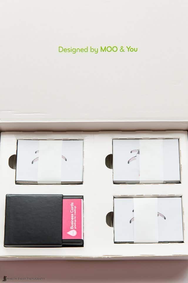
Here (right) you see the packaging that they came in. Nice and basic but functional packaging, and I like the touch of humour that Moo add to their packaging. When you open the box you are greeted with the wording “Designed by MOO & You”, which brought a smile to my face, and that’s special. How many times do you open a simple business product and smile?
The humour continues with the words “Quick, schedule a meeting! Your Business Cards have arrived” printed on the packaging of the box that you use to store your business cards in. You only get one of these boxes holding 50 cards, and the other 150 were bound by a paper belt and dropped into the packaging as you see in the photo (above). This is fine, and helps keep the cost reasonable.
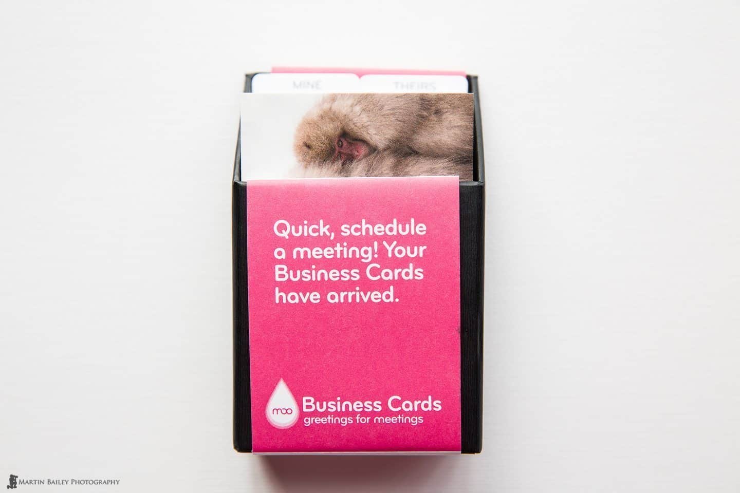
Moo Business Cards Box
Although I have a quite special lacquer-wear card holder that I use here in Japan, I don’t like to use this when I’m out and about shooting, roughing it somewhat, so I decided to also pick up the Moo ShowCase Card Holder with this order too. You can open this case in a number of ways, and you are supposed to be able to simply flick out a business card, although you’d need pretty sticky fingers to do this because the lamination makes the cards so smooth that they can’t be just flicked out, but it’s still nice to be able to easily just open the end of the case, and pull a card out.
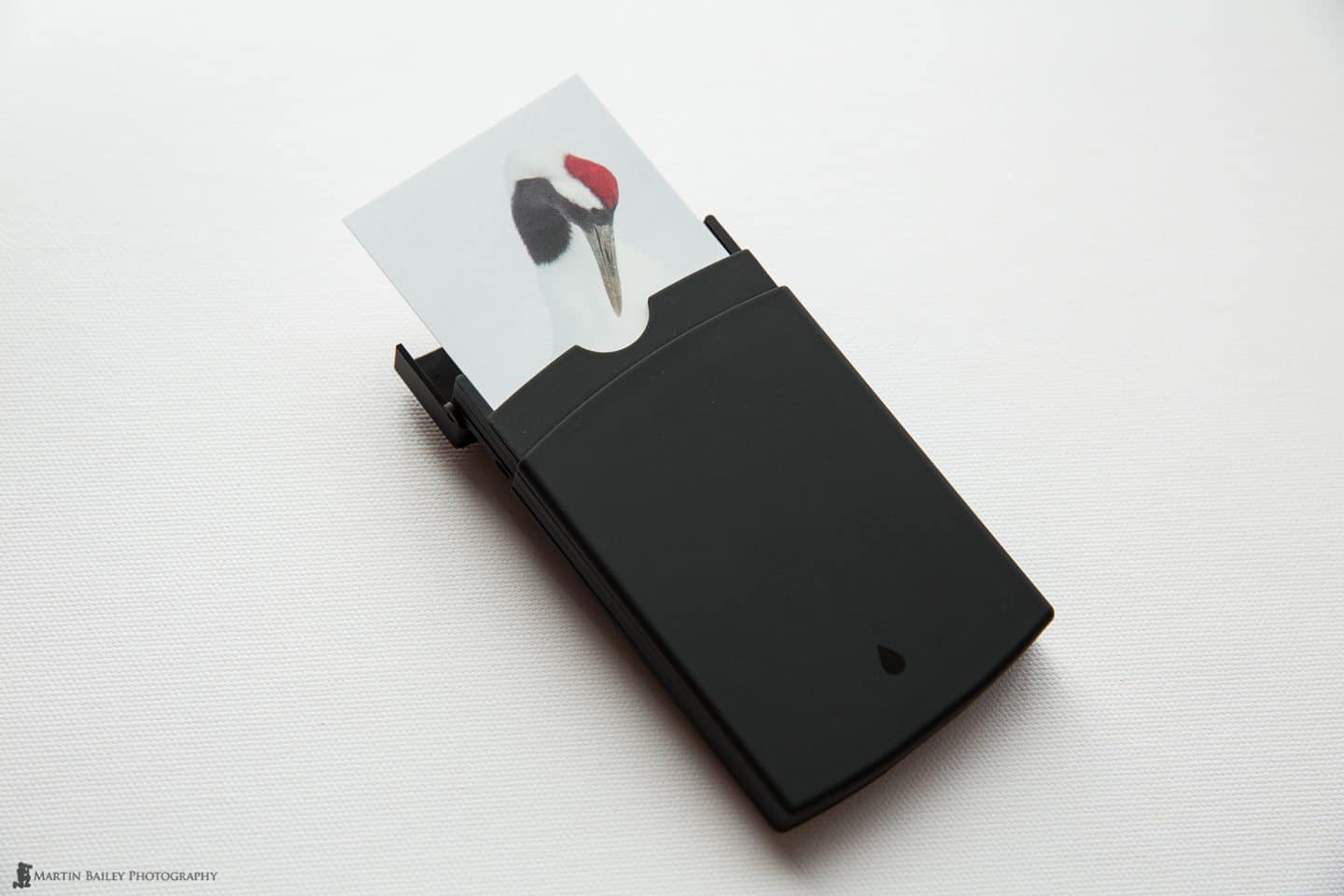
Showcase Business Card Holder
You can also fan the card case out as you see in this photo (below) to show off your cards, which is probably a nice way to present them. Although I think the Japanese people that I exchange cards with here in Japan would probably think this a bit gimmicky, it’s a good way to make an impression, so I’m looking forward to seeing people’s reaction.

Showcase Business Card Holder
It’s also nice of course to be able to show the various photos that I have had printed on these cards. Each of the three sections holds five Classic cards, so if you have more than three designs, from a photographer’s perspective, this gives you an opportunity to take out more cards and show off your work.
For this order, I actually uploaded 17 photos to be printed on back of my cards, as you see here (below). Moo’s Printfinity technology enables them to print as many different designs as the number of cards you order. Basically, if you order 50 cards, you can upload 50 different images to be printed on them. As I ordered 200 cards, I got 11 of some cards, and 12 of others.
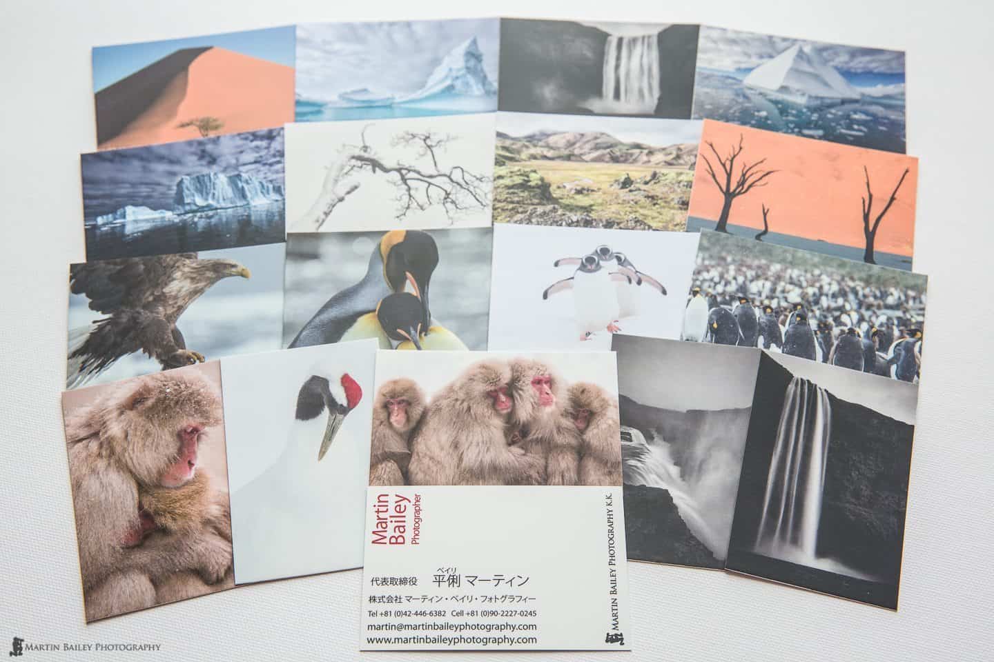
17 Designs
You can only have one design on the front of your cards for each batch, although you could order multiple batches of cards if you needed more. I used to carry both English and Japanese versions of my business cards, but I would invariably find that one would run out before the other, or I ran out of one language before the other when I was out and about, so I designed a single card with both English and Japanese on a few years ago, and I’m finding it works for me.
Preparing Your Artwork
I’m not going to go into details about the order workflow, as it’s pretty straight forward, and as with any Web site, subject to change, but there are a couple of things that I’d like to point out with regards to preparing your images and designs for upload, as you have to dig for this a little on the Moo Web site.
For the contact details side of my cards, I used Adobe Illustrator to create the design, and once you have your design how you want it to look, save a copy, then select all of your text and then from the Type menu, select “Create Outlines”. This changes your type, created with fonts, to vector based shapes, so you remove the risk of problems with fonts not being available etc. Don’t Create Outlines on your final design file, because you cannot edit the text once you’ve done this, so you wouldn’t be able to come back and change your details if necessary for future orders.
Also, according to Moo, when you to save your PDF, you have to ensure that you select the ‘Adobe PDF/X-1a’ preset and because they work with the “Coated FOGRA39” CMYK profile, ensure that you select this in the Output options as you save your design as a PDF ready for for upload. Even this of course is subject to change, and you can work in other file formats too, so do check the Moo site before you finalize your artwork for upload.
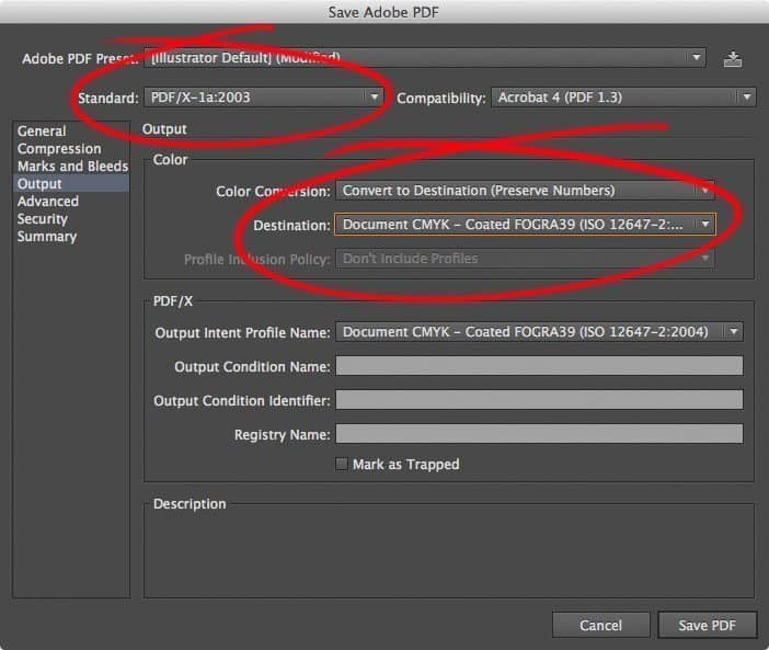
Illustrator Output PDF Options
Preparing Your Photographs
For the photos that I had printed, I converted the profile for each of them to Coated FOGRA39 before saving the images for upload. Moo says by the way that this information is only for design professionals, but if you can get your head around this, it removes the guesswork if you prepare your images properly. If this doesn’t make much sense, you’ll probably be fine to just use images in sRGB, but I think it’s worth taking the time to convert your images. Just open them in Photoshop, and select Edit > Convert to Profile… then select Coated FOGRA39 from the Destination Space Profile pulldown.
While I was in Photoshop, I also changed the image size to 59mm high at 300 ppi, which gives me a width of 88.56mm for a standard 3:2 aspect ratio image, and that also matches the cards aspect ratio. 300 ppi for the resolution is perfect for printing, and what Moo recommends. These settings give you relatively small files to upload, but will print great at the business card dimensions.
I actually just created a Photoshop Action that changed the size and converted the profile to Coated FOGRA39, then saved a copy in my artwork directory before closing the image. That makes it pretty easy to prepare a large number of images to give your cards some variation.
I Turn Off Photo Enhanced
After I upload my images to the Moo system, I also ensure that the Photo Enhanced checkbox is turned off. I don’t like anything automatic to happen to my images. If you don’t really do a lot to your images and you want them to look nice and punchy though, you might want to leave this turned on. You can preview the effect before you decide, so take a moment to check this and make up your own mind.

I Turn Off Photo Enhanced
Luxe Cards are no good for Photographs (IMO)
OK, so before we finish, I wanted to just give you a quick update on what I didn’t like about the Luxe cards that I ordered last year. The Luxe cards are extra thick, and although now comparing these to my Classic Matte laminated cards, I think they are perhaps a little too thick, I did like the quality and feel of the paper stock.
What I did not like though, was the quality of the printing. I did five designs, and apart from the winter tree photo in the batch we looked at earlier, the quality was just sub-standard. Now, I’ve been printing my own fine art images for long enough, and even written a best selling Craft & Vision ebook on printing, so I know what is possible with matte paper, but honestly, I was totally unimpressed with Luxe.
It looked to me as though the cards were printed at very low resolution, maybe 150 ppi or even less, or the coating on the Luxe media is just not appropriate for photographic printing. I basically can’t recommend Luxe for photographs. As you can see in this photograph of my new Classic Matte Laminate (left) compared to the Luxe card (right), the Luxe card has almost no detail in the foreground rocks to the left, despite me submitting exactly the same photograph to be printed on both types of card.
 and Luxe (right)")
Classic Matte laminate (left) and Luxe (right)
Although it’s difficult to appreciate how good the Classic Matte cards at this magnification, the detail in general is just so much better than the Luxe. You can probably also see a very subtle color cast in the Classic Matte cards in this comparison too, but that isn’t noticeable unless you compare them side by side like this, so doesn’t really concern me too much.
I do like the box that the Luxe cards come in, as you can see in this photo (below) but that comes at a price of course. The Luxe cards are £76.99 (excluding VAT) for 200, so almost double the Classic Matte cards. Although they’re nice, and probably work well if you get the right design for the back, I won’t be ordering these again.

Moo Luxe Business Cards
All’s Well That Ends Well!
OK, so sorry to end on a low note there, but in generally, I’m a fan of Moo’s products, and the Classic Matte cards have passed my best critiques approval too, which is of course my wife. She hated my Luxe cards, and was not impressed when I told her that I was ordering with Moo again, but I’m glad I did, and my wife really likes the new cards too. I’ll definitely be going back to Moo for more as my current 200 run out. As they say, All’s Well That Ends Well.
Show Notes
Support the Podcast by ordering with our Moo Referral Link: http://www.moo.com/share/2w68kf
Music by Martin Bailey
Subscribe in iTunes for Enhanced Podcasts delivered automatically to your computer.
Download this Podcast in MP3 format (Audio Only).
Download this Podcast in Enhanced Podcast M4A format. This requires Apple iTunes or Quicktime to view/listen.

I’ve used Moo and generally like the cards. The one difference with Moo cards is they are larger then the U.S. standard business card size. Something to keep in mind.
I didn’t realize that Shelle! They are exactly the same size as the standard card here in Japan, so I hadn’t noticed. Thanks for letting me know.
Thanks as always for a cracking review Martin…I’ve been toying with the idea of business cards and Moo was in the mix. You mentioned that there were a few other business card companies you liked. Would you feel comfortable in mention those as well..??
Cheers…
You’re welcome Altoid65.
Some of the companies I’ve used are local Japanese printers, so probably not worth mentioning, but the company that I was very happy with and used most for the last few years was Zazzle.com. They have a wonderful platinum paper, literally silver colored, that works really well with black and white photos. The details side of the card looks great too. Create a black background with white characters and the characters all come back silver. Very smooth.
Thanks the reply Martin, I will check out Zazzle.com. Much appreciated…
Cheers…
Thanks Martin, I think you’ve restored my faith in Moo. I love so much about them but was very disappointed in my Lux business cards. I’m embarrassed to hand them out.
thanks for your blog, it’s very helpful!
cheers
Mandy
You’re welcome Mandy. I’m pleased this helped.
I too ordered my Luxe cards and was really excited to open the package, and then really disappointed as I looked at each photo on the back. Only one out of the five designed was any good, and like you, I was embarrassed to pass them out. I’ve thrown the last 20 or so out now that I have my new Classic Matte cards. They’re just so much better for photographs.
Thanks for stopping by and for taking the time to comment!
Martin.
First off, like your card design. Classic!
We liked our Luxe cards at first, too. Then we noticed two interesting things people did when we handed them to them that both seemed a bit weird (maybe good or maybe bad)… http://www.moonandowl.com/small-business-branding-messaging/moo-luxe-business-card-review-2015/
Yes, I noticed that too with the Luxe cards. Around half the people that I handed one to tried to peel it apart. They seem like a good idea, but in addition to the print quality, this is another reason I didn’t really like Luxe. Sure, it might be helping people to remember your card, but the look on peoples’ faces as they try to figure out what’s going on was usually one of frustration. Good point to raise. I’d forgotten about that.
In regards to the print quality for Luxe, I’m not sure, maybe they only recently added this recommendation to their guides based on feedback, but they recommend minimal designs.
I ordered a free sample set of Luxe before my actual cards, and can confirm. It has to do with the paper. It has a great feel and texture, but it’s suited for Vector-based work with cleanly defined colors and lines. My design was that; that’s what I was going for. And in that type of scenario, they’re a dream.
But yes, due to the paper, I wouldn’t recommend them for photos. Basically a good rule of thumb is if your design is vector, these are great. Otherwise, I’d look at their other options
This is in line with my findings Garrett. The only photo that looked any good on Luxe was the stark tree against a white background, as can be seen above. This is basically just lines, similar to an illustration, and good OK on Luxe, but all other photos looked terrible. Everything looks good on the classic matte laminated cards though, and I actually prefer the feel of the matte laminated cards too. Luxe have their place, but not for most photographs.