

I'm often asked which color space to use in Photoshop, and when I tell people that it's best to work in ProPhoto RGB, I hear various reasons why people don't think it's necessary. One of the main ones is the camera's widest color space is Adobe RGB, but that of course is not true. Adobe RGB is available as a better alternative to sRGB for use in the JPEG previews in your RAW files, or if you should for some reason shoot in JPEG, that's your lot.
Once you have your images in Lightroom though, it automatically uses ProPhoto RGB, you can't even change it! When you go over to PhotoShop though, you have a choice, and far too many people select Adobe RGB or even sRGB, because that's what your images are often exported in. Today I'm going to show you why that's a mistake.
If you are already up on color spaces and just want to get blown away, skip down to the video below. If this is all going over your head a little, read on first...
What is a Color Space Anyway!?
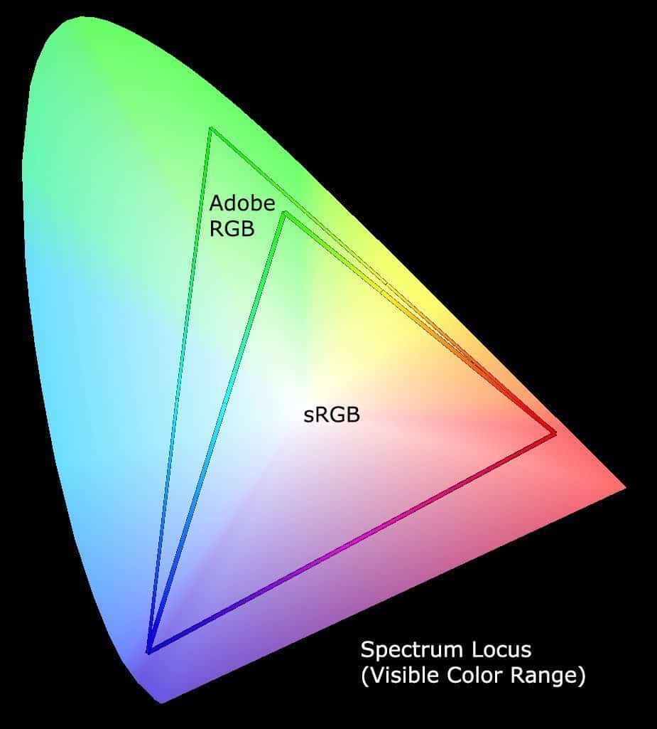
Just in case you don't know what I color space is, briefly, in this diagram you can see the Spectrum Locus, which represents all the colors that we can see. Computers work with large amounts of data much better though, if that data can be mapped out mathematically, so over the decades a number of clever people have created what are called color spaces, that basically map out colors based on straight lines forming a triangle within the Spectrum Locus. This enables us to give each color a number, that can be used to create that color on a computer.
As we see here, sRGB is actually quite a small segment of the visible spectrum, and although better, Adobe RGB is only in reality a bit larger that sRGB. To really show you the relationships between these color spaces and a bunch of others, in the video below I use a tool called ColorThink Pro to make it plainly obvious that ProPhoto RGB is the way to go when editing your images in Photoshop or any other image editing software.
ProPhoto RGB in PhotoShop
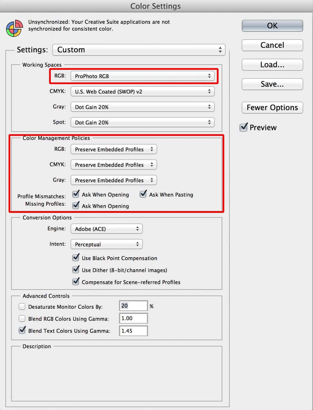
To set ProPhoto RGB as your working color space in Photoshop, just go to the Edit menu, and select Color Settings, and you'll see this dialog box. Just select ProPhoto RGB as the RGB working space. Don't worry about CMYK for now. You will usually only use that in pre-press work and when necessary, you'll be told what color space to use.
I also turn on Ask When Opening and Ask When Pasting for Profile Mismatches and Missing Profiles too. This prevents me from using the wrong profile without realizing it. Really though, once you've made this change, you can pretty much forget that you are working in ProPhoto RGB, and just reap the benefits.
(Click on the screenshot to view larger.)
This goes for any other image editing software too of course. Whenever you can select ProPhoto RGB, it's always best to do so, and save your working files in this color space, then use sRGB when exporing for Web or Adobe RGB when necessary, sometimes for printing services, and some stock sites prefer Adobe RGB, but that should only be selected when exporting your images for these purposes.
Editing in ProPhoto RGB from Lightroom
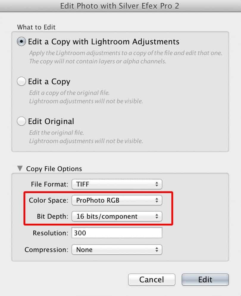
Note that if you send files from Lightroom 5 to Photoshop, there is no need to specify a color space as you leave Lightroom. When you do round-trip editing in other plugins though, such as Silver Efex Pro you will need to specify ProPhoto RGB as your color space, as you see in this screenshot (right).
As an aside, always select 16bit in the Bit Depth pulldown too. As a rule of thumb, to ensure that you never shoehorn your images into a smaller workspace, select the highest possible setting, unless it imposes unrealistic limitations on your workflow.
Some other plugins and applications, such as onOne software have their own color space setting. Surprisingly, onOne software is installed with Adobe RGB as the default, so you need to change this to ProPhoto RGB in the preferences before you start using the program. Once set though, it stays set, so the time investment in using ProPhoto RGB is minimal.
Not Throwing Color Away
It is worth noting of course, that you aren't exactly throwing away color when you export to these smaller color spaces. The conversion takes into account the difference between the color spaces, and compresses and remaps the colors to fit into the smaller color space. You usually can't see a difference on a computer display.
Wiggle Room and Future-Proofing
The major benefit of working in ProPhoto RGB is to maintain your full data for editing wiggle room, and printing, and we will also probably see wider and wider color spaces available in displays in the future too. Please don't limit your images to today's technology.
See for yourself!
Anyway, take a look at the video. I was giggling like a schoolgirl when I first looked at ProPhoto RGB in ColorThink Pro, and I hope this helps you to understand why working in ProPhoto RGB is really the only way to go. Don't forget to go full-screen!
Pixels 2 Pigment Aug 2014
Before you go, I just wanted to let you know that having just finished the first In-Studio Pixels 2 Pigment workshop, we've set the dates for the next one! It will be held on Aug 23-24, 2014, right here in my Tokyo studio. For details take a look at the Pixels 2 Pigment page. I hope to see you there!
Show Notes
ColorThink Pro: http://www.chromix.com/colorthink/pro/
Subscribe in iTunes for Enhanced Podcasts delivered automatically to your computer.
Download this Podcast for the iPhone in MP4 video format. The full sized video above is much better quality though.


Hello Martin
A very interesting video. One thing that might be worth mentioning is that if you use Lightroom and launch from there to Photoshop you don’t have to worry because your image stays in ProPhoto.
I toyed with the idea of purchasing ColorThink Pro but thought I wouldn’t use it enough to justify purchase. Do you use it to assess the gamut of individual images when printing if you suspect they may be out of printer gamut?
Regards,
Murray
Hi Murray,
That’s a good point, but I’ll expand on our recommendation, because sometimes you do need to specify the color space when editing from Lightroom when a copy is going to be made, such as a PSD or TIFF. I’ll probably add a screenshot of that, just to be more thorough.
I have only had ColorThink Pro a short time, though I will look at some images before printing. That red flower shot is particularly difficult to print, which is why I chose it to take a look at in the video.
Cheers,
Martin.
Test reply. I’ll remove this later.
You mention that you can’t change the color profile used in Lightroom. I’m not on my PC at the moment but can’t you change the color space for the develop module in Lightroom in the soft proofing panel?
Hi James,
Yes, you can change the profile for softproofing, but it’s only emulating what the image will look like when using that profile, typically for printing. It isn’t actually changing the profile that is used to display and work with the images. There is no way to do that, and for good reason. Lightroom wouldn’t be able to do the amazing things that it does if it were restricted to a smaller color space.
Cheers,
Martin.
That wasn’t my understanding of how it worked. Changing that setting changed what it actually uses in develop mode and I think that was direct from Adobe.
No James, that’s not how it works. The profile is only used for soft-proofing. You can save the image or create a virtual copy that saves the changes made while soft-proofing, but as soon as you turn soft-proofing off, the base image is displayed again using ProPhoto RGB. If you show me what you saw on Adobe I’ll try to explain why it’s confusing you.
A very interesting video, but do you ever actually see all of this extra ProPhoto RGB data?
It seems as though the screen range (and even more so the print range) of colours is smaller, so I don’t see the point … maybe I’m missing something.
Steven, as you saw, the reds in my photo were already outside of the Adobe RGB range. The camera captures more data than the Adobe RGB range. By using Adobe RGB you are compressing the data that your camera creates from the word go. That should be enough to use ProPhoto RGB, no? Just because you don’t use the full range, doesn’t mean that you should compromise your images by shoehorning them into a smaller color space, even if the computer displays are not displaying the full range.
At the very least, in a few years time, when displays actually show much more information, people that processed in sRGB or Adobe RGB will look at their images created now and cringe. They’ll be full of crunchy gradations and patchy color, and you wouldn’t know until the display catches up. Have you ever taken a look at an old 8bit 256 color graphic made in the 90’s on a modern display? Not nice. 🙂
You are attempting to equate bit depth with colorspace and they are different animals. Bit depth determines number of available colors, while gamut hull size determines maximum saturation levels. Only bit-depth would result in the color breaks and banding you are referring to.
Your camera in no way captures “more data” than any colorspace. It captures at a bit depth within its own range and those colors are remapped to whatever working space the file is processed in. Same amount of data regardless of colorspace. The only difference is where those colors map. Even by today’s current technology (2019) there are no reproduction methods that output to ProPhotoRGB, so there is no way to actually verify that working in ProPhotoRGB results in more accuracy. At this time it’s only theoretical.
Hi John,
I agree, of course, but my example is more about how the technology changes. For specific uses, as I mentioned in my earlier reply, as long as the conversion is done properly, I agree that the images rarely suffer. My main argument is that is that there is no reason to not do this, and as the technology improves, there may well come a time when we regret restricting our images to a smaller color space.
Of course, this only matters when baking in any changes that we might make when saving in a format like PSD or TIFF. When the base image is raw, it doesn’t matter at all, because most of the time we have no control over the color space, but, to back up my case, note that both Lightroom and Capture One Pro use a color space very similar to ProPhoto RGB. If you were correct on this, I’m sure these programs would all use Adobe RGB or even sRGB color spaces instead. The fact that they don’t must say something.
Regards,
Martin.
One thing that should be remembered that Pro Photo RGB is not supported by all web applications. I changed the Export colour space in Lightroom from sRGB to Prophoto and the final version that went to one web site was really drab looking, while the same picture uploaded to Facebook and Flickr still retained the original vibrant colours. Curious.
Very interesting Podcast Martin on a very technical subject
Absolutely. I mention in the video and post too that you should specify sRGB for web. Some browsers understand different color spaces, but you can’t be sure that people will be using these browsers so at this point in time, sRGB is recommended for web.
Hi Martin
A great video! Thank you.
I am in the process of setting up a commercial print studio and would love to link this video to the website that I am busy building. Would that be ok?
Regards
William Walker
Hi William,
Sure, no problem. Just please ensure that you grab the embed code from Vimeo, so that the video is played in its entirety. If you have any problems, please drop me a line and I’ll give you a hand.
Cheers,
Martin.
Martin,
Excellent video and explanation. Seeing that you are certainly on top of your color space knowledge, any tips for avoiding banding in images during the workflow and export? I am referring to a shot say at night, captured in RAW, that starts to show banding in the sky. Thanks in advance!
Hi Angelo,
If you are seeing banding in skies, it is most likely being introduced when you output to JPEG. There shouldn’t be any banding in the raw file, unless you are reducing it to 8bit when opening. How do you view your raw files, and at what point to you start to see banding?
What about when you want to print? Does something always print in CMYK or do we get the colours of Prophoto?
Hi Alex,
What colors are used during printing depends on the printer. If you have a CMYK printer, that’s all that will be used, but a printer with more colors such as Red, Green and Blue for example, will print with those colors, often in addition to CMYK.
You never need to limit your base photograph to the colors that you will print with though. Your software will convert your image for the printer using the ICC profile or printer driver software when you print.
You can of course soft-proof using your ICC profile in Lightroom or Photoshop before you print, and make adjustments to get the best results, but you save those adjustments as a virtual copy in Lightroom or a copy of your original if you use Photoshop, and ensure that you keep the file in the ProPhoto RGB color space, because you still want your file to be the highest quality.
I hope this helps some.
Martin.
Hi Martin,
From my understanding, it’s best to generally export images in ProPhoto/16bit format. However, if I receive an image from a client that was set to Adobe RGB/16 bit or SRGB/8 bit, would a conversion to ProPhoto/16 bit increase the color space and gamma? I understand that you can change color profiles in Photoshop and lightroom, but would it make an effect if the original file was initially set to a lower color profile? or will the initially applied lower profile become irreversible?
Also, if you import an image of lower color profile into Photoshop, and your color setting is set to work in ProPhoto, will it automatically change the lower color profile to ProPhoto?
Lastly, can you convert ProPhoto to lower color profiles using Photoshop? In your video, I see that you used Lightroom to export images to aRGB and sRGB.
Sorry about the loaded questions, but I’m struggling to wrap my head around this. Input would be greatly appreciated!
Thank you
Hi Coy,
You can convert to a different profile in Photoshop, but Lightroom uses ProPhoto RGB by default, and there’s no way to change it except for when soft-proofing and that isn’t really changing it.
Whether there is a benefit to converting to ProPhoto RGB / 16 bit really depends on what you do with it. If you are going to actually modify the image at all, it’s better to convert, as it gives you much more wiggle room so your changes will be saved in higher quality.
Whether or not Photoshop automatically converts to ProPhoto RGB depends on your Color Settings. You can set the Color Settings (under the Edit menu) to Preserve Embedded Profiles or Convert to the Working Profile, and whether or not it asks you what to do or not.
I usually select Preserve Embedded Profiles but then ask me what to do when there’s a Profile Mismatch. That way, if I’m opening a web graphic in sRGB and need it to remain that way, I can just open it, but if I need to convert to ProPhoto RGB I can easily do that when I open the file too.
Yes, you can convert to a lower color space in Photoshop. Just use Edit > Convert to Profile…
No problem about the questions. I hope this helps. 🙂
All the best,
Martin.
The idea that there is more “wiggle room” in larger spaces is a myth. Color spaces do not have a physical size! They are merely mapped to different sized to represent maximum saturation levels – i.e. the gamut hull. Any “room” you speak of is a result of bit depth and never of colorspace. A 16bit file in sRGB has the exact same number of colors as the same 16bit file in ProPhotoRGB. If by room you are referring to saturation levels, then yes, the “larger” space will have more saturation. But working in such spaces comes at the expense of predictability. You are essentially working in a space with colors that you cannot see on screen. This in effect means your screen is dishonest in effectually out of calibration for the space. Instead you are seeing a larger space mapped to the smaller display space and you get to hope that the end result is what you want. There are two goals for color-management.
1: Improved color match across multiple output devices – such as having your brochures match your banners, that match your catalogs.
2. Improved predictability in the output stream from capture, through proofing to final output.
Working in any space your display does not support somewhat defeats the goal of #2.
Those who insist that they get perfect color when working in ProPhotoRGB tend to miss a very important point. They have NEVER viewed the file in Pro. Only on AdobeRGB1998 or sRGB displays. One cannot effectively say they are getting a match to a Pro when they were looking at a smaller space the entire time.
Thanks for your comment John.
With all due respect, I have to disagree with at least some parts of your comments. Bit depth is a major part of this, but the color space, whether you consider it a container or restriction on saturation levels, absolutely does affect the ability to save any given image within that “space”. As you say, the larger color space will have more saturation. All colors in our images are saved with this information, and if you shoehorn an image into a color space with less saturation, you essentially have to throw some of it away, and you cannot get that back later.
I do agree that you are not able to see the benefits of using a wider color space like ProPhoto RGB at this point, but that is why I talk about future-proofing our work. I have some images that were digitized and saved in the early 90s on a computer that only supported 256 colors. While this is mostly about bit-depth, as you point out, I could have saved them with more bit-depth if I’d known why I should, but as it stands, they became pretty much useless as the technology improved, allowing us to see just how restricted the earlier images were.
Much of the reason that I use ProPhoto RGB is because, firstly, I want to ensure that my images are not restricted to 2019 technology. In ten years, when ProPhoto RGB displays (or whatever we’ll have then) are mainstream, I do not want to be kicking myself for shoehorning my images into a smaller space at this point.
Also, why not? This is easy to do and has no ill-effects on our work. I can print my images fine, and indeed, they have to be shoehorned into a smaller gamut of colors at that time, to match the limitations of my printer, as good as they are getting now, but I want to be able to make that decision using the best quality image possible.
As to your two points at the end of your comment, my point is, that for 1) you keep your images in the largest space available, and export for specific scenarios such as brochures and banners as a final step. Your matching occurs during the export, so this point is invalid. 2) is pretty much the same. It’s all predictable, and the final out for any given purpose is what is important, not the format of the base image, which, in my opinion, should never be limited unnecessarily.
Regards,
Martin.
Hmm. I’m worried this has the thinking exactly backwards, though. Let’s think this through.
Analogizing for simplicity’s sake with a 2-bit color space, sRGB represents colors something like this:
0: no red
1: slightly red
2: more red
3: red
[no corresponding value]: redder
[no corresponding value]: still more saturated red
[no corresponding value]: ultra-saturated red
ProPhoto RGB then represents colors something like this:
0: no red
[no corresponding value]: slightly red
1: more red
[no corresponding value]: red
2: redder
[no corresponding value]: still more saturated red
3: ultra-saturated red
In other words, ProPhoto RGB doesn’t represent *more* colors, it represents a *wider* range of colors.
Now, if you’re working on an image in the ProPhoto RGB working space today, what you see on your screen today– that is, what you use to make your editing choices– is that ProPhoto RGB image *remapped to your screen’s color space*, which probably is close to AdobeRGB or sRGB. That is, while you’re working in the ProPhoto RGB space you’re working, behind the scenes, in colors from the above list all the way up to ultra-saturated red, but you can’t actually see that. Instead of the range of reds represented by the ProPhoto scale, you’ll see those things mapped down to the sRGB scale. That’s what you’re working with, and that’s what you use, as I said above, to make all your editing choices. So what happens when you go to save?
Well, if you save it converted to the sRGB color space, embedding the sRGB color profile, you’ll wind up with a file that more or less exactly represents what you saw while working. It will show the same thing on any device, present or future, that is calibrated properly to show sRGB. It not only won’t look worse; it won’t look different at all on the hypothetical future ultra-high-gamut monitor.
But what if you save it as a ProPhoto RGB image? Now you are saving something as definitive that you never saw on the screen at all. By embedding the ProPhoto RGB profile in the file, you are actually declaring that the stretched-out color range which you never saw is the *correct way to display this image*. So when you open this file on your imagined future monitor, it is now going to show all kinds of ultra-saturated reds and things that you had no idea were even there, because during edit time, they were hidden from you. You made all those creative decisions about color in the image originally, and now what you see no longer looks like what you chose. What looked punchy now might look outright garish, for instance. Unlike an sRGB image, which will look the same tomorrow as today, you can’t predict what your image saved in ProPhoto RGB today will look like tomorrow. Moreover, I suspect that you’re also likely to get less good or predictable results even when going to other color spaces today, like translating to a printer profile, when converting from the mysterious and never-seen ProPhoto RGB image than when converting directly from the exact thing you saw onscreen.
Or, maybe another analogy for this altogether. Imagine, in a sort of fanciful scenario, you’re working on poetry on your science fictional future AI computer that can do creative writing for you. Your set your word processor to use a working semantic space of Japanese, because you have heard there are some ideas that apparently are well-represented in Japanese but don’t have good equivalent English words. But you don’t understand Japanese, so while it is generating your poem in Japanese behind the scenes, it is auto-translating to English for your visual representation. You work through the creative process; you tell the computer to adjust line lengths, the number of adjectives, the intensity of the words used, and so on, and it builds your poem– doing all this in Japanese but mapping it back to an English translation all along. You finally wind up with a really interesting result, a poem that you like a lot. Now how should you publish this? If you publish the poem in English, you are indeed losing the Japanese version…but you have no idea what the Japanese version even says anyway. If you go and publish the underlying Japanese version as the authoritative version, someone who can truly read Japanese will read your poem and won’t hear the same poem you did at all. It might even be very ugly and weird-sounding. Who knows? Certainly not you. You’ve kind of lost control over what is out there, and discarded the version you settled on and like. (Sure, if you use exactly the same translator again, you can get it back, but a different one may give you something that isn’t the same at all.)
Publishing the English version, on the other hand, means keeping the version you saw and liked. It will be the same today and tomorrow, and you’ll know what every English reader sees upon encountering it. And if you go someday and widen your linguistic skills by learning Japanese? You’ll still be able to pick up the same poem and read it exactly as you first saw and approved it.
So I’m very skeptical about the idea of saving images in a color space my monitor cannot represent. If I want to preserve everything the camera captured, what I need to do is simply keep the raw file. If I want to preserve everything I saw while editing and finalizing the image, which I almost certainly do, then saving it with coloration info that is out of the gamut of my monitor is the opposite of what I want to do. If I want to future-proof my results, I have to embed the profile I *saw*.
I’m not a professional colorist or color scientist, so maybe there’s a flaw in my logic. If there is, I’d be happy to know how I’m mistaken.
(And, I should say, thanks for the educational site and great photos you’ve got here.)
Hi Trajan,
Great comment! Your thinking is sound, and you obviously have a good analytic mind, but I’d like to point out a few things that might help you to understand the why, so that you can decide on how to proceed.
I would suggest looking at the embedded video above at around 3:51, and look at those little red cubes that are outside both the sRGB and ProPhoto RGB color spaces. They are real colors from a real image that I captured in the natural world. They were captured with a regular camera; the Canon EOS 5D Mark II probably, but the colors are already outside of these two “smaller” color spaces. This is not uncommon.
To maintain your images the best you can, you are completely correct in saying that you need to keep them in the raw format. That is the only way to avoid compressing your colors into a smaller color space. Note though, that when you do this, if you are using Adobe Lightroom or Capture One Pro, you will automatically be using a profile similar to ProPhoto RGB. This strongly backs up my arguement for using ProPhoto RGB when editing too. Why would these companies choose to use ProPhoto RGB is it is not the optimal color space to work in?
Then, when you have to output an image for any other purpose, you make your decision regarding the selected color space based on the target use. sRGB for the web, maybe Adobe RGB for some print outsourcing, maybe even CMYK for specific printing uses, but your base images should not be converted to any of these color spaces, just your export files.
As for your comments about saving an image in a format that you cannot see, you are already doing this with your raw files if you work in any raw editing package that is non-destructive. This article and my thinkinng on this is for your reference and nothing more. If it helps, great! But how to work on your images is completely up to you.
Regards,
Martin.
You have no idea how useful that was for me – I have immediately purchased colorthink v2 . I was trying to do all this in my head … – thanks Martin!!!
I wonder if you can answer a question I have? I make abstract color images with my own software – my aim is to maximise the color space use of any particular printer/paper combination – I suspect working in AdobeRGB or ProPhotoRGB then rendering with relative colorimetric mapping will do this (subject to adjusting out of gamut colors) but if I have images already in the sRGB space (which I think is generally smaller than good printer spaces like the Epson 4900/7900) is there a way to expand the color space of these images to maximise their use of the print space – in other words to get the most from the printer eg. does rendering with saturation intent do this or would I be better re-assigning a larger color space first (not converting) then adjusting the color channel saturation for out of gamut?
Also you say “that you aren’t exactly throwing away color when you export” so is an AbobeRGB – sRGB – AdobeRGB roundtrip (using convert then assign) lossless? Any pointers you have on where I can read up on this would be appreciated. Thanks, Paul.
Glad this has helped Paul. On your questions…
Most of the time, regardless of your final output, working in ProPhoto RGB will enable you the most wiggle room for editing. Unless you are forced to use a smaller color space by an application, just use the best you can, which is going to be ProPhoto RGB.
For rendering intent, 9 times out of 10 Perceptual is going to give you better results. Flick between the two in Soft Proof mode to see, but generally Perceptual is better for print, because it remaps all colors to maintain their relative look, unlike Relative Colorimetric which only changes the colors which are out of gamut, and that can lead to nasty gradations between colors and tones.
It will also help you to think of working color spaces such as ProPhoto RGB and output color spaces such as your printer profiles separately. The software that interprets and converts from your working space to your output space will generally do as good a job as possible, but you can check the results in soft proofing in either Photoshop or Lightroom. Trying to work to an output profile in your editing is not necessary unless you are creating crazy colors that simply cannot be output. Again though, to check that, just use soft proofing.
What I mean by not exactly throwing colors away is that they are converted OK most of the time when compressed into a smaller color space such as sRGB, but that does throw away a certain amount of detail, and so you shouldn’t convert back and forth, and there shouldn’t be any need to. As I say, use large color spaces to work on your files, and small color spaces only as output spaces. This goes for outputting to a printer, or to a smaller color space such as sRGB, or even Adobe RGB.
I hope that helps!
the software really helps to understand the whole input/output space thing – as for sRGB I now see it should only be used really for web images – even CMYK swop can handle some colors which sRGB cannot store. Thanks again.
Hi Martin,
thanks for your great post.
I’ve got a question. I cannot find ProPhoto RGB in PS (CC2014), it is not available in the color settings in PS. I’ve searched my Mac but the profile doesn’t exist. Do you know whether I can download the profile and install it on my Mac.
Thanks for your help, best,
Ralf
Hi Ralf,
That’s strange. It’s part of the OS, so I’ve never had to add this. When I look under Color Settings in PS, it’s right next to sRGB near the top of the list. First double check, as it’s not necessarily in the main list, but a separate section near the top. Then, if you can’t find it, drop me a line https://mbp.ac/contact and I’ll email the profile to you.
Cheers,
Martin.
Hi again Ralph,
I just checked, and this is actually in the “/Library/Application Support/Adobe/Color/Profiles/Recommended” folder. I just emailed it to you, as I can get your email address from your post.
Let me know how you get on.
Cheers,
Martin.
Fantastic video Martin! I’ve been looking for this type of ‘VISUAL’ explanation of color spaces, and yours says it all! … I share in your excitement over discovering how much larger Pro photo actually is.
So, I have a question: I edit RAW images in Adobe Camera Raw quite often and I was wondering… Is it true to say that the main benefit of editing in Pro photo is the latitude of adjustment available to me? That the gradations are extended so as to allow for more fine tuned adjustments. And even though the image will eventually be remapped to sRGB at some point, the Pro photo colorspace during editing will produce a better result than editing in a smaller color space? … I think my question was in there somewhere. Lol!
Thanks Randy. I’m pleased you enjoyed this.
Although you won’t really see the benefits on screen, yes, ProPhoto gives you more wiggle room when editing. When you do eventually remap the colors to sRGB, they are generally remapped correctly, and you should hardly see any difference. If you use a wide gamut display, you can sometimes see the difference, but it shouldn’t usually be a very big difference.
Basically, it’s best to set up Photoshop to always use ProPhoto, but change the Color Settings so that it asks and gives you the option to keep and use the embedded profile when it is not already ProPhoto. If you are using Lightroom or Capture One for example, to manage and edit your images, they use a profile similar to ProPhoto when editing images, so you would also ensure that you send the image to Photoshop using ProPhoto, so that you don’t have to compact it during the move.
Hi Martin,
Thanks so much for the video. I am all good regarding export in Lightroom, but am lost on the way to export a high resolution (300 dpi) sRGB image from Photoshop that has an embedded ProPhoto RGB colour profile.
I’d like to export JPG’s at 300 dpi, with the convert to sRGB function. But when choosing Export As, it doesn’t provide an option for dpi whatsoever, and seems to be defaulting to 72 dpi.
Would it be best to bring the photo back into Lightroom somehow after making alterations in Photoshop? If so, how?
Am totally lost here Martin, could use your help. Please let me know, would be greatly appreciated.
James.
Hi James,
You’d need to change the Resolution to 300 under Image > Image Size, ensuring that you turn OFF Resample, so that the image size is not changed. This just tells the image how to report its resolution, and doesn’t actually change the image.
Then, you need to open Edit > Convert to Profile, and change the profile to sRGB. Then after you’ve done these things, Save As a copy of your image. Assuming that you don’t want to save the image with these settings, after you saved your 300 dpi sRGB version, you would close the image without saving it.
If you find yourself doing this a lot, I’d recommend recording an Action, that first Saves your image, so that you don’t lose any changes when you close it later, then change the resolution, then convert to sRGB. If you always save them in a certain place, you could include that in the Action, and add a Close too.
As you say though, I think it’s better to just roundtrip to Photoshop and save your images back into Lightroom, then export from Lightroom. You just need to right click the image you want to edit, and select Edit in Photoshop, then when you save the image, it should be saved back into Lightroom automatically. If Photoshop isn’t available in the shortcut menu in Lightroom, let me know and I’ll tell you what to do to add it, but usually it’s added automatically.
Note too that you can select the ProPhoto RGB color space and your resolution of 300 in the dialog that opens before sending the image to Photoshop, so this would save you changing the resolution in Photoshop later.
Cheers,
Martin.
While there is a huge difference in color range between ProPhoto RGB and other color profiles, I can’t use it to send my work to a printer. If a client sees something fantastic in my online portfolio, which is in ProPhoto color profile, they are going to get a horrible print when changing into a profile that is supported by my printer. Does the ICC profiles take this change into account, or am I just starting over from square one?
And it wouldn’t make any difference if you could use it to send an image to the printer, because the printer will work to Adobe RGB at best, and even then, there are limitations. But, that is an output limitation, that you work with all the time, and has nothing at all to do with the profile that you use to save and work on your images in. To your question, the ICC profile is nothing more than a standard, so the answer would be no, but the conversion engine used to convert from ProPhoto RGB to sRGB, Adobe RGB or whatever ICC profile you are saving to, does take that into account, with your help, by your choice of Rendering Intent, such as Relative Colorimetric, or in the most part, for photography, Perceptual.