OK, so just a quick episode this week, because things have gone a bit pear-shaped with my Web site and I don’t have the time to do a full episode. I am in the middle of switching WordPress themes, and despite some initial testing, there are some gaping issues and I’m torn between going back to my old theme and staying with the new one.
So, here’s what happened. A few days ago I was in a position where I had to send someone a link to my portfolio, and I had to do something that I hate doing, which was make an excuse, because I have been having problems with a plugin that I was using to create my Web galleries. The problem may well be a problem with my site, and not the plugin itself, so it will remain nameless, but having spent way too much time trying to fix this issue, I decided to look around for a better solution.
Well, I found what I thought was a better solution, but this is what’s left me in a bit of a mess. If you ever visited my old Portfolios web site you’ll have probably seen a beautiful theme with full screen images and very nicely formatted galleries. This was a theme called Atlas, and I bought it hoping to use it on my main web site, only to find that it didn’t support blog posts. I was flabbergasted. A WordPress theme that did not work as a blog!
Well, that set bells ringing when I did a search for a nice looking new WordPress Theme that would give me some great ways to show off my images, support my WooCommerce shop, and actually work as a blog. The bells were because the theme that I found was made by the same person made Atlas. The theme is called Titan, and it really is incredible, or will be, if I can remove a few major issues that are still in place as I type and record this Podcast today.
With a few restrictions, Titan does work as a blog, so the Podcast episode posts are currently being served via this theme, but one of the issues is that the blog cannot exist on the top page. If you visit the blog soon, the pages that I currently have set up may still be in place, but you’ll see a few full screen images displaying on the top page, and you would have to access everything via the menu at the top of the screen.
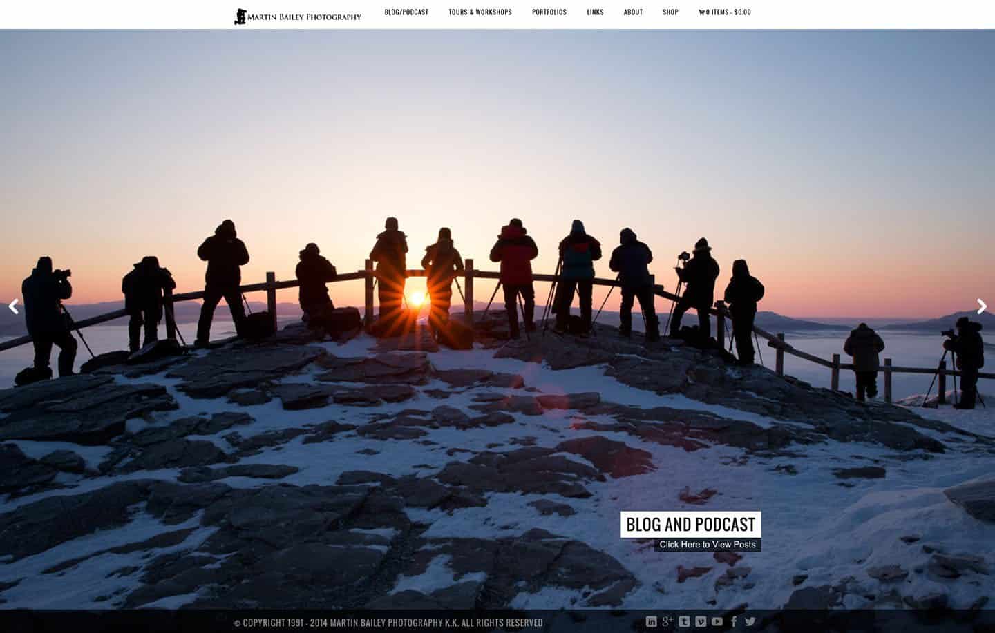
Luckily, as a workaround, I found that you can embed links into the image captions, and use the title of the image as a text label, so if you visit the site while this is still in place, you’ll see something like the screenshot below. This isn’t ideal, but it does actually give me a relatively lightweight top page, and the call-out links are functional, so I have to think about how I’ll proceed here if we stay with this theme. Either way, note too that at least for the time being, there is a Blog/Podcast link in the menu, to take you to the Podcast posts as usual.
Conversely, build your Web sites with WordPress and want something to show off your images, this is a great way to do it, but honestly, this is one of those times when I wished I just used Squarespace, and all of the technical issues were taken care of for me. The only reason I don’t use Squarespace by the way, is because they didn’t have a smooth migration path from my hundreds of blog posts with Audio players embedded. There are just a few too many customizations that I have to do to enable the Podcast to work and these can’t be recreated. If I was only building a photography Web site, I’d be with Squarespace in a flash, or perhaps another service that I’ve been working with that we’ll also look at soon, but not today.
Anyway, problem one, is that I can’t put the blog posts on the top page. Well, I can, and I tested this far before switching themes, but the pagination doesn’t work. You know how you have that series of links below a set of posts, that take you to the next page of five posts, then the next page etc.? That always brings you back to the top page, so I decided to go with this full-screen front page for now.
The next problem I ran into, although I’ve fixed this now, is that all of the images embedded in blog posts were left aligned. Even one’s that had been right aligned, so that messed things up. I had to put some standard WordPress CSS back into my custom CCS field to put this back. How someone can design a theme that breaks something as fundamental as that escapes me, really.
The next issue, and this is now the main reason that I have ran out of time for this week’s Podcast, is that the theme as it stands has a conflict with the Fancybox for WordPress plugin. Fancybox is basically that cool way that images open up inside the browser window, and you can then navigate between all of the images in a blog post with your mouse or keyboard arrow keys. This is what I always ask you to do when you come to the blog to view images.
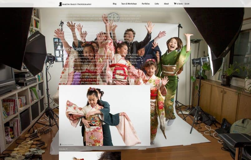
Well, probably because the new theme also uses FancyBox, it causes problems with the plugin. Not only does the plugin stop working, but it stops the theme from overlaying a dark transparent image over the page backgrounds, so as you see in this image (below) from my test site, and that results in the page background image being so bright that you can’t read the text.
If the Fancybox plugin worked otherwise, I’d turn off the page backgrounds for now, but it doesn’t work anyway. The result is, for the time being, when you click on an image on the blog, it will open in a separate page, which I absolutely hate to see. Hopefully before many of you listen to this episode, or read the blog post, I’ll already have this fixed, but it’s probably going to take a few more days as I wait for help from the theme developer, or more likely get frustrated as they fob me off with excuses that they can’t guarantee the operation of third party plugins, which always really annoys me, especially when they break standard functionality with their own coding.
Update: A few hours after I released this Podcast, I was able to find a new Fancybox style image viewer (Responsive Lightbox) that does not conflict with the Fancybox code in the new theme, so it’s all working again now.
Anyway, the final problem that I’m still trying to figure out, is how to stop the audio player on each Podcast blog post from auto-playing. Some people might actually like this feature, but the majority will probably find it annoying, especially those of you that visit to read, and don’t actually listen to me reading this out, so I really want to turn this off by default if at all possible.
What’s Good About Titan?
OK, so rant over. What’s good about this theme? Well, as I said, it really does have beautiful galleries. The developer of the Titan theme, as with Atlas before it, really knows how to get the most out of photographs. The images on the full screen galleries, which is basically what you see on the front page, are only 1440 pixels wide, and yet they still look great when expanded out to full screen. I don’t know any other developer that does this as well.
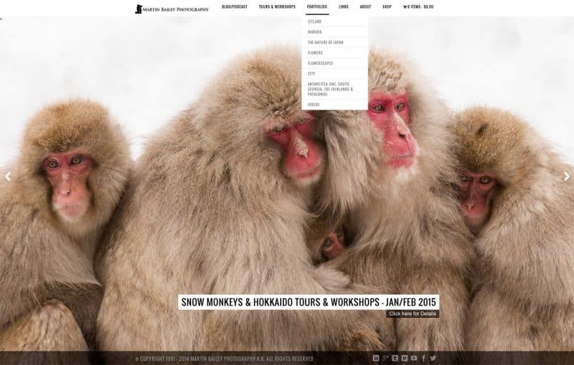
Also, if you go into the Portfolios menu, you can now see a number of different gallery styles used with my portfolios. There are 14 gallery styles available, and I’m only using a few variations, but some are automatic slideshows, and some are very nicely formatted thumbnail grids and masonry layouts.
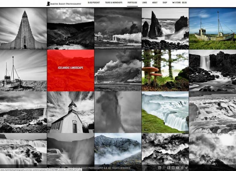
This screenshot for example, shows the Iceland Portfolio, which I just used a square thumbnail grid for, but I find this really pleasing to look at, and when you resize the browser window, all of the thumbnails are resized and moved around accordingly.
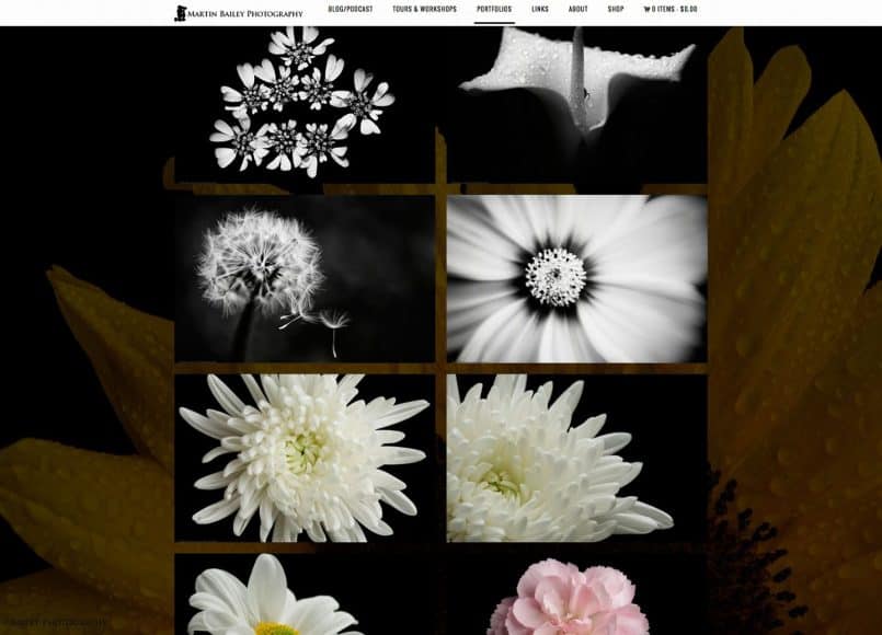
Another gallery type that I like is the two column thumbnail gallery, which I currently have assigned to the Flowers Portfolio. Again, it’s really pleasing to look at, and all of these galleries are set with just a few clicks. Once you have your images loaded into a standard WordPress Gallery, all you have to do is select the type of gallery you want to use from the Page Template pull-down, and then select your gallery. To change gallery types, it’s just a case of changing the Page Template and saving the page. Ingenious and very effective.
So, it’s kind of a nice mess to be in, as I feel as though I’m making progress, but there is a take-away here. Despite me spending a full day testing this new theme on a test server, I was in too much of a rush to get this change done over the weekend, and so really didn’t do enough testing before making the switch. I knew there were a few issues, but didn’t find all of the big ones, and now I’m paying the price. I’m in one of those positions where I feel I’m close enough to not go back, but things are nowhere near acceptable yet.
Depending on how much help I can get from the developer, by the time many of you listen to this, the blog may actually be on a different theme again, or back to the old one. It’s hard to tell at the moment. if you do come along while things are still in a bit of a mess, believe me I feel your pain, and your patience is very much appreciated until I get this all sorted out.
Sorry that this wasn’t photography related today either, but this is all I can manage this week. Hopefully we’ll be in better shape next week.
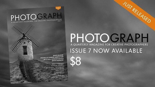
I do have one bit of great photography news to finish with though, and that is that the Craft & Vision Digital Magazine PHOTOGRAPH No. 7 was released last week. This eMagazine just goes from strength to strength, so do check that out at https://mbp.ac/cvp7.
Show Notes
Craft & Vision PHOTOGRAPH No. 7: https://mbp.ac/cvp7.
Music by UniqueTracks
Subscribe in iTunes for Enhanced Podcasts delivered automatically to your computer.
Download this Podcast in MP3 format (Audio Only).
Download this Podcast in Enhanced Podcast M4A format. This requires Apple iTunes or Quicktime to view/listen.


Looking good, but you’re right, I find the audio auto-play annoying. If you can’t turn it off, then I would like the Pause button to displayed more prominently in a place accessible from anywhere on a podcast page. Up on the page menu bar would be good.
I’m really hoping we can just stop it auto-playing Morton. The speed at which it is displayed would probably be harder to change, but thankfully I’m pretty sure we’ll be able to stop the autoplay instead. The developer gave me some advice, but so far it hasn’t worked. I’ll stick with it, and hopefully get it changed before too long. Thanks for the feedback!