I recently bought a Pina Zangaro portfolio case, and put together a physical portfolio of some of my work, to take to clients to discuss using my images in their magazines. A portfolio is also useful to present your work to potential clients to win assignments, and most printed media clients want to see a printed portfolio or book of your work.
My old portfolio, a black clamshell box in a leather case, was starting to look very dated, and didn’t really portray the image that I want to show potential clients, so I decided to splash out on the case that I’d originally considered some six years or so ago. Today I’m going to discuss my process for selecting my portfolio images, the format, and also take a look at my new case, which I’m really pleased with.
I actually originally tackled part of this subject back in September 2006, when I released Podcast episode 55. I walked you through my process for creating a portfolio at the time, but the tools have changed, so today I wanted to talk a little about how I edited my selection down in Lightroom. If you don’t use Lightroom, you can certainly do similar things in Aperture, Bridge or even Finder or Explorer on Windows, but we’ll concentrate on Lightroom and you’ll need to rethink this yourself for your own system if you use another tool for your photo management.
Decide Format & Orientation
As you start to consider your portfolio, it helps to make a decision on your format before selecting your images. Of course, there’s nothing to stop you from creating multiple portfolios in multiple formats, but if you try to work on too many possible formats at once, you run the risk of weakening them all, or worse, not actually completing any of them. I suggest you set your sights on one main presentation format, and aim to take that to completion, but work in a way that will enable you to easily rework your collections for other formats, or easily extend or create new collections without having to start from scratch each time.
We’ll talk a little about other formats later, but for my main portfolio, I decided to go with a loose leaf portfolio, that would allow me to easily change the contents and order of the portfolio. The case I bought also has room for some sixty or so prints if I need to, which means I could for example carry two or three large collections of images if I need to. Note that I wouldn’t suggest walking into a clients office with 60 images in a single portfolio. That’s too many. You want to be working with 20 to 30 images or an even tighter edit when you know exactly what the client wants.
Another decision that it helps to make before you start to edit down your image selection is the orientation of your portfolio and whether you will print all of your images with the paper in that orientation. For example, if you print with the pages in landscape orientation, you might want to try to select landscape oriented images over portrait when possible. And for the portrait aspect images you leave in, you need to decide whether you will print them with the page also in portrait mode, or print them smaller with the page still positioned horizontally, to save you or your clients from having to turn the page for portrait images.
Of course, if you know that your potential clients prefer portrait aspect, which is common with some kinds of magazine, you may decide to print in portrait orientation, and even print your landscapes narrower in this orientation, although there is of course the option of printing double page in the magazine. There are lots of possibilities to consider, but whichever you decide, it’s good to make this decision before you start your selection, and give yourself maximum flexibility in your portfolio as you start to print.
One other thing to note is that when I find something in the field that can be shot in both orientations, I usually do. This allows me to select a portrait or landscape orientation of essentially the same subject based on these factors.
Also keep in mind that if your final output is going to be a printed book, although you may still be able to decide to go with landscape or portrait orientations, you won’t realistically be able to flip the book around to change orientation. You’ll need to create a book that most matches your clients requirements and your images, and go with that. The good thing with books though is that it’s easier to include two portrait images facing each other on an open book, and if necessary, spread landscape work across both pages, although in this case you do have to be mindful of what you’d lose in the dead area in the binding of the book pages.
Once you have decided on your format though, be it loose leaf or book, portrait or landscape, we can move on to start our selection process.
The Selection Process
As a standard process, I’m a big believer in keeping tabs on my best work as I shoot, and I actually make a copy of these best images to make selections like this easier. I do all of my rating leaving the stars on my original RAW files, so that I can easily go back to my original folders and sort by the star rating, and see exactly which images rose above the rest and made it to my Best Images collection. I also leave 2 stars against everything that I thought was good, but didn’t make the final cut, so that I can easily go back and look for something similar later if necessary.
Once I’ve completed my selection process, I create a copy of the best images in a different location, and archive the originals. The result is that I continuously build on a collection of my best work, so I don’t have to trawl through over 130,000 and growing original files when I start a project like this. If you don’t already do this, it’s a good idea to start. It makes things much easier.
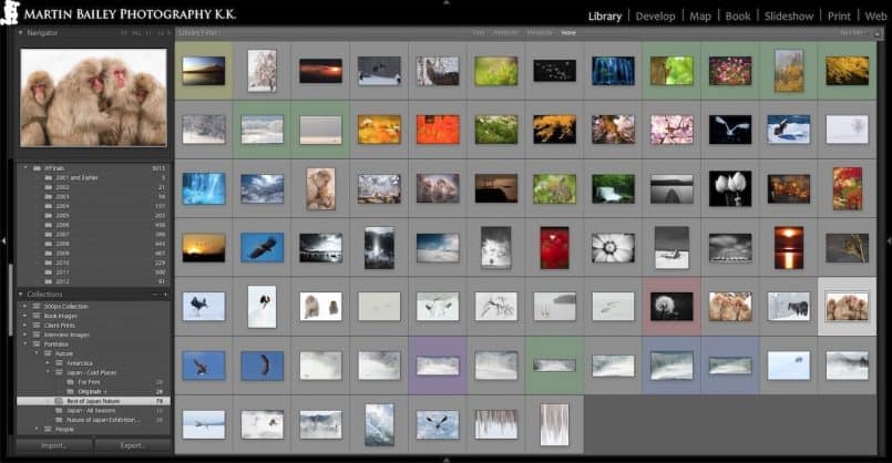
There are currently some 3,000 images in my Best Images folder, although the selection is ready for a bit of a pruning session. I live with my images all the time though, looking through my library often, and I always have a bunch of stronger favorites in mind. The first thing I did when I decided to put this recent portfolio together was decide on my main theme, which was going to be Japanese Winter Wildlife and Landscape, one of my stronger genres. I also decided to select and print a few of my other season images, so I went through my 3,000 best shots, and started to select my favorite Japan nature and wildlife images.
I find the easiest way to make your selections in Lightroom is to create a Collection in the Library module called Best Shots or something like that, right click it and select “Set as Target Collection”. Once you’ve done this, you can just go through your images and hit the B key on your keyboard to add it to the collection, and hitting B again will remove it. If you don’t already have that batch of your best work, like my 3,000 shots, then you’ll need to go to your archives, and add everything you are confident showing people and that represent your best work.
Be Very Selective
Even at this point though, be very selective. Your portfolio is only as good as the worst image it contains. If you are undecided between on or two images of a similar subject, at this point it’s still OK to put them into your collection, but the next phase of the process has to be another run through your images to whittle that selection down to as few strong images as possible. If you are doing this for the first time, I suggest you do include both portrait and landscape oriented images, even of the same subject if you have them, as that will give you more flexibility in producing a portfolio in various formats later.
My first pass through my best shots with my Japanese nature theme in mind resulted in 79 images in my initial selection. (Click images to view larger.)
Once you have your selection of best shots, it’s time to really narrow this down to only the images that you intend to include in your portfolio. By all means, make a copy of your collection at this point, and that will be your intermediate base for creating larger or more varied portfolios, but we still want to move on now and whittle this down to a much tighter edit for your printed portfolio.
Let’s continue the selection process though, now really bearing orientation in mind if you have to. I decided for my loose leaf portfolio I was going to print full page, regardless of the orientation, so that people would be able to see my images as large and detailed as possible, although when I had the option, I selected landscape over portrait orientation to avoid making the client turn the pages, as much as possible at least.
Next I reduced my selection to just Winter Nature and Wildlife shots, and I still had 55 shots in my collection. My goal was to keep the main part of the portfolio, without any other backup images, to no more than 30, it was time to start getting really ruthless. I still had to kill off almost half of my selection.
It was at this point, that I enlisted the help of my wife, as I feel it’s important to get impartial feedback from a trusted third party. My wife can certainly be ruthless, and although I don’t agree with her on every single choice, in general, she’s really good at helping me to weed out the images that the selection can live without.
After a nasty afternoon deciding which of my images had to go for the sake of the greater good, I was finally down to 32 images, and decided to sleep on the selection. It’s easy to get wrapped up in the process, and remember that each of these images is selected from what I believe is my best work. They’re like my children. In fact, Zack Arias did a post last year about his portfolio creation process, and in that post he mentions that one of his friends said “It’s like lining up your children and deciding which ones you’re going to shoot” and someone else rephrased it to “…deciding which ones you love more”. I can totally relate to both of these sentiments. It’s hard, but you have to reduce your numbers to something reasonable.
After walking away from my selection for the night, the next day I was able to reduce my selection by two more, to my initial goal of thirty, and as I continued to work on the printing, I actually removed two more, taking the portfolio down to 28 Japan Winter Wildlife & Landscape images. For a large printed portfolio this feels like a good number to me.
Lose the Emotion!
Something to note here is that one of the images that I killed last was one from this year’s Hokkaido Workshop. I’ve mentioned a number of times in previous Podcasts that I like to sleep on my images for at least three days, and usually more than a week if possible, before making my final selections to post to the Web or otherwise show people. Well, this emotional attachment that we have with our images continues to wear off as the memory of the experience and hard work that we went through fades.
The last image that I removed is a nice image, and it will continue to live on in my Best Shots folder for years to come, I’m sure, but it was probably only in my final selection because of the emotion of the experience and any viewer of an image in a portfolio doesn’t have that. They only see the image in front of them, and if you have to spend time explaining why it’s “good”, then it probably isn’t. At least not good enough to be in your best of the best portfolio.
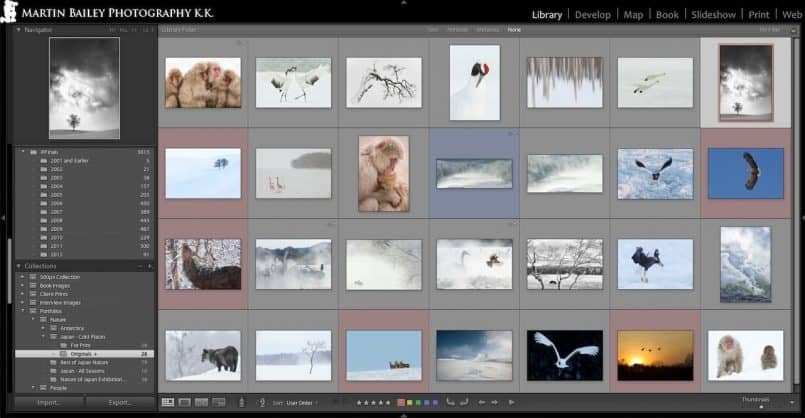
So here’s my final 28 images for this initial Japan Winter Wildlife & Landscape portfolio. It looks a bit bleak compared to my very colorful Nature of Japan selection, but this is to show a Landscape centric client, so I’ve tailored it for their use, and this is an important point, and one of the reasons that I went for a lose leaf portfolio as opposed to a printed book at this point.
Specific but Flexible
In addition to the above 28 images, I have printed 10 of my images from other seasons from around Japan, and 5 images from last year’s Antarctica expedition. These are to have ready if the conversation moves on from the Winter work, and as I mentioned earlier, having a lose portfolio allows me to print various images and mix and match what I include for any given meeting, depending on client needs. In the coming weeks I intend to do more printing to create a full Nature of Japan portfolio, so that I’m ready to take that out at the drop of a hat too.
Note too that I can also reorder this set depending on what I think is important to any given client. One rule of thumb that I touched on back in my 2006 Podcast episode is that you do want to lead and finish with your best two images of your set. Of course, you have worked hard to get this selection down to what you consider your very best work, but even within that, there are going to be varying degrees of greatness, so select the best two and put them at either end of the set.
Note that in Lightroom if you drag and drop an image into a different location in your list of images, it will automatically switch your sort style to User Order, so you can easily use Lightroom to decide on the order in which you’ll present your images. This is also useful if you are going to print your book, as you can use Lightroom to work on the order without printing your images out if that works better for you. When I first started keeping a printed portfolio, I used to print out the images on plain paper, and lay them out on the floor, which works, and is great for collaborative editing, but at the moment, I prefer doing this in Lightroom initially, then physically reordering the prints, and making any adjustments necessary after that.
The Printing Process
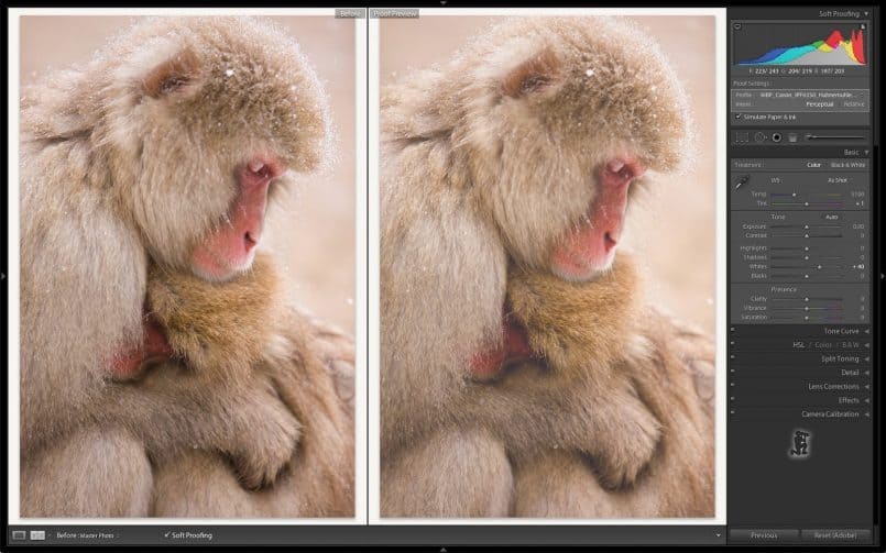
So, as I set about the task of actually printing my portfolio images, I used a few techniques that made the process easier, which I wanted to pass on here. Firstly, before I printed any of my images, I used the new Soft Proofing feature in Lightroom 4 to check and adjust all of my images. I touched on this in my Lightroom 4 Beta video in episode 319, so I won’t go into detail today, but being able to move through all of these images, checking how they’ll look when printed, and making any necessary adjustments right there in Lightroom made the whole process much quicker. I soft-proofed all 28 images in less than an hour, including adjustments, whereas it would have taken me probably a day to do this in Photoshop. This new feature in Lightroom 4 is incredibly useful.
As you soft-proof in Lightroom, if you make any adjustments to the image specifically for print, Lightroom will create a virtual copy of the image, appending the printing profile name to the copy, so that you can identify it correctly later.
To make the printing process smoother and easier to track, once I’d finished soft-proofing, I selected all of the soft proof virtual copies, and the images that had not required any soft-proofing, and created a second Collection called “For Print”, and told Lightroom to include the images that I had selected.
Then, when I started to print each image, I selected to only show images without a color label in the Attribute toolbar in Lightroom, and as each print was completed, I hit the number 6 key on my keyboard, to add a red label to the image I’d printed. This not only made the image disappear from the list, so that my current view of the collection only contained images that still needed to be printed, but it also gave me an indicator later on that the image had already been printed, should I select the image or soft proof copy in the future for another variation on my portfolio. I use number six for red, as in stop, to make me stop and think before printing, but you can of course use any color, or even star ratings or the flags, whatever works for you.
Pina Zangaro Camden Portfolio Case
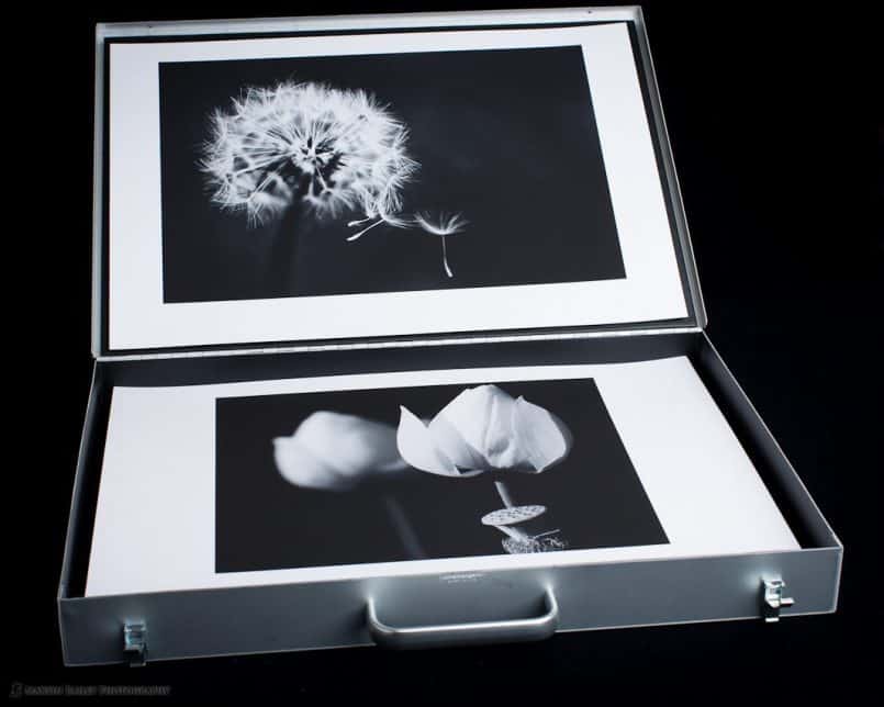
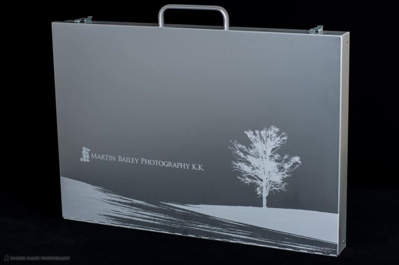
Let’s just take a quick look at my new Pina Zangaro Camden Portfolio case (no longer available) before we move on too. As you can see, I had the case Laser Etched with my company logo and a part of a landscape scene across the bottom of the case.
To create the artwork, I used Photoshop to roughly cut out part of one of my winter landscape shots, and then posterized it to make the details almost totally black, and then I opened the image in Adobe Illustrator and created an outline from my image, which is what you have to submit for etching. I then just placed my logo at what I thought was an esthetically pleasing position on the case, and sent it in for the Etching to be done.
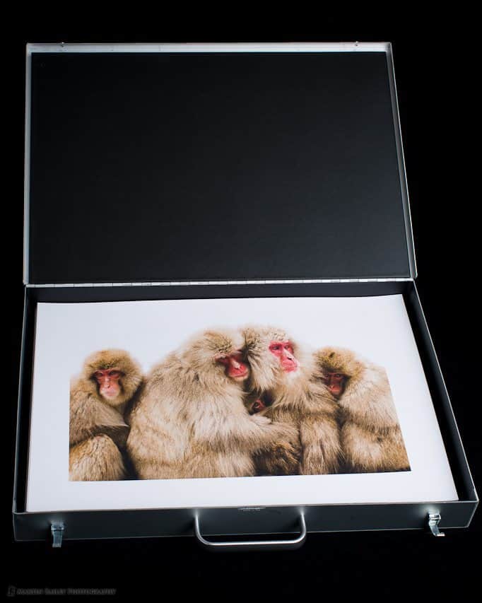
As I said earlier, I’ve been hankering after one of these Camden cases for around six year or so, and so I was really excited to be finally placing an order. I went for the 11×17″ case, which is probably named that way because you can put 11×17″ portfolio books inside, but my plan was to place my prints directly inside the case, which has internal dimensions just over 13×19″ so it’s perfect of course for 13×19″ prints too as you can see here (click image to view larger).
The case in incredibly well made, and I’m very happy with it. It was certainly worth the wait, and I’m pleased that I personalized the case with some artwork and our logo.
You can check out the pricing over at www.pinazangaro.com but just to let you know that this particular size and case without the laser etching costs $220, and if you add the laser etching allowing five days for the work, they cost $292, plus shipping. I wasn’t in a hurry so five days was fine for me, but if you are in a hurry there’s a one day laser etching option too, for $364, plus shipping. These certainly aren’t the cheapest portfolio cases around, but the impression that this will give my future clients, could well be priceless. 🙂
What’s Next?
There are times when a client just wants you to send them a physical book of your work, so my next job is to decide whether I’m going to send off to Blurb to create an actual book of this current portfolio, or create a book matching my new Camden Portfolio Case, with something like the Pina Zangaro Machina Presentation Book. I must admit this is what I’m leaning towards, as it will allow me to add printed pages either in polypropylene sleeves, or with adhesive hinge strips, and I can add business card or DVD pockets to make the presentation totally self contained.
As interest in my work here in Japan increases, having these various ways to approach potential clients and present or have them view my work in a way that works best for each situation is going to be very useful.
Digital Presentation
We shouldn’t close either without noting that I do also usually take either my iPad or MacBook Pro when I’m meeting clients, so that I can quickly show them other work that I have, should the need arise. I make sure that I have a number of collections loaded on my iPad for impromptu presentation, but I actually have all 3,000 of those best shots loaded too, and I know roughly where each image is if I need to show something relatively obscur from my library.
If I’m using my MacBook Pro, I just fire up Lightroom and I can show them collections right there, but the great thing about the iPad is that you can give your clients a more tactile experience and let them control the experience by just passing them the iPad.
I have been using a few portfolio applications on the iPad, namely Foliobook, and I recently also picked up Xtrafolio as well to compare the two. Both work great, although I haven’t yet reset these up fully since upgrading to the new iPad, but I’ll be revisiting these applications soon. I will probably do a Podcast episode on them both once I’ve taken Xtrafolio through it’s paces, and seen which of the two I personally start to sway towards.
Oh, and on resolution, I know that there are lots of schools of thought on how to resize for the iPad, but honestly, I just export full sized JPEGs to a folder on my hard drive, and I just sync that to the iPad. I let Apple deal with the resizing and it works great. You can zoom right in on the details when necessary, and the images look stunning, so I’m a happy camper.
Tear-Sheets
To round off the discussion on the portfolio, I should also note that I will often also take a number of relavent tear-sheets of previous uses of my work, to show the potential customer not only how my work is being used, but this is a good chance to show that you are actively working with other clients, which obviously becomes a more powerful tool as you get more big names in your previous client list.
I also keep a digitized version of these tear-sheets on my iPad and iPhone, as you never know when this stuff might come up in conversation. All of my images and collections are on my phone too of course, which is always with me, and the Retina display actually makes this a viable method of showing images to someone that you meet unexpectedly.
Conclusion
I don’t think there’s any one way to present your work, though I do suggest that you make your image selection process robust enough that you can easily go back and pick out some relevant images to cater for various client’s needs. I was recently asked to go and meet a few people at Canon, with very short notice, but because I already have my best shots identified, I was able to quickly create a collection of some 40 images on my MacBook Pro to show them, and they sat through all of them, commenting on each, which was great.
If you do have clients that deal with printed images, I do suggest that you try to create at least one printed portfolio, and although I know money doesn’t grow on trees, don’t scrimp too much on your presentation either. Whatever type of portfolio you choose, makes sure it’s as classy as you and your images, and you’ll get the right message across to your potential, and hopefully future clients.
Show Notes
Pina Zangaro Camden Portfolio Case – removed link because no longer available.
Music by UniqueTracks
Audio
 Subscribe in iTunes for Enhanced Podcasts delivered automatically to your computer.
Download this Podcast in MP3 format (Audio Only).
Download this Podcast in Enhanced Podcast M4A format. This requires Apple iTunes or Quicktime to view/listen.


Great post Martin.
Just wondering have you considered a square format portfolio? That way portrait and landscape are equally well represented.
Cheers
Hi Antony,
I have considered square, and am thinking that when I order a Machina book style portfolio, I may well do that.
For the large portfolio, the reason for this size is because I can use ready cut sheet paper, which is easier than having to cut each piece myself after printing. There are certainly benefits to square though, as you say.
Cheers,
Martin.
Martin–
As I was listening to the podcast and thinking about best practices, I had a couple questions about the physical portfolio. If you mount the prints, how? If not, what do you use to keep them flat?
I’ve been listening for a few months now and have gleaned some great information. Enjoy your guest host spots on This Week in Photo as well.
roy
Thanks for listening Roy! I’m pleased you’ve been picking up some tips.
I don’t mount the prints in the portfolio, as that would greatly reduce the number of prints I could keep inside.
This paper is so thick at around 350gsm, so I don’t feel the need to strengthen it any more for presentation. It lies flat no problem.
Cheers,
Martin.
Great post and podcast Martin! I have been thinking about doing this and it was great to find it in your archives. Sorry I missed it earlier 🙂
No problem Patricia. I’m pleased this was useful. 🙂
Thanks for listening!
Martin.
Martin,
First of all, thanks for sharing all that you do.
I am printing my own portfolio now and I have a few follow up questions for you.
I really like the borders you left on the prints as that will make handling them so much easier. But I was wondering if you used a consistent image size on each print or to what degree you allowed for variability. Also, based on the photos above, it looks to me like about an inch and a half border and I was wondering if you have found that sufficient as you have used your portfolio.
Thanks a lot!
Hi Hil,
Firstly, you can see how I calculate my border sizes in a spreadsheet available here: https://martinbaileyphotography.com/print-border-size-calculation-spreadsheet/
If you want to know more about why and how I set the borders up in Lightroom (and a bit of info on Photoshop and Aperture too) you might want to pick up my book, Making the Print for $5 from Craft & Vision. I explain all of this in there.
http://craftandvision.com/books/making-the-print/
Cheers,
Martin.