I picked up my iPad on May 28, which was the day that the iPad went on sale in most countries outside of the US. Today I’ll talk about how I’m using my iPad now, and throw in a few useful app suggestions, as well as covering what I’m not doing, with reasons why, and a few small areas that really need to be improved to make this little device the photographer’s Utopia, if it isn’t already.
Feel the Quality
The first thing you’ll notice when you hold an iPad, for those that haven’t had a chance to yet that is, is that it is the perfect size to just sit on a sofa and hold when you view eBooks or browse Web sites etc. The weight is enough to be able to feel the quality, but not enough to start to feel heavy while using the iPad.
Portfolio Viewer
Of course, the most obvious use of the iPad for the photographer is to use it to show your portfolio of images to others. One of the first things I did was sync my best shots to the iPad, just to see how good they look, and they look great! I had high expectation, and it totally lived up to them. The screen is 9.7” diagonally, with 1024 x 768 resolution at 132 pixels per inch, so it’s incredibly sharp.

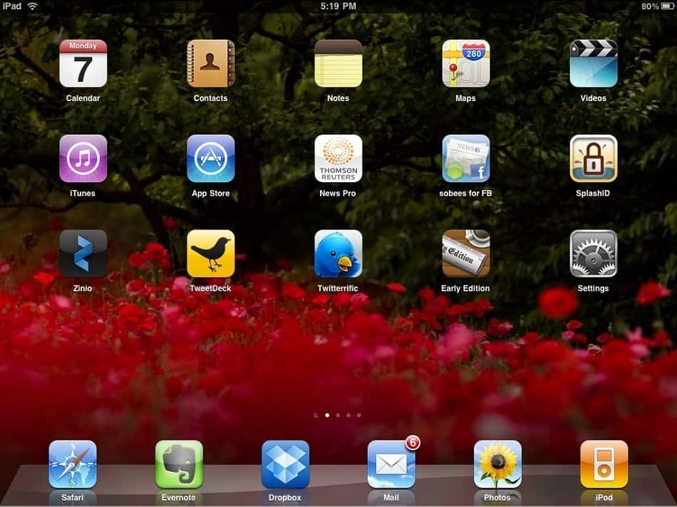
MBP iPad Home Screen
The iPad Technical Specs state that the screen is Fingerprint-resistant, which I think must mean that fingerprints are easily removable, which they are. It’s misleading though in that these things do get covered in fingerprints. After you’ve washed your hands, and there’s no oil in your skin, they are fine for a while, but unless you wash your hands every time you touch the screen, there will be finger prints. I find though that when there are noticeable finger prints, a microfiber cloth like the ones we use to clean our lenses will clean the screen with a few wipes, and also, after you have washed your hands, you can easily remove the finger prints by just rubbing your thumb or finger over them a couple of times.
Don’t Resize for the iPad
After I’d simply copied my library of best shots to the iPad, I exported my current 44 image Nature of Japan portfolio to a directory on my hard disk, and synced that to the iPad. I initially made a mess of this though by trying to be clever, and resizing my images. Because the screen is 1024 pixels wide, I tried exporting my images with a maximum long edge of 1024 pixels. This of course though stops you from being able to zoom in on the images. This was actually how I had my portfolio synced when I met Marcus Bain, a great photographer living here in Japan, the day after I got my iPad. The first thing Marcus did when I showed him the portfolio is used the multi-point technology, where you place two fingers on the screen and then spread them apart to zoom the image, and of course, this doesn’t give you a sharp image if you have the photos resized to just 1024 pixels. Luckily I had my other images on there still, so Marcus could still have a play with them and check sharpness, but the first thing I did when I got home was re-exported my portfolio without any resizing.
I’m sure there’s an optimum size to resize images to for the iPad, but as iTunes will do all of the resizing and sharpening necessary to display images in amazing quality and give you a certain amount of zoom-ability, I decided to just export my images without any resizing at all. I can then use that folder of JPEGs for slide shows etc. as well so it really isn’t a big deal to have the full-sized JPEGs sitting on my hard drive.
Photos Currently Ordered by Creation Date
One thing that I noticed though, that I don’t like about the iPad, and I have raised an enhancement request with Apple about this, is that you can’t specify how images are sorted in the Photos application, which is the native image viewer on the iPad. I usually order the images in my portfolio in a pleasing or aesthetic way, and then when I export my portfolio images from Lightroom, I have a preset that will add a two digit number and an underscore to the start of the file name as it saves the images to my hard drive. This means that when you view the images sorted by file name, they are in your intended order. The iPhone actually orders images by file name, so I always have my portfolio in the order I want it on my iPhone.
So, I was surprised that when I cranked up the Photo viewer on the iPad, and saw my images in a totally different order. On closer inspection, it seems that the images are ordered by the capture date of the original digital image. Now, this of course is another way in which I’d like to view images. I have a whole bunch of folders that are just named by year, and these are more like a yearly photographic diary that I like to have with me, and this is great sorted by creation date, because it starts are January 1st, and ends with December 31st.
Apple are great at taking away confusing configurations and decisions from the end user, but on this occasion, I think we need a little more control. My enhancement request was for the ability to sort on file name as well as create date, and to have the ability to specify ascending or descending order. I also want to be able to do this by folder, and not a generic setting for all image folders on the device, because there are times when capture date is preferred. OK, so that’s negative point number one. Not a showstopper by any means, but I hope Apple decides to change this functionality, in the near future.
Handling Sub-folders Not So Graceful
One other negative thing about the Photos application is that when you sync from iTunes, if you select a folder to sync that contains lots of sub-folders, they are all displayed as one larger album on the iPad, even when you select the Albums tab in the Photos application. This is annoying because I want to display my best shots in their year folders, and have my portfolio shots in another folder. To make this possible, you have to go down a level in your file system, and tell iTunes that you want to sync each of the folders individually. This means that I can’t just say, OK, sync my Best Shots folder, and make sure that my yearly folders and my portfolio folder are in there. I have to select to sync each folder on the lower level by selecting each one of them in iTunes. I can live with this, but I’m not a fan of changing how I organize my computer because of conditions imposed on me from third parties.
Slide-Shows with Music
The Slide Show feature in the Photos app is pretty good. You can turn music on and select any track that you have synced to the iPad in your music library. There are also a number of transitions to choose from such as Cube, Dissolve, Ripple, Wipe and Origami. Wipe is probably the most orthodox transition, but these are great to play with, and the Origami transition can be fun, but I find the way it crops images to make its three image spread can be a little unkind to nature photos. Definitely worth having a play with this though.

Full Screen Image with Thumbnails Bar
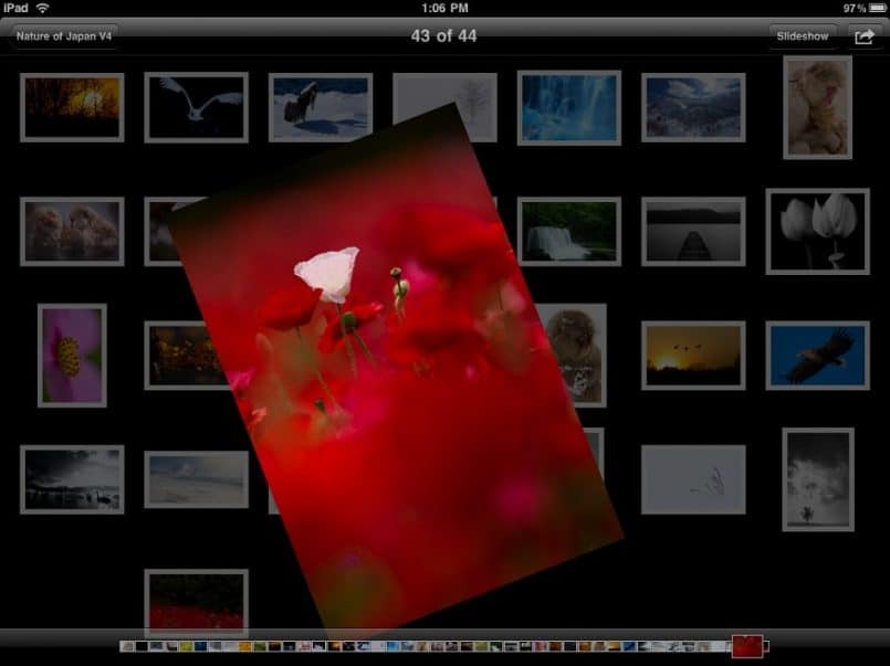
When viewing an image full screen, if you tap the image, you’ll get a narrow thumbnail bar at the bottom of the screen, and when you run your finger along it, it literally whizzes through your images as fast as you can run your finger along the thumbnail bar. You can also hold the image with two fingers, and turn it, and the image will rotate under your fingers, as well as expand and contract. This isn’t particularly useful, but it gets a good reaction when showing people how cool the iPad is.
Hold and Rotate – Cool But Meaningless
Pinching closes the image and returns to the thumbnail view, and then if you pinch the screen again, you will go up to the next album level. To open albums or images you can either tap them, or use two fingers, spreading them apart, and of course simple swiping on images and album pages will move you swiftly through the albums or images on the screen.
Picture Frame
Before we move on from the display of photos, one other great feature is the Picture Frame. If you go to the Settings panel on the iPad, you’ll see an option called Picture Frame. In there you can set a transition and a few other settings, and you can also select to display all photos or specific albums, and then when you turn your iPad on when you see that slider that you have to slide with your finger to unlock the iPad, you’ll notice a little icon with a flower in it to the right of the slider. If you click this, you will automatically turn your iPad into a Picture Frame, and the images in the album you selected will start to display on the iPad, without you having to go into the iPad, select the Photos app, navigate to your album and then turning on the slide show. This is very handy if you just want to quickly show your images, or even set the iPad down on a table on a stand maybe, and just use it as a digital picture frame.
No Adobe Flash!
I can’t believe I have so much to say just about the Photos app! Let’s move on to some other great things that you have to check out. As I mentioned, Web pages look absolutely amazing on the iPad, as long as they are not Flash based of course. I’m sure you’re sick of hearing about this, so I won’t go into detail, but basically the iPad does not, and from what we’re hearing probably never will support Adobe Flash. Sure, there are arguments that it’s a battery life hog and that there may be a few bugs in Flash, whatever. I personally think that it should just be supported, because if there were bugs, Adobe would fix them, like they always do, so I wish Apple would just get over this and give us Flash.
Web Sites Do Look Great!
Apart from that though, really, Web sites look amazing on the iPad. I have found myself doing more web browsing than ever before, just because I can do it from the sofa, sitting next to my wife, who I think is also pleased I bought the iPad, just because it’s keeping off my PC more than she could have imagined.
So Do Videos!
Videos also look great on the iPad. You can sync videos just like Photos, from the same dialog in fact, and if you have videos in your iTunes library, it will try to sync them to the iPad as well. The speaker on the iPad is surprisingly good for the size, so you don’t always need to use earphones, unless of course you’re annoying other people with the music or sounds coming out of the speaker. Some sites like Vimeo.com will dish-up video to the iPad too, so you can go over to vimeo.com/martinbailey for example, and check out my videos if you are looking for some video content to give a try. Currently though, the Vimeo fullscreen video button doesn’t actually go to fullscreen on the iPad. If you want to go true fullscreen, you have to download the video and sync it to the iPad.
Generally Very Pretty
The email client on the iPad is pretty good. I like the way, as with many apps, when you turn the iPad up into the vertical orientation, it automatically gets rid of the side bar, and just displays the email. If you get mail with graphics in the iPad does a great job of formatting those, as well as plain text email. The Calendar and Contacts apps are also nicely formatted. I think Apple has done a great job of really utilizing the additional screen real estate that the iPad has.
My Essential Apps
Evernote
I don’t use Notes on the iPad, as I have Evernote, which brings us to some of the third party apps that I don’t think I’d like to be without. The iPad is great for photos and mail, and web browsing, etc. right out of the box, but it really comes into its own when you start to customize it with your own selection of apps from the iTunes App Store.
Evernote is an application that basically allows you to create text notes, which you can type directly to the new note or old note that you are editing. You can also record audio notes, and attach them, as well as attaching photos etc. You can organize your notes into various Notebooks, and tag them, for easy searching later.
The beauty of Evernote though, is that all of the notes that you create are automatically synced to a central secure server, and then if you install the Evernote client on your Mac or Windows PC, or even your iPhone or many other mobile devices, you can continue to access notes that you made not only on that device, but on all of your devices. If you are on a PC for example, you can capture entire Web pages, or copy PDF documents or just about any document to Evernote, and have it available on all other devices, and there’s no need for any manual syncing at all. You can only display a certain type of document mind. The Evernote reader has to support it, but it does an OK job with Word Docs and Excel Files for example, and PDFs display OK, although not optimal for the iPad, but none of the PDF viewers really do a good job yet, but we’ll get to that shortly. Evernote have a free account, into which you can upload up to 40MB a month, and sync between all of your devices without paying a penny. If you find that you are using it a lot though, you might want to consider a Premium account for $5/month or $45/year. I have a premium account and have not regretted it once, especially now that I can get at all of my notes from an iPad too.
Dropbox
For syncing files between computers more than notes, another service that I use is Dropbox. Dropbox has a free service where you can sync up to 2GB of data across as many machines as you like, but if you want to go above 2GB, there are a couple of options. For 50GB, it will cost you $9.99/ month or $99/year, and for 100GB it will cost you $19.99/month or $199/year. I have signed up for the Pro 50 account, and I now sync my best images and all my eBooks and other important files across all of my machines to save me from having to sync them manually. And of course, there’s an iPad client for Dropbox that does a pretty good job at opening all the common file types. It will also give you a basic image viewer so that you can view your JPEG images, but it does not have a slideshow feature in the iPad version as of June 2010. The iPhone client for Dropbox actually has a very nice photo viewer though, so I’m sure it won’t be too long before this is added to the iPad version as well.
Twitterrific & TweetDeck
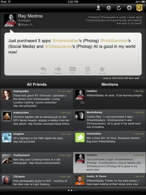
Tweetdeck in Vertical Orientation
There are some great Twitter Clients that have been redesigned for the iPad too. I have installed and continuously switch between two clients which are Twitterrific and TweetDeck. Both are free for the iPad at the moment, but Twitterrific has some ads at the top of the feeds right now. I will buy a Premium version when available to get rid of the ads. Tweetdeck has no ads and is still free too. I prefer the layout of TweetDeck on the iPad, but I prefer the way Twitterrific behaves for retweeting etc. They’re both great though, and I know there are a bunch of other good Twitter clients out there, but these are my personal favorites. Be sure to grab the iPad versions from the App Store when searching for these apps, as you can download and install the iPhone versions, and even use them, but they don’t make use of your nice big iPad screen, so I wouldn’t advise it.
We’re kind of going off topic here in that Twitter is not specifically for photography, but there is a pretty big community of photographers on Twitter, that are sharing a huge amount of useful information all day long, so if you are not already using Twitter, I suggest you give it a try, especially if you have just bought an iPad.
Sobees for Facebook
Continuing with the Social Networking (for Photographers) theme, if you use Facebook, you need to grab a copy of Sobees for Facebook. This is a great app that gives you a view of latest status updates from all of your friends, as well as latest images, links and videos. The People tab is amazing, in that it gives you a largish thumbnail of the profile photo for all of your friends. I was actually quite touched by this view, seeing all of my family and friends from around the world that I have connected with on Facebook. As I scrolled down I saw the faces of many of you that I know from the MBP Community as well, and it was just really nice. There’s a photos tab and an events tab too, that are great for seeing the shots uploaded from friends and events that are being planned. The Profile tab shows your own profile and all of your recent status updates and interactions. You can also scroll through Friend’s thumbnail and view their profiles too.
Reuters News Pro
Another loosely Photography related app that I want to mention is one that Roy Booth from the UK recommended on our Photography Forum, and that is Thomson Reuters News Pro. This is a great app for catching up on world events, as well as financial information such as Currencies, Markets and Stocks. The photography connection here though is that there is a Picture section, and in there, you have basically a screen full of thumbnails, and when you tap on them, you see a page that is mostly a photo from a current news event, with some text explain what the photo is about with a little bit of news to back it up. It’s a great way to view some amazing photography at the same time as catch up with world events.
Zinio
If you don’t subscribe to digital magazines with a company called Zinio before you get an iPad, you have to start to use them when you do. Zinio have their own reader for the iPad, as well as the iPhone and desktop computers, but one of the main things that I wanted to do on the iPad was sit and read my Zinio magazines, and here’s the photography connection. For a few years now, I have subscribed to magazines like Popular Photography, ShutterBug, American Photo and Layers Magazine. Zinio subscriptions range from a bit cheaper than the hard copy magazine, to ridiculously cheaper, and they are delivered to your computer or iPad as soon as they are released. There’s no waiting for the postman, and of course, no postage charges.
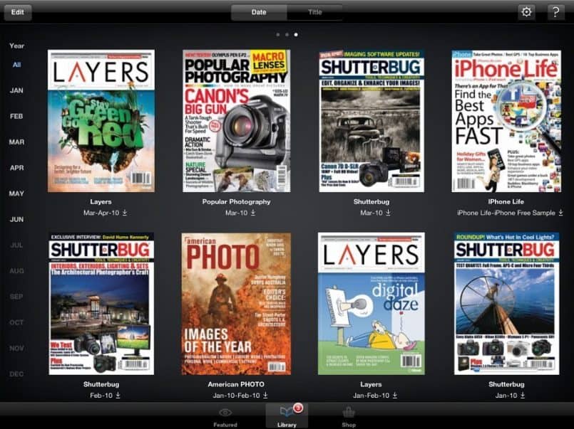
Zinio Library View
Rich Content & Interactive Magazines
Also, with the advent of the iPad, innovative magazines like National Geographic are now making their magazine more interactive, including animation and video clips, right there in the magazine. When my hard-copy National Geographic magazine subscription runs out in December, I’ll be switching to Zinio too. Not only is it a richer experience, with the clear type and amazingly clear and vivid photographs on the iPad, but the interactivity takes it to the next level, and no trees have to die to get me my copy! How cool is that!?
Zinio – Simply the Best
In my opinion, the Zinio Reader for the iPad is the only eBook reader at the moment that has got it right when it comes to the way you store and read books. You have a number of different ways to view your library of magazines, and then when you open them, you will see either a single page or a double page spread, depending on the orientation of your iPad. If you have it horizontal, you’ll see two pages, and you’ll see just one page, when the iPad is vertical. Of course there’s a little button on the side of the iPad if you want to stop this from happening, say if you are reading lying down or something. When you double tap or use two fingers to zoom on a page, you can zoom in even closer to the text for easy reading, although it’s possible to read most text without zooming. When you have finished reading a page, you just swipe in the direction that you want to turn a page, and the book will advance for you. If you touch the page, you also get a nice thumbnail bar, so you can visually search through the magazine and then tap on the thumbnail to jump to any page.
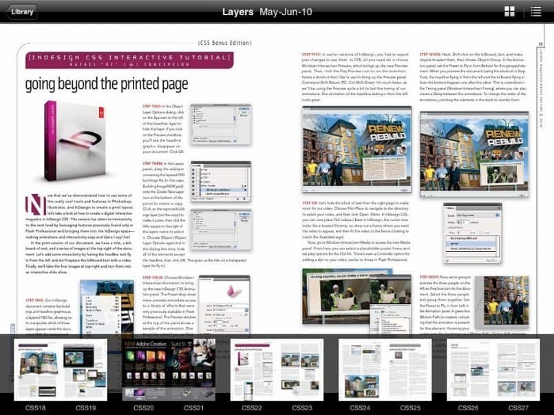
Layers Magazine in Zinio – Double Page with Thumbnails
I have tried a number of other PDF readers so that I can read some of the eBooks that I have bought, but so far none of them have this rich a reading experience. A few have come close, and some even offer double page spreads, which I really want when reading an eBook, even though I’ll probably zoom in to actually read the text. But the one reader that I found that does have double pages does not have a zoom function. They say it’s coming, but I’m not going to call out the name of any of the other readers I’ve tried until they get this feature right.
The Early Edition
One last application that I want to mention, because we photographers tend to keep track of a lot of Web sites and information, is Early Edition, which is an RSS reader with a difference. RSS readers are often relatively boring, and they just give you a list of the feeds you subscribe to, and when you click on them, you see a list of the most recent articles on the Web sites that you are subscribed to. Well, Early Edition takes those feeds and creates newspaper pages out of them, so you get a headline made from the latest post, then three more sections from the next three posts, and then you get six smaller sections from the next six posts, so you see the 10 most recent posts from your selected feed on the first page, and it creates multiple pages for feeds that have more than 10 recent posts listed. I’ll put a screenshot on the blog and in the Podcast to so that you can see exactly what I mean. Of course, if you don’t have a 3G version of the iPad, if you sync before you leave home in the morning, you can read all of your favorite feeds offline while you are on the train or wherever you’re going.
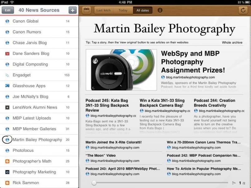
MBP Blog in Early Edition RSS Reader
Doesn’t and Won’t Stop There
There are a whole slew of other apps available of course, and we are only just seeing the start of what people are going to develop for this platform. I have touched on the main apps that have been developed or updated specifically for the iPad today. All of the apps that I bought for the iPhone, including our very own MBP Companion App for the iPhone work fine on the iPad, and there’s a little 2X button to even have them fill the screen. They’re usable, but I’m not finding them as aesthetically pleasing as iPad specific apps, and they generally don’t make good use of the larger screen size.
Other Areas to Note
Amazing Battery Life!
A few other things to touch on before we wrap up for today are that the battery life on the iPad is amazing! I have used it pretty heavily for two or three days at a time before recharging the battery. This is a good thing too, because most people don’t realize that you cannot charge the iPad from most current PCs USB ports, like you can an iPhone or iPod. Some Mac computers apparently have enough voltage on the USB ports to charge an iPad, but from what I gather, PCs generally won’t do this. I find though that I can get at least a day or two out of the battery, so I just check to see how much charge is left before going to bed, and if it’s down to around 50-25%, I’ll charge it overnight.
Soft Keyboard, OK
For typing email etc. there’s a soft keyboard that appears on screen, which is OK. I usually touch type, which means I don’t look at the keyboard when I type, and that is difficult, because you don’t have physical keys to rest your fingers on, but it’s not impossible. The more I type, the easier it’s getting to type relatively fast on the iPad.
Hardware Keyboard/Dock, Silly
There is a hardware keyboard from Apple for the iPad, but it docks to the iPad in the vertical position, which is a bit silly in my opinion. Pretty soon someone will design a keyboard that allows you to dock with the iPad in a horizontal orientation and then it will be worth considering. Because the iPad has Bluetooth though, I’m sure you can just pair up with pretty much any Bluetooth keyboard and use that if you want to. I really just don’t see me using the iPad as a production machine as such though. For me, it’s mainly about consuming information with basic interactivity.
Not a Mobile Digital Workflow for the Photographer
Some people may have been expecting me to tell you how to load your digital photos on to the iPad and manipulate them with various apps, and upload them to Flickr or your Web site today. If you were hoping for that, I’m sorry to disappoint, but I have literally no interest in doing that sort of thing with my iPad. As much as I love this little baby already, I do not consider it the best device for doing that sort of thing. It’s not that you can’t use the iPad for some basically image selection and upload to a Web site, I just don’t think I’ll ever do that. I want to embed meta data into the file, and do some color management before I upload it anywhere, so if I need to work with images on the road, I’ll take my Laptop PC. It’s just going to be so much easier on a laptop because it’s designed for this sort of thing.
You Need This Device!
So, in summary, and this is the part that you have to print out and show your partner to get them to agree to you buying an iPad…
Photographers are going to get more out of an iPad than most people. Especially for the online photographer that makes the most of Social Media and digital communication to further your hobby or business. Whether you simply want to show your images to family and friends, or you are going to take the iPad with you to show potential clients your portfolio, the wow factor when you show people images on this device is huge. So far, everyone that I’ve handed the iPad to, to view my images, has just said wow, and then their mouths drop open.
The iPhone was great for showing images to people, and because you always have it with you, it will continue to be so, but I am going to be carrying my iPad with me as often as possible too, because you never know when you are going to get a chance to show your images to someone, and the more you show your images, the more chance you have of getting assignments or selling prints etc. I really believe that an iPad will change the way we consume our photography related information, share our own ideas and information through Social Media, and change the way we interact with our clients and potential customers.
Sure, it’s only been 10 days for me, but this device has already changed my life. I’ll update you again in a few months, and let you know what new applications are available then for the photographer.
If you are sitting on the fence though, wondering whether or not you should buy an iPad, jump off the fence, and run to the nearest Apple Store!
Podcast show-notes:
I’d also like to mention that there is a problem with the iPad in that it does not display the images in Enhanced Podcasts yet. I don’t know if this is a bug, or something that Apple did intentionally, because the images in Enhanced Podcasts are too small to be displayed full screen on the iPad, but it doesn’t work at the moment. I have provided feedback to Apple via their Web site, and I’ll update you if this situation improves, but for now, you won’t be able to view images in the Enhanced Podcast. The good thing here though is that the blog and my online galleries and Podcast page look great on the iPad, so you can go and follow along on the Web site while listening to the audio on the iPad, and this may actually be a better option for now.
Here are iTunes App Store links for each application I mentioned:
Evernote: http://itunes.apple.com/app/evernote/id281796108?mt=8
Dropbox: http://itunes.apple.com/app/dropbox/id327630330?mt=8
Twitterrific: http://itunes.apple.com/app/twitterrific-for-ipad/id359914600?mt=8
Tweetdeck: http://itunes.apple.com/app/tweetdeck-for-ipad/id364153769?mt=8
Sobees for Facebook: http://itunes.apple.com/app/sobees-for-facebook/id370382132?mt=8
Thomson Reuters News Pro: http://itunes.apple.com/app/reuters-news-pro-for-ipad/id363274833?mt=8
Zinio Magazine Newsstand Reader: http://itunes.apple.com/app/zinio-magazine-newsstand-reader/id364297166?mt=8
The Early Edition: https://itunes.apple.com/app/the-early-edition-2/id471813327?l=en&mt=8
Win a Kata 3N1-33 Bag! http://bit.ly/mbpga2
Music from Music Alley: http://www.musicalley.com/
Audio
Download the Enhanced Podcast M4A files directly.

Good article!
FYI, when you order your files in iPhoto on the Mac they sync over in that order. It would be nice to have this on the iPad but you have a littl ebit more control on the Mac. You can also choose which photo albums/events etc you want to sync to the iPad which makes things very easy. I guess this is an example of how Mac software works well together. It seems they need to do a bit more work for the PC version though.
One problem I’ve noticed with the iPad (had it for 4 weeks now) is that the iPod app does not play extended podcasts correctly. The app only shows the first image in any extended podcast, although the audio plays OK. Others have noticed the same problem, so it’s a bug.
Hi Al,
I had read that on a forum when I first started to look into this, but then promptly forgot about it. 🙂 Good point.
Hi Dave,
Yes, I mentioned that above too. It’s probably a bug, but I think it could also be intentional because the images in Enhanced Podcasts are too small to show full-screen on the iPad. By default I believe they are only 320x320px, or 300×300 if you check to limit the size when exporting. Even if they are shown small in a window though, these images should be displayed if the user has chosen to listen to Enhanced Podcasts.
We’ll probably see an update to Garage Band too, so that images saved in the M4A files are large enough to view full screen on the iPad. I also entered an Enhancement Request for this.
Cheers,
Martin.
Martin – Love the iPad podcast, listening to it right now in fact. One comment about the keyboard: you are correct that the dock/keyboard combo is silly, however I have a Griffin stand (which is quite solid) and an Apple wireless keyboard. This DOES work in both portrait and landscape mode, and I have used that combo as an alternative to my Macbook for simple searching/note taking during meetings. Also, for not-very-lengthy blog posts, as well as slightly-lengthy emails.
~EdT.
Thanks for the confirmation on the bluetooth keyboard Ed! I imagined that should work.
Thanks for listening to the Podcast too! 🙂
BTW, I didn’t mention it in the Podcast, to save time, but I am using an Incase case with my iPad, which also doubles as a stand for various angles. If I hooked up a keyboard while standing the iPad on that, it would be pretty easy to use too.
Cheers,
Martin.
Great post about the iPad. After reading about Zinio, I visited the site and thanks it is a great reading experience and the prices for subscription are fantastic. This is the way electronic publishing should be priced
I can’t wait to see what it is like on the iPad
Hi David,
You’re very welcome. I love Zinio, and I’m pleased you’re enjoying their magazines too.
Cheers,
Martin.
Hi Martin,
Spot on in all your comments. The sorting is a pain.
I just wrote a post on http://blog.michaelwillems.ca/2010/07/23/geez-apple-sort-it-out-already/ with a workaround in emergencies, but this is not at all scalable.
Have you found any viewers yet? There are none that do not use Flickr or Smugmug from what I can see (no thanks!)
Michael
Okay I found one called Photo-Sort. It is far from ideal but at a pinch, it will help me out when I most need it.
Michael,
Sorry for not getting back to you sooner.
I have been working with the people at SortShots, and they have fixed most of the issues that I was having with their software, so I’m relatively happy with it.
Since then though, I also found FolioBook, which is almost perfect for what I wanted to do. It currently only allows you to set up three portfolios, but it has a nice top screen with your logo once set up, and three portfolio links on the first screen. When you click on the links, you can set it to start the slide show automatically, and the transitions are smooth.
http://www.foliobook.mobi/
My only gripe is that it does not hide the iPad bar and clock etc. at the top of the screen. I’m not sure if this is really difficult to do, but many apps leave this visible, and I don’t like to see it. Some do hide it though, so I know it’s possible to go true full-screen.
I’ll probably check out Photo-Sort too Michael. Thanks for the recommendation!
Cheers,
Martin.
Fantastic beat ! I would like to apprentice while you amend your site, how could i subscribe for a blog
site? The account aided me a
acceptable deal. I had been a little bit acquainted of this your broadcast provided bright clear
idea
Nice going!
This episode offers valuable insights into utilizing the iPad as a tool for photographers. The discussion on optimizing image display and app recommendations is particularly helpful for enhancing mobile photography workflows.