In September, I had a conversation by mail with a friend that some of you may know from the MBP Community, Jared Fein. Jared had taken a look at the images on 500px following Episode 295 : An Introduction to 500px, and asked how people achieve the punchy look that you often see there. I replied and the communication resulted in Jared making some progress in his photography, so today, I’m going to discuss what I told Jared, and include some other tools and techniques that you might consider.
Over the years, I’ve slowly changed how I make my images pop, and although I’ve discussed most of this in previous Podcasts, I’m going to briefly touch on this again, but let’s start with a bit of history.
Lens Quality Matters
Firstly, around eight years ago, I’d noticed that some of my images were pretty flat, and lacked contrast, and I remember someone telling me the last thing that I wanted to hear, and that was that my 100-300mm lens, one of three lenses that I’d been using for well over ten years, was a piece of crap. Until that point, I’d figured that a lens is a lens, is a lens. I’d just started using my first DSLR at the time, which was the Canon EOS D30, with the promise that I already had my three lenses, so all I needed to do was replace the camera body.
Well, if you know how many lenses I own now, you’ll be sniggering as you’ve probably witnessed me slipping down this very slippery slope, but basically, I pretty much immediately realized that two of my three lenses were indeed pieces of crap. The only lens that I could have kept was my 24mm F2.8 prime lens, but the 1.6X crop factor on the D30 caused me to set foot on that slippery slope and buy the old 17-35mm F2.8 lens, so I sold the 24mm. My mid-range zoom and long zooms were soon replaced too, and I noticed that my images now had much more depth and contrast. Luckily, now, some eight years on, even the crappiest kit lens is better than the my two old zoom lenses, so this is no long such an issue, but I mention this, because if you are shooting with really old lenses and unhappy with the image quality, it matters.
The D30 was a revolutionary camera, but the way it processed images did leave a lot to be desired. The JPEGs were OK-ish, but the RAW files were totally flat, and we didn’t have Lightroom and Camera Profiles back then to fix it. The only two options at the time were Canon’s Digital Photo Professional which remains the son of satan to this day, and never even get’s installed on my computers any more, or Photoshop. I remember that I would run entire batches of images through Photoshop, just automatically applying auto-curves, and watch the image just pop as the curves were applied.
Canon’s Picture Styles
With the 10D though, I think it was, Canon introduced Pictures Styles, which I thought was a huge step in the right direction. In my film days, I used to shoot FujiChrome Velvia which was really heavily saturated, as I’ve always been partial to very rich colors, and Velvia gave me exactly that. Now with the Landscape Picture Style, I could get that Velvia look from my DSLR. The problem at the time though, was that Pictures Styles are proprietary, and only Digital Photo Professional could develop RAW images and maintain the Picture Style.
Then Adobe developed Lightroom which I fell in love with from the initial Beta stages, although I was hesitant to shift my workflow to Lightroom because of a lack of Picture Styles. After a bit of experimentation though, I found that if I added between 25 and 50 on the Red saturation slider, and around 18 on the Blue and Green saturation sliders, the result was very much like the Landscape Picture Style, and my old Velvia positive film, so I was able to fully switch to Lightroom. I would apply this saturation to pretty much everything I shot during import, and it worked for most of my work.
X-Rite ColorChecker Passport
Adobe then developed Camera Profiles, that were very similar to Canon’s Pictures Styles, which I also tried from time to time, but couldn’t really beat my simple saturation boost. This brought us to around two years ago now, and at the end of 2009, and by now, I’d been happy with my images for a few years, and producing nice crisp, and punchy images, but then I bought an X-Rite ColorChecker Passport, and it transformed my photography again.
I reviewed the ColorChecker Passport and posted a video for Episode 227, at the beginning of 2010, which you can still go back to and check if you want, but basically, you include a ColorChecker Passport target in an image when you start shooting, and then later on your computer, you use that image to create a Camera Profile that you can apply to your images just the same as your would any other Camera RAW Profile, under the Calibration section in Lightroom or Photoshop Camera RAW. When you do this though, the colors in an image just pop right out at you. Taking my word on this and picking up a ColorChecker Passport was Jared’s major breakthrough following our recent conversation.
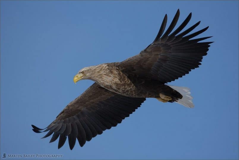
Let’s take a look at a couple of images that I sent Jared to convince him that the ColorChecker would make his images pop! Firstly, here’s a White Tailed Eagle that I photographed in Hokkaido just after releasing Episode 227. It’s not a bad shot, but it’s nothing to write home about either.
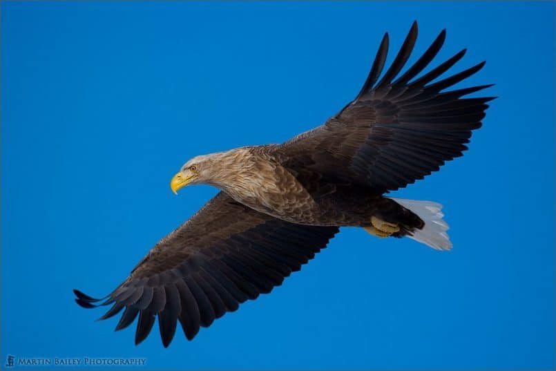
Next though, here’s the same image with a Camera Profile that I made from a photo at this location including the ColorChecker Passport. This profile has become my standard Clear Winters Day profile for my 1Ds Mark III. If you can’t see the difference here, go to the gallery at the bottom of the blog post and click on the thumbnail of the first image, then click the right side of it to switch to the second image. The difference is obvious, and if it isn’t, you have a bigger problem in the your computer display seriously needs calibrating. 🙂
One thing to note though, is that I don’t apply ColorChecker Passport profiles to all of my images. I usually do this when I feel that the color could be enhanced, or when I’m shooting something that I need to be color accurate. Even so though, I’m very happy with the depth and punchiness of my color work, and wasn’t obvious why this is until I really thought about it to answer Jared’s question. Here are a few other things that I always do.
Never Use AWB!
Firstly, I never use Auto White Balance. AWB is the daughter of satin and should be banished from the planet along with DPP. Sure, Auto White Balance can get you close, and it is a lot better than it was until a few years ago, but still, it’s the result of the camera taking a look at the colors in the scene and/or the color of the light that falls on a sensor on some cameras, and even that light is reflected onto the camera from the scene you are photographing. The result is that if you are photographing a field full of red flowers, the camera will think the White Balance needs to be more blue, and cool it down. If you are shooting a field full of blue flowers, the opposite happens and your White Balance is warmed up.
I once shot for a few hours with my AWB turned on by mistake, having made number of exposures from exactly the same location of exactly the same subject but with very slight movements of the camera, the color was shifting all over the place. I thought maybe this was so, and checked the White Balance and it was on Auto. If you want to get close, and will reset your White Balance to something constant in post, then break a leg, but personally, I would rather have everything constant from the get-go, so I shoot with either a preset, usually Daylight, or a custom white balance created from the gray card included with the ColorChecker Passport. Usually if I do a custom white balance, I then follow on and shoot the main color target on the passport, and create a camera profile to really snap the colors in, but just have control over your White Balance can make a huge difference just by itself.
Expose to the Right
I also pretty much always use Manual Exposure. This can be scary, but taking control of your exposure makes you consciously think about how you are exposing the scene. Unless I’m going for a low-key, or overall dark image, I expose to the right. We’ve covered this before too, but generally what this means is that I keep increasing my exposure changing the shutter speed until the brightest part of my image is just about touching the right side of the histogram on the back of my camera. Note too that if your camera has the ability to display an RGB histogram, turn it on. The standard gray histograms are displaying an average of the Red, Green and Blue channels, and this can give you a false sense of security. Depending on your subject, one of the channels can start to blow out, or become over-exposed before the other channels, and it’s sometimes only possible to see this with an RGB histogram. So when I say that I expose to the right that means that the right-most color channel is just about touching the right side. The two other channels might still be a way off, but you don’t want to blow out any of the channels, unless on purpose or for specular highlights.
The reason this will help with the overall punchiness of your images, is because you’ll probably end up capturing your images a little bit brighter than your camera would if you left it to its own devices. Nice bright images will generally be punchier. If you don’t expose your images like this, just try grabbing the exposure slider in Lightroom, Photoshop’s Camera RAW, or Aperture or whatever, and move it to the right until the histogram data just about hits the right side. You should be able to see that this makes your images look light and crisp. If the images appear to blow out when you do this, without your histogram running up the right side, then you have your computer display set too bright.
Shoot on Overcast Days
Another thing that I do is purposefully choosing overcast days to shoot on. Sure, the eagle shot that we looked at earlier was a beautiful clear day, and that works well, especially with a field of snow to bounce lots of light back into the underside of the bird, but a lot of the time, I head out on overcast days more than sunny days, especially for landscape work. When you shoot on overcast days, you don’t have bright reflections to deal with, and the sky is like a huge soft box, spreading light evenly and filling in the harsh shadows that a sunny day would create.
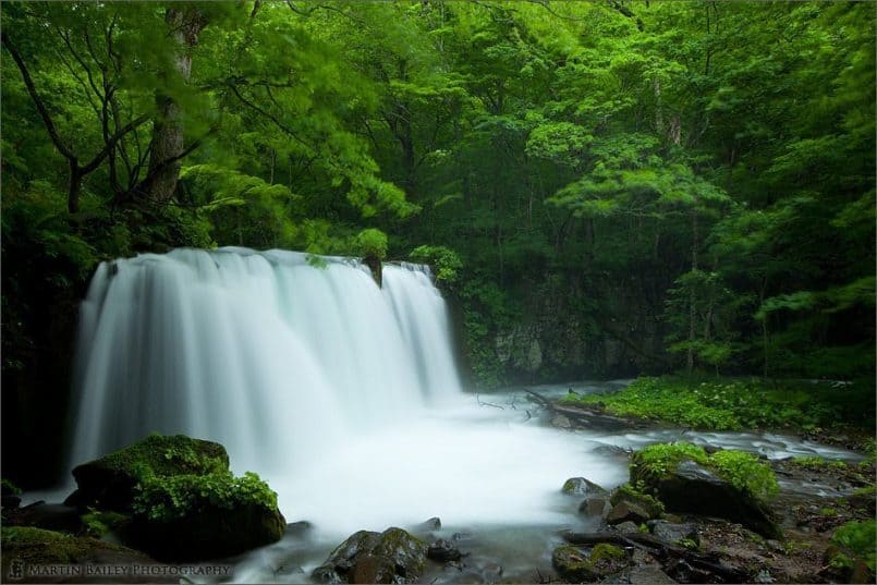
Take a look at this shot of a waterfall in the Oirase valley shot on an overcast day. There are a couple of things to note here. Firstly, if this had been a sunny day, the water would have reflected the light so much that had I tried to keep the water from over exposing, the surrounding greenery would have been much darker, and the shadow areas would have been totally plugged up and black. Also, the moisture in the air either from the waterfall or some light rain will have been keeping the surrounding foliage wet, and wet foliage is much more saturated color-wise. Pun intended.
Shoot in the Shade
Note that even if you are going out to shoot a waterfall on a sunny day, try to find out what time of day it will be in the shade, perhaps shaded by the valley walls if they’re high enough. Although you’ll lose that soft box effect, it doesn’t necessarily have to be overcast, if you can find some good shade.
Something else to keep in mind though, and this will certainly improve the quality of light in your photographs, is try to get out to shoot during the Golden Hour around dawn or dusk. Because the sun is low in the sky the quality of light is beautiful and warm, and even if it’s direct sunlight, any shadows that are made at this time of day have a special quality. The light is just so much more pleasing than the harsh light of a sunny day.
My advice to shoot on overcast days or in the shade will help you to get nice saturated colors, but of course this depends on the kind of photography you’re doing. If you are shooting a beach scene, you may well want lots of sun, and a blue sky with some fluffy white clouds. Personally, as I look through my work over the last eight years or so, I can only find a handful of blue skies, in my landscape shots at least. They just don’t appeal to me. That really is my personal opinion though of course.
Black and White Skies
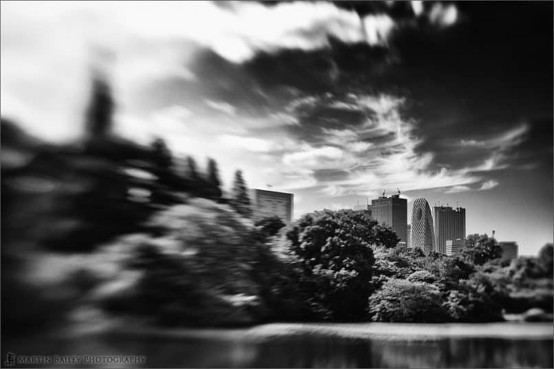
When I do include the sky, I generally want it to be thick with dramatic clouds, and then, I’ll usually end up creating a black and white image from the resulting shots. When there are patches of blue, I’ll generally still use that to create a dramatic black and white image, like this one from last weekend, that I shot with my Lensbaby Composer during a walk in the Shinjuku Gyoen Park here in Tokyo.
I knew as I shot this that it would be converted to black and white, but sometimes I’ll try black and white on finding that the color doesn’t work the way I’d hoped. For the last few years I’ve done more and more black and white conversions, and now since Nik Software released Silver Efex Pro 2 that we looked at a few weeks ago in Episode 297, I really have fell in love with this process. This of course is not about punchy colors, but you have to admit that these contrasty black and white images have a lot of punch still. More so than a color image in some cases.
Nik Software: Color Efex Pro 4
I was a big fan of Silver Efex Pro even before the upgrade to version 2, and Nik Software have done it again with the last thing that I wanted to cover on this subject today. Even though I owned Nik’s Color Efex Pro 3, that was included in the Complete Collection that I bought a few years ago, I never really used it, and didn’t keep it as an option in my mental image enhancement toolbox. A few days ago though, I downloaded gave the brand new Color Efex Pro 4 a try, and have been blown away.
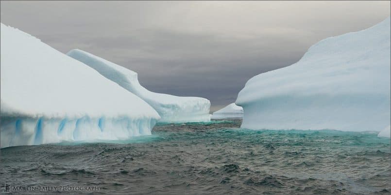
I love the dramatic skies that Silver Efex Pro gives me, and now, with Color Efex Pro 4 and the ability to use multiple filters simultaneously, I can bring out detail to create those dramatic skies in my color images as well. I’ve been back and reprocessed some of my Antarctica shots from March this year, and I really love what I can now do with Color Efex Pro 4. Here’s an example of one of the newly processed images, with a shot I called Iceberg Alley. This first image is my original processing, in which I did already bring out part of the sky and that beautiful blue ice just below the surface of the water.
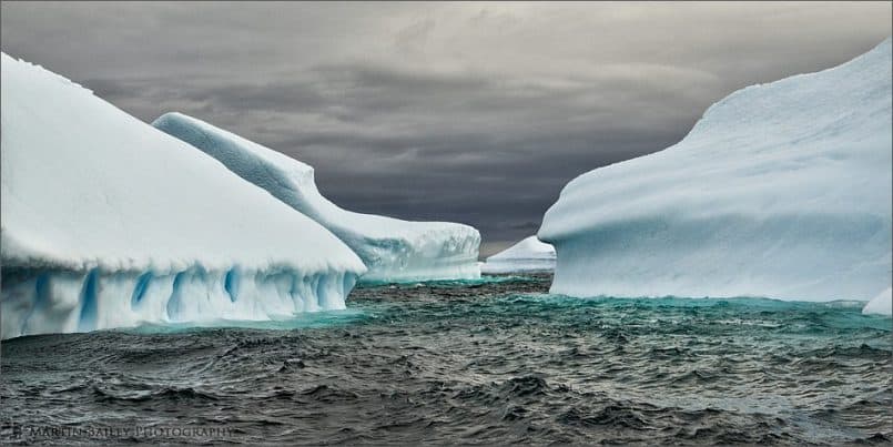
Here though is the new version re-edited with Nik’s Color Efex Pro 4. Again, to really appreciate the difference, flick between these using the gallery at the bottom of the blog post.
I’m not a fan of over-processed HDR images, but the effect I can get with Color Efex Pro 4 look to me like a really well done HDR. Lots of tonality and punchiness, so I figured it was worth a mention here today too. I’m going to be using this much more in the future. Remember that if you decided to buy this, or any of Nik Software’s amazing plugins, do use our code MBP15 for a 15% discount [this code is no longer valid] on your order, or click through from our banner on the right side of the blog.
By the way, once I’ve gotten a little more used to what Color Efex Pro 4 can do, I’ll produce a video to walk you through it, probably over the next couple of weeks, so stay tuned for that if you’re interested.
So, these are all of the things that come to mind as I’ve sought crisp and punchy images over the last eight years or so since picking up my first DSLR. I hope it’s been of some use.
Show Notes
ColorChecker Passport Review: https://mbp.ac/227
Music from Music Alley: http://www.musicalley.com/
Audio
 Subscribe in iTunes for Enhanced Podcasts delivered automatically to your computer.
Download this Podcast in MP3 format (Audio Only).
Download this Podcast in Enhanced Podcast M4A format. This requires Apple iTunes or Quicktime to view/listen.



Martin, I enjoyed the clear reminder that we need to develop our camera profiles to create good images.
One thing I don’t think was clear from your discussion of White Balance, is that it does not apply if you are shooting RAW. It only effects in-camera corrections applied to jpegs. Thats why we need the power of our external tools like Lightroom, Aperture, Photoshop, etc. RAW images are definitely not ready for display, as jpegs are intended and commonly used by the public.
On page two of this Canon Professional Network post–see the paragraph “Working in RAW” (their site design prevents direct linking to page 2)–it describes the relationship of RAW with White Balance.
-Dan
Thanks for the comment Dan!
On White Balance, being able to change it later is a given.
I personally believe it is important to set this in camera though, even when you are shooting RAW. I should have gone into this, but the reason is the histogram is built from the in-camera JPEG and not the RAW file, and when you are tweaking your exposure based on the RGB channels of the in-camera JPEG, if it’s too warm or red, you’ll blow out your Red channel earlier than you will when you process your RAW file, and the same goes for too cool a White Balance, and the Blue channel.
In addition to this, I just want to see a constant color balance as I shoot, and not something that’s all over the place while shooting.
This is perhaps the least important of the points mentioned, but this technique works for me, as I am very careful with my exposure based on the channel information.
Cheers,
Martin.
Ahh, yes. Since you are using the histogram to set the exposure, this makes sense. But, the clarity that it does not get stored in a RAW format image is important too. Some of your pro-sumer class of readers may not realize that. I didn’t for some time.
I’m a relatively recent convert to digital–had a hard time giving up my Canon A-1 that was a press rental at the 1980 Winter Olympics in Lake Placid, NY where I was able to purchase it direct from Canon post-Olympics (I was working for the photo concessionaire)–but the dollars & cents of digital just lets me shoot so much more! Processing is now FREE! And I only print what I like, after polishing myself. No need for my old darkroom gear filling up the bath…
-Dan
Yes, I should have put this clarification in there. I thought about touching on RAW, but do believe it’s kind of a given now too.
That’s a cool story about your A-1. It’s great owning a camera with a bit of history!
“Digital Photo Professional which remains the son of satin”
Son of Satin? Doesn’t sound to bad to me. Hah.
Hi Martin,
I’m new to your site and am just catching up on old Podcasts, so apologies if I’m a little slow on this one!
My current camera is a Canon d30 and whilst I’d love to upgrade believe its better to focus my cash and energy on developing my craft of photography for the time being.
However as a previous user of a d30 are there any tips for getting the best out of my work today? Should I invest in a X-rite in the meantime?
Paul
PS Just downloaded you new ebook – great so far….
Doh! Sorry I missed this comment for a while Paul!
Images from the D30 could be very flat and lack contrast sometimes, so I imagine the X-Rite ColorChecker Passport would help to make your colors pop.
When I had a D30, I also often found that just adding auto-levels in Photoshop gave my images the boost they needed. In the Adjustments panel, hit the Levels button, then the Auto button to apply auto-levels. It can be a bit of a sledgehammer tool, but it worked well pretty much all of the time on my D30 images.
I hope this helps.
Thanks for downloading the book too!
Thanks very much for the tip! I’ll give it a go and maybe get round to submitting an image for the next monthly challenge!
Hope the Hokkiado trip goes well and look forward to seeing the results!
No problem Paul. I hope it helps.
Thanks for the well wishes for Hokkaido too. I can’t wait to see what we find up there this year. 🙂
Just want to say hi,
I am about to get my first printer, and by coinsidense read about you in Craft&Vision. I downloaded your book Making the Print, and almost all my questions got answered. Thanks a lot!
As I find your website and blog very interesting and resourceful I will be a regular reader from now on.
Cheers,
Kim
Hi Kim, and thanks for stopping by. Thanks for reading my book too! I’m pleased it helped.
Do keep in touch.
Martin.