In working on preparation for my first solo exhibition in December, I found myself doing a few things that I thought you might find useful, so I’m going to share these ideas today, and I’ll tell you a little more about the exhibition venue etc. at the end of this episode, in case you are in Tokyo in December and want to come along. It would be great to shake the hand of any of you listeners that could visit.
As this is my first solo exhibition, preceded only by a joint exhibition in Italy years ago, that I didn’t even visit myself, we can pretty much say that this is my first attempt at this exhibition thing. I generally learn by throwing myself in the deep end, and that’s what I’m doing here too. So, as is often the case here, rather than me knowing everything about this, and preaching to you how to do it, I’m going to tell you what I’ve done so far, in the hope that you might take something away from my experiences. I’m sure people that have already done their own shows have better ideas, and I’d love to hear them if so, but here’s what I’ve found so far anyway.
Firstly, I needed to find a venue. This isn’t a sponsored exhibition, so basically I have to rent a gallery and pay for my own printing and everything. I certainly considered applying for a show at some of the famous galleries, but many of them won’t allow you to sell prints. The beauty of renting gallery spaces is that most of them don’t mind you putting prices on your prints and trying to recuperate some of the exhibition costs. On that, right now, I’m not thinking to put a price tag on all of the prints, as that will look tacky. I am going to create a panel explaining the pricing, and offer a few various formats in which the potential client could buy a print or two should they so desire.
I searched online for a suitable gallery in a good location. Here in Tokyo, the Ginza area has a lot of galleries, and accordingly, it’s pretty expensive, with most galleries between $250 and $350 per day. Now, you will probably get more people visiting that are likely to buy prints in Ginza, so it’s not a no-starter by any means. The reason I passed Ginza over was because most of the galleries there are very small. I wanted to display up to forty or so images, either on 20×30 inch gallery wraps, or 13×19 inch framed pictures. To do this you need some serious wall space. As I continued my search, I found a couple of galleries that looked promising, and went to see the first one. I was disappointed by both the size and the location of the first, but the second one was great. I settled on the H.A.C. Gallery in the Aoyama area of Tokyo, which is quite a trendy and arty area, and the display area was huge compared to everything else I’d look at!
H.A.C. isn’t cheap mind. They charge $300 per day, but I noticed they’d had a summer campaign charging just $250 per day for July and August. I took that information and when I called to book, I asked if they had a similar offer in December. The answer was no, but they gave me a free day, so I’m going to pay for seven days, but the show will run for eight days. I’d have preferred to do two weeks, but there wasn’t a two week slot before the end of the year, and paying for the last few days around New Year here in Japan would be pointless, as everyone spends New Year with their families. I also managed to get some time extensions for free on the first and last days of the show, to give me time to set up and pull things down, because these days are pretty much holidays in Japan, and the owners will just be giving me the keys.
Now that I had the gallery booked, I had to ensure that I had enough paper and canvas to print out my photos etc. I have a plenty of Hahnemühle Museum Etching, Photo Rag and Fine Art Baryta, which I’ll be using for the prints, and I ordered a batch of canvas and stretcher bars from Breathing Color, because that was going to take some time to wing it’s way over here from the States. As I changed the number of images that I will do as a gallery wrap, I have to order a few more stretcher bars, but I’ve got plenty to be getting on with while I wait for that.
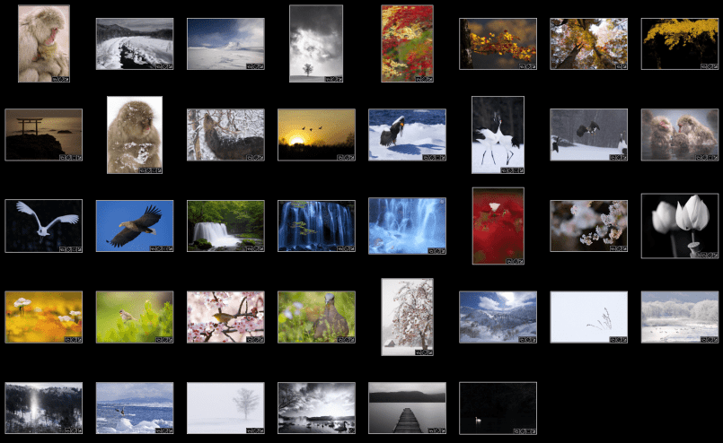
Of course, another huge job when doing an exhibition is selecting your images. As I mentioned in a previous episode, I want this exhibition to be kind of a benchmark for my nature and wildlife photography, as I end my part time photography, and move to a full time photography career. Because of this, I based my selection on my Nature of Japan portfolio that you can see from my blog, but I cut it down to 38 images. This was based partly on my really taking a critical eye to my work as I considered showing physical prints to the general public, but also based on the amount of wall space I’ll have, and the flow of the images on the wall.
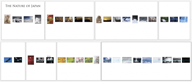
I spend a number of hours over a number of days deliberating my selection, and running it by my wife. I don’t always heed her advice, but as the need to reduce kicks in, it’s most often the images that she doesn’t like that I painstakingly remove. This (below) is pretty much my selection. Because there are so many winter images, we considered making this a Winter Hokkaido exhibition, but I didn’t want to do that, because it seems too obvious a road to take. I left my autumnal color and a few Flowerscape images in there, because they are so me.
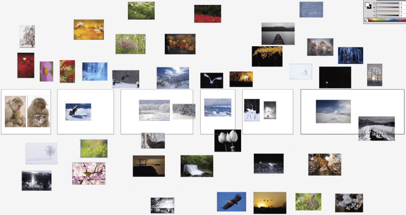
Once we’d got the selection down, I need to figure out the position of the images on the various walls of the gallery. When I think of doing things to scale on a computer I generally turn to Adobe Illustrator, and so that’s what I did. I created six art boards and resized them to a 100th the size of the actual walls in the gallery. Here’s another screenshot to illustrate, but basically you can see that I then exported a smallish version of each image from Lightroom, and just dragged and dropped them into Illustrator, and spread them all out in the workspace.
As I mentioned a while back when I talked about putting a portfolio together, I’m a strong believe in starting with a strong image, so I started by dropping in my mother and baby Macaque shot on the start of the first wall, and then while resizing the images to roughly 100th of actual size that they’ll be when framed, I proceeded to order and place them onto the walls.
Here we can see the scaled and ordered images on the wall, but with this configuration of the room I was going to have to do three gallery wraps with multiple images on them. I don’t like to see multiple rows of images, and really wanted to avoid that if possible, so that was putting a little pressure on me.
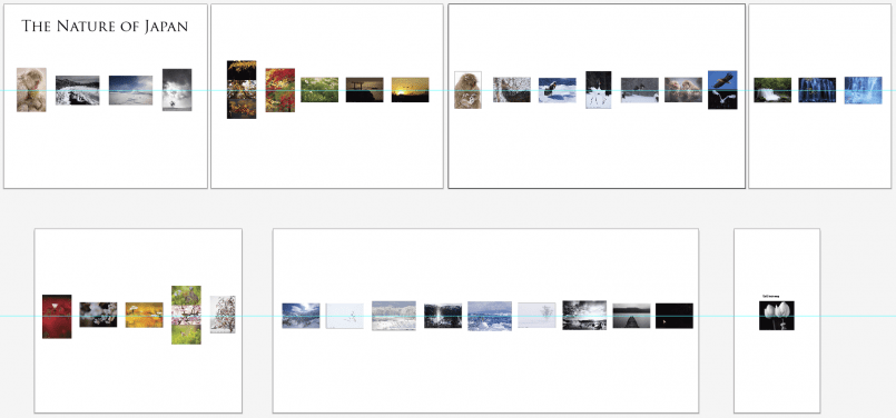
Finally, I decided to use one of the partitions that’s available, and increase the wall space, and lose the multi-photo gallery wraps, as we can see in this screenshot. I wanted to use the room without the partitions, but one at the end of the room won’t be so bad, and it will give people a little space to hide as well, which isn’t a bad thing either.
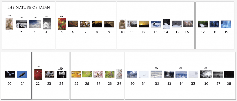
Next, I numbered all of the images, and this will become the key for our organization while creating, storing and then finally hanging the prints. The gallery comes with 45 wires by the way, to hang the prints from, so I don’t have to worry about providing my own.
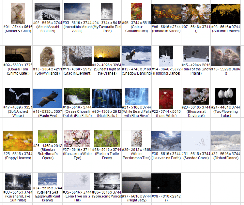
I then needed to start checking a few other things about the images, so I went into the Print Module in lightroom, and selected a 20×24 inch photo size, and created a huge contact sheet. I initially was thinking that I’d just print it out and write directly on the paper as I checked stuff, but I ended up using it Photoshop and writing on it with my Wacom Tablet. The first thing I noticed as I set up the Contact Sheet in Lightroom was that I could specify to display EXIF and IPTC information on the contact sheet. As I wasn’t sure that all of my files had Titles, I included the title field and found a few that didn’t have a Title assigned, and correct that. I’ll probably change some of these titles for the show, but at least they all have titles now.
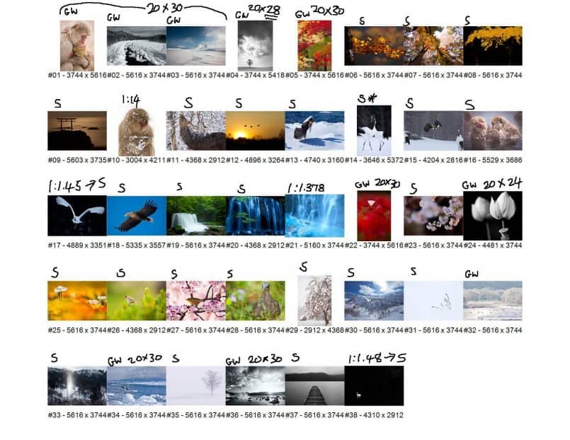
The original reason that I created this contact sheet though was so that I could start to check which of these images were cropped to a non-standard aspect ratio, which I need to know in preparing to buy frames for the 28 images that won’t be displayed as a gallery wrap. In the next screenshot you can see the contact sheet without the Titles, but after I output it as a JPEG from Lightroom, then opened it in Photoshop, so that I could scribble on it.
First I wrote a GW for Gallery Wrap against the 10 images that I’ll create gallery wraps from. I’ll do 8 of the 10 wraps at 20×30″. Although I can create longer wraps, 20″ is the widest I can make with my 24″ wide printer, because you have to deduct 4 inches for the width of the bars. Digital SLR images are an aspect ratio of 1:1.5, so this means the standard gallery wrap for a standard aspect ratio image will be 20×30″. My recent order of goodies from Breathing Color contained enough 20″ bars to do 24 wraps, so I’m good there. I also bought two boxes of eight 30 inch bars, which means I can do my eight 20×30 wraps.
Since I placed my order with Breathing Color, I decided to do two more prints on gallery wraps, and as one of them is cropped slightly along the top, I need now to order a box of 28 inch bars too, and my last gallery wrap is going to be 20×24 inches, and I have some 24 inch bars, so I’m good there.
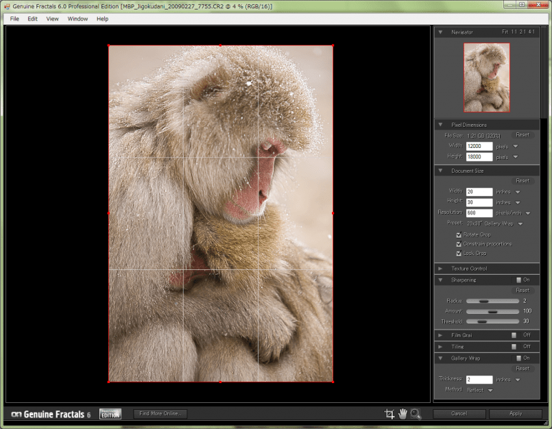
This might be a good time to also mention that I recently bought a copy of Genuine Fractals 6.0 Professional Edition from onOne Software, and will be using that to do my resizing etc. for the gallery wraps.
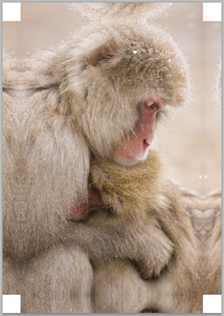
As you can see here, you can basically just tell it the size that you want to expand the image too, and do your sharpening right there in the plugin. There is also a great little feature that you can see in the bottom right of the screenshot. All you have to do to create the additional 2 inches of photo around your image for the gallery wrap is to specify the width that you want, and it just adds these for you, as you can see in this screenshot of the upsized image. The amount of detail retained in the image, despite it being upsized by 320%, is also pretty incredible, so kudos to the onOne Software team for creating such an easy to use yet powerful plug-in.
Anyway, back to the contact sheet, basically after marking my gallery wraps went on and wrote an “S” for Standard above all of the images that are a standard aspect ratios. To check if the images are a standard size, first I marked all the ones that are 5616×3744 pixel dimensions. This is the native size of images from my 1Ds Mark III and 5D Mark II at 21 megapixels. There are also some 3264×4896 pixel images, which are the native size for my 1D Mark IV, so they are easy to spot too. For the other sizes I divided the larger number by the smaller with a calculator. If it came out a 1.5, I knew the image was a standard aspect ratio.
Note too that some of these images have been cropped slightly, but whenever possible I try to remember to hold down the shift key while cropping, to maintain the aspect ratio. If the crop requires that I move away from the 1:1.5 ratio then so be it, but when possible, I try to maintain it. I did find a few that were not standard crops, but could be re-cropped without ruining the image, so I made those changes too as I went through the images.
The images that I marked with an asterisk next to the S, are close enough to be framed as a standard crop, but there are a tiny bit off. The reason that I was marking these images like this is because I have to make a decision regarding the mattes. I was thinking that it will be cheaper and easier if I can frame the majority of my 28 non-gallery wrap prints with standard 13×19″ frames.
I’ve spent a lot of time in recent weeks trying to find a relatively inexpensive and yet quality looking frame. The craft shop that I visit a lot does very nice frames but they are mainly for paintings, and they have very few that are sized for digital prints. They do have a custom framing service but the choices are either not very nice looking frames for around $50 each, or really nice ones for much more, and they need about two months to fulfill the order.
I eventually found a nice stylish black frame, that won’t break the bank, from a company called Hakuba. There were two problems in that the readymade frames on their site had black mattes in, but I prefer white. Also, the window in the matte isn’t exactly a 1:1.5 ratio. They were slightly longer, meaning that I would to have to trim the top and bottom of all of my prints, which I don’t really want to do. So, I got on the phone and asked if it was possible to do these frames with white mattes and a custom window in all of them. Because some of my prints required a custom window size, I had to do this anyway, so I figured I’d go for getting them all custom made.
They got back to me quickly and said that it was possible, but they wanted me to order them via one of the large camera stores in town. I asked why, and they said it was because I was not company, so I told them I’d call back in about two weeks when I will have Martin Bailey Photography incorporated. This is exactly the sort of problem that I mentioned a few weeks ago. It makes working with manufacturers in Japan so much easier when you have a company name to throw at them. The trust level is totally different.
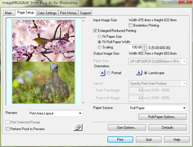
The other benefit of ordering these frames with custom matte windows is that I can print much more efficiently. To print all 28 of my fine art paper prints out on single sheets of A3 would be a pain, plus, my large format printer doesn’t like borderless printing on 13×19 inch sheet paper, and I’d need to have borderless printing for the image to fit in the standard matte window that the frame has. I started to think about my roll paper options though, and I have rolls of 17″ and 24″ Hahnemühle papers, and to print the most efficiently I can print two images back to back on 24″ paper stock, and they will be 302mm high each. This is just over an inch shorter than the 13×19 inch images would be, but with a nice wide matte they still look great framed. It will give me about 5mm around each edge to attach to the back of the matte board.
There is one other major detail that I’m planning, but as I mentioned before, I’m going to keep that under wraps until the event. I think it’s going to be a big hit, and I don’t want to spoil the fun.
So, now I have most of the planning done, and need to simply move forward with the execution in the coming two months or so. I’m looking forward to moving on to the next phase and actually proofing and printing the images. I’m also looking forward to trying out the Breathing Color Lyve Canvas and Timeless Laminate, and will be reporting my findings having used that later.
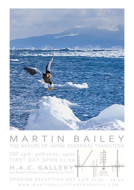
I of course needed to produce a poster and post card for the exhibition, and it was partly because I was trying to complete this that made this episode is a few days late. I spend almost two full days working on a design, and could not come up with something that I really liked. I ended up sending my designed to MBP Listener Marcus Bain for advice, but I’d been reluctant to do so, because Marcus’ own exhibition opens tomorrow, and I really didn’t want to burden him at this busy time. Anyway, after I’d been messing around with my design for two days, Marcus sent something totally cool and amazing after just a few hours. I recreated it in Photoshop, using the fonts that I have available to me, but I’m really pleased with the results, so thank so much to Marcus for your help with that. I’ll buy you a drink on Saturday at your exhibition’s opening reception.
I’ve posted details of the exhibition on the Exhibitions page, but in summary the exhibition is going to be from December the 23rd to the 30th, at the H.A.C. Gallery in Minami Aoyama, Tokyo. If you are in town and have time, I’d love to see you there, and don’t forget that the opening reception is on Thursday the 23rd from 5:30 to 7:30PM. I’ll get some drinks in, but if you come along, it might be an idea to bring a bottle of your favorite tipple too. Anything except red wine is fine. That’s banned apparently because it stains the carpet. 🙂
Podcast show-notes:
Transcript and Images: http://bit.ly/mbp262
Exhibition Details: http://bit.ly/mbpexh
Music created and produced by UniqueTracks.
Audio
Download the Enhanced Podcast M4A files directly.


Maritn
Thanks for this, it has been very interesting hearing about the process that you went through in choosing the Gallery and the images that will be used in your exhibition. I wish you the best and hope that it will be a succesfful venture. Sorry but I won’t be in Japan during decemeber , but have a drink on me and keep these informative pocasts coming. I kook forward to them every week
Regards
Hugh Walker
Hi Hugh,
You’re most welcome. Thanks for the comment and for the kind words.
Sorry to hear you won’t be in town. Hopefully you can continue to follow along vicariously via the Podcast until our schedules align.
Cheers,
Martin.
Thanks for this detailed nuts-to-soup overview, Martin – very informative! I hope you’ll post updates as the show approaches.
Best of luck with the show!
– Jack