On Saturday August 7, 2010, I gave a full day seminar at X-Rite Japan, focusing on the Color Managed Digital Workflow. Today I’m going to run through the key areas we touched on, to hopefully spark some ideas for your own workflow.We had a great time on Saturday. My main objective was to relay many of the things that I bear in mind when shooting, from pre-capture, to all sorts of output methods, including slideshows, Web, PDFs and my personal favorite, prints.
 We also did some hands on exercises, where we all photographed the X-Rite ColorChecker Passport, and created profiles to apply to images, and we ran through a printer/paper combination calibration, again to create a profile to apply when we print, to ensure accurate color throughout the digital workflow.
I started by talking about why calibration and color management is important. I’ve heard it said that it’s important to calibrate our monitors, because it puts us all on a level playing field, and we know that other people will see our images as we expect them to see them. This is only true in very limited circumstances. They basically need to be using the same monitor and profile, with all the settings exactly the same, and viewing their screen under the same ambient lighting conditions that you do.
Of course this doesn’t mean that you don’t need to calibrate your monitor, far from it, but the main reason is so that you are in full control of your workflow through to output. You need to know that you are starting at the right place, so that you can proceed to work on your images with confidence, right through to the print. The print in my opinion is one output format that you can control how people view your images to a pretty high degree. Of course, prints are still affected by the ambient lighting conditions under which the viewer views them, but our eyes often compensate for that better than you might think, and you can adjust to certain viewing conditions if necessary. The fact that you have a calibrated monitor will of course help others to see your work as close to your intended finished images as possible, but don’t expect your images to be the same on all other monitors.
One major theme throughout the day was that I wanted to impress on the participants the importance of making everything you do, as stress free as possible. I turned up for the seminar in my usual shooting clothes. I explained how I buy quick drying outdoor gear, and will always choose something with a collar when possible, because this stops the camera strap from chafing your neck, especially when it’s hot and sweaty as it is in the Tokyo summers. I also mentioned that I always buy neoprene or some kind of elasticated camera straps, because these help to make the camera feel lighter than the straps that come with the camera. I also always buy straps that have clips to remove the strap easily when you are using a tripod, especially when shooting long exposure images, because the strap can catch the wind and vibrate the camera.
I also showed the group my Black Rapid straps, that I use for fast past hand-held shooting. I use single straps when I only use one body, or the double strap when I shoot with two bodies, like when I’m shooting wildlife. I also fit my straps with Really Right Stuff quick release clamps, so that I can quickly change bodies and lenses without having to screw things into my plates. I use Really Right Stuff plates and L-Brackets, because the all have screw threads, so I can screw the Black Rapid straps into them pretty easily, but I generally try to use the quick release clamps, and remember that I have Really Right Stuff plates on every camera body and lens that has a tripod collar. Everything is interchangeable, and very fast to switch between.
I spoke about the importance of shooting RAW, to give yourself the best possible image quality, and not so that you can change settings as an afterthought, or rely on getting the exposure right after the event. This will always result in lower quality images, and I suggest that we all strive to become better photographers, and get it right in the field. You only want to be changing exposure in post, if you messed up in the field, and have no other choice. Even then, having a RAW image instead of a JPEG, will give you much more latitude.
We talked about some auto-focus techniques, like using LiveView to tweak focus, and then moved on a simple studio setup, where I set up a graduated gray background, and set up some small constant daylight balanced lights that are OK for small subject still life work. I’d bought some flowers, which we would shoot, but before we did that, I took the group through the process of shooting the X-Rite ColorChecker Passport gray card, then setting a custom white balance, and then shooting the Passport’s Classic Target which we’d use to create our DNG profile, and we included the Color Enhancement Target, which we’d also use later to tweak White Balance when necessary.
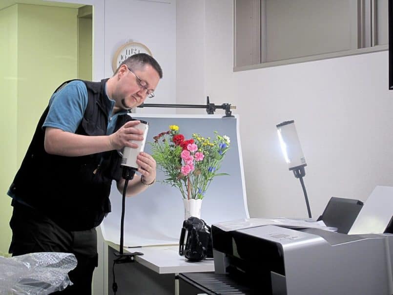
Setting up the lights (Copyright © Lem Fugitt – http://www.robots-dreams.com)
I also shot the same flowers after putting orange gels over the studio lights, and we turned down the ambient light in the room, so that the orange light was the main light source. You can see the difference in the following two images. The first is the first gray card, shot with the daylight preset, and then the second image is the gray card under the orange light, shot with the custom white balance that we assigned having shot the first gray card.
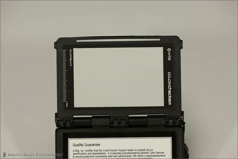 Gray Card Under Daylight Balanced Lights |
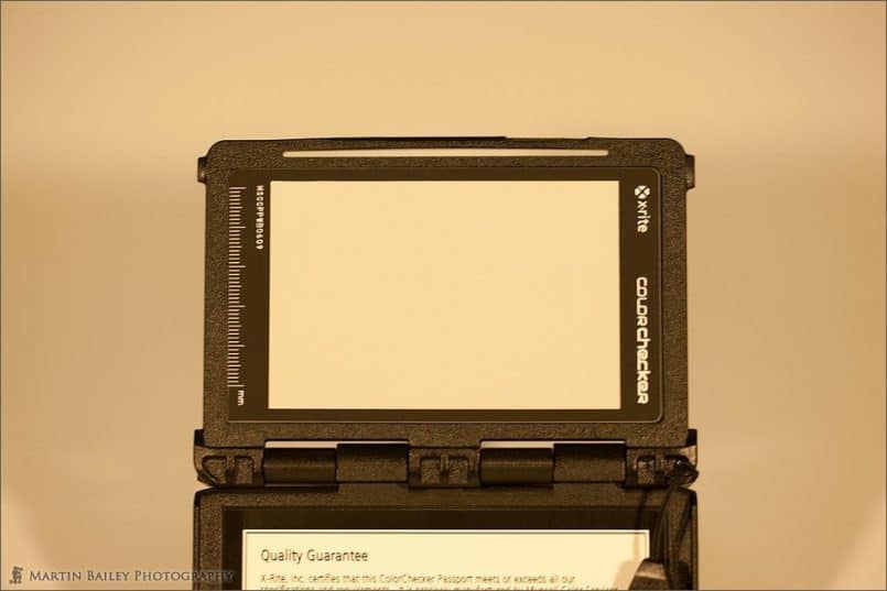 Gray Card Under Orange Gelled Lights |
The difference in the color of light is striking, and yet we went on to shoot the flowers again under the orange light, but with the correct white balance for that light, and this is the resulting image. It is correctly balanced, and looks exactly the same as the first photo of the flowers that was made with the daylight balanced light source.
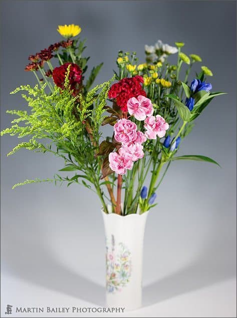
Flowers, Shot Under Orange Gelled (Tungsten) Lights
This image also of course has the DNG profile that we created from our X-Rite ColorChecker Passport shots, using the Lightroom Plugin that comes with the Passports applied. I took the group through how to create the profiles, and we then applied them to our images, and with the colors in the flowers that I selected, you could really see the subtle pinks in the carnations and the violet colored flowers to the right pop as we assigned the profile. I’d wanted to bright reds and pure blues, because these really pop, but couldn’t find these colored flowers. When we assigned the profile to the photo of the ColorChecker Passport used to create the profiles though, again, we could see all of these colors just pop into place. It’s really quite impressive to see.
I explained to the group too that I used to add saturation to my images, with a preset that I created years ago to emulate FujiChrome Velvia, which was a heavily saturated slide film that I used back in the day, and still really like the look of. I actually used to apply +25 on the Blue and Green sliders, and +50 on the Red sliders in Lightroom. Then as cameras changed and RAW images got a little punchier right out of the camera, I dropped this down to +18 on the Blue and Green, and +25 on the Red channels. Now, with the X-Rite ColorChecker Passport and the accompanying software to create my profiles, I find that the colors pop enough, and look so natural, that I no longer need to adjust the saturation of my images in Lightroom. I just create the profile, or use one that I already have from similar lighting conditions, and the images look exactly how I want them to.
Trying to be as thorough as possible, I gave a brief talk on Depth of Field, but as it was such a full day, I’m going to be dropping this and a few other subjects from future seminars. Everyone agreed that the day was very useful, but we covered a little too much, so I’m going to be tweaking the contents for the next time. This took us to our morning break, where I actually ended up showing the group how I configure my tripod to get down to ground level for macro or ultra-low angle photography. They were hungry for all sorts of information, so it was a pleasure to be working with them, and not having a break didn’t bother me, or the group.
After the break, I spoke about customizing the ID Plate and the Panel End Marks in Lightroom, and we moved on to some of my most used Keyboard Shortcuts. I’m not going to go through these here, but I do want to stress the importance of learning shortcuts for everything that you do regularly on your computer. If you ever watch a professional graphic designer, or anyone that spends a lot of time in an application, it’s often difficult to even see what they are doing, because they make such extensive use of keyboard shortcuts. If you have to reach for the mouse every time you want to make a selection, it can really slow you down.
We talked about rating images too. Not just on the keyboard shortcuts to help us to work through lots of imags quickly and efficiently, but also the importance of a good edit of your selection. I also mentioned that you want to edit differently depending on the type of photographs you are editing down. For example, for your portfolio, you only want to include your very best images. Your portfolio is only as good as your worst image.
For clients, you don’t want to only include images that you like. If you have a bunch of images that are technically accurate and artistic, but you just don’t like them, you’ll do your client a disservice by at least not showing them a selection of these shots, because there may be something in there that really sings to them. Indeed, I often find that the images that my clients select are the images that I least expect them too, so leave in anything that is technically good and well balanced. Do though, remove duplicates. If you have 5 shots of essentially the same thing, get rid of four of them. Don’t make your client, or your family members and friends for that matter, look through all of your images. It’s your job to make that selection, not theirs.
Having explained all about the import dialog, and how heavily I rely on presets through my entire Lightroom workflow, we went on to actually import our images of the Passport and the flower shots that we’d shot earlier. We changed the file name on import, as well as deciding on a file organization strategy, and we added our generic keywords, all on import, so that we don’t have to mess around do that later. My general rule of thumb is do everything as early in the workflow as possible. Everything that you put off for later, will take more time to revisit. I even apply a metadata preset that fills out my copyright information in all of my images, right there on import.
We also discussed Collections and Sets and organization images once you have them on the hard drive, after which we went on to actually calibrate our monitors. I went through the process myself, and then the group all calibrated their monitors using the X-Rite ColorMunki Photo, and that took us to lunch time.
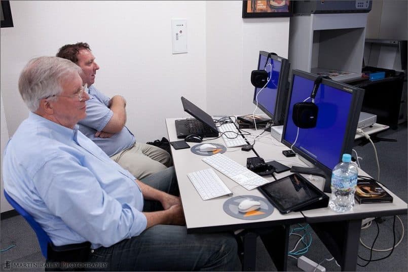
Syncronized Monitor Calibration
After lunch, now that we had calibrated monitors, a bunch of our own images and the photos of the ColorChecker Passport on our hard drives, we went on to use the Lightroom plugin that comes with the Passport to create a DNG Profile. We also created a profile with the desktop utility that also comes with the passport, which you have to use on occasion if the Lightroom plugin can’t find the registration marks that it needs to identify the color target, in your photo of the Passport.
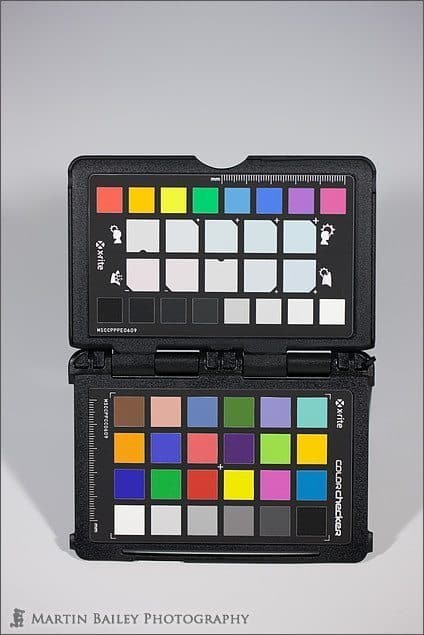
My ColorChecker Passport, Shot Under Orange Lights
On applying the profiles we could see the color pop in, as I mentioned earlier, and I also showed the group how you can use the Color Enhancement Target on the Passport to modify the white balance by clicking on the slightly warmer or cooler white balance patches that X-Rite included in the target. This in really useful if you want to warm up or cool down an image after the event. Remember that the passport will give you accurate color balance, but at the end of the day, how you want the image to look is part of your artistic vision, so it’s nice to have the tools to modify this quickly, easily and reliably.
I also pointed out that once you have your profiles, you can apply them not only in Lightroom, but they also appear in the Camera Calibration section of Adobe Camera RAW, that you use from Bridge or Photoshop. I also mentioned that X-Rite have now provided a tool called the DNG Profile Manager, that can be downloaded after you register your ColorChecker Passport, and this helps you to manage the profiles on your hard disk, filtering by camera, and changing the names etc. We also touched on the importance of backing up your profiles, because they are stored on the system drive and would be lost if you re-install your computer.
We then went through some of the common editing tools that you have in Lightroom, like the Dust Removal tool, Adjustment Brush and Graduated Filter, and I spoke a little about the histogram, and how to use it as a guide, both when shooting and editing images, and how to use the over or under-exposure warnings while editing images too. We worked through cropping and rotating images, the new Lens Correction in Lightroom 3, and Vignettes, and I showed the group a few trick to easily reset sliders by double clicking on its text label, or how you can reset entire groups of sliders or settings, by double clicking on the group’s text label. You can also do this by holding the ALT key down and single clicking the group label.
We did some Black and White and Duotone conversions in Lightroom, and I cranked up Nik Software’s Silver Efex Pro to walk the group through what I did on one of my favourite black and white images. I also demonstrated how to add frames and watermarks to images during export from Lightroom using the LR/Mogrify 2 plugin, from Timothy Armes. We walked through how to create Slideshows and export them as both a PDF, and as a Video, which again is new in Lightroom 3, and we looked at the Web Gallery options, which took us to the afternoon break time.
After the break, we walked through creating a printer profile for your printer and paper combinations, using the X-Rite ColorMunki Photo. The great thing about the ColorMunki Photo is that you use it to calibrate both your monitor and your printer. You can also calibrate projectors with it, so it’s a very versatile tool, especially for the price. If you missed it recently, I actually released a video walking you through the process of calibrating your monitor and printer with the ColorMunki, in Podcast episode 249, so check that our if you’re interested. I also included a section on how to optimize profiles in both the video and the seminar.
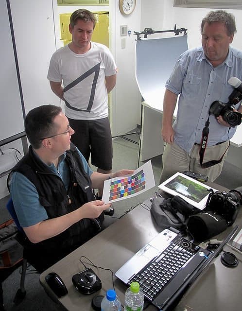
Printer Calibration Charts (Copyright © Lem Fugitt – http://www.robots-dreams.com)
We then went on to take a look at the Lightroom Print module, and actually printed out some of our photographs of the flowers that we’d shot. I discussed presets again, as I probably use more presets in the print module than any other module, because of all of the combinations of papers and print sizes, as well as various types of borders. I also showed the group my Excel spreadsheet that I created to calculate the size of my borders and the cell sizes that contain the images, so that I can ensure that my images occupy the same percentage of the paper in relation to the border, across all of my fine art prints.
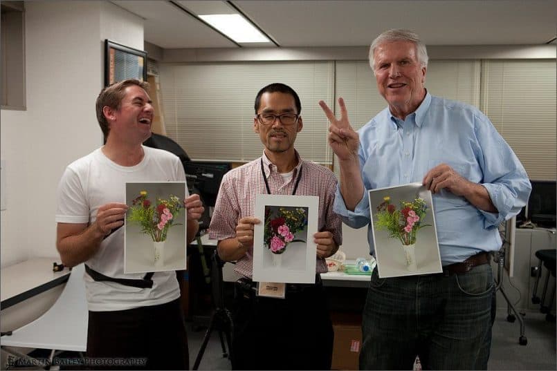
Marcus, Eiji and Lem
We then covered soft proofing in Photoshop CS5, and moved on to the importance of backing up our images, both at home, off-site, and in the cloud, with services like Backblaze and Mozy. This took us to the end of the day, and although one guy had to leave as soon as we’d finished, to watch some fireworks with his family, we hung back a little longer, and did a little more printing, courtesy of X-Rite, and discussed the day.
All in all the feedback was that the seminar was very useful, though I could cut out a few areas, and I fully intend to do that. As my first attempt at this totally home grown workshop though, I was really pleased with how it went. I hope you also got something out of listening to how the day progressed today as well.
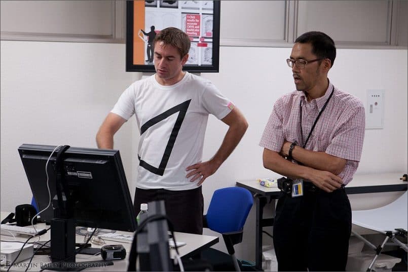
Marcus and Eiji (from X-Rite Japan)
Before I wrap up, I would publicly like to publicly thank the folks at X-Rite for loaning the color management tools, and the room in their offices to enable me to deliver this seminar. I really appreciate all of your support, and especially would like to thank Eiji, for not only spending his Saturday with us, but for also helping on some of the technical areas that I would not have been able to answer accurately without his help. Thanks Eiji!
I’d also like to thank the guys that turned up for the seminar, and shared their Saturday with me. It was a pleasure to meet those that I’d not met before, and to see those that I had met before again. Thanks for your incredible feedback too, especially Marcus, who just sent me some of the most valuable feedback I could have possibly wished for. Also, thanks to Lem Fugitt, of www.robots-dreams.com, for the photos that you took during the day, some of which you kindly allowed me to use in the Podcast and blog post today.
Podcast show-notes:
Details of the seminar: http://bit.ly/mbpcmdw
My video on the X-Rite ColorMunki Photo: http://bit.ly/mbpcmp
ColorMunki on B&H: http://bit.ly/mbpbhcmp
ColorChecker Passport on B&H: http://bit.ly/mbpbhpassport
X-Rite Product Details: http://www.xritephoto.com/
Checkout X-Rite’s Webinars here: http://www.xritephoto.com/ph_learning.aspx?action=webinars
Music created and produced by UniqueTracks.
Audio
Subscribe in iTunes for Enhanced Podcasts delivered automatically to your computer.
Download this Podcast in MP3 format (Audio Only).
Download this Podcast in Enhanced Podcast M4A format. This requires Apple iTunes or Quicktime to view/listen.

0 Comments