

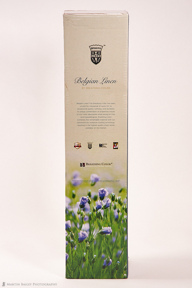
This week I was lucky enough to be able to take a look at Breathing Color's new media Belgian Linen, and today I'm going to relay my findings, as well as a cool way to create a home-made panel to show this beautiful media off.
Let's start with a little bit of background about my tests though, which starts, as it always does when I introduce a new media type, with the creation of my ICC profiles. I won't go into details on this, but I always create my own ICC profiles, because that always gives the best possible results when printing. Having given the 24 x 11-inch test target an hour or so to fully dry, enabling the colors to stabilize, I scanned the 2380 color patches using my X-Rite i1 Photo Pro 2 spectrometer, which you can see under the Color Management section of my B&H Photo Gear page.

Then, to avoid the color issues with the Canon ImagePROGRAF PRO-4000 large format printer, I associated the newly created ICC profile with the Media Type that I registered with the printer, as this is my preferred method to get great color out of this printer. I explained the problem and how to work around it in Episode 573 so check that out if you are interested.
I have created so many color test patch sheets over the years, that I'm pretty much able to see how good a media is from the patch sheet, and I was already getting excited as I saw the patch sheet emerge from the printer. Even just looking at the contrast between the raw linen color on the back of the media compared to the white printable side had me giggling like a teenager.
Media Specifications
Before we go on, let's take a look at some of the Breathing Color information on this beautiful new media. From their website, we can see that Belgian Linen™ is a unique European textile which is woven in Belgium by members of the Masters of Linen Club. It has been prized for thousands of years for the high quality, softness, and durability it offers. It naturally has a rich color absorption and is lint-free and hypoallergenic.
Breathing Color combines this remarkable material with their advanced ink receptive coating technology, resulting in the highest-quality inkjet textile available on the market. They also provide the following bullet points of information...
- Archival Certified:
OBA free and 100+ years certified archival by the Fine Art Trade Guild (view certificate) - HD Image Quality: We've used our most advanced inkjet coating technology yet to make your prints on Belgian Linen look their sharpest and have deep, rich colors and blacks.
- Strong and Durable: Linen is 30% stronger than cotton, making it the perfect textile for printing gallery wraps or rolled prints.
- Sustainably-Made: The flax seed used to make Belgian Linen are grown from one of the most ecological fibers in the world
- Revered by the Old Masters: Belgian Linen™ has been used for centuries by famous artists such as Dali, Whistler, Monet, and more!
- 18 mil Thickness 425 gsm Weight: This luxury linen textile is
thick andheavy weight . It feels substantial and expensive in your hands.
So, we know thanks to Seth Godin that all marketers are liars, but in this case, I can attest that everything the Breathing Color team says about this media is 100% true.
Profile Visualization
Let's continue and take a look at a screenshot made with ColorThink Pro to compare my new Belgian Linen profile with two others. The Belgian Linen is the semi-transparent color-filled profile, and I have compared it firstly, to the Breathing Color media that I have so far felt to be the best matte media I've ever used, which is their Signa Smooth. I thought that Signa had a wide gamut for a matte media, but as you can see, it fits nicely inside the Belgian Linen profile, which is a good 10% or so larger, and that's a big difference for a matte media.
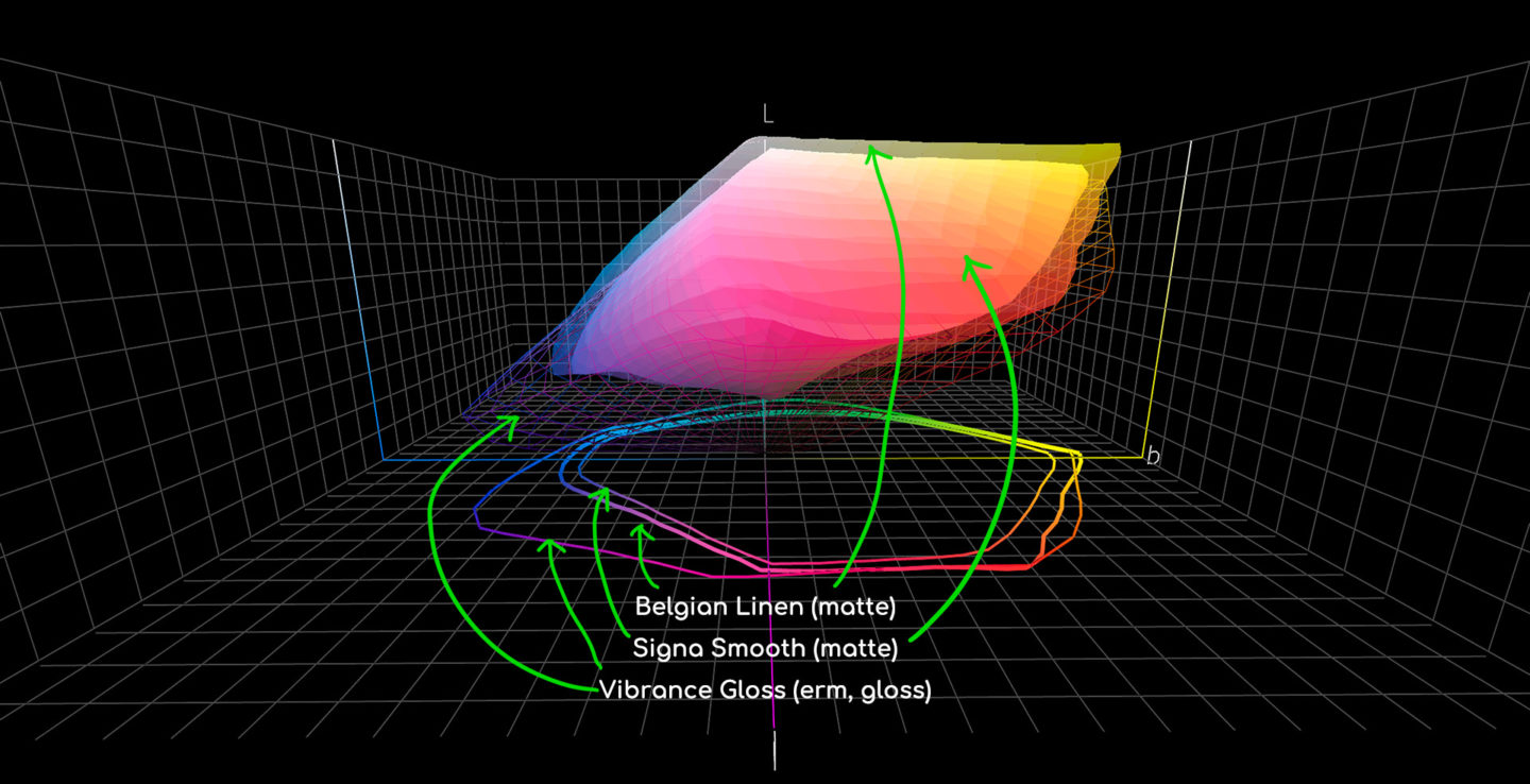
In Wire-Frame, I've actually included Breathing Color's Vibrance Gloss, to show you that gloss media is generally going to give a wider gamut, and you can see by how low the wire frame goes, that the darkest black that Vibrance Gloss will provide is much darker than its matte cousins, but for matte media, the other two are still very, very respectable.
I know that these charts aren't easy to glean a lot from when you have to view a static screenshot, but to hopefully help some, here is a different angle, again with an arrow pointing to each of the profile representations.

So, we can see from these 3D representations that Breathing Color's new Belgian Linen is very capable with regards to the color gamut, but let's take a look at a straight print that I made before we jump into the details of the home-made panel that I'm going to walk you through today.
Feel the History
Although Belgian Linen is a canvas, I think it's texture is so beautiful as it is, that it doesn't necessarily need to be wrapped like a regular canvas print, although, of course, it would be beautiful as a gallery wrap as well. I selected a photo from this year's Complete Namibia Tour because I figured it's rugged and worn look would suit the Linen. I printed it out using my fine art print border ratios at a size of 18 x 24 inches, because this is the size that I generally print at when printing for myself, and I keep them in an 18 x 24-inch binder.
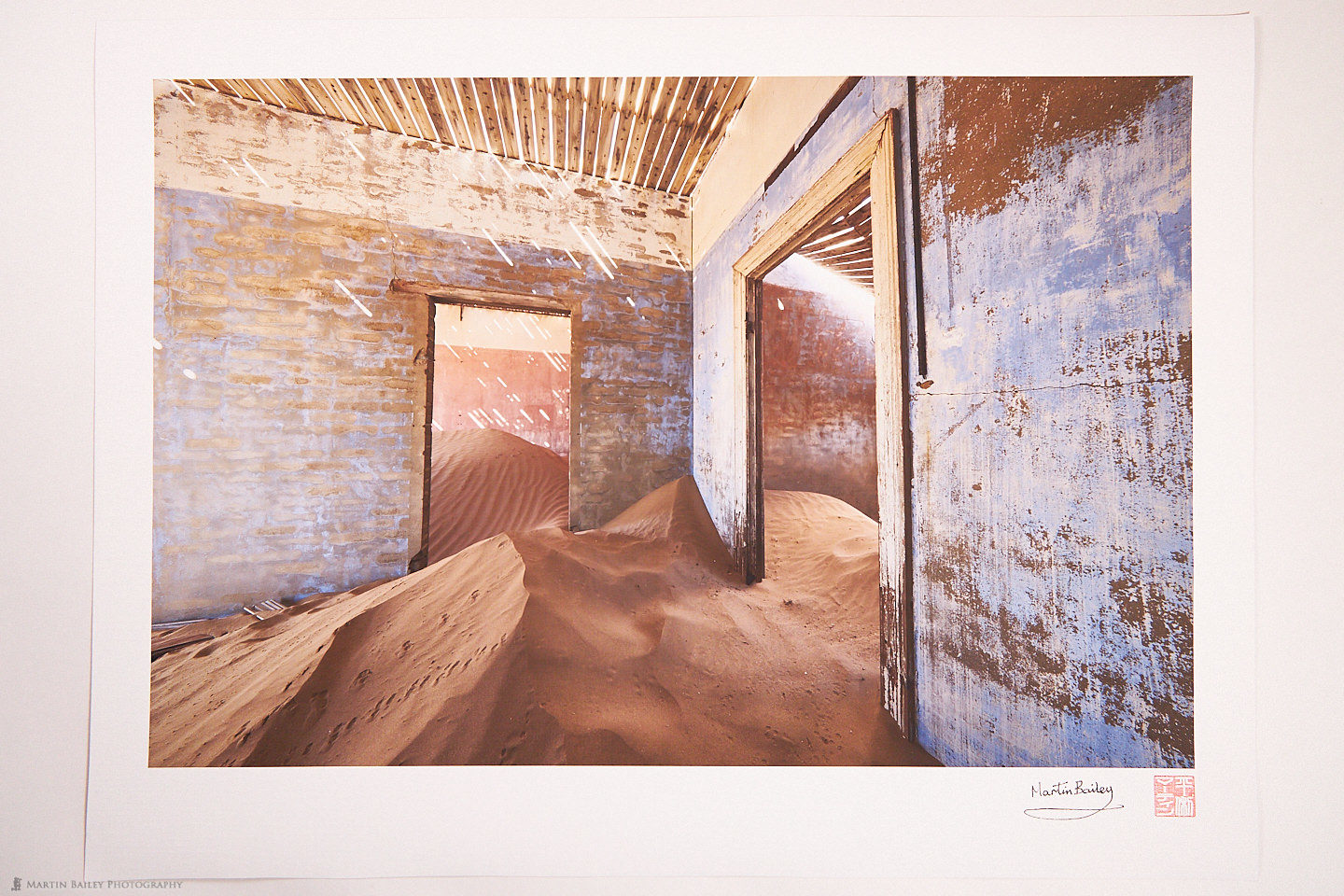
It's hard to see in this image, but the quality of this print when you hold it in your hand is absolutely unreal. Belgian Linen is very flexible and relatively forgiving with regards to handling, yet it has a weight that almost helps to recall the history of this media, and the artists that have laid their brushes down on this canvas.
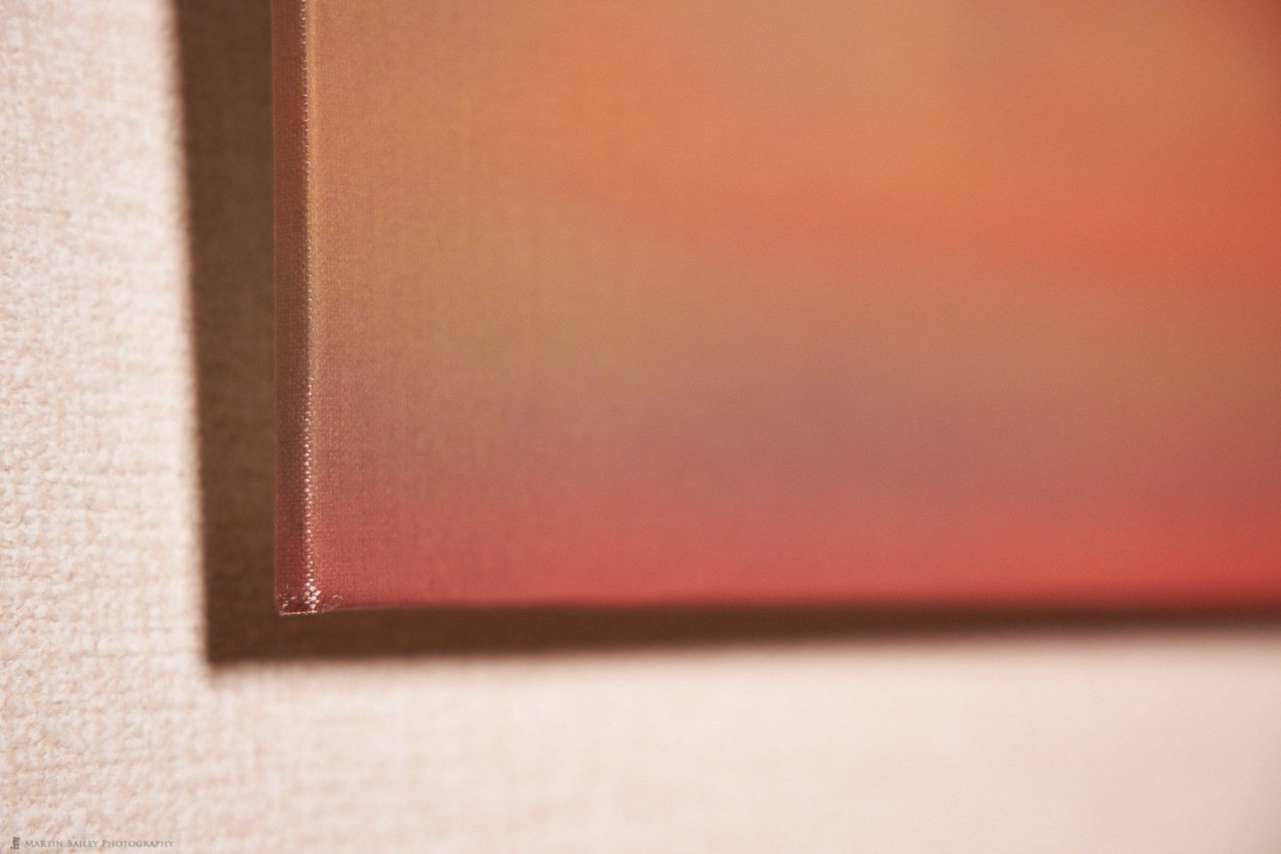
A Closer Look
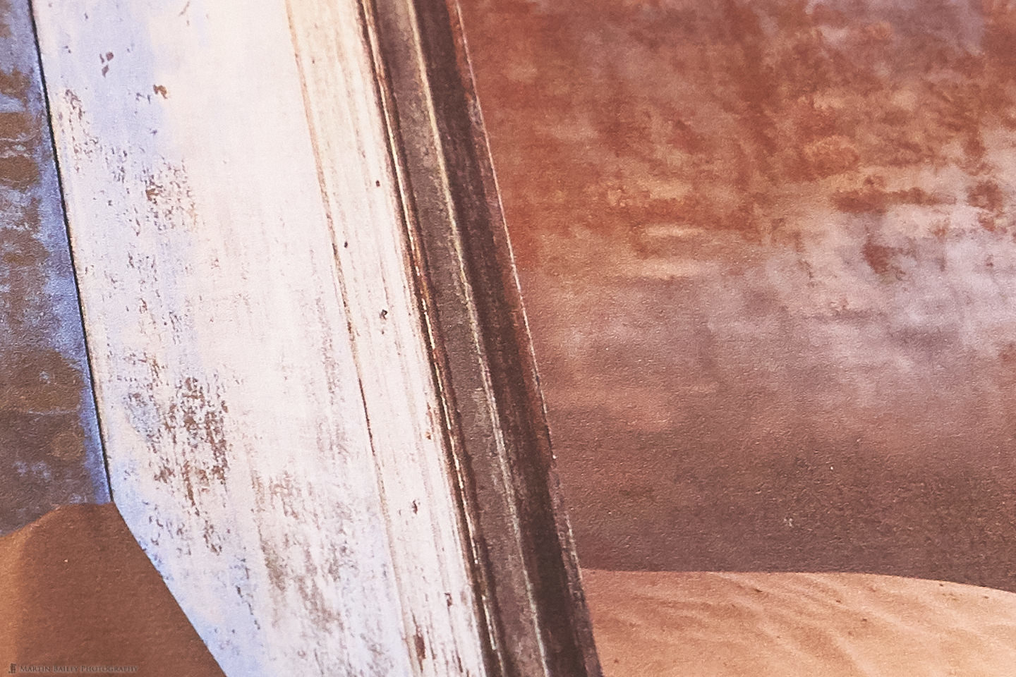
It isn't very easy to see, but here is a 100% crop from near the center of a photograph of this print at an angle. Hopefully, though you'll be able to see the almost painterly feel that the texture of the Linen adds to the photograph. Of course, the photo I selected has a painterly feel too, but I think they really compliment each other.
When you consider that Belgian Linen is $180 for just 20 feet on a 24" roll, compared to $138 for 40 feet of
Home-Made Panel
OK, so let's move on and talk a little now about the home-made panel that we're going to make and then print for. I first introduced this method of presenting prints five years ago in one of my columns in the Craft & Vision PHOTOGRAPH magazine. I actually prepared a second panel back then, so I am going to use some of the photographs of the process from 2014, so forgive me if the look of the images varies a little.
To me, printing is a wonderful way to complete our photographs. As I mentioned earlier, I have an 18 x 24-inch binder that is full of prints that I simply make just for fun. I generally use a printing afternoon as a way to wind-down. It's almost like a way to give myself a little bonus, as I love the entire process, and the thrill of holding a tactile print in my hands never gets old. I think it gives us a way to be more intimate with our work than we can be by only ever viewing it on a computer or TV screen.
As an extension of this, I developed this relatively simple yet effective form of presentation that although takes a number of days to create as you wait for things to dry, feels very fulfilling to finally hang on the wall when you are done. I should mention though that this method is probably best kept for personal use unless you can source a panel that is made of archival material. I did not, as we'll hear.
Required Materials and Tools
So, the main component of our presentation piece is the panel itself. I bought a piece of 600 x 450 x 5.5 mm MDF board at the local DIY store for $3 and had a guy at the store cut it down to 600 x 400 mm with their band saw. I don't have a lot of DIY tools, so this was easier and most accurate.
I also bought a length of 24 x 40 mm pine, long enough to cut two 40 cm bars and two 25 cm bars from. This cost $8. A bottle of strong wood glue cost $4, and the brackets to attach the string to the back to hang the panel cost $2. You will also need some archival glue to actually stick your print or canvas to the panel, which you can get from Breathing Color or University Products for around $8. You won't use up all of the
Tools required will vary and you can perhaps improve on some of these, but you'll basically need a saw, a miter cutting block
Deciding Your Panel Size
I chose 600 x 400 mm for my panel size, because I wanted to display a standard cropped image. Most DSLR cameras create 3:2 aspect ratio images, so I was able to buy my materials before I decided on an image to print. If you have a specific photo in mind, and you have cropped it away from the standard 3:2 aspect ratio, you'll need to check the proportions and buy your panel accordingly.
For example, you might have cropped to a 16:9 ratio. In this case, if you wanted to create a 600mm wide panel, the height would need to be 337 mm. For a totally arbitrarily cropped image, you could use the pixels to calculate your panel size. For example, say your base image is 4882 x 3624 pixels, you could divide 4882 by 3624 to get your aspect ratio, which is 1:1.347, and again using the 600mm width, divide 600 by 1.347 for a panel height of 445 mm.
Of course, you also need to ensure that you can actually make a print large enough for your panel. As you'll need at least an inch wrapped around the back of the panel, you probably need to deduct two inches or 50 mm from your paper size to ensure that you can actually print your image.
Build the Panel
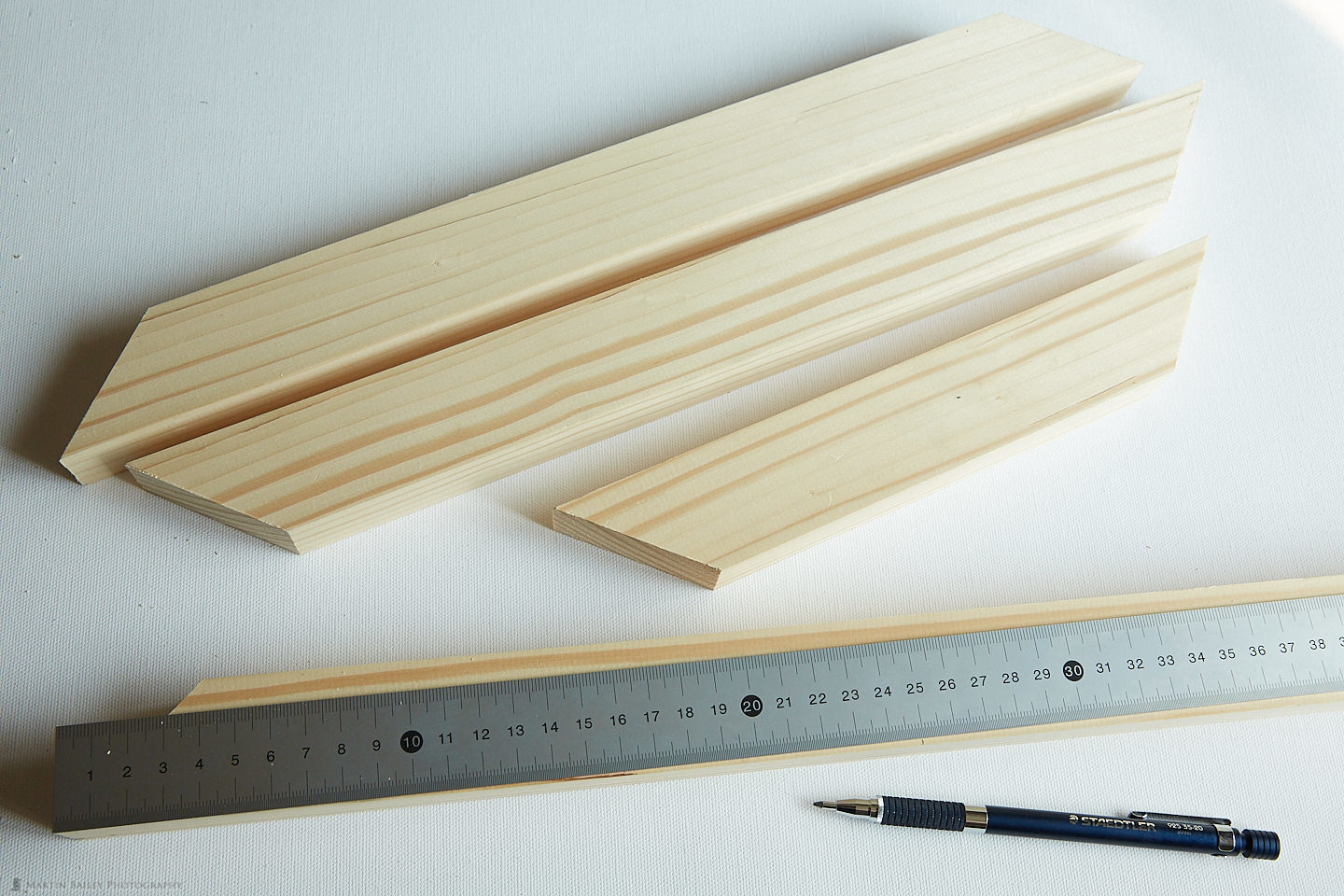
So that the panel will stand away from the wall, we're going to build a frame to attach to the back of our panel. Use a miter cutting block to first cut off the end of your wood at 45 degrees.
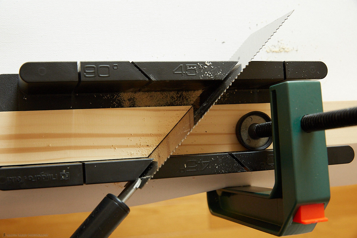
Then measure from the outside edge to where you'll need to cut your first frame bar. For my panel, I cut the long bars at 400 mm and the short bars at 250 mm.
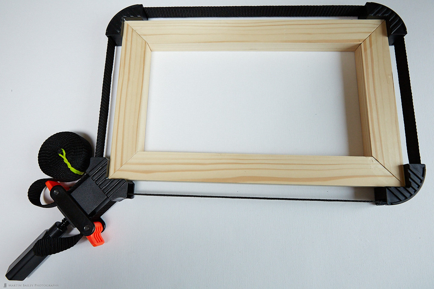
Once you have your four bars cut, match them together to get the best fit, and apply your wood adhesive to the ends where the bars need to be fixed together, and then clamp them together. I use a $10 band clamp for this, which works very well, but you might be able to use other clamps, or maybe even screw this frame together. Ensure that if use adhesive you check how long you need to keep the wood clamped together. My adhesive was good to work the wood in one hour, but requires 24 hours to fully set.
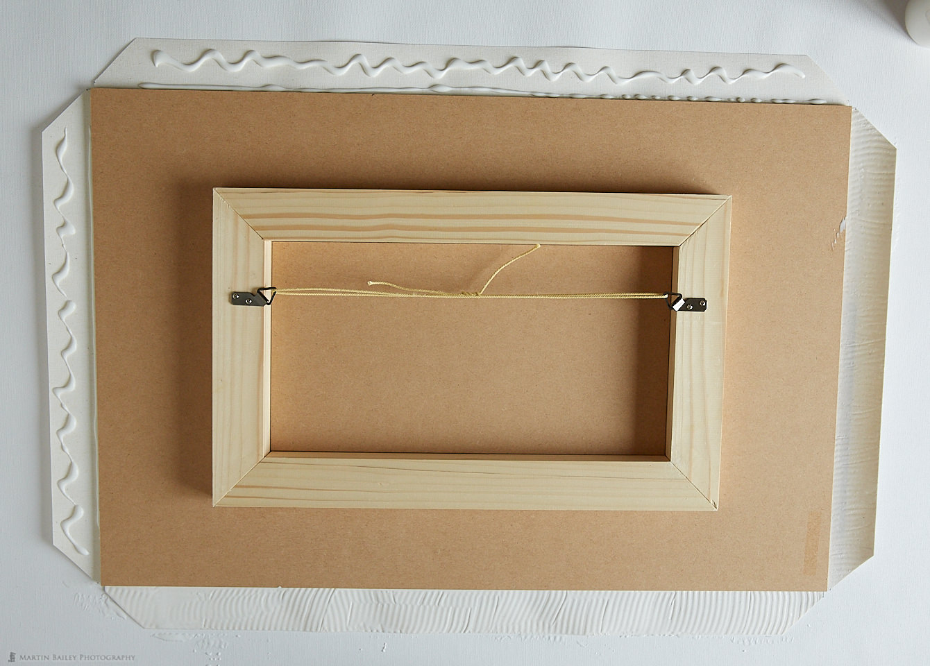
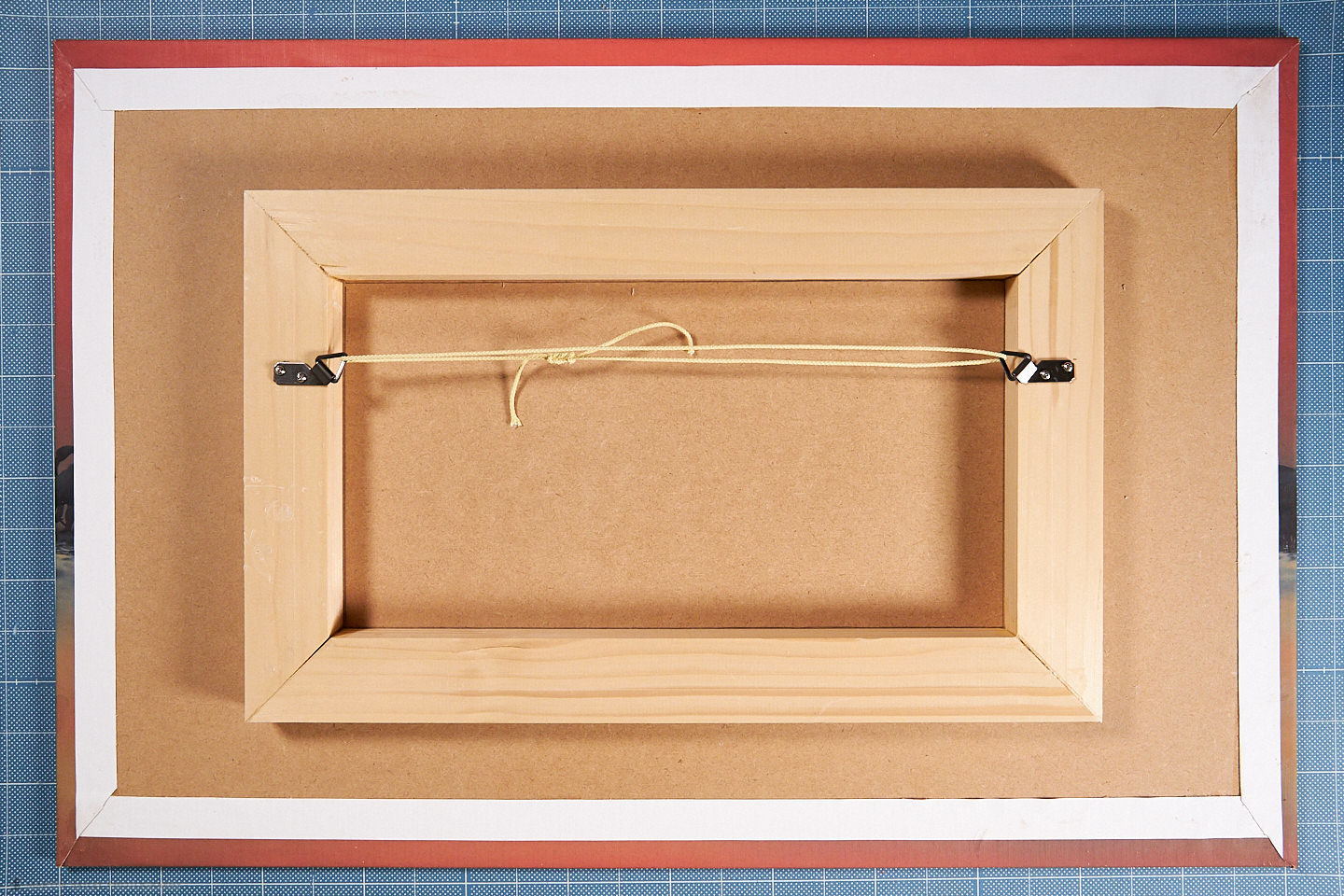
I then aligned the frame on the back of the panel, and measured the distance from all four edges until I had it in the center, then marked around the inside of the frame with a pencil, then applied adhesive to the frame, and lowered carefully it into place, aligning it with the pencil marks.

Then we get to reap an often-overlooked benefit of being a
I then use some small, hinged brackets from the framing store to attach some string to the back of the frame so that I can hang it on the wall. Now we're ready to move on to the printing.
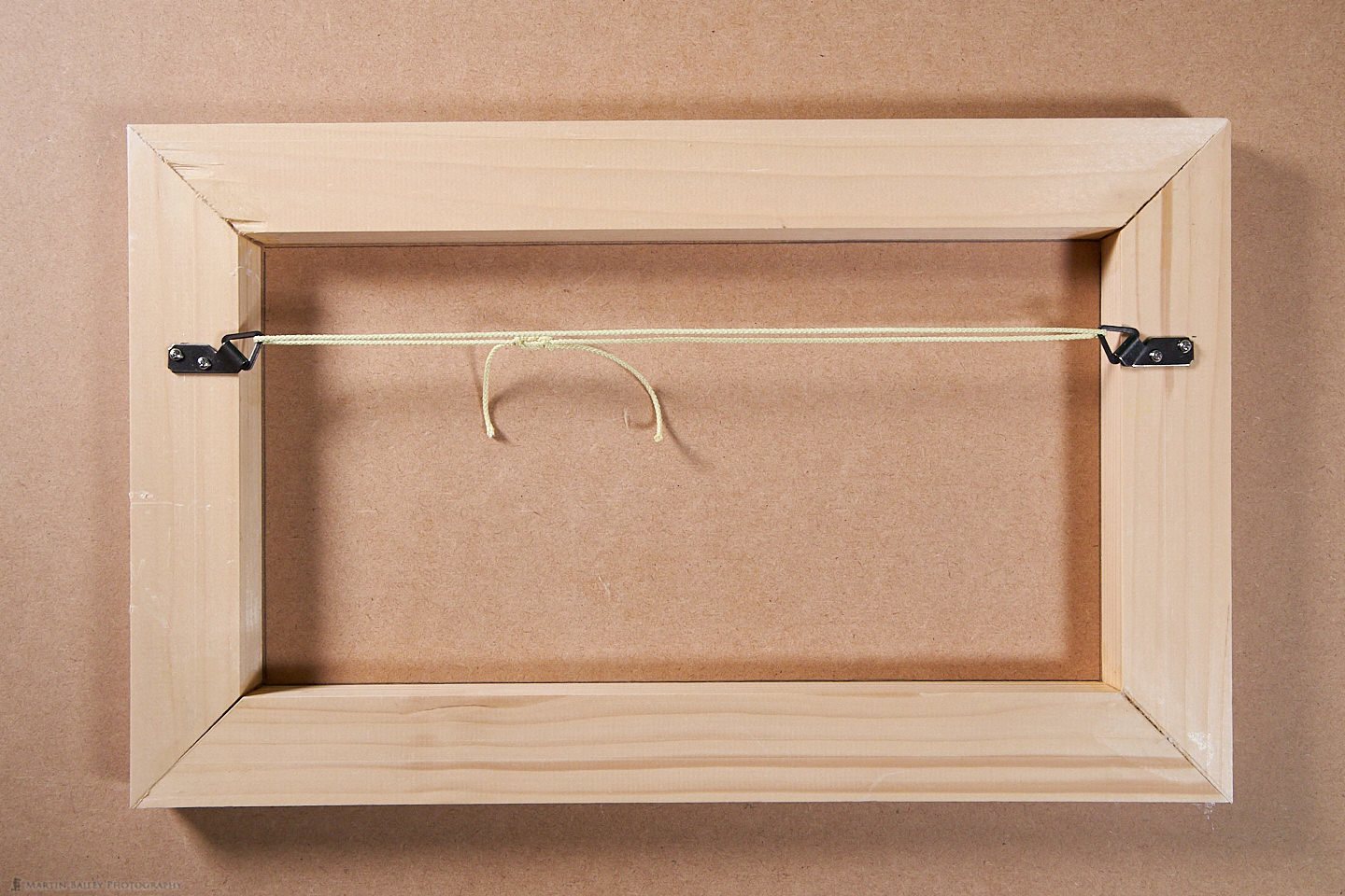
Prepare to Print – Adding Borders
The edges of our panel have some depth, so we have to decide if we are going to print the image a little larger, and lose the edges of our image, or to avoid effectively cropping the image on the face of the panel, we can extend the image out, as we often do when creating a gallery wrap.
For this, I use ON1 Software's Perfect Resize. You can launch Perfect Resize from within Capture One Pro, Photoshop or Lightroom
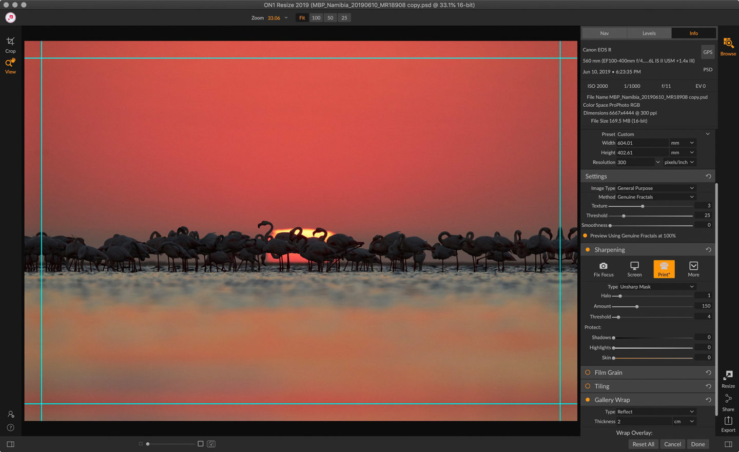
In the Settings panel, I set the Image Type to General Purpose and Method to Genuine Fractals, and use the default settings. I reduced the amount of Sharpening that Perfect Resize would usually apply, as I generally sharpen a little when printing, You can view the image at 100% to check the effects, but I generally find that Unsharp Mask gives me the best results as the sharpening method. If you are upsizing an image a lot the Progressive sharpening method can be better, but again, it's best to check at 100% as you make these changes.
I use the Gallery Wrap settings to mirror the edges of my image out to form the sides of my panel, and because the board is 5.5 mm deep, I need to reflect my image out by at least that much. I actually choose 2 cm here, so that the image wraps around the back of our panel a little. If you don't have Perfect Resize you can use any photo editing software to extend the canvas size, then transform the edges out to create a similar effect.
Printing
Remember to add whatever border size you created when you print. I added 4 mm on the width and 2.6 mm to the height of my image to allow for shrinkage, and another 2cm border for the edges of the panel and a little on the back of my panel, so have to add a total 44 mm to the width of my print, which is the height in this screenshot, because the print is rotated for printing.
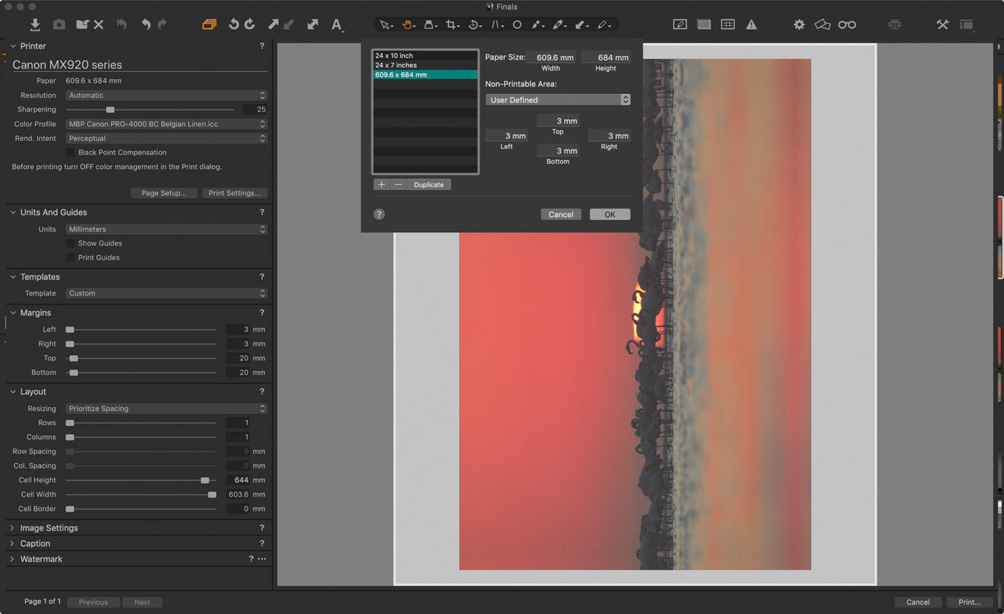
As you can see, I created a custom page size in the Canon PRO-4000 printer drivers that
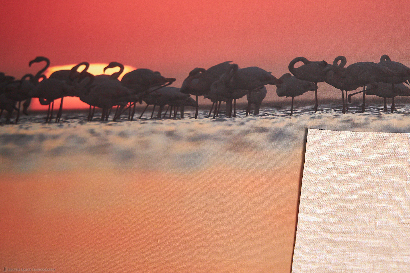
The Print
Before we continue creating our panel, here is a photo of the printed face of the Belgian Linen canvas, so that you can see the texture again. I've also laid a piece of the canvas over the print, so that you can see what it looks like on the back. You can actually buy Belgian Linen Natural from Breathing Color, which I might try at some point, but the print side also looks like the back of canvas that you see here, so it would give interesting results for sure.
Cutting Notches
I usually like to give the print a day to fully dry. Once It's dry, I trimmed the canvas so that there was a border of exactly 2 cm on all four sides. The next part is a little bit tricky, and I actually tried experimenting with a different method this week, but I prefer my earlier method, so I'll show you the photo from my original article. Note that the back of the Belgian Linen does not look like this. It's the brown stuff that we just looked at. The point here
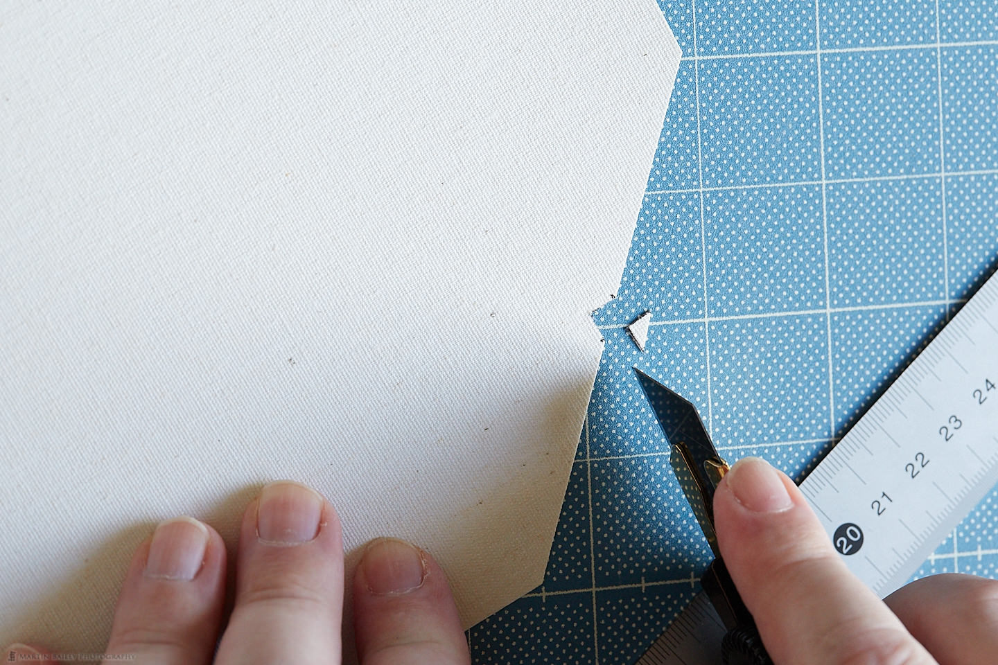
I actually tried cutting after I'd applied the glue this time around, and as you'll see shortly, it was a bit messy. The canvas wet with glue is difficult to cut, so the above method definitely works better for me.
The Sticky Bit
To stick the canvas or paper to your panel, you could use 3M spray adhesive, probably number 111 if you are printing on canvas, as 111 is good for wood and cloth, or check for compatibility of the two surfaces if you are using other materials. Although the archival qualities of your panel will depend on your media as well as the board material, because Belgian Linen is archival certified, I used archival glue from University Products, but as I say, my wooden board is probably not archival, although the print that I made five years ago has not faded or discolored at all, so I figured I'd just go ahead and use archival glue again. I also use a toothed spatula from a DIY store to spread the glue.
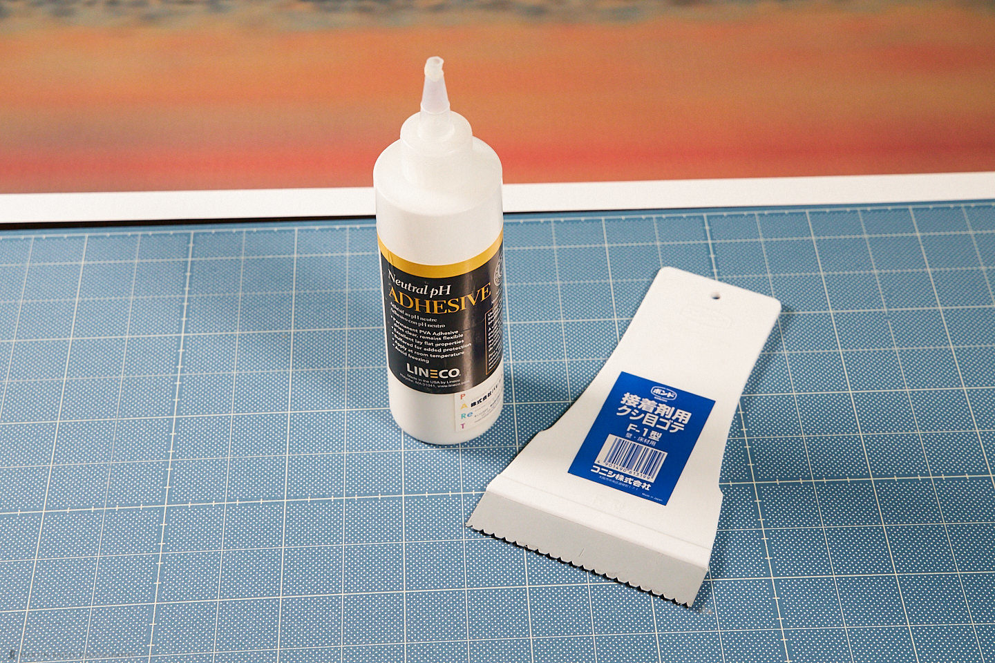
Having squeezed plenty of glue onto the face of the panel, I then scraped it out with the toothed spatula, as you can see here.

Ensure that your work surface is clean, but also keep in mind that you are going to get glue on it, so you may want to lay down some paper or something to protect your surface. Then place your panel on the back of the print, and align the corners with the notches that we made on each corner. Apply some pressure over the entire panel to ensure that it is stuck, and continuously check that the panel doesn't slide around on the print, taking the corners out of alignment. After a few minutes, the adhesive will dry enough to stop the print from moving, and then you can apply your adhesive to the edges of the print. Again, this is a photo from my original article because I didn't like the result with the experimental method I tried this week.
Once you have glue on each of the flaps fold them up and over the back of the panel, and keep stretching and rubbing the back edges, with a dry rag if necessary, until it's fully adhered to the back of the panel.
This is what the back of my new panel looks like, and as you can see, the corners are not very nice to look at. Although this is fine for a print for myself, if this was a product for a client, I'd have scrapped it and started again, considering my experiment a failure.
Another thing that I learned this time around, is that if you pull the side flaps up too tightly, the thread of the canvas can get ruptured slightly. This might also be caused by the fact that my panel board has very sharp corners. Gallery wrap stretcher bars are usually slightly rounded to avoid this. Here's a photo of my second lesson learned though, so that you can see what I mean.
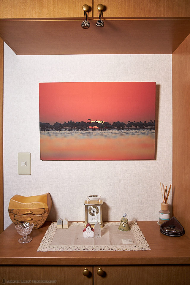
Here too is a photo of my new panel hung in the entrance to our Tokyo apartment. I really like the simplicity of this kind of presentation. At approximately $45 including the print on Breathing Color's Belgian Linen canvas, I feel that it's worth a bit of time to put together, but it's a labor of love. Or perhaps just my way to staying intimate with my art. I get great satisfaction from the act of completion with a project like this. If you also like tinkering around in addition to your printing addiction, maybe you can also give this a try.
I know I took this article away from a straight forward review of Breathing Color's new Belgian Linen, but I hope you found it useful. I would like to finish by reiterating how beautiful I think this new media is. It's expensive, and probably not going to be for every day use, but when utmost quality is necessary, Belgian Linen is it.
You can pick up both the white-coated Belgian Linen and Belgian Linen Natural from Breathing Color here.
Print Rotation
Let's finish with a word about print rotation. As I am not allowed to hang my prints anywhere in our apartment outside of my studio without my wife's permission, we decided on this photograph together. Although I was disappointed that I didn't get a flamingo head poking up into the sun on this year's Complete Namibia Tour, I still really like the warmth and atmosphere of this photo, and it became a firm favorite of my wife's too as soon as I got home.
There is only so much wall space, and we try not to fill all of our walls with prints anyway, so we have started to rotate prints a little according to the season. Being Japanese, my wife appreciates art differently according to the season, and that is rubbing off on me a little too, so we have fun with this.
For example, the panel that we've had here for the last five years is the original one that I made for the Craft & Vision PHOTOGRAPH magazine article. For that print, I used my photo of a church on the mountainside near Vik in Iceland. To us, that photo really suits the summer months, mostly because in Japan people rarely control the temperature outside of the main living space, so this entrance area gets really hot, and the cool feel of Iceland helps to balance that out.
Conversely, as we enter Autumn now, and the temperature has finally started to fall a little, we were looking for something that kind of felt warm, but not hot. My wife feels that the similarity between the end of the day signified by the setting sun in this new print feels similar to how Autumn is like the end of the heat of summer, although not as sad as the winter. Winter actually is different again. Similarly, because this entrance area is not heated either, it's freezing cold in here during the winter, so we won't hang a print of a winter scene, despite me having thousands of them. We'll probably either keep the warmth of this print, or look for something that conversely warms us up, to counter the winter cold.
Either way, we have fun thinking of which art to hang based on the location of the print and the season. Do your tastes change by season, or do you take things like this into consideration as well when deciding what to hang on your walls? Let us know in the comments below. I'd love to hear how you
Show Notes
Get Belgian Linen from Breathing Color here: https://www.breathingcolor.com/aqueous-linen
Audio
Subscribe in iTunes to get Podcasts delivered automatically to your computer.
Download this Podcast as an MP3 with Chapters.
Visit this page for help on how to view the images in MP3 files.

I really enjoyed reading your blog post about Belgian Linen. I’ve had some canvas prints done over the years and really enjoy how they look. Some of the prints I also framed myself. It can be frustrating, fun and yet rewarding.
I’m pleased to hear that you enjoyed this Mark. Also that you are enjoying canvas prints. I think they look great.
Regards,
Martin.
I started some test prints with the Natural version. Very nice indeed and easy to print (at least with a Canon pro-1000), but it can be difficult to find the right photograph for the medium.
Hi Luc,
That’s great that you are trying the Natural. It certainly looks interesting. Please share some photos if/when you get something that you like printed. You should be able to share up to three links in a comment or reply before the spam filter blocks your comment.
Regards,
Martin.
Martin,
Thank you so much for the review of the Breathing Color Belgian Linen but thank you even more for the information on your photo panels. I have been looking for an easy way to display my prints in my home and this just maybe it. I am going to be building my first one soon. I have a 13″ wide photo printer so I think displaying a 12 x 18 print will work just fine.
One question about print media and that is sharpness. Canvas is not as sharp as paper. Have you tried something like a mounting technique with paper?
Hi Steve,
You’re welcome, for the post, etc. Thanks for commenting!
I haven’t tried this with anything other than canvas, but a good heavy media should work fine. The things to be careful of would be the glue seeping through a thinner media. Try sticking it to a smaller panel first and check that the face of the print doesn’t get discolored or stained etc.
Also though, depending on what you use, Canvas can be every bit as sharp as a fine art matte media, although slightly softer than a gloss media. Just a thought mind.
Regards,
Martin.