This week I’m going to tell you all about Portfolio for iPad, an app that I’ve just started using to display my portfolios in, and I’m mostly very impressed with.
For a number of years, I used an app called Foliobook to share my portfolios on my iPad and I was very happy with it, but then Lightroom Mobile came along and gave us automatic synchronization across devices. This was incredibly useful until I started to use Capture One Pro to process my images, instead of Lightroom. I never used Lightroom Mobile to actually process images on the iPad, so I didn’t miss that aspect, but a self-synchronizing portfolio app was missing from my workflow.
A few months ago I told you how I am using the Apple Photo app, and I am still using it to keep a copy of all of my images in my photo timeline, and I’ve even created my Portfolios in albums in the Photos app now, because I wanted a way to sync them between devices. I do still like the casual access to my images that this gives me, but as a display format, it’s slightly lacking. The main problem for me is that images are often cropped so that they fill the screen, and I don’t want that.
iPad Pro 12.9 inch
Two weeks ago, I got a new 12.9 inch iPad Pro. I wanted that big screen for sharing images with people that I meet, and at that point I decided that as the Photos app view wasn’t sophisticated enough for my portfolios, so I went back to Foliobook, setting it up with my main portfolios and a gallery of my videos.
Then, over the last week, I updated a few more of my portfolios, adding some casual work that I’d done over the last year and as I manually added these new images to Foliobook, I thought to myself that there has to be a better way to do this, so, I searched for an alternative.
Two candidates came up. One was Xtrafolio, but that isn’t even available to buy in Japan, and the other was Portfolio for iPad. There are others, but my main reason for looking for a replacement for Foliobook was automatic synchronization, and Portfolio for iPad promised that so I set about the task of trying it out.
Setting Up Galleries
I’m not going to walk you through all of the steps required to get your portfolio galleries set up, but let’s look at some of the points that I learned, to hopefully help to save you time if you ultimately want to work in a similar way to how I’m now using Portfolio for iPad.
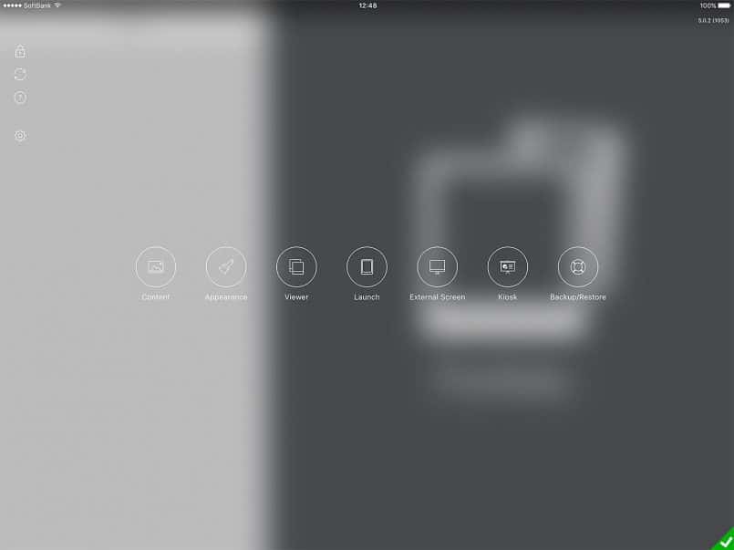
After launching Portfolio the first thing I did was to try adding a few albums containing my portfolio images. To get started with that, I clicked the little cog wheel in the bottom right corner of the screen, which changes to that green check symbol that you can see in this screenshot (below) and the app then displays various settings options.
To add a gallery manually, you click the Content button on the left of the list of options, then hit the plus symbol at the bottom of the left column as you can see in this screenshot (below). You just give the gallery a title and import your images.
At this point in time, you can import images from the Photos app on the iPad, via iTunes, Dropbox or box, and also by using an app from the developer of Portfolio for iPad that enables you to transfer images directly to the app, which is pretty handy.
I first used the method to import directly from the Photos App on the iPad, and that worked flawlessly. The thing to note here though is that if you have Optimize iPad Storage turned on in your Photos & Camera settings on the iPad it’s likely that not all of your images will be available. They have to be all downloaded to your device to even appear in the list. Because I got the 512GB model of the new iPad this is the first device I’ve owned that I’ve actually been able to use the Download and Keep Originals option, so I was able to import entire portfolio folders.
Image Size Limitation
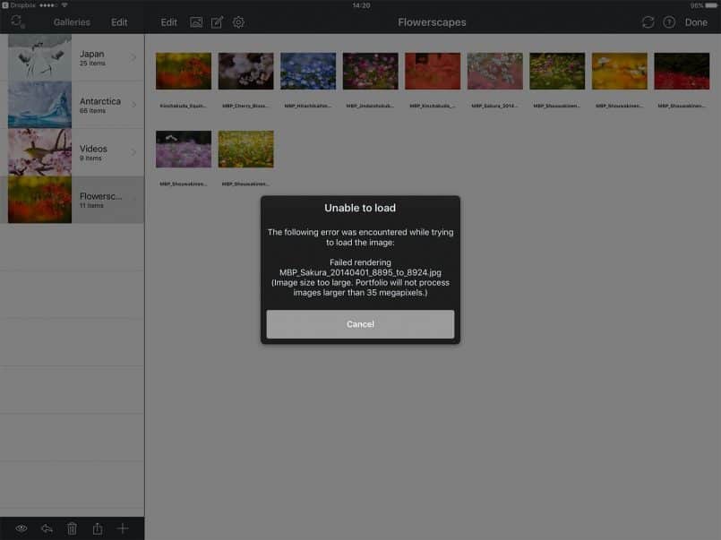
Because I have all of my portfolios in folders in my Dropbox, I also tried importing from Dropbox, and that worked great too until I hit my first problem. As I loaded some of my galleries a message was displayed, as you can see in the previous screenshot, telling me that images larger than 35 megapixels would not be imported.
Initially this came as a big disappointment because I really didn’t want to export downsized images specifically for this purpose. I can understand that a developer needs to add this kind of safeguard to prevent people with older devices from having problems, but Foliobook, the portfolio application I’ve been using for a number of years, simply warns the user about importing big files, it doesn’t prevent you from doing so.
And the reality is that if you have a relatively new iPad, the system resources are plenty to run galleries of 50-megapixel images. There is also a message in Foliobook telling the user that if they have problems, they should try resizing their images. In my opinion, this is all that is necessary.
Removing the Size Limitation
It turns out that there is a way to remove this limitation in Portfolio for iPad, but I had to wait three days for a reply from the developer before I heard about this. You just have to go to the iPad Settings and scroll down to the Portfolio app, and there is an Advanced settings section with an option to Disable size limits.
I spent about an hour on the developer’s web site trying to find something like this and came up dry. In my opinion, this is bad design. If there is an option like that, the developer should include a message to that effect in the message displayed telling people that images over 35-megapixel will not be loaded.
Not only did this waste my time looking for a solution or workaround, but I also went on to export all of my images shot with my Canon EOS 5Ds R bodies resized to 35 megapixels. Then after the developer did get back to me with the solution, I had to go back and re-export all of my 5Ds R images again at full size.
This took a few hours, and unfortunately, even though by this time I’d figured out how to automatically synchronize the images from Dropbox when you replace the images in Dropbox, the Portfolio app loses their position in the gallery, so I had to spend an hour or so manually sorting my images again. All-in-all I lost around six to seven hours because the developer couldn’t be bothered to alert his end-users to this override option, and that annoys me.
I should also note that as I’d expected, the 50-megapixel files work fine in the Portfolio app. I also exported the Portfolio to my three-year-old iPad Air 2 and it works flawlessly on that device too.
Automatic Synchronization
Luckily though, I’m a somewhat stubborn creature and decided to continue to see if Portfolio for iPad was worth working with. After manually creating a few albums, I figured I’d click the synchronization button in the top left of the Content settings screen, to see how synchronization works. I was presented with a message telling me that synchronizing at the top folder level would replace any manually created galleries, making me happy that I’d only created a few galleries before trying this.
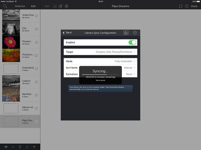
I turned on synchronization and pointed Portfolio for iPad to my Portfolios directory in Dropbox, as you can see in this screenshot (below). I left the mode as Fully Automatic, as I simply want to drop images into my Dropbox portfolio folders moving forward, and have the Portfolio app just pick them up.
Once synchronization has completed, it occurs automatically every 5 minutes while you have the app open, so initially, I was updating my images on my computer, resizing them to 35 megapixels, and the Portfolio app was automatically grabbing the new files without any interaction from me.
I found out later that this would have messed up my manual ordering of images, but during the setup up phase, I was really impressed by this. In fact, until I got to this point, I was still in two minds as to whether or not to continue using Portfolio for iPad, until I saw how well this automatic synchronization works.
If you make any changes that you need to take effect straight away, you can also press the Sync button that appears on many of the setup screens, and a fresh sync will start straight away. This really does work very well.
Videos Work Great!
I was also really happy to see that having added a folder of videos to my portfolios folder in Dropbox, it was automatically synced to the Portfolio app. The player in the app is really pretty as well, so it will look great as a way to share videos with people.
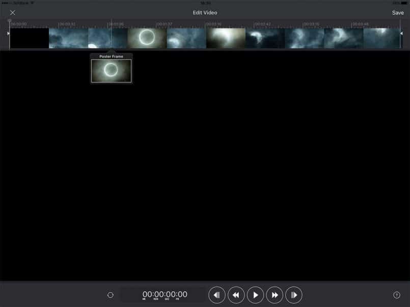
Assigning a Poster Frame
Note that when you first add videos, they are displayed as black boxes. To assign a Poster Frame you just have to press the filmstrip icon below the video after tapping it, then drag the rectangle below the video timeline until it shows the frame that you’d like to represent the video in your gallery, then click Save in the top right-hand corner.
I noticed that although you can change the title of videos in manually created galleries, in automatically synced galleries, the filename of the video is used, and cannot be changed. So, I went ahead and just changed the filenames to the actual titles, including spaces, and these synched fine, so if you want pretty titles in video files, change them before synching. The extension, .mp4 or .mov etc. is not displayed in the name, which is good.
Titles
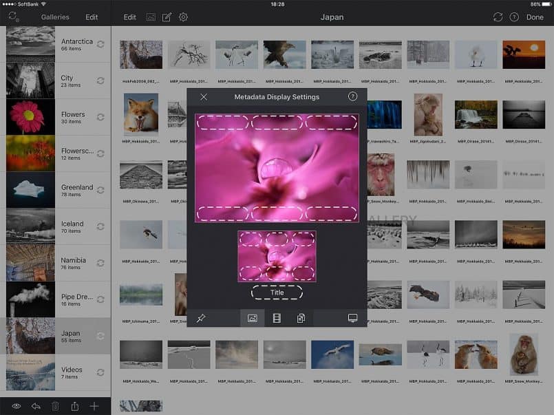
I also noticed that when you first import a gallery, either automatically or manually, the file name is used as the title by default, and it doesn’t look great. I imagine this is the default because some people, perhaps a lot of people, don’t add titles to their images in the EXIF or IPTC metadata fields.
I do though, so for each album that I automatically synched, I went into the gallery, clicked the cog wheel above the gallery thumbnails, selected the Configure Metadata option, and then selected IPTC Title instead of Name, as you can see in this screenshot (below). This changes all of the filenames to the actual Title that I’ve given each image and it looks a lot nicer.
Customizing the Appearance
Now that I had my images imported, and syncing nicely and automatically, I set about the task of customizing the appearance of Portfolio for iPad. When I tried to edit one of the three built-in themes I saw a message stating that “Only the appearance can be edited on a built-in theme. To change the layout first make a duplicate of the theme.” I’m not quite sure what this means, but I created a duplicate of the Modern theme and started to customize it.
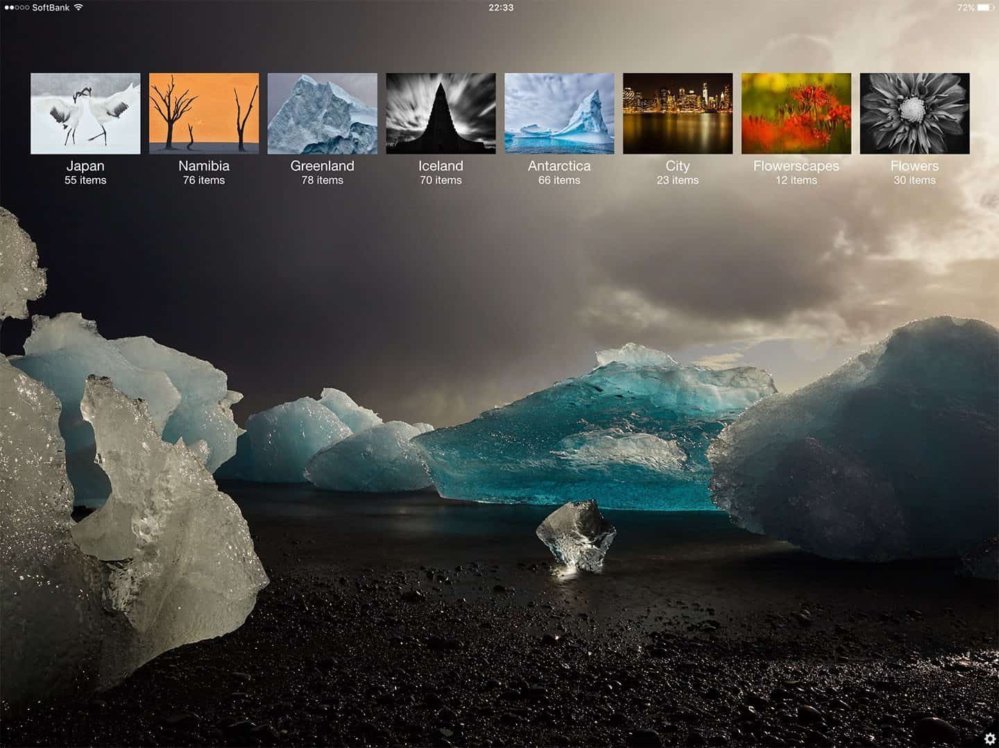
Initially, I found the customization controls very temperamental. Objects jump around uncontrollably, and I ended up scrapping my first few attempts to change the theme and started again from a fresh duplicate copy. Once I’d gotten used to it though, I was able to replace the background image with one of my photos taken directly from a gallery that I’d imported, and I placed the thumbnails in a part of the screen that looked good to me, as you can see in this screenshot (below).
One thing regarding customization that I was a little disappointed with, is that even if you open a PNG file with transparency when you place it in the layout of the app, a white background is added. I was hoping to be able to import my signature and Japanese stamp that I apply to my fine art prints and overlay it on this screen, but it wasn’t possible.
Of course, the workaround for this is to overlay the graphic onto a photo or whatever background you want and import, but this is more time-consuming. If I could just have my signature and stamp as a separate element, I could easily move it around and change the background image very easily.
Portrait Orientation
You can also set a different image for the portrait orientation view, and move the thumbnail bar to another location on the screen, as you can see in this screenshot (right).
If I can make the time I might create some images specifically to use as the background on these pages, but I’d much prefer to be able to overlay PNG files with transparency in tact, and just overlay it on any image from my galleries.
This would, for example, enable me to update a portfolio on the train on the way to visit someone to show them a portfolio. The more you customize the presentation to a viewers needs, the more likely you are to make a good impression.
One cool thing though, with how the themes work, is that if you wanted to, you can simply duplicate your theme and save a new version with different images, essentially setting up a variety of themes for separate occasions.
Backing Up Your Library
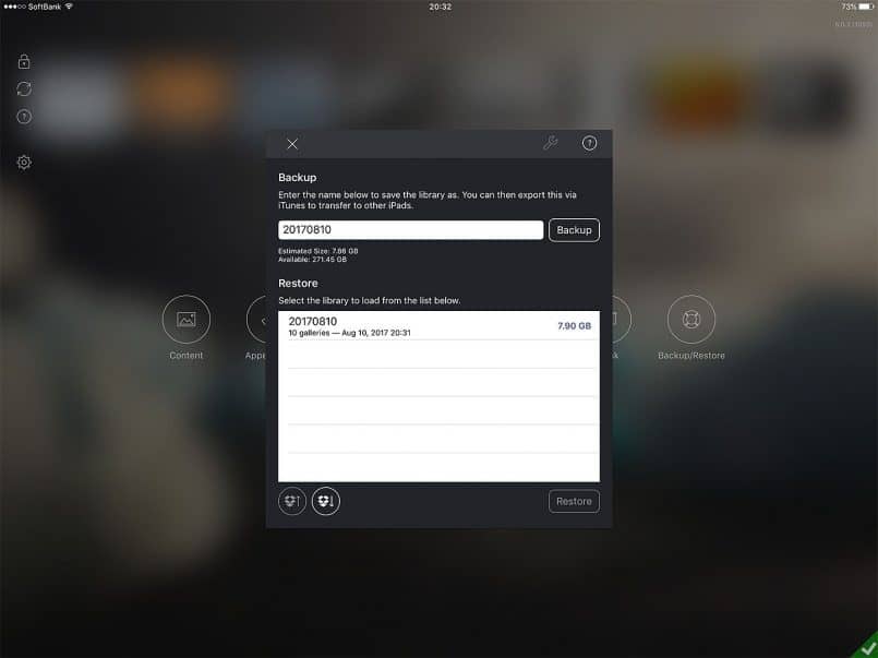
Once you have something put together that you are happy with, you can back it up, either just for safe keeping or to transfer the library to another device. Backups can be performed either to Dropbox or within the app, and then copied around using iTunes. Here you can see the Backup screen after I’ve made a backup with the Portfolio app (below).
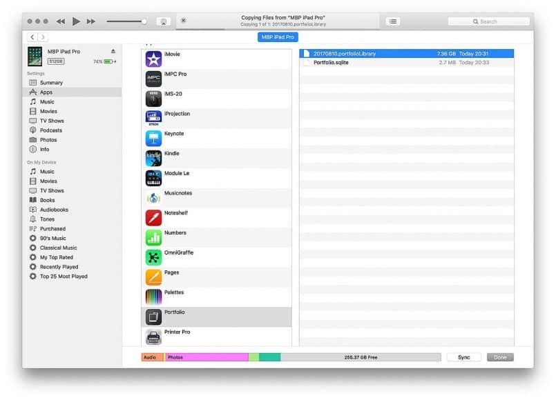
To transfer this library to my iPhone and a second iPad as a test, I opened up iTunes, then selected the iPad Pro, then the Apps icon in the sidebar, and scrolled down until I could see the list of apps installed on the iPad, then located the Portfolio app, as you can see in this screenshot (below).
Once you can see the backup copy of your library, just drag it to the desktop to transfer it to your computer. To restore this library on another device, just attach that device to iTunes, and navigate to the same location, and drag the library backup file back to the same window for the new device.
This worked as expected for the iPad Air 2, and the 50-megapixel files worked fine too. Note too that restoring the library like this enables you to keep all of your customizations, but then once the library is operational, it starts to synchronize from Dropbox like the original library, so any future updates to your images will be automatically synchronized. And, if you make any major changes, it’s not such a big deal to repeat the above backup and restore process.
Working with Multiple Libraries
Because the backups just sit inside the app until you delete them, you could actually use these backups as a way to keep multiple portfolios libraries on your device, assuming you have enough space. Say you’re a wedding photographer and a landscape photographer, you could maintain two totally different libraries and restore the one you need depending on who you are going to show it to.
Why Full Sized Images
Also, just to close the loop on this, if you are wondering why I want my full sized images in the Portfolio app, if you’ve ever passed an iPad to another photographer to look at your photos, one of the first things that many people do is to zoom in on the image to check the details. Portfolio for iPad lets you do this really well, so I want to maintain as much detail in my images as possible.
Image View
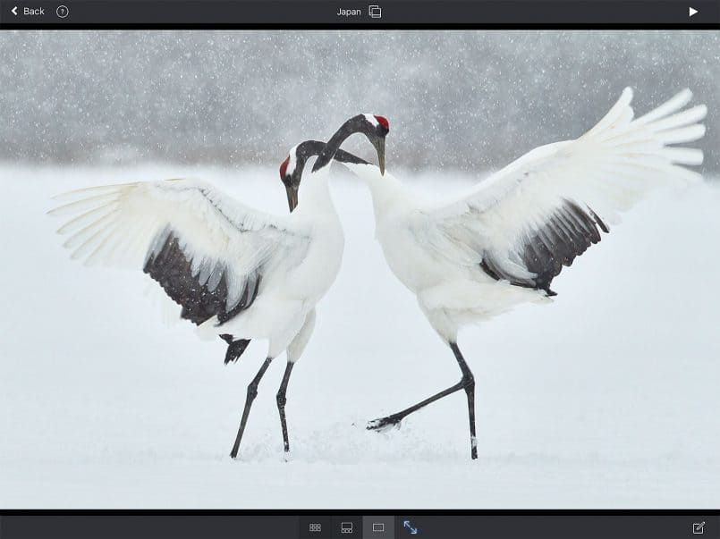
I should also mention that another area I wish was different is the view you get when you first enter a portfolio gallery. Although they disappear after about four seconds, I don’t like being able to see the top and bottom toolbars when you first enter the gallery.
I would love it if these toolbars remained invisible, even when you first enter the gallery until you touch the screen. You could argue that people might not notice the play button in the top right, but people are accustomed to the interface on an iPad enough to reach out and touch the screen to get started, and then the button and other options would come right back.
Filmstrip and Thumbnail View
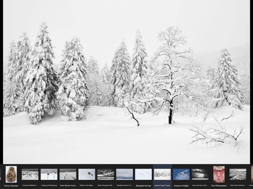
The buttons in the middle of the bottom toolbar allow you to switch to a full screen of thumbnails, or just have a filmstrip of thumbnails across the bottom of the larger image as you can see here (below). The filmstrip view is fine, but I really don’t like the all thumbnail view. In my opinion, they need to resize better for larger screens, and also the ability to hide the titles and just have nice looking thumbnails would be good too.
EXIF Metadata
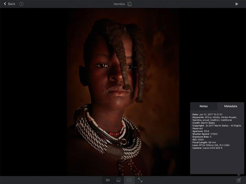
One other reason that I used to like about having my images in Lightroom Mobile, was that it was really easy to see shooting information, like EXIF metadata and the histogram for the image. Unfortunately, there is no histogram in Portfolio, but if you click on the little edit button in the bottom right corner, then click on the Metadata tab, you can see the shooting information for the image, which is really nice (below).
I wish I could just display this metadata directly, without going to notes first. Although you can also display metadata over the image by changing the gallery settings. Ideally what I’d like is to just be able to tap the image, say with two fingers, and display an overly with the metadata, like you can in Lightroom Mobile. A histogram would be nice for that matter, but not as essential for me as the metadata, and I do have that, so no huge complaints here.
Portfolio for iPhone
I was also initially excited to see that there is another app from the same developer called Portfolio for iPhone. I installed it and restored the backup of my library that we looked at earlier, but I quickly found that the iPhone version of Portfolio is a pretty weak offering.
It’s a very cut down version of the iPad app and doesn’t even allow the use of much of the EXIF and IPTC metadata in my files, despite having similar options to show the IPTC Title etc. like the iPad version. This simply doesn’t work, which is quite misleading and disappointing.
Also, although I realize that screen real estate is more at a premium on the iPhone, even though I am using the Plus, there are no background images. All you see when you start Portfolio for iPhone is a list of galleries. The images are displayed without any cropping to make them fill the screen, but this is really the only redeeming factor.
What’s more, there is NO SYNC!! You can backup your galleries on the iPad and restore them on the iPhone, and that maintains any image sorting you might have done, but there is no synchronization feature, so all updates will be manual, which is very disappointing.
Granted, it doesn’t actually say that there is any sync functionality in the iPhone version but excited by the features of the iPad version, I’d expected this to be there and bought the iPhone version without checking thoroughly. The iPhone app was only ¥360 though, so it’s probably around $3 in the US store. Because of the pricing, I would probably have bought it anyway to try, but I’ll have to see how much I actually use it.
Portfolio vs Foliobook
At the time of writing Portfolio for iPad is $14.99 in the US App Store. Foliobook is currently $9.99 with video support being a $1.99 in-app purchase, so it’s basically $12. The extra $3 for Portfolio will give you that all important automatic synchronization. That alone to me makes Portfolio for iPad my new go-to portfolio application. I also like having thumbnails on my gallery view in Portoflio too, where as Foliobook is just text links.
Once inside a gallery, Foliobook looks better and the thumbnail views are much cleaner. Foliobook is lacking any kind of metadata display as well, so that’s another point in Portfolio for iPad’s favor.
If I was to give a score to each app, assuming that 10 is my perfect portfolio app, I’d give Portfolio for iPad an 8/10 and Foliobook a 7/10. Foliobook is a more sophisticated app in many ways but lacks some important features like auto-synchronization and metadata view. Portfolio for iPad doesn’t get a 10/10 because it lacks polish in many areas. It has most of what I want but needs refining.
Conclusion
In conclusion though, if you are looking for something to help you use your iPad to display your portfolio, be it as a photographer or designer or any other artist creating imagery and/or videos, Portfolio for iPad is well worth taking a look at. Despite some very frustrating setbacks over the last few days as I’ve set it up, I’m now basically very happy with what I have, and the ability to just update my portfolios in Dropbox and have them automatically synchronize to my iPads is absolutely golden.
Show Notes
Check out Portfolio for iPad here: https://ipadportfolioapp.com
Check out Foliobook here: http://www.rocketgardenlabs.com
Subscribe in iTunes for Enhanced Podcasts delivered automatically to your computer.
Download this Podcast in MP3 format (Audio Only).
Download this Podcast in Enhanced Podcast M4A format. This requires Apple iTunes or Quicktime to view/listen.




Thanks Martin, I was considering to change to foliobook as find the portfolio editor abut cumbersome but never considered the auto sync option which looks like the idea solution! So will be giving it another go,
Thank you
Having used Foliobook for a few years, I did find the Portfolio editor a bit cumbersome, but for me, that auto-sync pretty much trumps everything. I’m about to create a Morocco portfolio, and knowing that all I have to do is save my images to a new folder in Dropbox then arrange the order in the Portfolio app is great. It’s a real time-saver.
I hope you find it useful too.
Cheers,
Martin.
Good review and article. I was thinking of switching from Foliobook as I find it a bit clunky. Surprised no one has a much better app than either of these two choices. Synchronization isn’t that important to me so I’ll stick with Foliobook.
I am the developer of Foliobook and found this an interesting and fair review. I would correct one point, there is some metadata display within Folibook, but it’s currently somewhat limited and a little prone to bugs. I’ll put this on my ‘to think about list’ as I’m doing more work with metadata and can improve it.
Interestingly we did used to support Dropbox sync until 2018, so in fact when this article was written Dropbox sync was still in place. Then in 2018 when Dropbox replaced their sync API, I had to completely rewrite the Dropbox integration and experimentally I left the automatic sync part out as it was complex to add back in. Few if any people complained that I’d removed it! Now I realise that many people may not have realised it was even there despite the fact there was a button with the word ‘sync’ written on it in the Dropbox picker. Another reason for its removal was that many users with less sophisticated needs were accidentally synching when they did not need that capability, then they were confused when they could not edit their gallery because they were ‘slaved’ to Dropbox.
Anyhow, after a period of illness I’ve spent much of the summer replacing ageing parts of Foliobook and have just released an update, It still does not sync with Dropbox, however there are some changes coming to a spanking new version that I hope to have out later in the year that will make adding and managing images easier without the complexity of syncing… there is a much more intuitive solution. watch this space.
The other objective I have is to remove the ‘clunkiness’ that some refer to. It really comes down to time, making a really slick app takes the most incredible amount of effort. I know what makes a good Apple app, but getting there is hard with only a part of a person available to do the work. Nevertheless there are efforts on the way to make the app work as slickly as an Apple product with the goal that this should be achieved in the next six months.
Hi Paul,
Thanks for getting in touch. I cannot find the paragraph above where I said that Foliobook did not have Dropbox sync, and your mentioning the Slave mode seems familiar, so I think I was using it. If I did say anywhere above that Foliobook doesn’t have Dropbox sync I honestly don’t recall why. Likewise for the EXIF data. If it was buggy, that may have been cause for me to just say it was not available. I don’t recall I’m afraid.
Improved EXIF data display would be great and if you could drop me a line when you release your update with a different kind of image management, I’d love to review it for you and release an update, which I would link to this review as well. Please keep me posted.
I do understand the amount of effort that goes into these things. A few summers ago I taught myself to program for iOS and created my own app, so I know that this stuff takes a lot of time. I’m sorry to hear that you’ve been ill too. I hope all is well now and look forward to seeing your updates.
Regards,
Martin.
I have used this portfolio on my iPad Air 2 since it first came out . And have been very pleased with it. Had an accident with the 2 and am now upgrading to an iPad Air 5th generation. There have been a lot of changes between these two models.
Do you still recommend it as highly?