When it’s not possible to get far away from home to a beautiful location, I love to just take a walk in the park with my Macro lens, and have some floral fun. Today I’m going to walk you through a few photos from a recent walk, and talk about how I take some of my flower shots to another level.
I’ve already talked about my black and white flower shots in the past, but today in addition to walking through my thought processes and a few techniques, I’m really thinking about how to make the most of a few hours with the camera, when it’s not possible to get further afield. For me, this kind of trip helps me to stay productive as a photographer when running the business and other work keeps me behind the desk for too long. Plus, I really do find this kind of photography to be a lot of fun!
When I moved apartments four years ago in preparation for incorporating Martin Bailey Photography, the reason I looked for a place in the area I live, is because it’s not far from Jindaishokubutsukoen, which is a botanical garden park. We buy a season ticket each year, and often jump in the car and just have a walk around, just as a refreshing walk, but when there are some flowers or other natural aspect that is at it’s peak, I often bring a little more gear.
On this particular day, although I had more gear with me, I could just have easily have brought just my 5D Mark III and my 100mm macro lens, because that’s pretty much all I used. I actually didn’t bring my diffuser which I like to use for this sort of photography, because I seem to have left it somewhere. I’ve replaced it now though, and I’ll talk a little about how I use that too as we progress.
Violet Rose
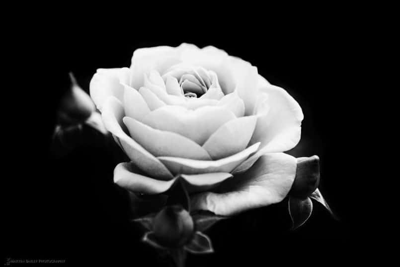
So, let’s jump in and start to look at a few photos. First up is this rose (below), which was actually a violet colour as we’ll see shortly, but I converted this to black and white. As I shoot, I generally know what I’m going to do with an image, and although I like to look at the pretty colours in flowers, I rarely find that the colour is enough of a key feature to actually keep it in the photograph.
As you may recall from a few videos I’ve released over the years, such as the video in episode 297, I like to reduce the background to almost and sometimes totally black, as with this photo. I just find this much more pleasing, as most of the time, I really just want to draw the viewer’s attention to the beauty of the flower.
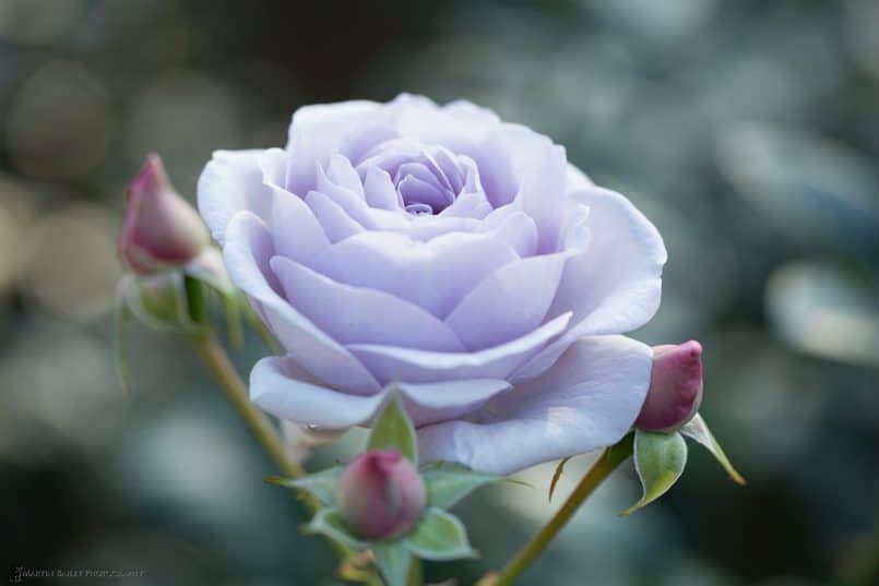
To explain this better, here is the original photo, straight out of the camera (below). Now, for sure, this is a beautifully coloured rose, and the balls of bokeh in the reflection are nice, but as I shot it, I knew that both of these elements had to go. The beauty of shooting images like this is that Silver Efex Pro works with colour and tones, so because the flower is different to much of the background I can easily reduce the darkness of the background with a few strategically placed Control Points. Again, see my previous videos to see how to do this if you aren’t aware of the technology.
Maybe it’s just me, but I really just find the black and white, simplified version much more aesthetically appealing, and although I find myself quietly apologising to the people that worked so hard to create a rose of this colour, when I search for a flower to photograph, I’m much more interested in finding flowers without many blemishes. This one actually had a bit of a rotting petal just showing on the bottom, to the left of the foreground bud, but I can kind of live with that, and didn’t feel it necessary to clone out, especially as it reduced to a small spot in the black and white version.
Shoot in the Shade or Use a Diffuser
One technique that I’d also like to mention before we move on, is that I had my wife hold my hat to the top right of the frame for this photo (above) to stop the sunlight directly hitting the flower. It was a clear day, with full sun, but that creates way too much contrast for a pleasing photograph, so I generally block it out. Having lost my old diffuser, I’ve just bought something similar to the Lastolite TriFlip, which is an 8 in 1 triangular reflector, with the base layer being a translucent diffuser.
You just hold the diffuser between the light source, the sun in this case, and the flower, to reduce the light hitting the subject. I was totally blocking the light with my hat, but a diffuser is better, because it allows a soft white light through, which is really pleasing. The TriFlip also comes with gold, silver and black reflector covers as well, and I find these really easy to use in the field because they have a handle to easily hold them in position.
Pretty in Pink
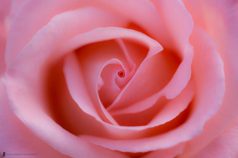
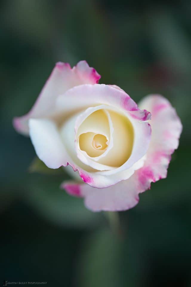
Sometimes of course, the colour does add a lot to the photograph, and although I could go either way on this next image, I feel that the pink is worth keeping (below). This wasn’t a large rose, but I just got in close enough to fill the frame. This time I believe I was able to just position myself so that I was creating my own shadow, to avoid any nasty high contrast.
Apart from the next photo that we’ll look at today, all of these images were shot at f/4, which gives a very shallow depth of field when focusing this close with a macro lens. That was by choice of course. I really like the softness created with this aperture, and as you can see here, I am just careful to ensure that the focus falls on the critical part of the flower. This varies by subject, but here, because the top of the petals is in sharp focus, we can allow the rest of the rose to go soft and it still looks beautiful.
Also for this shot, I reduced the Clarity slider in Lightroom to -55, and then with the Adjustment Brush, I painted +37 Clarity back in along the top edges of the petals in the centre of the frame. This is an easy way to enhance the softness of an image but still keep the critical sharpness where necessary. I like to use plugins and I don’t mind jumping into Photoshop if necessary, but these options force me to create a new TIFF or PSD file, so when I can make this simple tweaks just in Lightroom, I like to do this, as it is done to the original raw file.
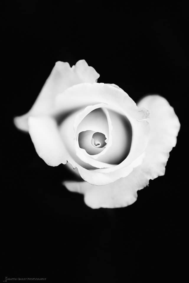
In this next image, I once again took the background to almost total black. It’s actually zone 1 in the zone system, so not totally black. I checked this in Silver Efex during my conversion, and again, we’ve touched on this in previous videos, so I won’t go into this today.
The point that I wanted to make with this flower, once again, requires that we look at the original (below). Here you’ll see that there are splashes of pink in what was an almost totally white flower in the black and white version. To achieve this, I just dropped a Control Point over the pink areas in Silver Efex Pro, and increased the brightness. This basically turned the pink to white. Then, once I’d changed one spot, I held the ALT key while dragging the Control Point to the next spot, and repeated until I’ve whitened them all. It was probably a twenty second job.
There are a couple of bits of texture left, but I like the look and it really is easy to achieve once you are used to making this kind of photograph. Again, because the background is just shades of green, it was also very easy to just take them down to almost black.
Beautiful Flower or Viscous Alien?
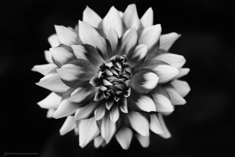
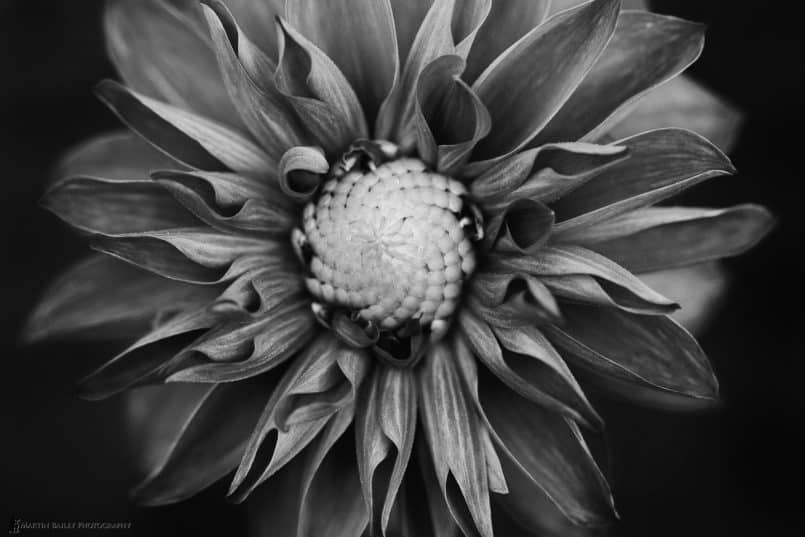
After spending an hour or so in the rose garden, we walked around to an area of the park where they have a wide range of Dahlia flowers at this time of year. Here once again, after the black and white conversion, I reduced the Clarity of the entire image in Lightroom, then brushed some back in over the centre of the flower, to enhance the overall softness, but then really draw attention to the centre of the flower.
I like this because I feel that the image can be read in a number of ways. If I want to see the softness and simple beauty of the flower, it’s right there, but because of the sharpness of the centre petals, I can almost imagine this being the teeth of a piranha fish, or an alien mouse shooting out from the flower. I don’t necessarily want you to see that in the photo, but I always find it fun when I can read multiple meanings from a single photograph.
Next up, let’s take a look at the original image first (below). Again, this is a dahlia plant, and I was continuing to look for specimens without blemishes and keeping my eye out for a nice clear background. I wanted to quickly mention here that with the diffuser that I mentioned earlier, you can also use the black cover, and hold it behind the flower, to almost create your black background right there in camera. That does take away the option of leaving some texture as I did in the conversion that we’ll look at shortly, but this is an option I sometimes use.
I’m sure that especially with this photo, you will agree that it’s a very plain, boring image in colour. Here though is the black and white version of this photo (below). Do make sure that you click on this image to view it at the largest web size available, as the texture in this photo just blows me away. Again this was shot at f/4, and because I was now in the shade as the sun was almost on the horizon at the end of the day, the ISO was up at 1000 for a shutter speed of 1/250 of a second. I like to keep the shutter speed up, because the flowers were blowing around in the breeze a little, so I was timing my shots during moments of stillness, but still, they were often not totally still.
Because of this centralised composition, I could of course flip this for a horizontal photograph, or easily crop down to a 4:5 aspect ratio or even a square crop. I did leave a little of the texture in the background here, as I think it works, and enhances the texture in the dahlia.
Edward Weston Homage
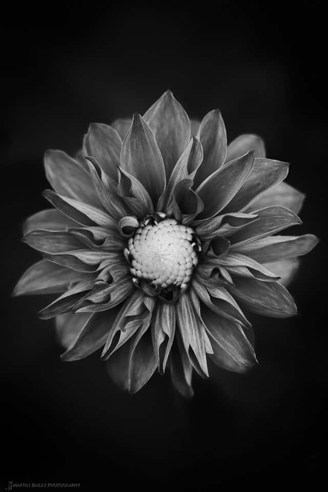
This next image (below) is actually a tighter composition of the same flower, which I also like a lot. None of these images have been cropped in post. These are the compositions right out of the camera.
I’ve named these two images Dahlia #2 and Dahlia #3, kind of as homage to Edward Weston, as I can’t help feeling a little bit nostalgic about this look, and dare I say, that they kind of remind me of Pepper #30, which is a photograph that probably had a lot of influence over my appreciation of black and white still life images.
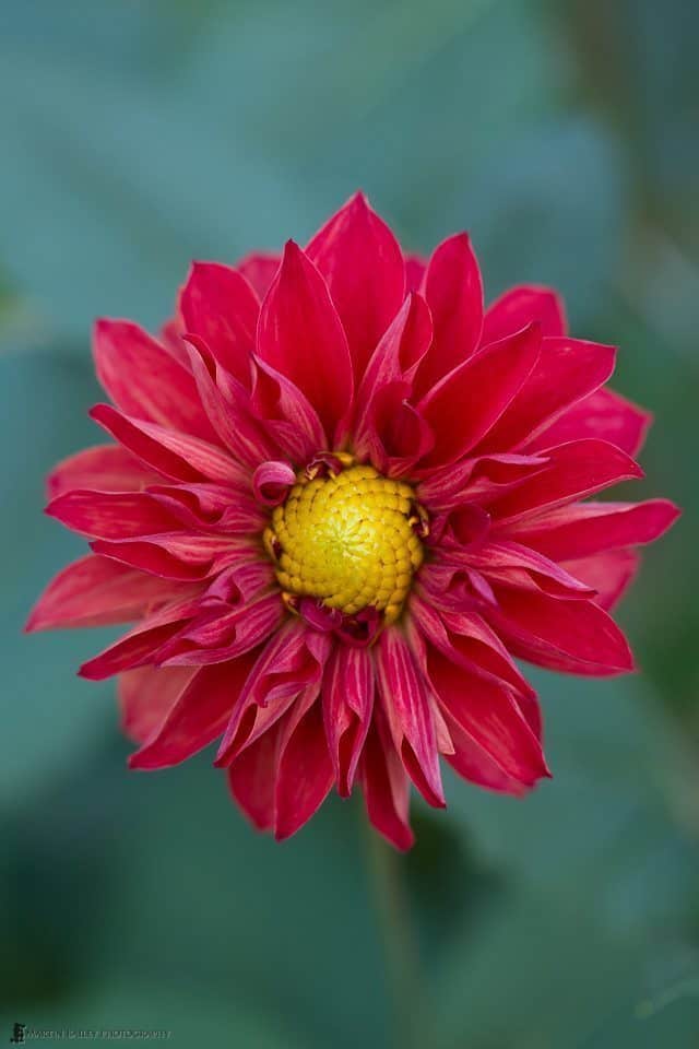
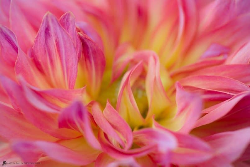
Let’s take a look at one last image, which is another that was really all about the colour, so it stayed that way. I called this image Dahlia on Fire (below) because the petals really felt like flames. Once again I soften the image slightly with the Clarity slider in Lightroom, then added the Clarity back to some of the flames with the Adjustment brush, but otherwise this is pretty much straight out of camera too.
I know that this is just accepted now, and really not worth raising, but looking through my images from this shoot, I was reminded of just how empowering digital has been to the modern photographer. I shot at five different ISOs, ranging from 400 to 1250, and both colour and black and white.
I’d have needed to change film at least six times to create the seven images that we’ve looked at today, and although I generally know when I’m going to convert to black and white, and when I’m not, having the ability to decide this later is totally liberating. I know I’m probably showing my age now, as many listeners probably never even shot film, but sometimes these are things that I think about.
Have Fun – Staying Productive
So, as I mentioned at the start of this episode, I really wanted to talk about this set today, both to introduce a few theories and techniques that may not have been obvious, but also because I really do find it important to keep options like this simple afternoon in a local park in mind when you have some time, but maybe not enough time to venture further afield.
There was a time when this was one of my main focuses, and venturing further afield would have actually been taking a visit to a park like this, but now, I generally want to go further spending more time on my photography, but that simply isn’t always possible, for a variety of reasons. Most of us though are happy if we have a camera in our hands, so this is a welcome break in an otherwise busy life, and I for one really enjoy this kind of casual shooting.
I hope you agree too that the results are worth it. Having sat on some of these images for a few weeks now, I will be adding some of these to my flowers portfolio, and probably making some of them available for sale as prints and adding them to my stock photography library too, so my enjoyable few hours in the park turned out to be quite productive.
Choose Your Own Medicine
Of course, photographing flowers may not be your idea of a relaxing afternoon. Maybe you’re a street photographer, and need to just identify a few local spots that you enjoy to shoot, or a portrait photographer that needs a model friend or two that you can call upon from time to time. Whatever your medicine, I know this kind of casual shoot can be very satisfying and fulfilling, so I hope you already have a few of these up your sleeve, or are able to find some to feed your soul in the short pockets of time that are sometimes all we have.
Show Notes
Martin’s Flower fine art prints: https://martinbaileyphotography.com/product-category/prints/flower-prints/
Subscribe in iTunes for Enhanced Podcasts delivered automatically to your computer.
Download this Podcast in MP3 format (Audio Only).
Download this Podcast in Enhanced Podcast M4A format. This requires Apple iTunes or Quicktime to view/listen.



Those are wonderful! I listened to the podcast first, then came to see the photos and was blown away. Black and white flowers can be amazing. Who knew?! Thank you for sharing.
Thanks Barron! I’m pleased you like these. I’m kind of surprised you even came to look after just hearing the audio for this one. Thanks for doing just that though!
Great podcast Martin. The images are beautiful, thanks for sharing.
Thanks very much!
I often listen on my iPad and read along or check out photos on your website at the same time. Since you embed the link, it makes it easy. 😉
That’s great Aaron. I’m pleased the link helps. Hopefully the iOS issues will be fixed soon, and you’ll be able to view all the images on the iPad too, although it’s always nice when you visit the blog as well. 🙂
You know, I’ve lost faith that Apple will fix the numerous issues in iOS 8 anytime soon. The multi-touch gestures for example to switch or close apps has been broken since the beta. Just slide up the notification center once and it comes back, so it’s hot a huge deal, but still, with thousands of complaints about it in the Apple forums and most of my customers experiencing this issue intermittently you’d think it would have had high priority to be resolved, let alone discovered in beta. Same with podcast images. Same with apps crashing iTunes on sync. Same with stuttering audio in podcasts/music on occasion, etc. At least the photo album issues from iOS 7 have been resolved. 😛
Anyway, great blog, really enjoy it! Hopefully we’ll cross paths in person someday!
Hi Aaron,
I hope that you’re wrong, but fear that you’re right. 🙂
I’m pleased that you enjoy the blog. It would be great to meet in person at some point.
Cheers,
Martin.
Beautiful images. Did you use a tripod on these?
Thanks Tim. These were all hand held. I like to use a tripod when possible, for quite often for flowers in a park it’s not practical, as I can’t put a tripod leg into the soil without annoying the wardens. 🙂