I recently switched newsletter services from Campaign Monitor to MailChimp, and today take a look at some of the key differences between the two services. Now having experience with both, this isn’t going to be a MailChimp vs Campaign Monitor death-match, because they are both great systems. My intention today is to point out the differences so that you are in a better position to decide which one is for you, or at least which one to try first.
I know this isn’t directly photography related, but it very much is business related. I believe it’s very important that any business tries to build a mailing list to keep in touch with your audience and customers. The Internet is becoming a very crowded space, and we are all fighting for eye time, so it’s important to develop ways to stay in contact and interact with people that are interested in what we have to say.
People digest information in many ways. For example, although I release the audio recording these Podcast episodes each week, I know that some people still prefer to read. Some people come to the Web site and read rather than listen, and others subscribe with our RSS feed. Some people obviously subscribe to the Podcast directly in iTunes, and others listen via the various players and syndication applications that pick up my Podcast.
Having put in pretty much full day each week to make these Podcasts, I of course want to reach as many people as I can with them, and one of the things that we’ll look at, is the automatic delivery of my blog posts each week now, via MailChimp. Although not everyone is going to open the mail, I find that proactively pushing information to people’s mail inbox is a great way to augment what I’m doing with the Podcast and blog.
I also have people that sign up for Tour and Workshop information, and that gives me a way to directly alert people that are interested to new tours as information is made available. Before I started using Campaign Monitor a few years ago, I maintained groups of email addresses in the address book on my computer, but that can get messy and hard to maintain, plus the emails that I sent out were mainly just text and links, and didn’t look great. I also had to BCC people to protect their privacy, but that is a surefire way to get your email sent straight to the spam folder.
The services we’ll look at today enable us to create great looking email, that are less likely to be automatically marked as spam, so they are more likely to get read than a simple text email. I know a number of very successful pros that send out plain text email, and they really don’t do their content justice in doing so.
Pricing
OK, so to start our comparison of MailChimp and Campaign Monitor, let’s take a look at the pricing. Both companies enable you to set up an account for free to get a feel for the system. MailChimp actually allows you to have a completely free account for up to 2,000 subscribers, and send up to 12,000 email per month without paying a penny, which is awesome, and a great way to get started. You only start paying for your account when you go over 2,000 subscribers, or if you want some of the extra features only available with a paid account that we’ll look at shortly.
Campaign Monitor pricing starts at $9 for a monthly account, with up to 500 subscribers, or you can use a free account, and pay $5 per campaign plus 1¢ for each recipient, so if you were to send a campaign out to 1,000 subscribers, you’d pay $15 for that campaign but there are no other charges. This is great if you just need to manage a list of subscribers, and don’t send out emails that often. If you will send out an email more than one a month though, a monthly plan probably makes more sense.
Both companies have a sliding scale pricing model, where you pay more as the number of subscribers to your newsletters grows. Campaign Monitor charges $9 for that first 500 subscribers and with their basic plan, you can send up to 2,500 email per month, basically sending to your entire list once every week. Once you go above 500 subscribers, you’ll jump to the $29 plan, which is good up to 2,500 subscribers and 12,500 email per month. If you need to send more email that the limit of these basic plans, you can select the unlimited plans, but these are quite a lot more money. The $29 basic plan for example jumps to $59 for unlimited emails. Check out Campaign Monitor’s pricing page for more information on larger volume lists.
MailChimp’s pricing starts at $15 per month for 501-1,000 subscribers but that is for unlimited sends out of the gate. The MailChimp scale is more granular than Campaign Monitor, increasing with every 500 subscribers. I actually switched from the $29 a month plan on Campaign Monitor, to the $30 per month plan on MailChimp, but because that now includes unlimited sends, it will actually work out cheaper for me, especially as I’ve now enabled automatic emails when I release new blog posts, as we’ll see later.
List Management
Another major difference between the two services is how they manage lists and subscribers. Campaign Monitor allows you to have the same person subscribe to multiple lists, but then when you send out an email, you can select multiple lists, and if the same person is in more than one list, they will only receive one copy.
I found this easy to manage, and it enabled me to post a subscribe button for my Tours & Workshops newsletter on my tour pages, and I could post another button for my general information newsletter elsewhere, and I didn’t have to worry about which list people were in.
MailChimp however has no linkage between mailing lists, and although you can put people in multiple lists, you can’t select multiple lists to send out an email to. Now that I have it set up, it’s quite intuitive, but there was quite a learning curve initially, especially having come from what I considered to be more intuitive functionality on Campaign Monitor, although ultimately MailChimp’s lists enable you to do a lot with their Segments and other add-ons that we’ll get to shortly.
Because there is no way to send to multiple lists in MailChimp, if I had kept my old structure, with one list for Tour information, and another list for General Information, if I wanted to send the same newsletter to both lists, I would literally have to send it to both lists, and people that are on both lists would receive two copies, and in doing that, I’d run the risk of people marking my newsletters as spam, which is obviously best avoided. At the very least, I’d probably see more people unsubscribing from at least one of the two email, if not both.
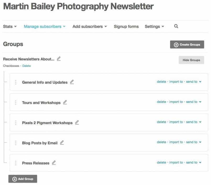
MailChimp uses Groups and Segments to achieve the same thing, so if you want to avoid sending multiple emails to the same recipient, you need to put them into a single list, separated into groups. Here (below) you can see how my main MBP Newsletter list is divided into General Information, Tours and Workshops, Pixels 2 Pigment and a few other groups.
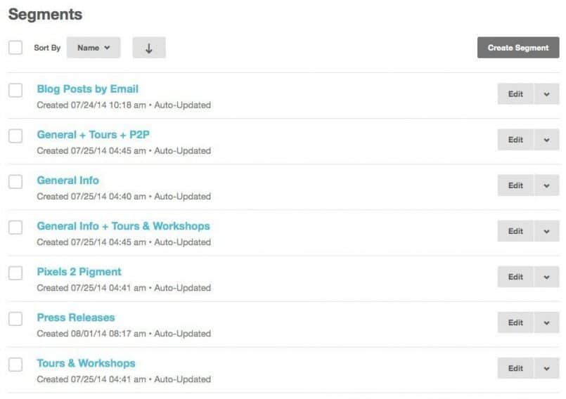
Then, to send email you create Segments. The cool thing about Segments is that you can create Segments based on various rules, so for example as you see here (below) I can create a segment just for General Information, and I can create a segment to send to both the General Information group and Tours & Workshops group, or any combinations of group in my list.
This way I can easily create larger groups to email when the information I’m sending out is likely to be of interest to more than one group, and of course, if the recipient is subscribed to more than one group they still only receive one copy of the email. I also have some other lists that people are added to, and I can merge lists easily as necessary.
Another benefit of the MailChimp system is that you can keep your monthly costs down by only having recipients in a single list, assigned to various groups, because if someone is subscribed to multiple lists, they are counted as separate subscribers, so you will jump up to the higher price bracket sooner.
Sign-up Buttons and Forms
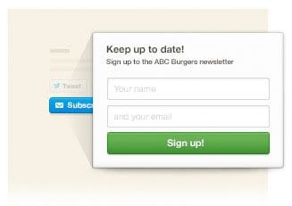 To get people signed up, both companies provide various forms to use on your Web site, and both have an iPad app that you could use at events or exhibitions, and they both have a Facebook signup form.
In general, I think the Campaign Monitor forms are better looking and easier to embed in your web site. I found it took more time to get the MailChimp forms looking how I wanted them too, although the forms themselves do have to be more complicated to handle things like signing up for specific newsletter groups.
Once you have them working, both companies do the job at hand, but one area that Campaign Monitor has the edge is their simple popup button, which I could easily embed into a page, and when clicked would just show a name and email address field, to get the user subscribed quickly and easily.
MailChimp don’t have this, and it’s one thing that I really wish they’d work on. They have a popup style form, but they even call it the ‘evil popup mode’, probably because it’s is timed to display after so many seconds, which I find really annoying too.
I may well change this, but I’ve started to use a WordPress plugin called SideOffer with a custom background graphic to add a simple tab to the top right of the browser window, which when clicked opens a small window containing the form. I experimented with a number of ways to actually build the form, but the native MailChimp forms work best because they tap straight into the system, which enables them to check if people are already signed up, and if they are, an appropriate message is displayed and an email sent with a link to change existing subscription options.
You can of course also just provide a link to a simple page with a sign-up form, which works fine and it’s easy to customize the forms with your logo and group options etc. Again, these aren’t quite as pretty as Campaign Monitor, but they do the job.
Autoresponders
Both companies enable you to set up autoresponders, which are emails sent automatically to new subscribers as they sign-up. Both companies enable you to fully customize the autoresponder template, so that the new subscriber receives an email with a similar look and feel to your newsletter and you can include your own welcome message and links to things that you’d like to draw to your new subscriber’s attention. Neither company offers an autoresponder with their free plan, which in the case of Campaign Monitor would be a pay per campaign plan, so if you want to set up an autoresponder, you have to pay for a monthly plan with either company.
Templates
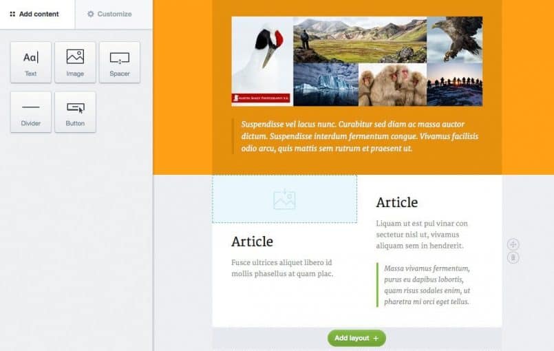
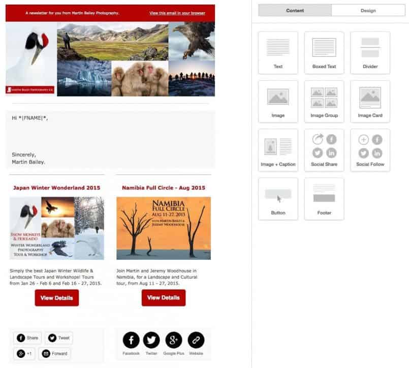
Both systems have a huge array of templates for you to use and customize. Compared to the templates that I’ve been using until recently on Campaign Monitor, I’d say that MailChimp had the edge on customizability, but with the recent addition of Canvas templates in Campaign Monitor, there is probably now very little in it with regards to what you can create and the ease of use.
I tend to find that MailChimp’s templates lend themselves a little more towards reuse. For example, in Campaign Monitor I found myself copying and modifying old templates or creating new templates quite a lot, but with MailChimp I’m finding that the templates are more flexible, so I can create what feels like a more higher level template, and use it more often for various types of email.
Both systems have code blocks that you add to your template or email as you write it, and these can be used to create great looking emails without a lot of effort. If it’s a pain to actually create an email, you’ll do it less, so ease of use here in paramount, and both do a great job.
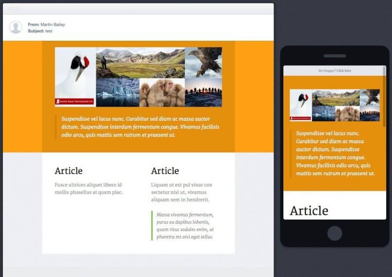
Both companies also offer both a regular mail client preview and iPhone preview of your email as you complete your design, but MailChimp don’t do themselves any favors by messing this up. As you can see here, the Campaign Monitor preview has the iPhone version correctly scaled and responsive.
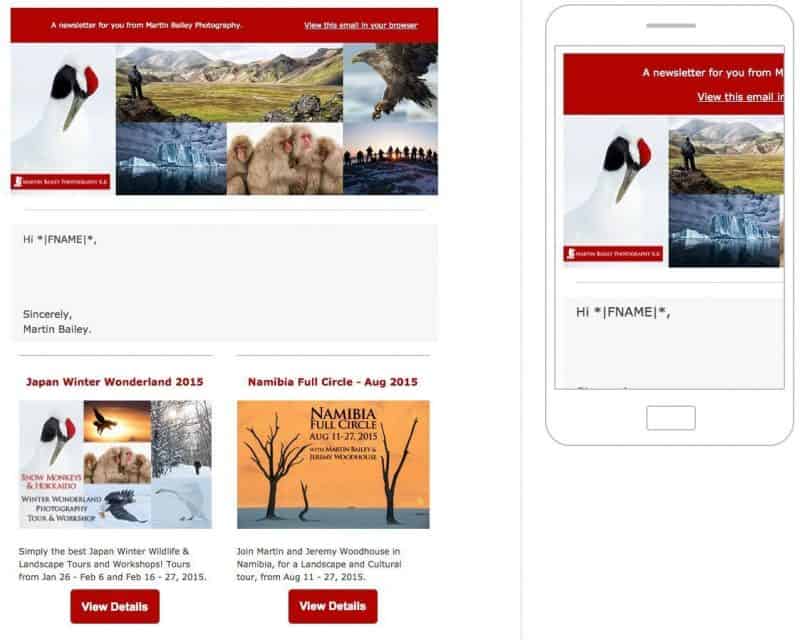
MailChimp’s preview however shows the images too large in the iPhone view, as we see here (below). In reality, the MailChimp email are also correctly scaled when viewed on the iPhone, but that isn’t correctly displayed in the preview making it feel more like a gimmick than a useful feature.
Blog/RSS to Email
So far, with regards to most of the stuff we’ve touched on, Campaign Monitor is either neutral, or perhaps even does a better job than MailChimp in some ways, but one of the things that MailChimp does do better, is the RSS to email feature. Most blogs have what’s called an RSS feed, which contains either a summary of posts, or the full posts in a simplified format to be read by syndication readers such as Feedly, Reeder and Leaf etc.
This provides a way to create automatic updates, such as the RSS to Email functionality on both Campaign Monitor and MailChimp. Basically the content of your RSS feed is used as the body of an automatically generated email that is sent to subscribers of a specific list.
The reason I was never able to turn this on when using Campaign Monitor, was because it insisted on including the last four posts in my feed, and because I have the full post in my RSS feeds, this would result in a huge email going out to subscribers. All I wanted to send was the most recent post, and that’s exactly what MailChimp does. A very subtle but important difference, and one of the factors in my decision to switch systems.
This has enabled me to create an automatic campaign via MailChimp that looks at my blog’s RSS feed every day at 8pm Japan time, and if there is a new post, it creates an email and sends it out to everyone that has subscribed to receive Blog Posts Delivered by Email.
A Stronger Push
You might think that’s a stupid thing to do, because I want people to visit my site, right? Well, that’s true, but I also want people to be able to receive and consume my content in any way that suits them. Some people only subscribe to the RSS feed, read my content and never visit the site, which is fine. Likely some people subscribe in iTunes, listen to the Podcast during their commute, and never visit the site, which is fine too.
I spend a lot of time each week putting this content together, and the more consumption options I can provide people with, the better. Of course, too many choices can lead to none being selected, but in this case, the visitor is already looking at my newsletter sign-up form, or subscriptions page, because, hopefully, they’ve liked what they’ve found, and want to receive regular updates when new content is released.
The other benefit of an automated email is that it’s what I’d consider a stronger push than iTunes or an RSS feed. I use RSS in a program called Leaf, which syndicates all of the feeds that I’m subscribed to, and I can flick through hundreds of blogs, only looking at newly published content, and then have everything that I’ve read automatically disappear from view. It’s great! But I have to be in the mood to do a bit of browsing, and start Leaf up, and I only do that a couple of times a week.
With email though, I open it first every day. I’d hazard a guess that most people do. So when someone gets up and checks their mail before running out of the house to go to work, they’ve picked up my new post. That means that they can now read it on the train, or even listen while driving if they have a data plan, because the audio player works fine in some mail clients. With very little effort on my part to set this up, I have enabled a new method of consuming my content, and that has to be a good thing.
A/B Split Campaigns
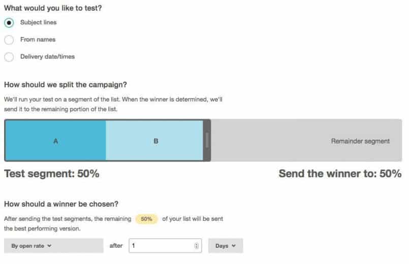
Both MailChimp and Campaign Monitor can send what are called A/B Split campaigns. This is basically a way of testing what works better in your email, based on a different Subject line, from name or in the case of Campaign Monitor, different content in the email, or with MailChimp, different delivery times.
Campaign Monitor splits the campaign 50/50 which enables you to check the results of the entire campaign for future reference. MailChimp on the other hand has the ability to start with an adjustable percentage of the entire list, and then send the rest of the list recipients based on the winning mail style after a preset period of time. This is great, as you learn from the test, but then act on the results during the same campaign rather than having to wait until you send your next newsletter out.
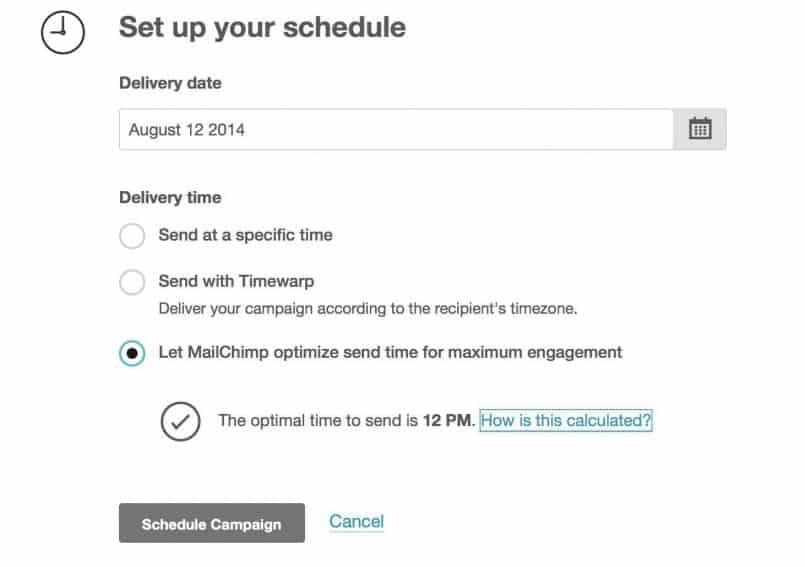
Once you are ready to send your campaign, both companies allow you to send straight away, or schedule the newsletter to be sent at a set time. Another couple of nice features in MailChimp are the ability to send with Timewarp, that will send at a set time, say 9am, in your recipients’ timezones, and you can also allow MailChimp to optimize the send time based on click activity from previous campaigns, so that you have the best chance of people actually opening and clicking on links in your email.
Reports
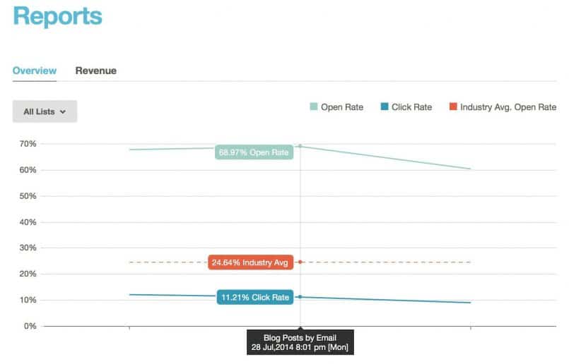
Once your mail campaign has gone out into the world, both systems provide comprehensive reports on how many people actually opened the email, and how many people clicked on a link in your email. I remember a conversation with the folks at MailChimp when I was at the Photoshelter Luminance conference in New York in 2012, and they seemed quite impressed when I told them that between 60 and 70% of my recipients open my email, but I had no way of knowing in Campaign Monitor whether that was good or bad.
In MailChimp, they actually provide industry standard statistics in your reports so that you can see how you’re doing without having to go searching for this information online, which is a big advantage to this system in my opinion. There are lots of other reporting features as well of course, breaking out your subscribers by country, age and gender etc.
Social Pro
MailChimp also has a cool add-on option called Social Pro, that collects data on your subscribers based on the social networks that they use, how active they are, and how many people follow them etc. This is useful because you can create Segments based on the information gathered, so I could for example send an email regarding something Facebook related just to people that I know are active on Facebook.
Social Pro costs an extra $1 per 500 subscribers per list, so it’s not a big deal to add, and depending on how you manage your lists you may not need to add this to all of your lists. I have a number of different lists that I actively use, but I only have Social Pro activated on one of them.
Conclusion
One of the main reasons I decided to give MailChimp a try recently, was the amount of community support I see for MailChimp compared to Campaign Monitor. Very often for example, a WordPress plugin will support adding people to a MailChimp list, but not Campaign Monitor. I’m not sure why this is, but it’s a trend that I’ve come across a lot over the last few years, and integration with my Web site is obviously an important consideration.
Both systems offer everything you need to manage mailing lists, easily create beautiful templates and emails to send out, and report on the results of your campaigns. I think MailChimp has the edge on the kind of information available in your reports, and I get the feeling that MailChimp are more interested in helping their customers to understand what they are seeing in relation to the bigger picture, and not just providing the necessary information to do your own research and analysis.
Having already been comfortable with Campaign Monitor, then spending a lot of time setting up MailChimp and getting used to the new system over this last month, my overall impression is that MailChimp takes more time to get up and running, but once that time has been invested, the system is a little more powerful. If you want to get up and running quickly, with a very capable system, Campaign Monitor may be the preferred choice.
Note though that whatever you decide, it doesn’t really have to be a final decision. You can export your subscribers from both systems, and import them to the other very easily, and both systems can be set up and seriously played with without paying a penny.
Anyway, I’ve voted with my pennies, and will be cancelling my monthly subscription with Campaign Monitor for now, but really, they are both great systems, and my hope with this comparison review is that it helps you to decide which one to go with if you need something like this yourself. I know it’s not directly photography related, so forgive me if you are totally uninterested, but if you are building a business, and don’t have a similar system in place yet, I hope this was useful.
Show Notes
If you should decide to use MailChimp, you can support this Podcast by using our referrer link: http://eepurl.com/ZyXaT
Campaign Monitor Web site: https://www.campaignmonitor.com/
Subscribe in iTunes for Enhanced Podcasts delivered automatically to your computer.
Download this Podcast in MP3 format (Audio Only).
Download this Podcast in Enhanced Podcast M4A format. This requires Apple iTunes or Quicktime to view/listen.


Excellent comparison! Thank you for taking the time to do such a thorough analysis. You helped me make my decision. Cheers!
You’re welcome Alan. Thanks for taking a look. I’m pleased it helped.
Great analysis, very much appreciated.
How would you compare MailChimp’s Segments feature to the Segments feature of Campaign Monitor? Better / worse / comparable?
(full disclosure: I work for Campaign Monitor)
Hi Matthew,
Thanks for stopping by!
When I first tried MailChimp, I found the segments confusing, and hard to work with. It meant changing a lot of my forms and in the end I had to buy a number of new plugin’s to make things work the way I wanted.
Now that I’m used to them though, I think it makes more sense (than before) and it helps to reduce having the same people in multiple lists, which in turn can help to keep monthly fees down.
Right now I’m happy with MailChimp, but as I said above I think there are some things that Campaign Monitor does better, and both companies provide an excellent service.
Cheers,
Martin.
Great comparison, thanks a lot!
Great article! Thanks for the effort of writing this down, helps a lot 🙂
Thanks for this review Martin – I’m just getting started with email campaigns and it’s been really helpful.
NB: campaign monitor does ‘segments’ as well as lists
– to avoid the multi counting of a subscriber on multi lists issue you mentioned
Thanks David.
I do mention this above, but at the time of writing wasn’t using segments as much as I do now. I now have almost all of my subscribers in one master list, and organize them into groups and use segments to manage them and send campaigns. You can now also send campaigns based on groups. MailChimp has grown even further since I joined them, and I’ve happier than even with my decision.
Cheers,
Martin.
Great analysis,and still useful half a year later. I’ve been using iContact, and am VERY ready for a change.
Sorry for the late reply here Brett, but I’m sure you’ll be very happy with MailChimp. They go from strength to strength, and I’m very happy with them.
I have been using Campaign Monitor for many years and have been happy with it. It is very useful to learn how MailChimp is different. I might give it a try in my next project, mainly because of the price and community support you mentioned. Thanks for the great comparison, very helpful!
I’m a little late in replying here, but if you use or have already used Mail Chimp, I’m sure you’ll be happy with them. It will probably take more than one project to really learn their system though. It’s not complicated, but it’s very different to CM, so you might need to give them time.
Martin, when you switched from Campaign Monitor to MailChimp, were you able to obtain an archive of everything you had done with Campaign Monitor (custom templates/images/etc., and email content)? Do they allow you to take this with you? Overall, how was that transition? Thanks!
Hi Amy,
I exported all of my email lists, and imported them into Mail Chimp, but I didn’t even look to see if I could export anything else. Mail Chimp templates are very different, so CM templates wouldn’t be much use. I can see the need to view old email content, but if you simply revert to a free account in CM, you can still login and access these any time after switching anyway. I personally didn’t need to do this though.
I hope that helps some!
Cheers,
Martin.
Great article. Super useful as I am decided which of these I am going to use.
ps. Minor typo… “Then, to be send email you create Segments.”
I’m pleased you found the article useful Wayne!
Thanks for pointing out the typo too. I just fixed that. 🙂