I recently took delivery of two new types of paper and a new canvas from Breathing Color, and having profiled and worked with them over the last few weeks, today I’m going to discuss some of the attributes of these new media types and how I’m going to be introducing them into my printing workflow.
If you get all excited about these papers and run off to the Breathing Color web site to place an order before we finish, note that we have a discount code, MBP20, for a $20 discount, but I’ll give you more details on this at the end of the Podcast. The first two of these three media types have me very excited though, so I do hope you also give them a try at some point. I usually like to save the best ’til last too, but I’m bursting to tell you about Breathing Color’s new Vibrance Metallic paper, so let’s jump into that first.
Vibrance Metallic
Until now, there haven’t been any true metallic inkjet papers available, apart from as a selectable media at some professional printing houses. There were a few companies that created inkjet metallic paper, but it didn’t really compare, until now. In true Breathing Color style, they have totally outdone themselves with Vibrance Metallic. This paper has a depth and quality that I’ve never seen before. Sure, I’m usually a matte guy. If I’m reaching for a paper to print for myself, it’s pretty much always matte, but I have a feeling that is going to change for at least for some of my printing.
Even as I printed out the patch sheets to create ICC profiles for these three new media types, I could see that Vibrance Metallic was very special. Of course, all three of these media types that we’ll look at today have excellent color gamuts and incredibly deep blacks, but Vibrance Metallic is like off the charts when it comes to depth and punch, but it’s not just about punch. There’s a subtle beauty that brings out the best in many types of photo. I found images with large swaths of color or dark areas look best on this paper.
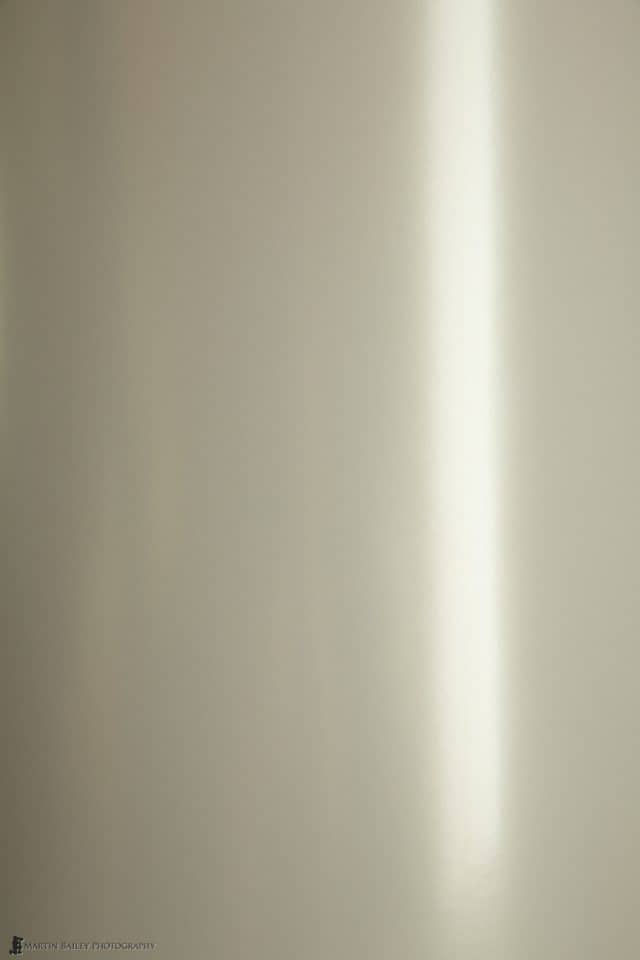
I tried some of my almost totally white winter scenes, which also look beautiful, but as you can see in this photo (right) the paper does have a silver look to it, which really enhances some images, but doesn’t necessarily add anything and maybe even detracts from a some snow scenes. All photos have their better matched media though, so we don’t have to try to find a single paper that will work with all of our images.
The biggest challenge I had in putting this review together was finding a way to actually shoot photos of the printed metallic paper in a way that would help you to see just how good it is, and I don’t really know if I’ve achieved that, but here is one of my favorite black and white shots that I’ve printed so far. I’ve put the paper in a position where the light from my studio window is reflecting in the top right corner, as I find that it’s these reflections that give you part of the feeling of depth. I’m really not sure that you’ll get this, but looking into this photo feels very much like peering at a slide, where you almost feel as though there’s a 3D type of depth and richness to the image.
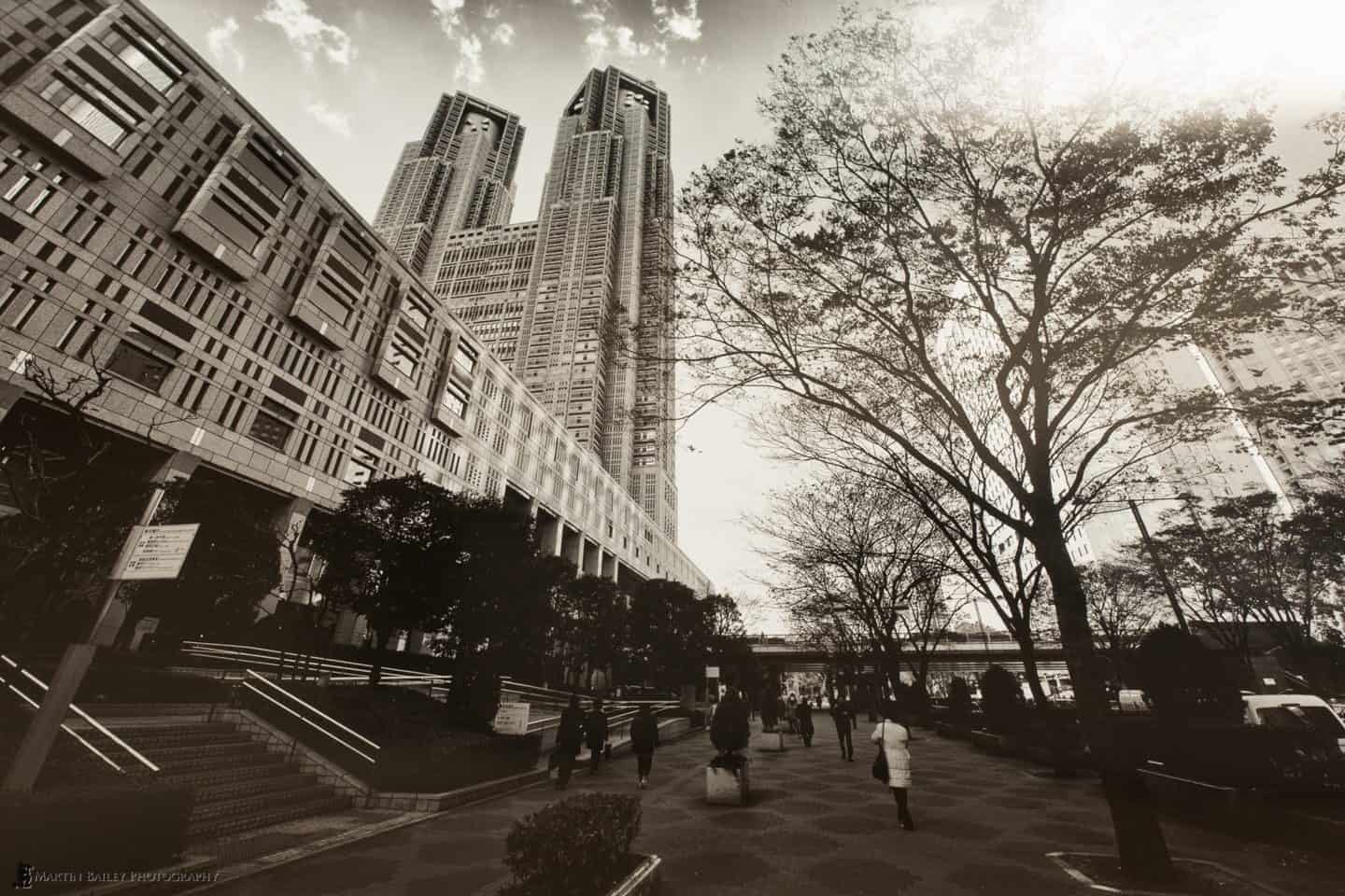
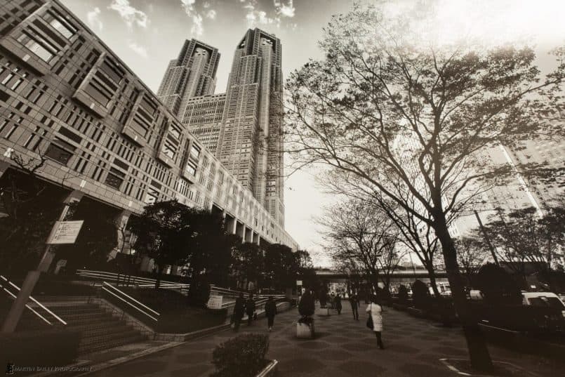
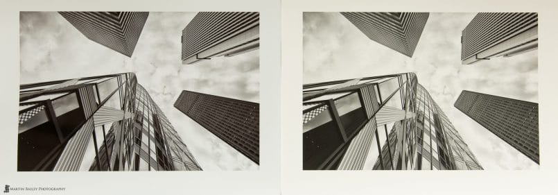
Here’s another black and white photo, this one of the Cocoon building in Shinjuku, Tokyo, that I printed on both Vibrance Metallic and Pura Smooth, the paper that we’ll look at next. Here you can easily see the slightly silver metallic look of Vibrance Metallic on the left, and the slightly yellow feel to the Pura Smooth. We’ll touch on that shortly, but I wanted to note that although this looks beautiful too on the Metallic paper, for this one, I kind of still gravitate to the matte version, so we definitely still need to match our images to our paper. This is how it should be though, and this is part of the fun and excitement of printing in my opinion.
I’ve posted this double print comparison in higher resolution than normal too, so open up your browser as wide as it will go and click on the image to dive into the detail a little more.
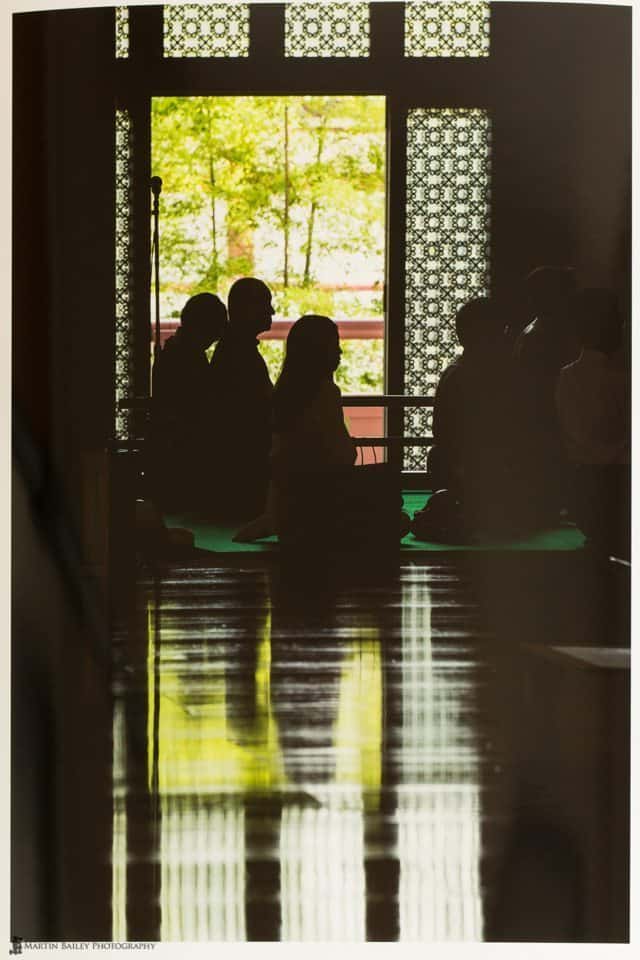
Black and white shots look great, but color images are simply beautiful on this paper too, especially ones with lots of dark patches or swaths of color. Here is a shot from the Zoujouji (temple) here in Tokyo, where some people were sitting for Houwa, a kind of buddhist sermon. I know this isn’t coming across totally in the photo, and I’ve purposefully left in some reflections from my studio, but this is probably my favorite of the images I’ve printed on Vibrance Metallic so far. As I hold the print in the window light of my studio, it’s almost as though I’m back looking through the side door at the temple again, as I was of course when I shot this. There are reflections in the image too, and I think that is a point to note when looking for images to print on metallic. Water, reflections, highly dynamic images, and I also believe HDR images will work very well on Vibrance Metallic.
It is of course available in sheets as well as rolls, and with our discount code, it really won’t break the bank to give this paper a try, and I reckon that’s the only way you’re really going to be able to fully appreciate this paper, to try it for yourself. When you look at the price of the rolls of Vibrance Metallic, you might initially think that it’s much more expensive than other roll media from Breathing Color, but do note that most rolls are 40′, whereas Vibrance Metallic is 100′ long, so you get one and a half times more paper for about a 25% higher price. It’s a steel really.
Pura Smooth
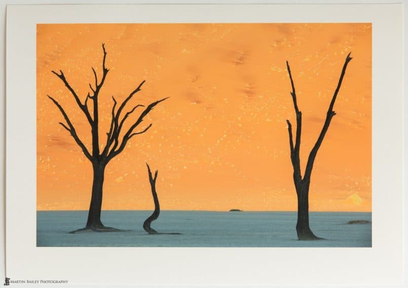
The second new paper I’ve just started using from Breathing Color is their new fine art matte paper, Pura Smooth. This is a simply beautiful paper, and as excited I am about the new metallic, matte paper is probably still going to be my favorite media. Although it lacks the punch that the high gloss metallic does, Pura Smooth is a subtle, almost sublime paper. Again, here’s a photo of a print, but it will be difficult to appreciate just how beautiful this paper is without holding it in your hand.
There used to be a time when matte papers were difficult to print on, with weak color and not very deep blacks, but those days are long gone. The color gamut of Pura Smooth is again off the chart. This was the case too with Optica One, my matte paper of choice from Breathing Color, but there is one major advantage that Pura Smooth has over Optica One, and that is that it is OBA free.
OBAs are Optical Brightening Agents, that absorb ultraviolet light that we can’t see, and emit blue/white light that makes the paper look a brighter white. This isn’t always a bad thing, and papers can still be archival certified, even if they use OBAs but they are considered to be unstable, and can break down over time, reducing the longevity of the prints, and therefore should be avoided if possible. There are other profiling concerns too, but I actually just wrote an article for a future issue of Craft & Visions PHOTOGRAPH digital magazine in which I go into more detail on all of this, so I won’t cover it here today.
Because Pura Smooth does not contain OBAs, this is part of the reason why it looks a little yellow, compared to the metallic paper, in the double black and white comparison shot that we looked at earlier. You really only notice this though, when the paper is held against a very bright white paper, or something more neutral, like Vibrance Metallic. Otherwise, the prints just have a beautiful, slightly warm tone to them, and wreak of quality.
I’ve always been very happy with Optica One, and because it is archival certified, I’ll use up my current stock before switching, but Pura Smooth is going to be my new go-to matte paper. It’s just beautiful, and OBA-Free. You can’t lose.
Crystalline Satin Canvas
The last of the tree media types that I want to talk about today is the new Breathing Color Canvas, Crystalline Satin. When I first heard about Crystalline, I was very excited, as this canvas does not need to be laminated. Although I have perfected my application of the Timeless Laminate for Breathing Color’s Lyve Canvas, it’s still extra work, and requires an extra day to let it fully dry. Crystalline canvas does not need that, and my tests show that there is no cracking along the edges of the canvas when you stretch it onto the stretcher bars, which is one of the main reasons you need to laminate.
Without lamination, the edges crack and the white canvas shows through, looking horrible. In addition to that, without Lamination, canvas is usually susceptible to dirt and scratches, and cannot be wiped down with a damp cloth if it does get a little dirty. Crystalline is water resistant to a degree though, and can be wiped with a damp cloth to remove excess dust, even without lamination. You probably still don’t want to go rubbing at the printed surface for very long, or I’m sure you’ll lift the ink, but being able to give a canvas a quick wipe down is pretty much a necessity. Remember you hang gallery wraps straight on the wall without a frame or glass to protect them, so the collection of dust and sometimes a bit of grime is a real issue.
Longevity
So, what’s the downside? Well, after I ordered my Crystalline canvas I found that it is not archival quality. I’m not sure if this information was just released or I just overlooked it initially, but Crystalline is only rated to 55 years before the print may start to deteriorate, and 75 years if you do apply a laminate. You can apply Timeless or Glamour II varnishes to Crystalline canvas, but it has to be applied with a HVLP Spray gun, which I don’t have or want to use. This was a bit of a blow, as the lack of necessity to laminate was the major attraction over Lyve Canvas, my current canvas of choice from Breathing Color.
The color gamut of Crystalline canvas is simply amazing. Very deep blacks and excellent color reproduction. It’s a pleasure to work with, but so is Lyve canvas. With the longevity in mind, I will continue to stock and use Lyve canvas for any and all work that I create for customers. I will use the Crystalline canvas I currently have for casual printing at home, because I’m not that concerned about the archival qualities of a home print, and the ease of use makes this canvas very attractive, but that will be the extent of my use. I really can’t put my name to anything that I’ll be sending to a customer, unless the formula is improved or a new canvas is released that doesn’t require lamination, but is still archival certified.
Requires Stapling
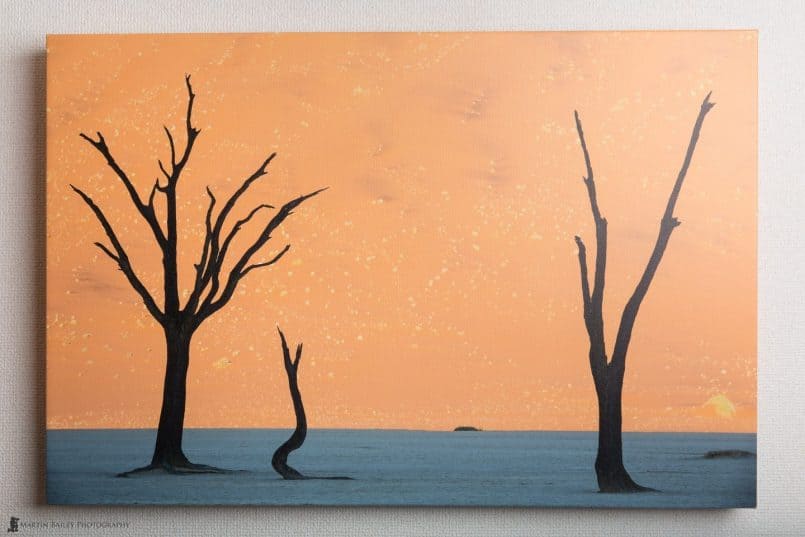
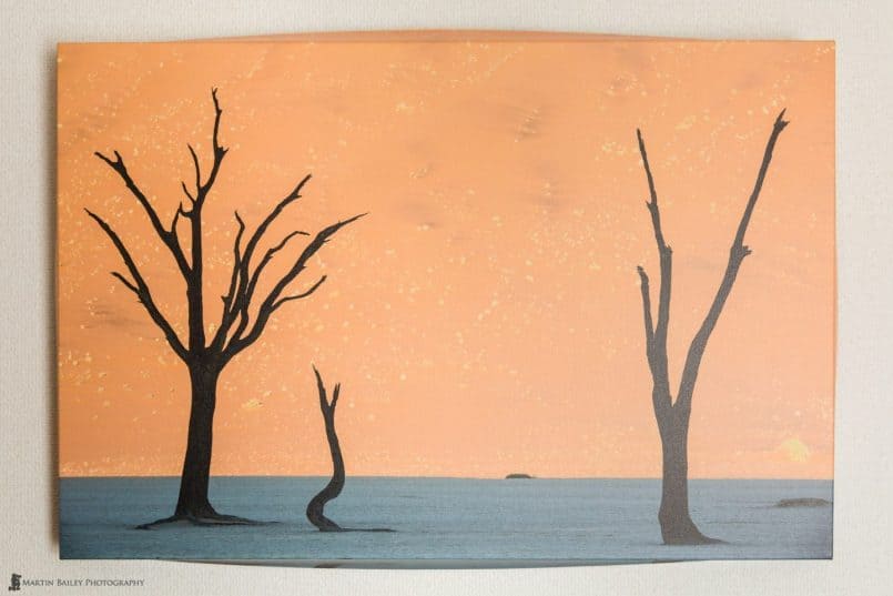
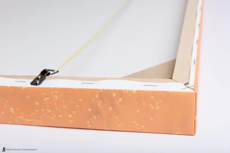
Another thing that you need to note about Crystalline is that you have to staple the edges to the back of the stretcher bars. I had actually intended to start doing this anyway, and had already bought a heavy duty staple gun, but I forgot to use this method when I put my first Crystalline canvas gallery wrap together. The result was that within 30 minutes of my hanging the gallery wrap on my studio wall, the edges came away from the adhesive tape on the stretcher bars as we can see here (below).
Needless to say, this doesn’t look good, although I noticed that Breathing Color do recommend that you apply a bead of their archival glue along the edges of the gallery wrap, or to use the staple method, to stop the edges of the canvas from lifting away from the stretcher bars. I’ve confirmed that using the glue is somewhat effective, but if you are going to use this canvas, I’d strongly recommend using the staple method, as you can see in this photo (below).
You normally want to leave a 1/2 inch of canvas to stable to the back of the stretcher bars, but as I made a 20×30″ gallery wrap with a 24″ roll printer, I have to cut it a little fine on the long edge, although it’s still enough to table the edge down with. Although I never had a problem with the edges of my old Lyve Canvas gallery wraps lifting, I actually prefer this method and will be using it going forward, so I’m not raising this as a demerit for Crystalline Canvas, but it is something that you’ll need to note if you give Crystalline a try for yourself.
Remember that Breathing Color don’t sell through camera stores etc. so if you do want to try any of their media, visit www.breathingcolor.com, and don’t forget that you can use the code MBP20 when you checkout, for a $20 discount on orders of $20 or more. This code is used to identify people that I recommend to Breathing Color, and you get a discount too, so please do use it. Note too that I only ever recommend products that I fully believe in, and as with today’s review, you will always get my honest opinion of any product I work with.
I hope this has been of some use though. I’m always excited when Breathing Color release something new, because they are continuously pushing the boundaries in inkjet media, and I even though the Crystalline canvas doesn’t hit it out of the park for me, this is still a huge step forward, as it Vibrance Metallic, and now having an OBA-Free fine art matte paper in Pura Smooth! I’m currently a very happy teddy.
Show Notes
Find Breathing Color’s amazing media at http://www.breathingcolor.com/
Music by UniqueTracks
Subscribe in iTunes for Enhanced Podcasts delivered automatically to your computer.
Download this Podcast in MP3 format (Audio Only).
Download this Podcast in Enhanced Podcast M4A format. This requires Apple iTunes or Quicktime to view/listen.


OK, this podcast bummed me out a little, Martin. I have $500 of Crystalline Gloss canvas sitting in my office. I just assumed it was archival. Doh! Still, 55 years isn’t too bad assuming that the estimate is accurate. The fine print says it will be 55 years before it begins to deteriorate (whatever that means).
All kidding aside, another good podcast. I’ll definitely be trying the metallic paper. And, BTW, you guys were hysterical on TWIP last week. : )
Sorry about that Tim. I was kind of bummed too, but it is still worth using for the ease of use, and as you say, it’s 55 years before it “starts” to degrade, which isn’t bad at all considering.
Thanks for listening to TWiP. I keep chuckling to myself about that 2.5″ episode towards the end. I knew that wasn’t going to go well as I started talking about it. 🙂
Don’t worry about the 2.5″ comment, Martin. All things considered, it’s just a pee…er, pea in the ocean. : )
Martin, I have also been very impressed with Vibrance Metallic, and have tended to prefer it for urban scenes, such as this one of Manhattan at dusk, which I felt looked great printed large on this paper: http://www.ianmylam.com/portfolio/G0000a0wmn68O5P8
Thanks for a great review.
Best wishes
Ian
Oh yes! I can see that would be a great shot on Vibrance Metallic. As I was saying, dark areas and large swaths of color. It matches perfectly. Great shot too of course.
It’s also nice to hear from someone that is already using VM. I love my matte paper (Pura Smooth now) but this is definitely going to be one of my chief consideration now as I consider what roll to feed into the printer.
Hi Martin,
RE: Breathing Color Vibrance Metallic
I see in the photo that the paper has a sheen, is the media surface a plastic or is it a coating on alphacellulose or cotton?
Also, can you comment on OBA nature of Breathing Color Vibrance Metallic and if there are any print permanence claims or figures surrounding this paper.
I do not see anything on BC’s site about the above items.
Thank you.
Hi again Chris,
I was just on the phone with Breathing Color, and asked about this. Apparently Vibrance Metallic is a coating on an RC based paper. It’s not alpha-cellulose or cotton based.
Hi Chris,
On your first question, I haven’t a clue. You’d need to ask Breathing Color about this.
Vibrance Metallic does contain a small amount of OBAs, but when I shine an ultraviolet “black” light onto it, it reflects very little bit. I haven’t seen any claims about the performance except the marketing you see on BCs Web site, but I can assure you that everything they say about this paper is an understatement. It’s better than anything that you can describe in words.
Again though, if you want more information than what I’ve provided here, please contact Breathing Color yourself. They are usually very good at answering questions, unless the information is proprietary or confidential for some reason.
Cheers,
Martin.
Thank you Martin for your quick reply.
What caught my interest is the statement about equivalency to slide film. I really miss the lightbox colors and impact.
That is interesting that they are attaining such apparent luminous quality without the use of a large quantity OBA.
Incidently, have you tried Epson’s Exhibition Fiber, I think you are on Canon so you might not have, but the color rendition from that paper is rather vivid and bright, however it does employ OBAs, I have seen a good tradeoff with Hahnemuhle Photo Rag Baryta which has no OBA but is still very vibrant. If you have tried either of these would interested to hear your opinion vs. Vibrance Metallic.
You’re welcome Chris.
Metallic really does look like your looking at a slide on a lightbox. The paper feels like plastic, and squeaks when you rub your finger against it, but I don’t know what it’s actually made of.
I haven’t tried Epson’s Exhibition Fiber, though I used to use Hahnemuhle’s Photo Rag Baryta. I now use Breathing Color’s Vibrance Rag in place of that. It isn’t OBA free, but it’s archival certified, and a beautiful paper to print on. They still just white gloss papers though. Metallic is different again. The depth and luminosity has to be seen to really appreciate.
Hi Martin,
I was able to contact BC about the paper, they indicate a standard print life of about 50 years, which they say is consistent with other RC papers.
Thank you for the further information.
Aah, I see you also contacted them. I was talking with their Sale VP just this morning (evening in the US) and got the same answer. Good stuff.
Has anyone order from Breathing Color and shipped internationally? This so far has been a laborious venture. Their sales cart wants to charge me triple for the paper & there is no email updates on the order. Not a great start.
Yes, Breathing Color have a ways to go on International ordering. They at least now take international addresses. That has only just been added. I actually just mail my orders in to them. They’re worth a little extra work, believe me.
Martin:
Thanks for this blog overall and for all your other writing, videos and podcasts. (So far, I’ve only read the podcast transcripts!). I have both your eBooks, as well. I’ve not done much printing, but based on comments from you and others, I’m going to dig into Breathing Color media. I have a couple trial rolls now, plus an EasyWrappe starter kit, and have just done my first few BC prints today. My question has to do with glossy papers, such as the Vibrance Metallic reviewed here, and how you deliver/display them. I’m very impressed by the first couple prints I’ve done on this paper, but I’m mindful of your concerns about putting glossy prints behind glass, yielding a second layer of reflectivity. The Silverada canvas, which is also metallic, and which I’ve also just used for the first time today, doesn’t have this issue, since it will be displayed as is (assuming that I don’t laminate it). It definitely looks great, as well. So, given your evident enthusiasm for Vibrance Metallic, can you share with us more background on how you intend to display/deliver prints done on that paper? I thank you in advance!
Mark
Hi Mark,
Thanks for picking up the ebooks and for stopping by!
Great timing on your comment about Silverada, as I’ve just started to look at that this week too. I’ve only printed the profiling patch sets so far, but that’s enough to show me that this is another incredible new media from Breathing Color. I’ll be providing a review here over the next few weeks.
As for how I deliver my Vibrance Metallic prints, I actually pretty much always ship them rolled, as the majority of my prints are shipped abroad, so it’s not practical to ship them framed. My suggestion though is to source some anti-reflective plexiglass or similar glass frames. For the few framed prints that I have sold domestically here in Japan, although not Vibrance Metallic, I have used anti-reflective plexiglass.
In addition to that, it’s important to hang framed prints in a place where there are not bright lights directly opposite, or in a position where light will reflect off of them when in your most likely viewing position. This is especially important with something Vibrance Metallic or other glossy media, because the surface is so reflective, although anti-reflective glass will help to reduce this to a degree.
I hope this helps some.
Cheers,
Martin.
Well, that was certainly quick, Martin. Thanks for the split-second turn-around!
The main focus of my question was how you expect Vibrance Metallic prints to be displayed, and your recommendation is: “behind anti-reflective glass or plexiglass”. Thanks for that answer, which is not unexpected. The further question it raises, however, is whether such a display is likely to seriously detract from the splendid vibrance (!) that prints on this paper seem to have, even to the point where the special benefits of the metallic character of this paper is substantially negated. I gather you’ve not done a lot with this paper yet beyond a few test prints, so it wouldn’t surprise me if I’ll need to wait for your upcoming review for detailed comments. I would, however, like to decide in the next few days whether to parlay my trial roll of the paper into a full roll, so any initial comments you can make would be appreciated.
Mark
I’m at the computer doing accounts, so I see the mail come in today. Other times it usually takes me a bit longer to reply. 🙂
I haven’t actually seen metallic behind any kind of glass so far, so I can’t say for sure, but I imagine if it’s going to be framed, anti-glare glass would be the way to go, but I find the best way to view Vibrance Metallic is with the print held in your hand. I’m sure you’ve already appreciated the fact that it looks incredible when held at certain angles, or even curved slightly. It will be difficult to reproduce this fully in a frame on the wall, but under those restrictions, I think the first thing to try would still be anti-glare glass. Another thing you might consider is something like the Pavox from Breathing Color. http://breathingcolor.com/action/bc_shop/206/
This is a great way to display and present paper prints without covering them. This does of course leave them open to sticky paw prints etc. so it may not be for everyone, but it’s something to consider. Again though, I’ve not actually used these myself, as most of my prints are shipped rolled, but I’ve long wanted to give them a try.
I’ve printed quite a lot on Vibrance Metallic, including a number of customers prints that have gone overseas, and don’t intend to revisit this for my upcoming review. It’s Silverada and the new Vibrance Baryta that I’ll be looking at specifically in the coming weeks.
Let me know how you get on with your decision about Vibrance Metallic display.
Thanks, Martin. I won’t assume such split-second response times for the future. 😉
My question was directly motivated by the challenge of translating the “look in the hand” for Vibrance Metallic into “look on the wall”. Pavox is certainly a possibility.
Thanks for clarifying that you’ve actually delivered quite a few Vibrance Metallic prints to customers. If any of them happen to be reading this blog, I’d welcome hearing how they chose to display those prints!
I eagerly await your review of Silverada and Vibrance Baryta. I noticed you were a fan of Vibrance Rag, but that seems to have gone away at BC, right?
Mark
Hi Mark,
Yes, Vibrance Rag has been replaced with Vibrance Baryta. It’s basically the same paper, expect for Baryta is now OBA free, plus, you can smell the baryta!
Cheers,
Martin.
Thanks, Martin. I look forward to your further comments on both those BC products!
Mark
Hi,
This is my first comment to you so thank you for all the information you share. I particularly enjoy your books, and Making the Print has been very helpful for my serious hobby. I did purchase Breathing Color samples and along with the ColorMunki you recommended, built profiles for the papers this past week.
As you noted, the metallic paper stands out among the papers I tried, especially for the black & white photo I printed. I am using a more basic printer (Canon Pro9000 mark ii) but the results were still impressive on many Breathing Color papers. I did find out that I cannot evaluate the matte papers because my printer does not have Matte Black, so the Photo Black I have cannot get dark enough. Hopefully I can remedy that someday with an improved printer. For now, I profiled and printed on Canon Fine Art Photo Rag so I do finally see what you are talking about when you point out the special look that a matte paper provides. From my analysis, it seems the matte papers draw the eye more “into” the print because the surface (through sheen/gloss, etc..) is not obvious. It is an interesting effect.
Thanks!
Thanks for taking the time to let me know Ron!
I’m pleased this has helped you to get deeper into your printing, and appreciate these papers.
The Pro9000 Mark II is actually a pretty good printer in my opinion. I’m not sure where you heard about the ink issue you mention, but as this printer is great for black and whites, personally, I would just steam ahead. If you are getting good results with the Photo Rag, which is basically a matte paper, then I wouldn’t be too concerned. Do note though that basic matte papers are in general not great with deep blacks anyway. When I talk about printing on matte, I’m generally talking about Optica One or now Pura Smooth.
All the best!
Martin.
Hi Martin,
I actually did have the problem with the blacks while testing Optica One and Pura Smooth, so perhaps a user error here – though the Canon photo rag did not exhibit this same problem. Since my post, I did buy a Canon Pro9500 mark ii which does have matte black and has a dedicated gray color. I have heard good comments about it’s black & white capability, too. For now, I still have some Breathing Color samples I have saved to test out on the 9500, but I did order some Photo Rag and also just sent BC an order for a supply of Vibrance Metallic. That paper looks wonderful when printed by my dye-based Pro9000. It will be interesting to observe the difference when the pigment-based Pro9500 arrives.
For the Vibrance Metallic paper, I intend to display it without glass.
Thanks for your reply!
Ron
Thanks for the update Ron.
I’m surprised that you had problems with the 9000 for black and white, as I seem to recall Canon saying that this was a great black and white printer, but I might be wrong.
Good luck with your 9500 though. I used the 9500 for many years. Great printer!
Cheers,
Martin.