Today we take a look at the five winning images from the April 2012 MBP Assignment, on the theme of “Interesting Plainness”. Turnout for this assignment was up again, which is great! Thanks to all of you that got involved and uploaded your images, and even if you didn’t upload an image, I hope you learned something in the process.
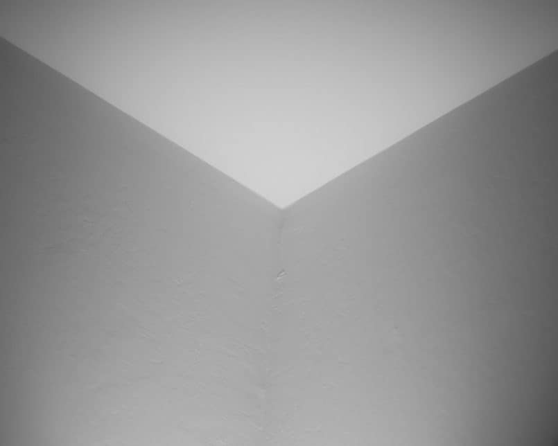
So, let’s jump right in and take a look at the incredible winning images for the Interesting Plainness assignment, starting with the fifth place winner, Jack Andrys, with “Cube”, and here’s Jack’s back-story…
Thank you for your votes, to have achieved 5th place was a total surprise for me and my congratulations to all the other place holders who obviously did better than myself. I had made a personal commitment to enter every monthly assignment this year and as the assignment deadlines come around I am reminded how short a month is nowadays. I was sitting at my desk looking at the images I had taken during the month with the assignment theme in mind, and I found myself rejecting all of them.
I had taken some shots of my three year old daughter’s doll house with a pinhole homemade lens but they just weren’t working for me. I did however learn that when making a pinhole lens you really need to make a very small pinhole for the image to work on a DSLR. I was trying to take an inside room shot with plain walls and furniture of the doll house yet having it interesting because of the pinhole effect and the miniaturization of the doll house; my daughter thought it was great to be playing together.
As to my image “Cube” with only an hour to go before the deadline for submissions I handheld the camera and captured the image which is of the room ceiling corner above my desk. My lighting was a desk lamp pointed up into the corner. The wide open aperture of 1.4 helped with taking the shot in poor light, but also helped with the use of a short depth of field to add confusion to the image. I then cropped and adjusted the image in Lightroom trying to make the image look as much as possible an outside corner.
Jack, I have to admit, that until I read your back-story, I really thought this was an outside corner of a cube. I think the element of confusion that you so masterfully added with the shallow depth-of-field here makes this work so well. We associate shallow depth-of-field with very small macro type images, which is of course why TS/E lenses also make us feel as though we’re looking at a diorama, or miniature model of a scene, rather than the scene itself.
It’s also an exercise in lighting, as the ceiling being brighter than the walls also makes us feel as though the cube is being lit from the top, with less light hitting the front two sides. I imagine this was probably more of a happy accident than something you calculated, although if it was calculated that would be even more remarkable. Still, kudos to you Jack for seeing this and working the crop etc. to accentuate the affect, and thanks for continuing your commitment to post a photo to each month’s assignment this year. I totally understand how these months fly by, and you are a busy man, so you really are a model MBP community citizen. Thanks so much.
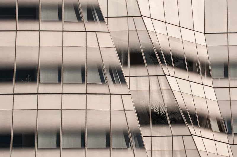
In fourth place is Donald McGuire with “Linear”, and here’s Don’s back-story…
The High Line is a New York City linear park built on a 1.45-mile section of the former elevated New York Central Railroad spur called the West Side Line which runs along the lower west side of Manhattan. It has been redesigned and planted as an aerial greenway, opening in 2009 . The rail line originally opened in 1934. The last trains operated in 1980 and it ultimately fell into decay until restoration started in 2006. Many cities have undertaken such rails to trails conversions. What is unique about this one, and especially significant for photography, is that is elevated. This provides a unique perspective of the many buildings and streets along the route.
On the morning of the 29th a group of us taking a local creative photography class met to see what we could make of the setting. I found this vantage point provided a perspective of the architecture that is not available from street level. The IAC (InterActive Corp) Building completed in 2007 is especially eye-catching with dominant lines, form and subtle changes in shading that really lent itself to this assignment. When viewed in its entirety the building resembles a bee-hive and is highly regarded in architectural circles. While I felt a full view of the structure was actually a more compelling photograph, I thought a tighter shot was more effective for this particular assignment, at a focal length of 105mm using a Nikon D300s.
As always thanks to the MBP community for the sustained collaborative and supportive environment. Of course, thanks to Martin for pushing us all forward since 2005, sharing his journey and enriching ours. For this assignment however I would like to also say thanks for ‘pulling me back’. It is so easy to be enamored of all the post-processing tools available to us in trying to make the plain look extraordinary that for me, this month, it was back to basics. Simply pressing the shutter hoping the plain could be made to look interesting.
Well, you are very welcome Don, on both counts. Although we have our friend Landon Michaelson to thank for the theme, I totally understand that simplicity and plainness is not as easy as one might think. You did an incredibly good job of it with your photograph “Linear” though. I am in awe of the tones in this image, and the lines are amazing. The gradation above and below each window looks so good it could have almost have been done in Photoshop anyway, but the fact that this is straight out of the camera is a tribute to the location, the perspective, and of course, your eye for the composition and ability to create the image. I love it. Thanks for getting involved Don and congratulations on fourth place.
Moving along, in third place is Elise Ange with “Emergence”, and here’s Elise’s back-story…
First, Congratulation to Wythe on his win with such an amazing image and to the others who placed. Thank you to all who voted for my entry.
This year, my project was to experience Spring. Too many years have gone by where work has consumed my time and I missed the wonderful colors that emerge with the season. I was at a local arboretum early one cloudy morning after some overnight rain when the light was just perfect. The red tulips were in one of the garden beds. This swirling petal of the opening bud made a simple tulip more interesting than the more common tulips that I normally see. Although I took many photos, this one fit the theme the best.
I made a small adjustment to the white balance and added some lens vignetting in Adobe Camera Raw to tone down the brightness of some unopened buds in the background. I made some other minor adjustment to increase the contrast and color. Thanks again, Martin, for another challenging theme.
Very well spotted Elise. I agree, that petal around the tulip adds a wonderful element of interest. The lines in the whole image are beautiful, and your post processing is very subtle, to the point that I’d never have guessed what you’d done, which should pretty much always be the case of course, but you’ve done it so well here. Excellent work as usual. Congratulations on third place Elise.
And in second place is Jason Dolbier with”egg”, and here’s Jason’s back-story…
Wow, thanks for the votes and congratulations to all the winners!! Thanks Martin for the great assignment, it was a challenge. I focused on the plainness part of the assignment first. I wanted to go as plain as I could. So i decided to play with white on white. After a thinking about it for a while I decide to go with an egg and a white background.
I used the 580 canon flash to separate the egg from the background with the egg’s shadow just outlining the top and left side of the egg. My goal was to make the shadow the interesting part of the photo. Once I got the shot I took it in to Silver Efex to convert the image to B/W then back to Lightroom to add a square crop to the image. I felt that this type of crop gave the final image a little more interest. Thanks again.
I totally agree Jason, I absolutely love this image! This is one of those images that makes me want to say that the only thing I don’t like about this image, is that I didn’t take it. It’s simply beautiful, and so simple, yet very effective. Kind of like Jack’s image that we looked at earlier, when I first looked at the thumbnail for this image, I thought it was a hole in something white, being lit from the front. I was amazed to see that it was an egg when I viewed the image full size.
The exposure and the lighting is perfect, and the tight crop, leaving very little of the shadow to the left, and removing the bottom and right side of the egg help to deepen the optical illusion you’ve created, as well as accentuate the curve of the top edge, down to the left side. Masterful work Jason! Thanks for getting involved, and congratulations on placing second.
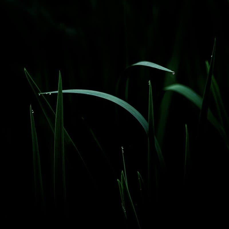
And in first place is Wythe Whiting with “Snakes in grass”, and here’s Wythe’s back-story…
First off, thanks for everyone who voted for my image. This is my first first-place finish in a challenge since I joined the MBP forums 4 years ago. At that time, I remember being struck with how friendly, helpful, and encouraging people were here. We are lucky that we have such an oasis on the web — I’ve never run across a single other community like it, and I must give credit to the people here for my growth as a photographer.
As for my image backstory, I had decided to go out shooting one morning at our local woodland gardens. Though there were many flowers in bloom, I remembered being frustrated because I just couldn’t find an interesting subject to shoot. The flowers just weren’t holding my attention, and I remember actually being bored taking pictures of them. Do you ever get that feeling where you’re taking pictures, but you know that nothing’s really working? That was my morning.
I had finally wound my way to the end of the property where there was a pond with many grass reeds along the edge. I’ve walked past these on many occasions and would never think once about photographing them. But this morning, each reed had a single water droplet on the tip of the blade as if it had been squeezed out. I created a number of macro images of single blades, but the image I entered was the last shot I took that morning.
I was drawn to the two blades that had wilted over, and liked how they leaned in opposing directions. The light was already fairly low being in a heavily shaded area, but there was enough light reflected from the sky to highlight the tops of these two reeds and provide some good contrast.
I tried a number of things in post processing, but ended up settling on this low key version where the exposure was pulled down one stop. I also adjusted the black point and contrast to draw attention to blades in the foreground and to push the background in to black. In the end there’s a nice interplay of forms between the sharp vertical blades and the lazier curved blades, which to me resembled snakes.
Thanks again for a wonderful assignment. I haven’t had a lot of time for photography, but these assignments give me an excuse to get out shooting.
I’m pleased that the assignments get you out shooting Wythe, and I am very happy that you’ve enjoyed the time that you’ve spent with the MBP community. I totally agree that this remains the best community on the Web, with none of the petty bickering that you see so much of. I too am very happy to be a part of it.
Almost the opposite to Jack and Jason’s white images, you chose to go the other way, and darken it down, and this too works very well. Some people don’t like to see total blacks in photos, but I do this a lot myself. It think it works very well. It was great that you spotted those droplets, that surely do make the shot, as well as the lines, as you say, both verticals and the curves. It all comes together very well indeed. Congratulations on first place Wythe, and thanks for continuing to get involved.
Thank all five winners again for taking the time to get involved, and to post your back-stories to share with us all. Thanks also to everyone that got involved in the assignment. Whether you placed or not, I do hope you learned something by getting involved and giving this a try.
Show Notes
Music by UniqueTracks
Subscribe in iTunes for Enhanced Podcasts delivered automatically to your computer.
Download this Podcast in MP3 format (Audio Only).
Download this Podcast in Enhanced Podcast M4A format. This requires Apple iTunes or Quicktime to view/listen.




Those windows are taking me in. Great image.