Today we take a look at the five winning images from the March 2012 MBP Assignment, on the theme of “Food”. Turnout for this assignment wasn’t great, which I guess proves what we already knew, that food photography isn’t as easy as you might think! Thanks to all of you that did get involved and uploaded your images, and even if you didn’t upload an image, I hope you learned something in the process.
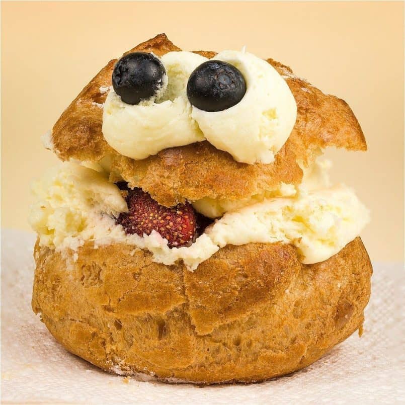
So, let’s jump right in and take a look at the incredible winning images for the Food Assignment, and in fifth place, is Morton Goldberg with More Cookie Than Monster, and here’s Morton’s back-story.
March was a busy month and when the 31st came, I had not even made a start on the month’s assignment. If I was going to participate, I would have to do something simple — there was too little time remaining to do anything elaborate. That certainly meant that I wasn’t going to do any fancy food preparation of my own. I decided that baked goods were my best bet. There are bakeries in my area that produce luscious looking treats.
I visited the bakery in a local Whole Foods Market. It was near enough to Easter that they had a selection of pastries shaped as bunnies and baby chicks, but I was attracted to a tray of puff pastries decorated to look like muppet monster heads. I thought them amusing without being too kitschy.
I bought two. I was afraid, although each was carefully packaged in its own little box, there might be damage on the way home. Puffs are very delicate. I was right to be worried. Despite my trying to be careful, only one made it home in good enough condition to be photographed.
I used my trusty tabletop Lowel EGO light set-up to light the puff. This consists of two 16-inch square daylight fluorescent softboxes. This is an excellent kit for food photography. Actually, I think it was designed by Lowel with food photography in mind as its main application.
A confession: despite what my caption says, the subject is not really a cream puff, but a custard puff. I didn’t know that when I wrote the caption. I only found out later when I ate the puff.
I’m very pleased to have placed fifth with my rather hastily produced photo. My compliments to all those who placed above me for their excellent work. Also, I thank Martin for providing this assignment and for keeping them going. I know, Martin, you have heard this many many times, but it still bears repeating.
Well, thank you for participating, and especially this month Morton, as your photograph brings a broad smile to my face every time I look at it. You may not have made this yourself, but it’s a great find, and you lit it very well indeed. I think the light brown background matches the subject very well too, and even the fact that your little monsters right eye has been pushed half way out of its socket, adds an additional touch of humor to the subject. I really do like this one, congratulations on placing Morton.
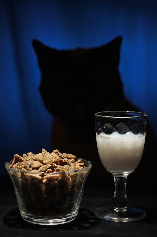
Next up, in fourth place is Greg Anderson, with A Fancy Feast, and here’s Greg’s back-story.
First off, a big thank you to everyone who thought that my photo was good enough to vote for. I’m surprised that my first entry made it into the top 5!
I had been planning to pick a “theme of the month” contest to try and keep myself shooting, and since Martin’s podcast is one of my favorites, this seemed to be the natural place. By the time the holidays calmed down and I re-combobulated myself, it was March, and theme was food. Oh no! I barely have any culinary skills to make food, much less an eye to photograph it. But after a bit of thinking, I decided that since there was no stipulation that it had to be people food, I would try a different take on the topic.
Originally I thought I might have a scene with some cat food in the front (like it turned out) but have the feline face be visible, perhaps with some lip smacking going on, or some other appropriately catlike facial expression. But I quickly scratched that, knowing that it would be hard enough getting one of my cats to sit in the right place, never mind getting one of them to take posing directions. So I decided that a backlit, silhouetted cat with more direct lighting emphasis on the food was the way to go.
Setup was pretty basic: I put one gridded speedlite above the food, and one bare flash behind the cat’s seat on the floor, pointed at the blue background. It turned out to be easier than I thought to get a cat to sit by the small table I had set up, and about as easy as I thought to get said cat to sit in about the right pose. What I hadn’t counted on was tails: After my first round of shots, I found that over half of them had the backlight flash obscured partly by a swishing cat tail, since the flash was positioned right where the cat’s tail hung over the seat.
Disappointed with the results, I let it sit for a week or two. Even though I put the food away, I found that I almost always had cat sitting or sleeping on the seat, and they always had an expectant look on their face when I came into the room. The liberal use of cat treats during the previous session had made an impression, I guess!
When I finally came back to it, I had decided to add the glass of milk to the scene because having just the bowl of food and the cat in the scene wasn’t creating the right balance. Also, my backlight problems had been solved by the addition of another grid that I received from my wife for my birthday during the two weeks of downtime. Now I could position the background flash further to the side, and shape the light more.
I of course had a willing subject, and in return for three for four cat treats I managed to get the image that I entered in about 5 minutes of shooting. Post production in Aperture involved a slight amount of burning to some of the topmost pieces of cat food, as they were a bit too hot compared to the rest of the food. I also brushed in some desaturation on the milk to make it look more white, as opposed to the yellowish-white that milk tends to come out as in pictures.
Thanks go to Goomba, the cat in the picture, and Martin for everything that he does for the community. And again, thanks to everyone who voted for my picture. And of course, congratulations to Colin Michaelis for taking first place!
Well, you’re very welcome Greg, and thank you for participating, and for the great back-story. I think the key to your success with this image is that you allowed yourself enough time to revisit the assignment after a few weeks, and there’s a lesson to be learned for all of us here. Some months, it just isn’t possible to start shooting early enough, and having the pressure to come up with something on the last day, as Morton did, will certainly help sometimes, but here, I think the fine tuning of the lighting, and thinking of adding the glass of milk really made this shot. Without the milk, the feeling of the cat sitting down to a gourmet dinner would have been lost. Also, thanks for the tip on desaturating the milk a little. I’m sure that’s something we can all put to use too. Congratulations on placing, and I’m looking forward to your future shots as well.
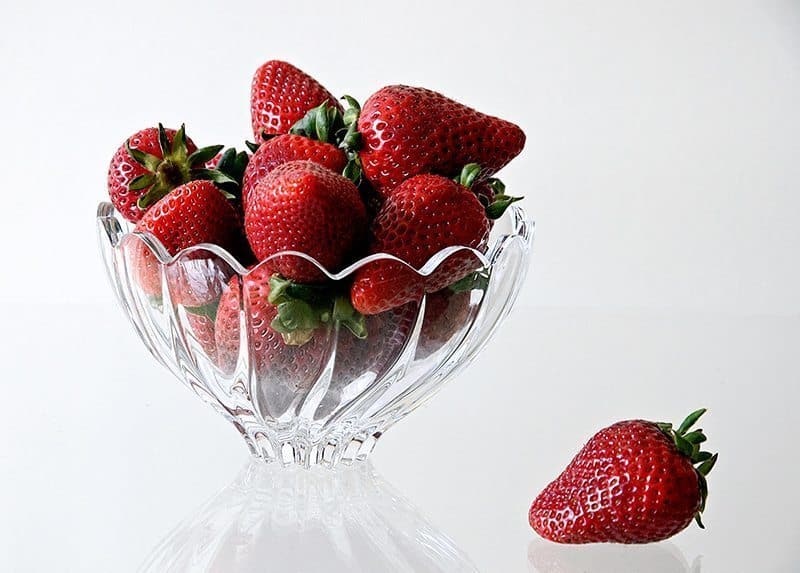
Moving on to third place, and we have Elise Ange’s back-story for “S” is for Strawberry.
Congratulations to Colin for the win and to all who placed! Thanks to everyone who voted for mine.
I had decided that what I chose as subject matter for “Food” would not be cooked. Strawberries were featured in the weekly shopping circular and they looked mouth-watering. I arrived when the store opened for the biggest selection. I spent a lot of time looking through the strawberry packages to find ones which were all red.The setup was not easy and I tried different glass containers, some with dry fruit, some with the fruit in water. I had a difficult time with the lighting. The first batch of strawberries did not yield any photos worthy of submission. Fortunately the next week, strawberries were still plentiful in the store and I bought a second batch.
I had done a bit of reading about food photography and decided to try natural lighting. I found a fancy bowl that I had received as a gift a long time ago and never used. However, I found that the natural lighting coming in the window still needed to be supplemented because it was stronger on one side of the subject than the other. I did some minor adjustments in Photoshop and cropped the image a bit. Martin’s themes present a challenge to me each month, but I learn something worthwhile with each of them.
What a beautiful way to have captured these strawberries Elise. Here simplicity is key, and the bright red strawberries against the white, and transparent bowl work very well, especially with that beautiful soft lighting.
I’m really pleased that the assignment helps you to continue to learn, as it does for all of us I think. Again, going the extra mile, and getting up early for the first batch, then going back to the store for a second batch of strawberries really contributes to the quality of your work, I’m sure. Congratulations on placing Elise, and thanks for continuing to get involved.
Next up, in second place is Graham Aylard with “Stawberry”, and here’s Graham’s back-story.
Thank-you for your votes and placing my image second. Here is the back story of the image ‘Strawberry’
Back in January I wanted to take my photography to a new direction. Studio photography. Inspired by one of the modern greats – Rankin. Although he operates with much more expensive equipment, staff and costly resources, personality of his subjects always shines through – a key element to his style of photography. I wanted to capture personality of people too. I’ve been doing landscape photography for some time, studios was something that I haven’t really done before. It was time to plunge into the deep end and tackle studios.
I booked Lux studio near my home town in Maidstone for my first lighting lesson. Few weeks later, I booked model Kate for my first ever shoot. I opted for a professional model instead of friends or family as I knew a model would be comfortable in front of the camera. Plus I wouldn’t have to worry too much on directing the model. It went very well, capturing with some lovely fashion images. I learnt so much about lighting and portraiture that I wanted to give it another go. Roll on a month later – I’d booked another session at Lux and hired semi-pro model Kandice.
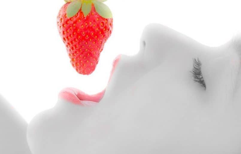
With the theme of food, I knew that a single item of food being eaten by Kandice would work well. I asked Kandice to pose using a cherry as the food prop. However it turns out that Kandice likes cherries as she kept on eating them after I took only a few shots each time. I also wanted to try a strawberry, so when Kandice finished off all the cherries, I got the strawberries out. I tried head on shots at first but I wasn’t happy with the results. The side on pose with the model holding the strawberry slightly away from the lips seemed to work better for me. It also prevented Kandice eating all the strawberries!
Lighting in the studio was provided by four Bowens units, two Bowens 250 pointing at the white vinyl backdrop insuring a pure white background, and two slightly more powerful Bowens 500R for the key and fill lighting. Both of these fitted with a soft boxes. Captured on my new Nikon D7000
Post processing was done using Lightroom 3. During my efforts to process the studio shoot my iMac slowly died. Re-installing the OS didn’t help. But a torx screwdriver – size 8, Sat Nav windscreen holder and a new hard drive proved to be the answer. I had to pull the screen off and replace the hard drive which is located right behind the LCD screen. Pulling the screen off an iMac is certainly not for the faint hearted. Reinstalled the OS and Lightroom and all is well. Thankfully I have a reasonable backup workflow so I lost none of my images.
Back with a working computer I took the image and tilted it about 40 degrees for a more pleasing composition. I softened the models skin using the selective brush tool and sharpened the lips, increased the contrast, brightness and vibrance. Using the selective brush tool again, I removed the colour in the skin leaving the strawberry and lips in colour.
I was pleased with the result and I am chuffed to bits for the votes – thank you. But my biggest critique is my partner, and she liked it too. So much so that my partner wants it framed and displayed in the kitchen of our new home when we move in together soon.
Other images of Kandice, including the colour version, the cherry images and my first studio shoot can be found on my website, http://www.grahamaylard.com.
I would like to add a thank-you to Martin for putting these assignments together. It has really made me think about my photography in ways I thought was not possible. And for the fact that each image is at first, anonymous which means we are all voting on the merit of the image and not the photographer or even the kit used. That’s really important to me, no matter how many votes I get! Thank you to MBP members for all the votes and thanks to Kandice, who posed for the image and ate all my cherries! I would also like to add a big thanks to my family for all their support, I would be taking a lot less photos if it wasn’t for the encouragement from my partner Sue.
And lastly congrats to Colin, for the winning image. A worthy winner.
Thanks for yet another great back-story Graham, and you are very welcome for the assignments. Again, I’m really pleased that they help. You are certainly doing well with your studio work. This image is simply beautiful. I checked out the color version on your Web site, as well as some of your other work. I really like what you are doing, in all of your chosen genres. Great stuff!
I find it interesting that both you and Elise ended up with vivid red strawberries and mainly white for the rest of your images. This really works well, simplifying the image overall, yet accentuating the reds. Very nicely done indeed. Congratulations on second place.
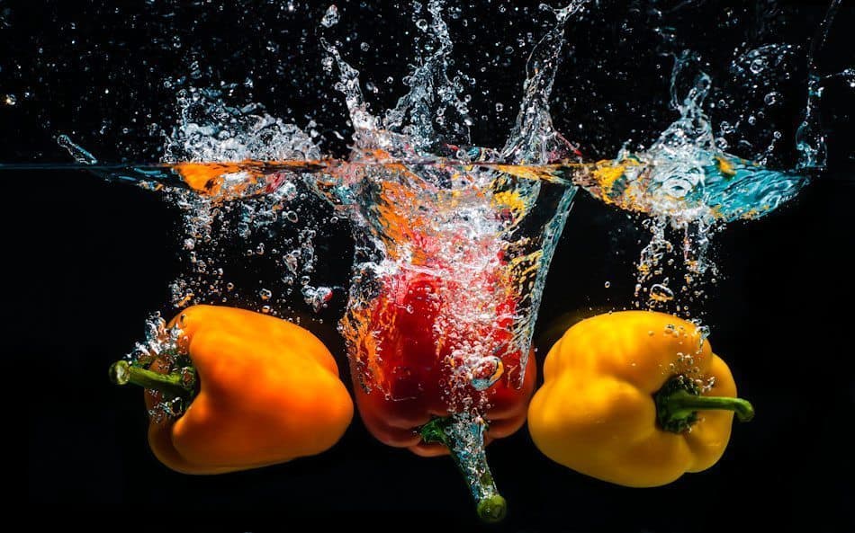
And in first place, as many have already mentioned, is Colin Michaelis, with A Splash of Color, and here’s Colin’s back-story.
Wow! What an honour it is to place alongside this great group of submissions for the “Food” assignment. Such creativity was shown by everyone. It is amazing the different perspectives we all bring to a topic.
When I saw the assignment for March was “Food”, my first reactions were – what on earth could I possibly do that will be worthwhile, and this is not something I know how to do. My next thought, however, was that this is exactly the reason why I have challenged myself to participate in the MBP assignment – so that I will tackle things that are not part of my normal routine, broaden my horizons and learn from the creative ideas of the other participants.
After a day or two of pondering the assignment, I decided on a concept. We have all seen pictures of food (often berries or fruit) splashing into water and so it is a little bit of a cliché image. However, I have the view that if I have never done it, then it is not a cliché for me yet. So I did some research into how other people had done similar assignments and made an investment in a $13 fish tank.
Setup involved placing the aquarium, about 2/3 full, in front of a black poster board. My two SB-28 strobes (covered in clear plastic to keep them dry) were on stands, one angled down into the tank from above and the other from the front through the glass at a 45 degree angle. The flashes were set to 1/32 power, and this was how I planned to freeze the action. I placed my camera, a Nikon D90, with my 50mm f/1.8 lens on my tripod facing straight on to the tank.
With the three peppers balanced on a plate about 12” above the water, I dropped them and pressed the shutter release cable with my other hand a split second later. From the first try, my timing was pretty good, but I found the first 3-4 shots all had a bit of reflection in the front glass. I removed the front speedlight, which solved the reflected light problem, but I was not getting quite enough light. I did not want to increase my flash power so I mounted the second strobe like the first but from the other side of the tank. This got me the look I wanted. It probably took about another ½ dozen tries to get the timing just right.
I found that two essential pieces of equipment were a squeegee and paper towels. After each attempt, it was essential to wipe the tank dry with the squeegee and then completely remove any remaining water spots with the paper towels. Even after doing this I needed to touch up a couple of water marks with the healing tool in Lightroom 4 and dodge a couple of places where there was a little reflection on the glass. I boosted the vibrance a little, although the colour of the peppers was already pretty good.
I had a lot of fun planning this assignment and I had a blast actually making the photograph. To get the results I did exceeded my own expectations and it is very encouraging to me to that I was able to learn something new. And as a bonus, I managed to keep camera and strobes dry, so they will still be working for next month’s assignment.
Martin, I thoroughly enjoy your podcasts which I listen to regularly. I learn a lot from them. And now that I am participating in the monthly assignment (this is my second entry) I am forcing myself to learn through making photographs that expand my comfort zone. So thank you Martin for providing this great forum.
You’re very welcome Colin, and thanks to you too for getting involved, and for yet another excellent back-story, and what an brilliant tutorial on how to shoot this kind of image! Your investigation beforehand, and the a little trial and error with the positioning of the lights really paid off. You totally nailed this, creating a professional looking image, and capturing the freshness and appeal of the food too. Very well done indeed, and congratulations on a well earned first place.
I’d like to quickly thank all five winners again for taking the time to write out your back-stories to share with us all. I often fail to mention this, but it adds so much to the assignment, and is key to enabling me to bring this episode to the community each month, really building on the experience that many of us put so much into. Thanks also to everyone that got involved in the assignment. Whether you placed or not, I’m sure you all learned something by getting involved and giving this a try.
Flattr & Paypal Donations
Before we finish today, I’d like to mention that I’ve recently placed Flattr buttons on the blog and Podcast pages, to make it easier for people to help with the upkeep of the Podcast. I don’t mention this very often, probably only two or three times in almost seven years of creating this Podcast, but it does take considerable time each week to keep this up, not to mention the cost of the servers etc.
I get a lot back from this community of course, and that’s one reason why I don’t push this, but people have recently been asking more and more how they can help, so I thought it might be worth mentioning again. Note that in addition to Flattr, the new microdonations service that I think is going to become almost a standard way to pay content creators very soon, I have left the Paypal donation buttons in place, on the right side of each page, so if you want to show your appreciation, a donation using either Flattr or Paypal would be very much appreciated.
I’ve also placed Google +1 buttons on most pages around our Web site too, so you can also help by clicking these +1 buttons to let Google know that what I do here is appreciated, or maybe you could write a review for the Podcast in the iTunes Store. Anything that you can do is very much appreciated.
Show Notes
Music by UniqueTracks
Subscribe in iTunes for Enhanced Podcasts delivered automatically to your computer.
Download this Podcast in MP3 format (Audio Only).
Download this Podcast in Enhanced Podcast M4A format. This requires Apple iTunes or Quicktime to view/listen.


0 Comments