Today we’re going to take a look at the winning images from the September 2010 MBP and WebSpy Photography Assignment, which was on the theme of Change.
We had some interesting voting results for the September Assignment on the theme of Change. Although I didn’t notice until it was pointed out to me, there was a clear winner, with more than double the votes of the rest of the group, but then we had a joint second, a fourth place, and then a joint fifth. This means that after the runaway first place, the voting was very close indeed. It was a difficult assignment to vote for again, so this wasn’t such a surprise.
Anyway, let’s take a look at the back-stories from the winners, in reverse order as usual.
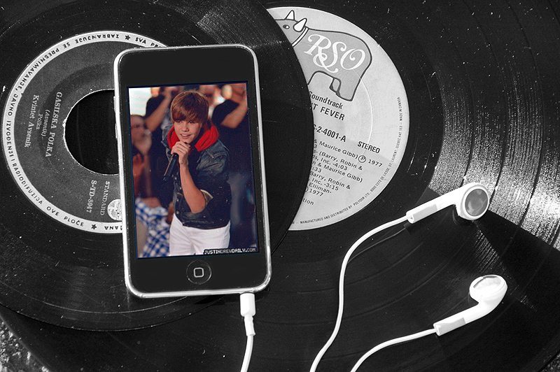
In joint fifth, we have Amanda, who turns out to be Dave Newcomb’s daughter, and Amanda is just about to turn 14 years of age, so it’s great to have such a young member of the community be placed in the Assignment. It’s not such a surprise that Amanda is so talented though, with Dave Newcomb as a Dad, and Dan Newcomb as an uncle. Dan has been winning the assignments for some time now, and as Dan left for his tour around Alaska a few months ago, he grafted his twin brother Dave into the community, and Dave has quickly started to attract your votes in Dan’s place. Now Amanda is on board, so we’d all better up our game here, before the Newcomb’s take all the votes each month. Actually it’s a good job we now vote for the top five images and not the top three as we did until this summer, or they really could have taken all three top places.
Welcome to the community though Amanda and I hope you understand that I’m saying all of this in fun. It’s great to have you join in, and I’m looking forward to seeing more of your great photos in the future too. Here’s Amanda’s back-story for “Skipping Generations”.
I was in the car with my dad (Shutter) and was listening to the radio, and I was thinking I know that song and how it’s on my iPod. It inspired me to take a picture of a vinyl record and an iPod representing old changing to new. Luckily I had my iPod with me at the time, and my dad and I went over to a second hand store and bought a few old records. We went in the parking lot and took the pictures as the sun was going down. My dad is still teaching me photography and helped me process the image. Thanks again for all the votes and good luck this month! I still don’t know what to take a picture of!
So, Amanda, I think the idea of representing old and new like this is incredibly cool. It’s great that you went to the trouble to buy the old records, which makes the back-story so much more interesting. You don’t even have any old records to shoot the image that you had envisioned. I don’t either. I left all of my old vinyl records back in the UK when I moved to Japan almost twenty years ago, and I haven’t owned a record deck since. In fact, when I moved to a new house in July this year, I don’t even have a CD player. My stereo now just accepts a Bluetooth connection from my iPhone or iPad, and I play all of my music from there, or my computer. For the few physical CDs that I buy I use them as the media to get the music home, and rip it to my computer, and never actually play the music directly from the CD.
Times are certainly changing and your photo makes me think of all of this so well. I like the way you chose such a young artist to show on the iPod screen too. This emphasizes the old and new theme even more, and in turn, represents change so accurately. I like the dust that you left on the records too, and the fact that you can see a little bit of tarmac to the bottom left shows us that these records are as good as thrown-out to the trash too. All very nice additions to a well thought out and executed photograph. Congratulations on joint fifth place Amanda, and thanks for pointing out that you actually shared your fifth place with Brian Lottis, or Brazilnuts in the forum.
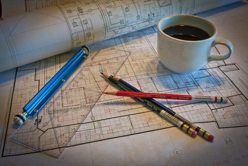
Here’s Brian’s back-story too, for his joint fifth place image “Redlines”.
My original idea was to use the coin theme. But after a couple other people posted that same idea here in the forum, I decided to try and find something different. I was struggling to come up with an idea until the weekend before the deadline.
We’re in the middle of a large project here at work and I had to bring some work home over the weekend. Part of my job is to “redline” HVAC drawings, which means make changes to the drawings so the drafter can then modify the cad files on the computer. As I was working that Saturday morning, I realized I was making changes to the design and that this would fit in to the assignment. So I decided to set up this still life.
I have no special lighting equipment, not even a decent speedlite (budget constraints 🙁 ). So I had to make do with the overhead light and the window. I arranged my pencils, ruler and paper rolls on the table next to the window and decided a coffee mug would add a nice touch. After three tries to get a shallow enough one where the coffee would actually be visible, I got what I wanted. I then tried microwaving the coffee (yuck) to get some steam, but I wasn’t able to capture it in the image. I’m guessing it was due to the angle of the light. Maybe next time.
The only thing I did then in Lightroom was adjust the white balance, boost the reds, add a slight vignette and some sharpening. That’s it, nothing fancy.
One thing I Iearned from this is that making a conscious effort with previsualiztion and then taking time to set up the shot really helps. The two times I did that were the times I got a few more votes from you guys. This has been a great learning experience.
Well, I really like the results Brian, as did a fair few other voters. It’s great that you kept the assignment theme in mind as you were making changes to the drawing, and that enabled you to link these few extra things together for a winning image. I think the lighting is part of what makes this image, so please don’t worry about not having any expensive gear. I have numerous Speedlites but when window light suffices, I’ll use that every time. I think because of that, this image has a real feel of someone working hard on the drawings in their study, but taking a coffee break before getting back to it, or maybe even rolling up the “Changed” drawings and feeding them back into a tube before moving on to another job, or maybe even picking up the camera and going out for a walk to relax after the work.
I love it when a photo starts me thinking of the circumstances surrounding the image, and yours certainly does that, so thanks for submitting this Brian, and congratulations on joint fifth place. Sorry that I missed that you were in joint fifth place initially too Brian!
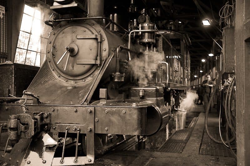
Next in fourth place is David Bailey with a beautiful image called “Yesteryear”. David also left a nice message before his back-story, and I’d like to read that out first, as it’s kind of relevant too.
Seeing that this is my first time on the forum I thought that I should say a little about myself. I am an electrician by trade. I got into photography because I bought an iPhone and I downloaded some podcasts and one of them happened to be the MBP podcast of episode 216 ‘Photography Fundamentals for the Beginner’ part 1. That was back in November, and the seeds were planted! In January I bought my first ever DSLR. I have never had one of these or an SLR before. So, I listened to many more of Martin’s podcasts before attempting my first assignment in May. This was more to see how to get the photo onto the sight, as May is not a good time for flowers in Victoria, Australia.
It’s definitely fun trying to do the assignments. As a ‘newbie’ I have no idea what I am doing most of the time, but at least the assignments give me a focus and a challenge. I often have no clue on where or how to start the assignments but the more I think about it and consider different ideas the more ideas keep coming. Before I know it, the table is full of glasses, money and for the next assignment books, for the entire month of the assignment. I’m amazed that Brenda, my wife, puts up with it all. She just shakes her head and awaits the final photo.
This is some excellent background on yourself David, and how you got into photography. I’m thrilled that I played such a large part in your getting hooked, and really thank you for sharing this story. I also am really happy that you put so much into the assignments and that your wife Brenda puts up with it. I can certainly relate to that part, as my wife puts up with so much from me, including giving up a perfectly good job to pursue my passion full time. What a saint! Welcome to the community David, and congratulations on your win, especially after such a short time experimenting with photography. Let’s move on now to hear David’s Backstory from “Yesteryear”.
My first photo posted was real change. This was just a test shot, as I had just got a new flash. I didn’t think it was that good so I tried using other old things like an old typewriter. I wanted something old to reflect change in that way. Puffing Billy is an old steam train in Belgrave, not too far from my place. I had a job to do up that way and decided to take my camera with me. When I had finished work I went straight down to where they service the trains, which is run by volunteers. As I pulled up there were about 8 people around the train and in the shed. I was a bit nervous and embarrassed so I took off the 70/200 and put on the lens that came with the camera. I left the tripod as well, as this made the camera look less pro. I walked up to one of the volunteers and asked if I could take some photos. I had never done anything like that before! The gentleman was very nice and said not a problem….thank god that was over with!
I started to take photos. As a ‘newbie’ I had no idea on how to get a good shot, in a small dark shed, with a massive steam train taking up most of it. I tried the KISS approach, but it didn’t really give the atmosphere of old. So I just took some very wide shots. When I got home, this shot, stood out so I used preset antique light and moved some of the mixer scales in Light Room to give the appearance that it was an older photo. This was done by trial and error. No cropping or straightening was done, which I was kind of proud of.
Thanks for this back-story too David. It shows that you really thought about your photo. Not only on how to shoot it, but the logistics around not making yourself look too much like a pro, which was perhaps important to keep the volunteers relaxed. It also takes a lot of courage to ask people if you can take photographs, so well done on getting over that obstacle too. On the photograph itself, I really like the way you cropped off the top of the train, and the right side of the train, along the left and bottom of the image. This may not have been a conscious decision, but many beginners would be tempted to try and include the entire train, and I think that would have detracted from this image. To me, this shot is all about the power of this resting machine, letting off just a little bit of steam, as if it is almost breathing.
With almost as much visual weight as the steam engine though, is the man walking up alongside it in the distance. He’s not in focus probably just outside of your depth-of-field at 24mm with an aperture of F4, but this also adds to the feel of the image, and then the fact that you topped it off with an antique sepia tone is just classical. I also really like the lighting, with the light from that old window to the left of the image and the blown out electric lights inside the shed also adding a really nice touch. Congratulations on fourth place with this incredible image David, and I’m looking forward to your future entries too.
Next up, in joint second place is Marcus Perkins’ with his image “Spare any…?”, and here’s Marcus’ back-story.
Once again I found myself thinking of many different photos to get my entry for this month. My first instinct was money and had decided that coins bouncing on a hard surface would be the way to go. I set up two Nikon flashguns and used the AutoFP setting to allow unlimited sync speeds. I tried various combinations but could not get the look that I was happy with. I then moved on to money dropping into a hand and from there to the hand of a tramp.
I decided that I would play the part of the tramp as rocking up to a homeless person with a handful of foreign coins and a bag full of expensive equipment was not such a good idea. I used shoe polish to blacken my hand and nails. The fingerless glove came from an old climbing sock with the end cut off. I wore an old coat and had a can of lager with me for the authentic look and medicinal purposes!
The shots were taken outside the backdoor as I wanted a brick wall as the background. I positioned an SB800 overhead and SB600 pointing directly into a large reflector that I was sat on. This provided the fill lighting under the hand. I then shot many frames with the camera mounted on a tripod and using a remote. The focusing was tricky here as I was pre-focusing with a narrow depth of field. Even in the final shot I would have preferred a bit more depth of field.
In hindsight I should have used Lightroom’s tethered shooting option here so I could review the shots on the fly. I used Lightroom to make my post adjustments with a closer crop and an increase in contrast amongst some other tweaks.
This is a great shot Marcus! Thanks for taking the time to put this together and get it posted. On first glance, this could have easily been a very predictable shot for this assignment, but you did such a good job of the execution, it really shone within the group. I think the bottom lighting is classic. It gives it a kind of surreal feel, but starts me thinking that this person might be sitting outside of a shop, with light from a show window somehow coming into the scene from a low angle. The can of larger also adds a nice touch, and although it’s not immediately obvious, the shoe polish to blacken the fingers and nails is also a very nice touch, as is the foreign money. These things all add an air of mystery to the shot that would not have been there otherwise. The final tweaks in Lightroom really polished this off nicely. Congratulations on a very well earned second place Marcus. Great work!
Also in second place with another totally cool shot is Forrest Tanaka with the image “Reflections and Sublimation”, and here’s Forrest’s back-story.
I had gotten the instructions for building a cloud chamber from a science podcast I listen to and thought, “That might make for some cool photos!” So I got all the materials including quite a bit of dry ice and put it together and got…nothing. I Googled for more information and found that my instructions had missed some important aspects. Left with no way to fix everything before my dry ice sublimated away, I figured I’d just try the old dry-ice-in-water trick and see what I could do with that.
With a small chunk of dry ice in a fish tank and a small amount of water, I tried blowing on the sublimating steam, and fanning it, but then I tried just tipping the fish tank very slightly, and found that water running past the ice would take the steam with it to make some very beautiful patterns. A few shots later, I had my entry. The connection with the theme of “change,” if it’s not obvious, is the change of state from solid to gas. The lighting was from two snooted Speedlites, one on the left and one on the right.
Well Forrest, this sure is a beautiful image. I’d love to hear where the blue and violet colors came from. Gels on the Speedlites maybe? I really like the swirling motion in the steam, and like the reflection of the dry ice too. The negative space plays a big part in the success of this image too, so well done on the composition as well. Once again, this is a great example of someone going out of their way to shoot for the assignment, which is always nice to see. Congratulations on a great joint second place image Forrest.
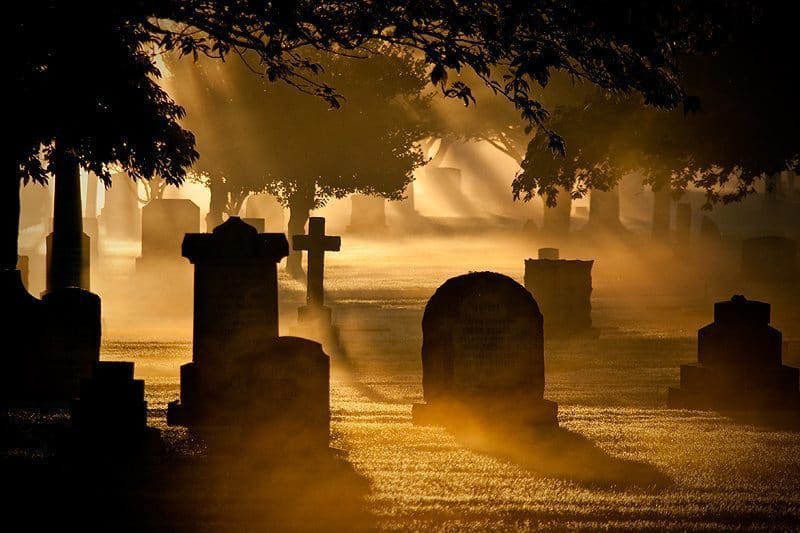
Finally, in first place with a ridiculously large number of votes is another classic image from David Newcomb, “Life Changing”, and here’s Dave’s back-story.
I first posted “Change in Technology” showing an old and new camera. I thought it was kind of boring, so I gave the subject more thought. I figure death is one of the most dramatic changes a person can experience. My initial plan was to put a subject in the shot to personalize it. I took some pictures of myself in silhouette at night in a graveyard (almost as creepy as Mr. Nikon’s shot), but they didn’t turn out the way I wanted. I was hoping for fog and the last day of the month the weather decided to cooperate. There was patchy fog so I explored a graveyard in the middle of Vancouver.
The sun was coming up and conditions were perfect. I set my white balance to daylight to give the morning light a warm look. I bracketed the shots with 1 under, 1 over and 1 properly exposed. The fog started to dissipate as the sun rose, so I had to work fast. I took about 350 shots from various angles. I uploaded one of the under exposed images taken at f6.3, 200mm, 1/1000 shutter speed at 200 ISO. Unfortunately I didn’t have time to put the subject (me) in the picture. I processed the image in Lightroom and did some minor changes. I slightly adjusted the contrast, fill light, blacks, and clarity. I didn’t change the color at all. I also added a little vignette to get the bottom right corner a little darker. I cropped the image and in hindsight maybe I should have taken more off the sides.
This one really did stand out from the gallery as well Dave. I love the mist, which obviously makes the shot, and I love the fact that you can see just a bit of detail in this side of the gravestones, although they appear almost in silhouette at first glance. The image might have been stronger with a little more cropped off the left side, but it wasn’t something that jumped out to me at all. It’s great how the mist gets brighter towards the back of the shot, which helps to lead the eye in, but then the contrast of the foreground pulls the eye back, helping us to navigate the image and see as much as we can in there. Excellent work as usual. Thanks for getting involved again Dave and congratulations on a runaway first place with this spectacular image.
Podcast show-notes:
Music from Music Alley: http://www.musicalley.com/
Audio
Download the Enhanced Podcast M4A files directly.




I love this post…those images really speak to me. Thanks!