OK, so let’s take a look at the five winning images for the August Assignment, each accompanied by a back-story from the artist. As usual we’ll do this in reverse order, and remember that if you subscribe in iTunes you’ll also be able to see the images in iTunes or on your iPod and they will automatically change as we discuss them.
In 5th place we have Shutter or David Newcomb with “Hot Water”, and here’s Dave’s back-story:
I started the month by spending about $30 at various dollar stores, buying bottles and vases. I wanted a picture showing motion so with my daughters help we smashed them all. I was somewhat happy with the results until near the end of the month when great photos started to be posted. Like usual I was having second thoughts. I figured flames always look cool so I filled a glass most of the way with water and then added some camp fuel. I took about 200 pictures of the flaming glass of water. Sometimes quality through quantity works.
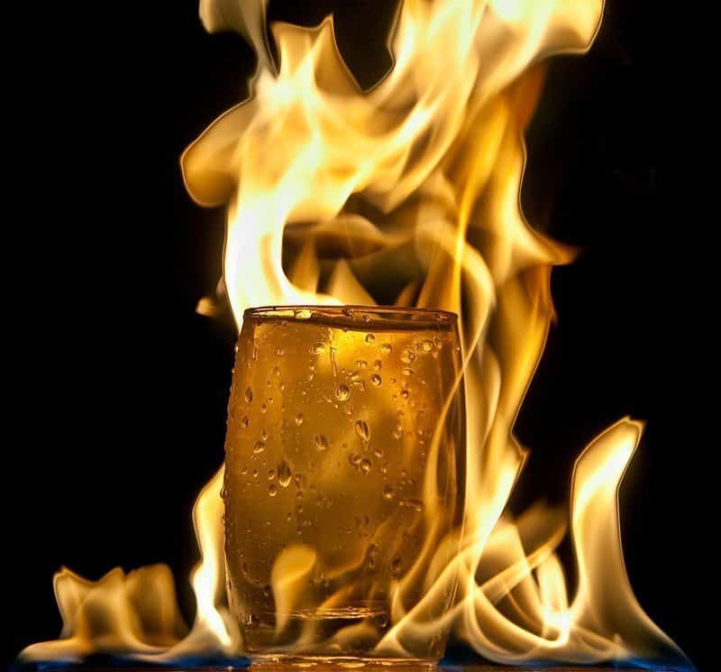
“Hot Water” (© David Newcomb)
I can sure relate to that Dave. I shot no end of images for this assignment as well, as I had my first try at capturing droplets of water. It was a lot of fun, but the timing was tough. I like your results with the flames, which do always look pretty cool. With your image, I like the fact that there is still some droplets of water on the glass, but with it being engulfed by flames, I imagine that the heat has all but evaporated the water that was once there. I also like the blue flames along the base of the image giving it a kind of anchor. Nice work Dave, and congratulations on fifth place.
Moving along, in 4th place is Steve Martin’s image “Too Late”, and here’s Steve’s back-story to accompany it:
Even before Martin announced the assignment theme, I really wanted to come up with a suitable image taken on my week long family vacation to the beach. With the theme of “glass of water”, I came up with the idea of a figure reaching for a glass of water taken on the beach which might also have the feel of a desert. The only problem was, finding someone to be in the photograph. Fortunately, I found out that my sister and her husband would also be on vacation with my family so I immediately thought of my brother in law. Graciously he agreed to be a model, which I was very happy about since I thought his physique would work well for the shot.
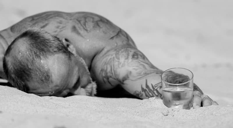
For the shoot, I positioned him in the sand with his hand reaching for the glass of water and as a final touch used a spray bottle (which I usually only use for adding droplets to flowers) to add some moisture to his head and back. I took about a dozen shots at various focal lengths and angles, and settled for this final one in which I was shooting on my stomach at a relatively long focal length. In post, I converted the image to black and white and added just a touch of sepia.
This is one of my personal favorites Steve. I really like the concept, and your execution is great. I think in addition to your brother in laws physique, the tattoos also add a lot to this image. It gives us much more to build a story for ourselves on how he might have ended up in this situation. I like the depth-of-field, with the glass and strip of sand the same distance as the glass all in focus, but then with the man getting gradually more and more out of focus, then the upper background being a nice smooth silky area is great. I like the slight panorama-like crop too. All add to the drama of this well thought out scene. Great work Steve. Well done on fourth place.
In 3rd place is Super Digital Girl, or Leslie Granda-Hill, with “Black and Blue”, and here’s Leslie’s back-story:
When I heard what the theme was this month, I was at a loss. I had no idea what I would do. Then I remembered that my husband made me a box with black lights several years ago. I haven’t used it since I started shooting digital. I thought this would be the time to try it again. I bought the vase at a local store, grabbed something bubbly from the refrigerator and set up my tripod. I didn’t realize that the quinine in tonic water takes on a milky look in black light until I poured it into the vase – this was a surprise that changed the look of the image – but I was very happy with the results. I used a couple of pieces of neon paper to reflect off of the glass and add the touches of pink. The vase is sitting on a piece of glass on top of black paper. I tried shooting it with and without the flower and decided that it worked much better with the flower. Normally I try to shoot more than one option for my entry each month, but this month that wasn’t possible, so I really appreciate that the members voted for this image.
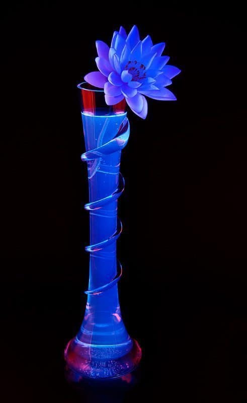
This is a stunning image Leslie. It’s so cool that you did this with black light! I was wondering how you’d done this, and was happy that you were place even if just to hear how in your back-story! I agree that the flower adds a lot to the image. It wouldn’t have been as strong without this additional element. I also like the various shades of violet to blue in the petals – very vivid yet somehow subtle at the same time. It was an excellent idea to use the black light, and very well executed. Congratulations on third place Leslie.
In 2nd place is Marcus Perkins’ image “Stem the flow”, and here’s Marcus’ back-story:
Like some others have mentioned, I was struggling with this topic and spent many days trying to get a suitable image. I even had my daughter pouring water from a watering can into a glass outside to imitate rain…
Last month I had tried a play on the word symmetry for inspiration and ended up in a cemetery! This month I couldn’t come up with an “angle” so went with a straight picture of a glass of water.
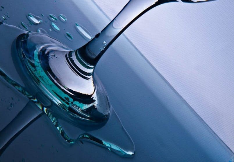
“Stem the flow” (© Marcus Perkins)
I had tried shooting water drops a few months ago and learned a lot about the lighting required for glass and liquids. I set up my SB-600 flash pointing towards my portrait background and used two heavy books to flank a wine glass of water.
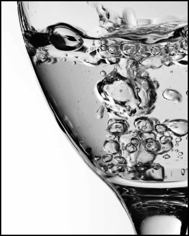
I stood the glass on a small sheet of picture frame glass and ensured that no direct light was hitting the glass. I was going for the bubbling water effect as can be seen in this image (right).
I wanted to capture a really sharp image with the bubbles frozen as they dance around inside the glass. This is good fun and easy to do although can get a bit messy!
I was reasonably happy with the result but I noticed that I had splashed water around and the green cast from the sheet of glass was quite vivid. I shot off a couple of frames just to capture the effect. It wasn’t until I was processing later in Lightroom that I kept coming back to this image as it just attracted my eye. When it came time to submit, I couldn’t decide on the other 20 images of bubbly water and so exasperated I went with this image. My partner came up with the title as she couldn’t stand the indecision and dithering anymore!!
Well Marcus, I really like both images. The one of the bubbles in the glass is a nice clean image, with a good crop and nice and sharp. The one you entered is probably the better of the too, from an artistic perspective. The strong tilt is very effective, and as you say, the green reflected in the water adds a very nice touch. Using the two books to add the dark shadow to either side of the glass is a good technique too. It’s good to see you reusing stuff you’ve learned in the assignments, and obviously helping to get you placed high in the ranking. Well done, and congratulations on second place.
Finally the winner for the second time in this batch of assignments is Cheshirecat, or Elise, with “Dot Theory”, and here is Elise’s back-story:
This was yet another difficult theme for me. Though I usually try to shoot something in the beginning of the month, two weeks had passed by and I hadn’t done anything. I looked through the cupboards for interesting glasses and decided on a couple that had possibilities. I searched for wildflowers, but by August, most of the more interesting ones are gone. I picked what I could find hoping that one flower in a glass of water would have some appeal.
The lighting in my house is inadequate for photography. There was much trial and error with the different flowers and with other glasses filled with water and ice. I found that daylight bulbs gave much better lighting. I saw Super Digital Girl’s ‘Black and Blue’ posted and gave up on the flower idea as hers was so good.
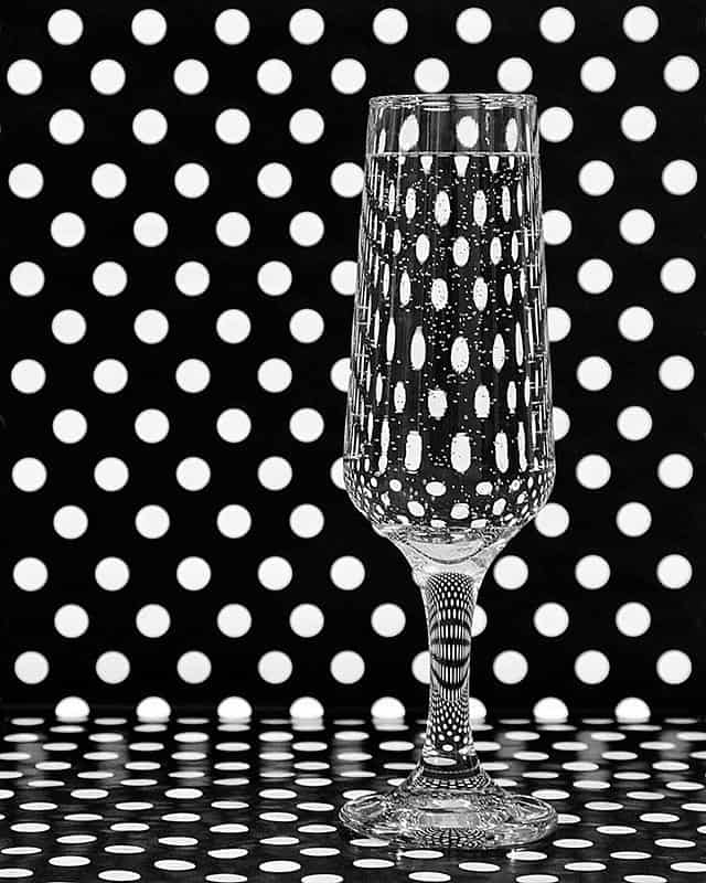
I tried different background materials, nothing worked. I bought a roll of black and white wrapping paper with the idea it might have an interesting look through a glass of water. I set up two lamps with the daylight bulbs and positioned them so that there would not be a shadow. Getting the background dots to be even was not easy, nor was getting the right height of the camera to get the perspective I wanted. I tried different glasses but this one was the best. It had the most surprising patterns in the glass stem. I converted the best shot to black and white. On receiving some good advice, I cropped it to 10×8 to get a more vertical image. Having a studio setup would have made this much easier. But I learned a lot in the making of this image for which I thank Martin for the challenge and WebSpy for the sponsoring of his site.
Once again, I really love this image Elise. I would never have guessed that we were witnessing your learning process here, as once again, the results are simply stunning. You made this look so easy I had imagined you just knocking this set together without really thinking too much about it, and knocking out a few world beating frames with very little effort. Obviously coming across the spotted paper is key here, but you had to be in a mode to go and look for it, and connect with the fact that you might be able to get this look as you started to play with the items you’d chosen to work with.
As you mentioned, the patterns in the stem of the glass, and the base too are incredible, and the black and white conversion once again tops this off perfectly. The alignment of the dots in the vertical background so that none of them are cropped at all is the icing on the cake here. It’s another incredibly strong image, so congratulation on the image, and on another first place Elise.
So, just to recap, the August Assignment was the third of six assignments from which the five entrants with the most accumulated scores will receive one of the five prizes that I and our sponsors WebSpy have made available. The prizes include an amazing Sony Alpha NEX-5, some X-Rite Color Management tools and my own fine art print and a folio of your choice from my collections. I’ll put a link to the prizes page in the show-notes for you to check them out if you are interested.
Thanks so much to all of you that took part in this assignment, and for those of you that took the time to vote. Remember that the September assignment is “Change” and there are ten days left to get your image in. I also hope you have fun and maybe learn something while shooting for the assignment. That’s really what it’s all about.
Podcast show-notes:
Music from Music Alley: http://www.musicalley.com/
Audio
Download the Enhanced Podcast M4A files directly.


0 Comments