Today we’re going to take a look at the five winning images from the July 2010 MBP and WebSpy Photography Assignment. We also have a back-story from each winning photographer, and a surprise placing for my entry, which was kind of cool.
It was a great assignment again last month, and the album looks pretty stunning. As we now have five votes, I’m now running through all five winning images, with the back-stories from the winning photographers.
In 5th place is Shutter, or David Newcomb, with “Tunnel of Symmetry”, and here’s David’s back-story.
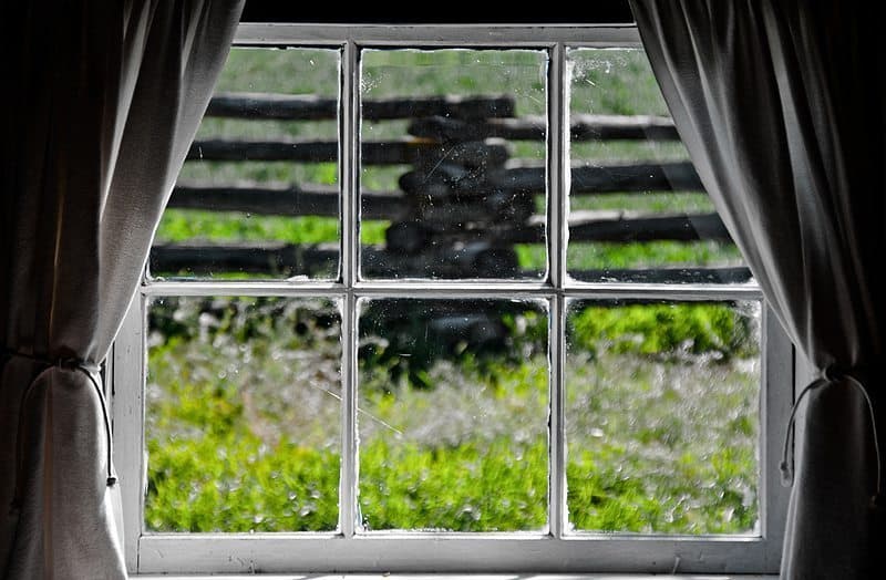
Thanks for the votes! I didn’t think I would come close this month because I didn’t like any of my images. I first posted “Window”, which was somewhat symmetrical,but boring.
Window (© David Newcomb)
Everybody was posting really beautiful images so I decided to go out and gather more. I got up at 4:30AM on my holidays to shoot a sunrise in a field that usually gets fog. I captured and posted the “Symme Tree” image. I liked the image a lot, but I wanted it to be symmetrical.
The night of July 31 I thought I would just have to live with posting a non-symmetrical image when I was called into work. As some may know I work as a cameraman for a TV station in Vancouver. A water bomber fighting forest fires crashed in the Fraser Canyon. On the way up I went through a number of tunnels. Knowing there wouldn’t be much to see at the crash site because it was dark and the wreckage was a long hike off the highway, I decided to stop and take a couple of quick pictures of one of the longest tunnels.
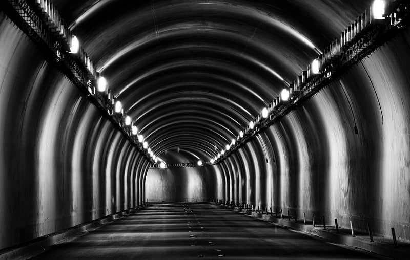
Tunnel of Symmetry (© David Newcomb)
I tried different focal lengths and framing. I also tried some shots with cars and trucks going through the tunnel, but it was distracting and the lighting didn’t look as good. I did some quick post and decided black and white looked the best because it highlights the pattern of the lights and the texture of the walls. I eventually found a Wi-Fi hotspot and uploaded the “Tunnel of Symmetry” image just before the deadline (can you tell Mr. Nikon and I are twins). It seemed a little too symmetrical, but better than my other images.
I really like this shot too. I love good quality black and white images, and this is certainly one. I agree that the texture of the walls is really brought out well by the black and white. It works well. I don’t think this is too symmetrical really. I think it’s just off by enough to make it interesting, but close enough to fit the theme. Really nice work David!
In 4th place we have Forrest Tanaka image “Hand That Draws That Hand”, and here’s Forrest’s back-story.
My entry to the Symmetry assignment, though I took it the very last day, reflects the very first idea that popped in my head when I first heard the assignment. I spent the month hoping for a different idea because this idea involves drawing, which I suck at. I took one semester of a charcoal drawing class with an amazing professor who took me from drawing horses that looked more like platypuses, to recognizable toned representations, but it’s still just one semester so I’m sure experienced charcoal artists out there are chortling at mine.
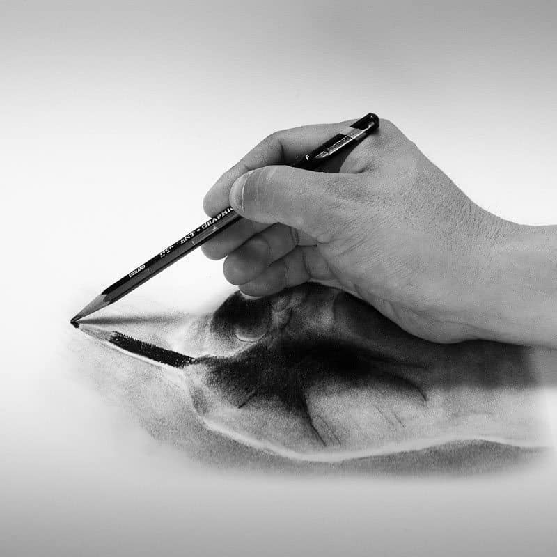
Hand That Draws That Hand (© Forrest Tanaka)
I took the initial photo with my hand and pencil resting on a mirror, converted it to black and white, printed it, then traced the outline of the hand reflection onto sketching paper with charcoal vine. Then I used charcoal pencils, gum erasers, and stumps to make the drawing. I did all this the last day, so I glossed over parts of it, which explains the fuzzy thumb. I then scanned and printed the drawing stretched vertically to compensate for foreshortening and make it look more like a reflection, rested my hand on it in the same position as before, and took the final shot.
The first idea that popped in my head also included my drawing tools and eraser shavings for some context, but in the end I preferred having just the clean image; I think there’s enough context there. My drawing professor could make charcoal drawings that some of my classmates thought were black and white photos, but people never confuse my drawings for photos for some reason.
You went to a lot of trouble for your image again this month Forrest, and I’m glad you did. I totally love this! I actually did think the reflected hand was a photo when I first saw the thumbnail, so I’m not sure I fully agree with your last statement. I agree that there is plenty of context here, although I think the idea of adding the tools and eraser shavings is another great extension of this wonderful work. As it is though, this is incredibly imaginative and very well executed. Thanks for sharing your process and insight Forrest!
Well, next up, I was really pleased to actually come 3rd myself with my “Japanese Lacquerware Bowls” image, and here’s my back-story, read by the author. J
I bought these bowls with my wife during a trip to the town of Joboji in July 2009. Joboji is where I’d photographed the lacquer gathering craftsmen for a book the year before. The perfectness of the bowls caught both of our eyes, and as my wife has a passion for collecting tableware, we decided to pick these up, even though they were over $100 each. A week or so after we got back, I bought the red and the black paper that I have underneath these two bowls here, from a shop where we used to live that sold traditional Japanese ornaments and purses etc. The idea was to shoot the bowls on each piece of paper separately, but I just never made the time to set up a small studio to actually do the shots. Before we knew it, a year had passed and we had just moved to our new place, and I now had space to set up some lights much more easily than before, when I had to take over the kitchen, and could never leave a setup in place for more than a few hours.
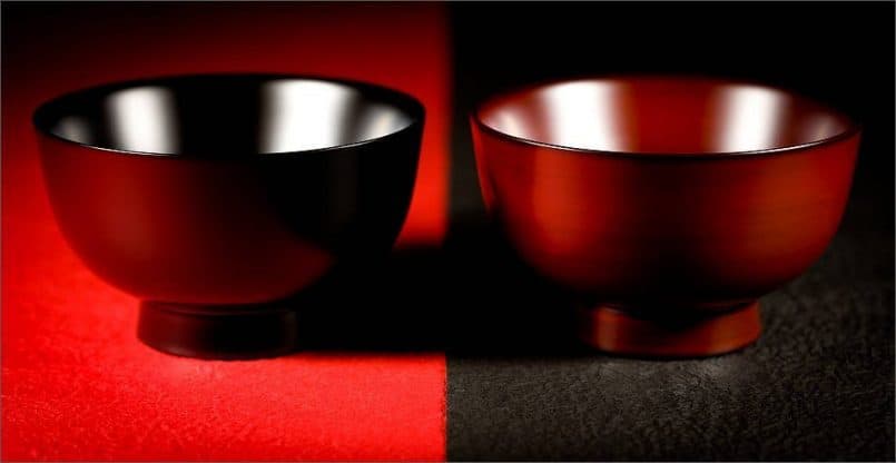
Japanese Lacquerware Bowls (© Martin Bailey)
Well, as we decided to move in July, I’d not been able to get out shooting at all, and it was getting towards the end of the month, when I figured that I’d try to shoot something in my new studio space, and I immediately thought of the bowls, because during the move, the paper had dropped out of the bottom of the tube that I put them in a year ago, to stop the paper from getting crumpled up. I also figured I’d play with the symmetry theme a little, and place the bowls on the opposite colored paper, so the red bowl was on the black paper, and the black bowl on the red paper. After shooting this way around, I did switch the bowls around, but I kept coming back to this shot, so I went with this for my assignment entry.
Here also is a shot of the setup. I used two constant light sources that I bought years ago. They use small fluorescent tubes, and aren’t very bright, but for still life work, where you can go with a pretty slow shutter speed, they work well. The other benefit is that I was able to model the light pretty easily, as you can see exactly what’s happening as you adjust the lights. In this set up you can also see an umbrella in the background, that I set up to pop some light in at the back of the bowls, but I actually turned that off for the shot that I uploaded. It didn’t work out as well as I’d have liked. I just bought a nice big soft-box and boom for this purpose too, so I’m looking forward to trying that out in the near future.
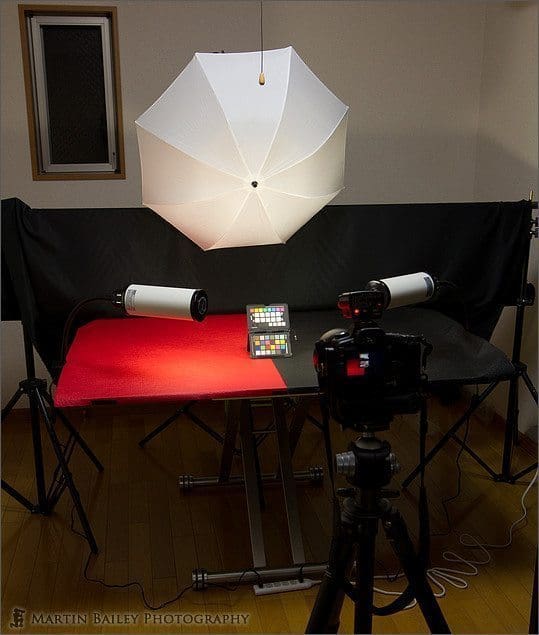
First New Studio Setup
The best thing about this setup too was that I was able to leave it like this for a few days while I played with ideas, which was one of the reasons for the move. Anyway, thanks very much for the votes! Although years ago I suggested that people don’t use their votes on my images, because I’m not eligible for the prizes, since we now do the assignments anonymously, I guess it’s fine, and it was kind of cool to get some votes, so thanks again.
Moving along, in 2nd place is schneehage with “sitting in symmetry”. I’m not sure how to pronounce this user name, but here’s schneehage’s back-story.
The girl sitting on the stairs is my sister. We were in London for a holiday this year. Of course visiting the British museum was a must, especially when you are interested in photography.
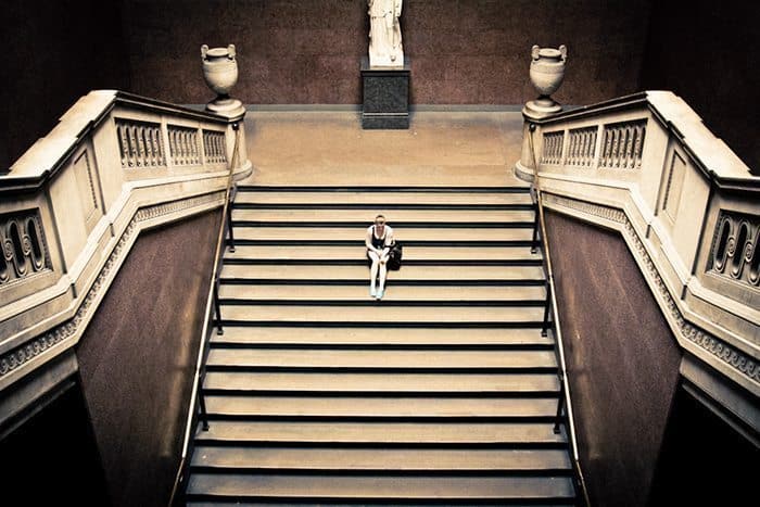
sitting in symmetry (© schneehage)
After visiting the exhibitions and photographing the architecture, we were on our way out, when these old stairs caught my eye. I took a few shots without her sitting on the stairs, but I felt there was something missing. I asked her to sit right in the middle of the stairs to give the image some dimension. It took a while until there were a few seconds without anyone coming up or going down the stairs. My sister got some strange looks from the other visitors as you can imagine, sitting there for about 5 minutes.
Due to the low-light situation I really had to boost up the ISO to about 2000 as you can see in the grain, but I decided not to remove the noise. Instead I de-saturated the colors and put on a pretty strong vignette to amplify the old look the stairs already have.
I really like this image too. From a symmetry perspective, I kind of wished that your sister didn’t have the bag to one side, but I think it may well have been too perfect had you removed that. I think the stairs alone build the symmetry story, then the human figure sitting the middle tops it off very nicely. I did wonder if the image might have been a little stronger if you’d included the top of the statue against the back wall as well, but the balance of the rest of the image may well have been lost.
I think the slightly visible grain does add to the image, as does your vignette. It’s heavy, sure, but it doesn’t look overdone at all in these circumstances. It enhances the image a lot in my opinion, so I’m happy that you added that. Overall it’s a very nice image, so well done and congratulations on second place.
And in 1st place is Chris, who from his comments on the forum I see is a Nottingham lad like me, which I thought was pretty cool. Chris spectacular winning image is called “Symmetry Collapsed”.
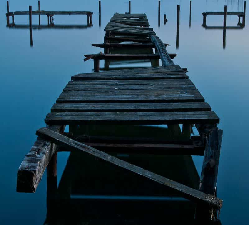
Symmetry Collapsed (© Chris Gell)
My wife and I have been trying to see as much of Germany as possible, so we try to take short trips to different parts of the country. Towards the end of last month, I still had nothing for this assignment, but I knew we were heading north to spend 3 days on the island of Rügen on Germany’s Baltic coast. I had always wanted to take a pier photo, I had an image of finding a perfect, small, wooden pier to photograph with a long exposure, ideally with some mist thrown in for good measure! In fact, I bought a 3-stop ND filter specially for the trip.
When we arrived at the hotel, we found it was right beside a quiet bay and running along the shore was a small footpath, I spotted the pier in the distance and thought it looked promising. We checked in, wandered around the village, and then I popped down to the shore at about 9 pm, 15 or 20 mins before sunset. When I got down to the pier, I was somewhat disappointed to see the dilapidated nature of it, but right away I saw that the decay somehow underlined the symmetry that would have been there. The fallen plank in the foreground and the way the pier appeared to twist back and forth along its length was just really appealing, and the age of the wood gave it a beautiful texture.
I set up a tripod, set aperture priority to f11 to try to keep the entire pier in focus, composed, focused and popped on the 3-stop ND and made a number of 60 second exposures, adjusting ISO on my D80 as the sun set. As it turned out the weather was just great and the light just perfect, cool and blue with some warmer light reflected off the water further out. The weather was never that good again on our trip. The ND filter helped with the long exposure but it turned out that the water was already very still, no waves and no tides there to worry about. The water turned to glass and, helped by the stillness, I got beautiful reflections of the pier and the background posts, again giving another ‘dimension’ to the symmetry.
Post processing was done in Lightroom; spot removal to get rid of couple of bits of sensor dust I have never been able to shift, a little fill light and clarity, as well as a touch of brightness and contrast. The fairly square crop just seemed to work; there was a lot of empty space either side of the pier as well as some distracting stalks from grass on the bank on which I was standing. Once more thanks for all the votes, looking forward to next month’s competition.
Well, thank you Chris. This is a beautiful image. I’m pleased you picked up that 3-stop ND filter for your trip too. The glassy water and those beautiful blue tones are simply amazing. The square crop does work well with this image, and I agree that the imperfect symmetry also adds to the image, as the votes you received show. The slightly reddish rust of the poles and that hint of warmth in the light hitting the water to the top right really top this off. As had been said in the past, the only thing I don’t like about this image is that I didn’t make it. Congratulations on a brilliant and well deserved first place Chris.
The July Assignment was the second of six assignments from which the five entrants with the most accumulated scores will receive one of the five prizes that I and our sponsors WebSpy have made available. The prizes include an amazing Sony Alpha NEX-5, some X-Rite Color Management tools and my own fine art print and a folio of your choice from my collections. I’ll put a link to the prizes page in the show-notes.
Thanks so much to all of you that took part in this assignment, and for those of you that took the time to vote. Remember that the August assignment is “Glass of Water” and there are two weeks left to get your images in. I also hope you have fun and maybe learn something while shooting for the assignment. That’s really what it’s all about.
End Notes:
If you don’t follow me on Twitter, you’ll probably have not heard that my new Canon imagePROGRAF iPF6350 printer arrived last Friday, and it is pretty impressive! I’m going to be putting an episode together on that in the coming weeks, probably with an update on how my new home office and studio is shaping up, now that I am really getting settled into my new place, so stay tuned for that. It should be helpful for anyone that is thinking of setting up a home office and studio, or if you are thinking of picking up a large format printer, though I appreciate that these are not for everyone, especially when you see the size of the thing. It’s a behemoth! It would have taken up a quarter of my living room at my old place.
Podcast show-notes:
Music created and produced by UniqueTracks.
Audio
Download the Enhanced Podcast M4A files directly.

0 Comments