Well, due to my moving apartment, that I mentioned last week, I wasn’t able to get an episode out. Although I had my new office/studio almost set up, and was ready to record last Thursday, I found that the mic stand that I’ve been using for year’s would not attach to my new desk, so I had to get a new mic stand before I could record, and so here we are, exactly one week behind.
It’s really nice to have my own space to do the Podcast now though, and my wife also no longer has to sit really quiet while I record, watching the TV with earphones in, which is nice for her too. Once I have everything unpacked, and something to show you that might also help anyone setting up an office space, I’ll do an episode on that. Today though, I’m going to relay the back-stories of the now five winning images from the June Assignment, on the theme of Cityscapes.
Note that from the June assignment voting, we changed the number of votes that each member can assign to images from three to five, based on community feedback. Because of this, I’m also going to change these assignment back-story episodes to discuss the five images, not just the top three, as long as I actually receive a back-story that is. This month, we have five great stories from five great photographers, so I’ve been looking forward to bringing you this episode. Note too that to view the images that we discuss you’ll need to subscribe to the Enhanced version of this Podcast in iTunes and view the images in iTunes or on your iPhone or iPod, or you can go to my blog and see the images embedded in the full transcript for this Episode.
So, let’s jump in and take a look at the five images with back-stories. First up, is Steve Martin’s back-story for the image “City of Monuments”.
When the assignment was announced, I knew I wanted to present a cityscape of Washington, DC, where I live a mere 30 minutes outside of. And, I wanted to highlight the monuments, which the city is known for. The three monuments in the image are (left to right): the Lincoln Memorial, the Washington Monument, and the US Capitol. Although these monuments are actually separated by about a mile each, I used a long focal length (about 250 mm in 35mm equivalent) to make them appear right next to each other. Initially I thought that doing an HDR composite would work best, but in the end I felt the straight single exposure looked the most pleasing and natural. It was captured about 50 minutes prior to sunrise to get the red morning sky along with the monuments lit up (the monuments are lit by artificial light between sunset and sunrise). I processed the image initially in Lightroom with a round-trip to Nik Color Efex Pro (to adjust color balance) and Nik Viveza 2 (to boost contrast and structure a bit).
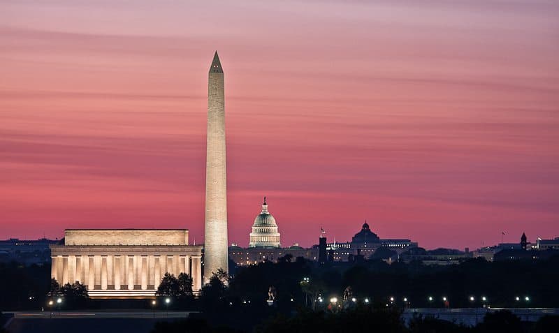
City of Monuments (© Steve Martin)
Well Steve, thanks for taking the time to get to this spot at such a beautiful time of the day, and for the detailed explanation of the monuments. The pre-sunrise sky is beautiful with the layers forming in the wispy cloud cover, and the work that you did to the image with the Nik Software plugins has probably helped to make this a very pleasing image. Of course, I haven’t seen your HDR version, but I am glad that you went with this version. I have nothing against HDR, but I think this is just so natural I can’t imagine how you could have improved on it. Your choice of the long lens to stack the elements together works well too. All in all it’s a very well planned and executed image. Congratulations on fifth place Steve.
Next up in fourth place is Forrest Tanaka’s back-story for his image “Beyond the Gate”.
I knew I wanted to include my favorite landmark in the world, the Golden Gate Bridge, in your Cityscapes assignment, and I had the perfect idea: an unusual view of the city of San Francisco seen below the deck of the bridge. I’m pretty sure there’s only one accessible place to experience this vantage point: the Kirby Cove campground near the north end of the bridge, not far from the town of Sausalito.
After a client had postponed an evening meeting at the last moment, I decided to use that time to try to get this shot. I drove to one of the many vista points along
Conzelman Road in the Marin Headlands, then hiked the mile down to the campground. I set up my tripod as the sun set, then discovered that I had left my flashlight in the car. The dirt road I hiked on would be in pitch darkness if I went back too late, so I decided to leave during nautical twilight. I got some shots I liked before leaving, but the ambient light was a bit stronger than I liked, and the incoming fog was higher than the towers of the bridge as I headed back in the near darkness.
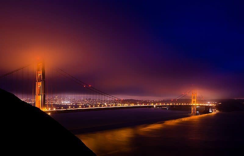
Beyond the Gate (© Forrest Tanaka)
As I got near the top of the trail, I found the most beautiful view of the bridge I’d ever seen. The fog had descended to just cover the tops of the towers, and the lights of the bridge were lighting it as well as the water below. I once again set up my tripod and got two shots, and then felt compelled to stand there for a while to appreciate the view. I’ve seen and travelled on this bridge countless times in my life, but it never fails to surprise me in its beauty. The view from the campground would have fit the assignment better, but I couldn’t resist entering the shot from higher up where the city is just visible beyond and above the deck of the Golden Gate.
This is another amazing image from an amazing photographer, and a fitting back-story too. Thanks Forrest! I really like the view that you captured here, and the mist on the top of the towers really does add so much. The golden reflections on the water and the gold color of the towers really does make this amazing structure live up to its name. I’ve never been to the Golden Gate Bridge, but my brother bought me a silk wallet from their when I was small, maybe 8 years old, and I always wanted to visit after that. You image and eloquent description of your own feelings for the bridge has made that desire even stronger. Other things that I like about this image is the way the totally black negative space in the bottom left corner give us a nice anchor point for the bridge, and I love the way that is almost mirrored with the same sized triangle of deep purple in the sky in the top right opposite corner of the image. It really is a memorable image Forrest. Congratulations!
So, as Dan Newcomb sets off on his Alaskan adventure, his brother David has stepped in to sweep third place with his first entry, “Home by the Sea”, and here’s the back-story.
Hi group. Here’s my back story for my 3rd place picture, but first my story. I’m Mr Nikon’s twin brother and this is my first photography group. We both got interested in photography way back in high school. Since then I gravitated toward video and he stayed interested in still photography. I’m a cameraman for a local TV station in Vancouver. About 2 years ago we both started shooting time lapse videos using DSLR cameras. It was a good mixture of video and still photography. Our latest time lapse on YouTube just went over a million views.
Well first David, welcome to the community, and congratulations on your Vancouver City video breaking the million views! Most people in the community have probably already seen it, as Dan talked about it in a round-table that we did a few months ago, I’ll embed the video below, for those that haven’t yet seen it. Once you click the play button, you might want to select a high resolution format and go full-screen to really appreciate this amazing work of art!
Here’s the rest of David’s back-story…
Now that I have a decent still camera I grab a picture here and there. I can recognize a good one when I see it, but these assignments are tough! It really makes you think and experiment. I have no idea what to shoot for this month. Photography is a great hobby and the best part is my 13 year old daughter is interested in photography too. Last month she joined the group thanks to Mr Nikon who lent (gave) her one of his cameras.
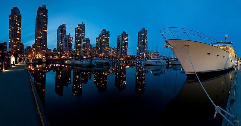
Home by the Sea (© David Newcomb)
Now the back story for the picture. I took a bunch of pictures and some panoramas the last week of June. I did a night shot of Vancouver’s skyline plus a sunrise shot and merged then together. I was going to submit that one until I read the rule saying the pictures had to be taken close together. Most of the panoramas were too small when resized to 800 pixels wide. I took the one I submitted just before going into work at the station. I work the graveyard shift from 11pm to 7am. During those hours it’s usually death and destruction stories and difficult to shoot creatively. Still photography is a nice outlet. This night I went out onto a dock that I had never gone down before. It was a still night and the water was calm. The sun had just gone down and the lights in the buildings were turning on. It was a great view in all directions so I decided to try another panorama and shot 20 overlapping portrait images making up a 180 degree picture. I put into Photoshop CS4 thinking it would turnout too wide (again), but this time it filled the frame better. The buildings seem to be at odd angles, but I think it works.
I think it works too David! Thanks very much for posting this. The water really is very calm, forming very nice reflections of the buildings. When I first saw this I thought it was probably just a wide angle shot, maybe at around 14mm, until I read your comment out it being a whole bunch of images stitched together. I really like how we can see the same dock on both the left and right sides of the image. I also like how there are two similar looking boats, one very large in the foreground and then one much smaller next to it, but in the distance. The blue color in the sky and reflected in the water is very nice, set off perfectly against the golden color of the city lights. This is a great way to enter the community David, and I’ve seen your daughter’s images coming in too. All I can say is that I’m pleased we just switched to voting for five images and not three, because once Dan comes back the Newcomb’s would have probably been taking all three places! 🙂
OK, so moving along, here’s Omar Gonzalez’ back-story for the second place image “Apocalyptic”.
Since I work in New York, I thought I would have countless images to choose from. Instead, I spent the entire month taking pictures of the entire skyline, street canyons, and interesting architecture throughout Manhattan. Nothing felt right. It was only in the last week that I decided to look in the one place I had forgot to look. UP! I remember Martin saying in one of his podcasts, “turn around” and “look up” once in a while. I got this shot on the way to work, somewhere near Central Park. The clouds were incredible! When I got home, I converted the image to sepia and liked it, but something wasn’t quite right. I flipped the image upside down and voila! It “felt” better. The image reminded me of the streets of downtown New York on the day of 9/11. (Hence the title) I was caught in the huge cloud of debris that day and the sky in this shot reminded me of one of the things I saw as I ran. My vote for first place (Under Construction) was a no brainer as it also reminded me of that infamous day. Again, thanks to all of you.
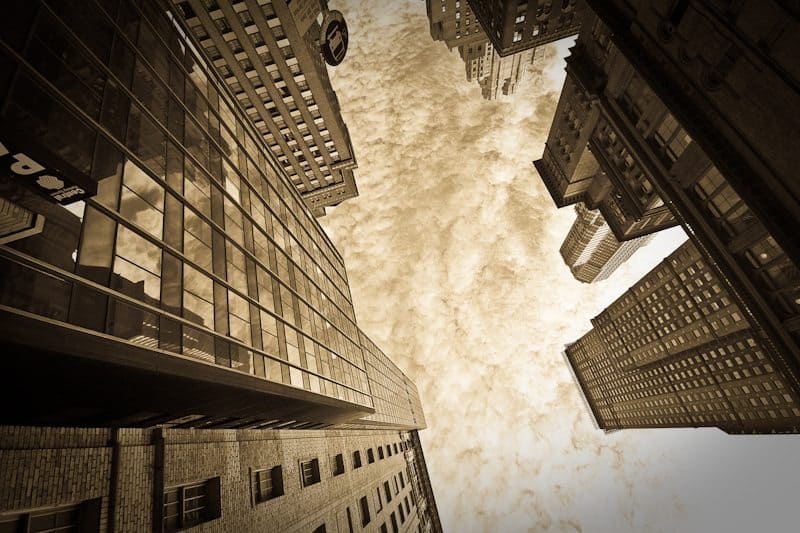
Apocalyptic (© Omar Gonzalez)
Thanks for that very thought provoking back-story Omar. Flipping your shot and the conversion to sepia has worked incredibly well. A Sepia conversion was maybe a relatively natural decision, even though one that may well have been overlooked, but having the vision and forethought to flip the image is incredibly important. It could well be what got you to second place, and pretty close to first place, as we can see from the scores. I think the cropping of the building that is now at the bottom of the image is prefect, and the way none of the lines are really straight gives the viewer a freedom that they would simply not have had if you’d tried to straighten the lines up at all. The sky is exquisite, as are its reflections in the building to the left. Overall this is an incredibly powerful and beautiful image. I’m really pleased to hear that we got you out shooting all over New York in June too. That really is what it’s all about. Congratulations on an amazing resulting image Omar – very well deserved.
And talking of well deserved, Elise Ange came up with an image for the Cityscape assignment that in my opinion belongs up there with some of the classic images of all time, and I’m not just blowing smoke here. Let’s first listen to Elise’s back-story for the image “Under Construction”.
Not living close to the city and with very early sunrises and very late sunsets in June, it seemed unlikely that I would get a dramatic shot of a city, like those seen in many of the great images this month. New York City seemed to be the place offering the best opportunities. After doing some research, I mapped out a walking tour, took a day off from work, and rode the Staten Island ferry into lower Manhattan.
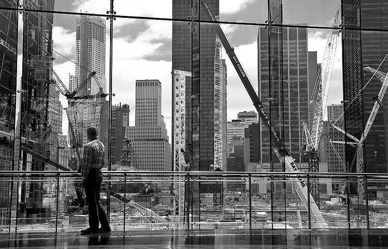
Under Construction (© Elise Ange)
The stop at the Winter Garden Atrium, a 10-story glass-vaulted pavilion, resulted in my best shot of the day and the month. The interior of the building is awesome. But the cityscape view was from the glass panels at the rear of the building overlooking the World Financial Center. There was no interior lighting to cause unwanted reflections and only a small amount of foot traffic in the area at the time. The curvature of the building is noticeable in the unparallel lines of the glass. As the shot was handheld, a slight leveling was necessary, but otherwise it is un-cropped. An increase in contrast and sharpening were needed to bring out the building and equipment details from behind the glass. The conversion to black and white and the lone observer set the mood of the image. Thanks again to Martin for hosting this challenging theme and to WebSpy for sponsoring his great website.
Elise, you said this was the best image of the month, and I’ve seen your work, and know how good it is, but I personally think this is one of the best images that I’ve ever seen. I totally love it. The composition, with the walkway forming a base, and the man looking out of the window at the construction, are perfect. You don’t even have to see the man’s face to know how thoughtfully he is looking out at that site. From a relatively small space you’ve managed to capture the huge scale of the reconstruction, and yet such a touching human element, reminding us of the sadness of the location. You’re contrast and black and white conversion tops this off beautifully. I was gob-smacked when I first saw it, and moved every time I come back to this image.
I’m not one for entering competitions myself, but I think you should find the most prestigious photography competition you can enter, and get this image in. Make sure that it is not one of those unscrupulous competitions that want’s all rights to the image if you win, but if you find one to enter, I’d be very surprised if you don’t scoop first prize there too. This really is an incredible image. Congratulations on the capture and one so deservingly taking first place.
Remember that the June Assignment was the first of six assignments from which the five entrants with the most accumulated scores will receive one of the five prizes that I and our kind sponsors WebSpy have made available, including an amazing Sony Alpha NEX-5 camera, some X-Rite Color Management tools and one of my own fine art prints and a folio of your choice from my collections.
Thanks so much to all of you that took part in the June assignment, and for those of you that took the time to vote. There’s only a few days left to get your Symmetry images in for the July assignment, but I hope you have had a chance to capture something, and most of all, had fun doing so.
Podcast show-notes:
Dan and David’s Vancouver City video: http://www.youtube.com/TimeLapseHD#p/u/0/_xMz2SnSWS4
Music created and produced by UniqueTracks.
Audio
Download the Enhanced Podcast M4A files directly.

0 Comments