As I didn’t talk about the February Assignment winners last month, here goes with a two month installment, including some of the winners’ back-stories and my own brief comments about the winning images.
In third place was Mark Carline with “Crossing over the River Dee”. First let’s hear what Mark told us about the image in his back-story.
It was a freezing cold night in Chester and it also looked like it was going to be a foggy night and so I grabbed my gear and headed out towards the Groves in Chester. It’s an amazing part of Chester by the river that during summer is full of buskers, ice cream stands, people rowing on boats and generally having a good time, but this cold night it was freezing and hardly anyone about! I originally went out to take some HDR night shots around that area and then a couple walked past me, I quickly grabbed my camera, set the ISO to 1600 and aperture priority at f2.8 (the fastest my lens will go) and then (handheld) fired off a loads of shots as they walked away from me over the bridge. I was very lucky to get one decent shot at 1/6 sec exposure being handheld (good job I hadn’t had a coffee beforehand or my hands would have been shaking!). Very little was done to the image in post processing other than a slight crop.
I love this shot Mark. You really captured the mood of the moment. I can also feel the cold air, and the atmosphere. The color is great too, almost like you converted to a sepia toned monochrome image, if it wasn’t for the hint of green in the tree to the left of the bridge. At 33mm you did a good job holding this still for a sixth of a second. The only thing that I’d possible like to see done differently with this image is a slight rotation to the left, especially as there’s a slight crop been done as well. Other than that, this is perfect in my opinion.
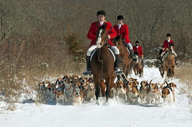
In second place, we have Elise, username cheshirecat, with the image “Coats of Red”. Here’s what Elise has to say about this image.
I became interested in action shots over the past year, particularly of horses. The Amwell Valley Hounds club meets twice a week during the hunting season when conditions permit. Although I am not a cold-weather person, I found myself traveling to their meets and braving the frigid temperatures. I was lucky to be in the right place when the huntsmen came riding across the field with the hounds all together and the other riders right behind. The contrast of the red coats makes the picture. Although I tried a sepia conversion, the color is better.
Another wonderful image here! The composition is great, and as you say Elise, the contrast of the red coats against the white snow and other brown tones really makes this a special photograph. The hounds are brilliant too. It always amazes me how they manage to avoid getting squished by the horses. Again, one possible way to improve this might have been to frame it slightly over to the right, with the front rider closer to the left hand third of the image. This might have made it a slightly stronger composition, but it’s great as it is as well. I’m pleased you braved the cold to capture this wonderful image.
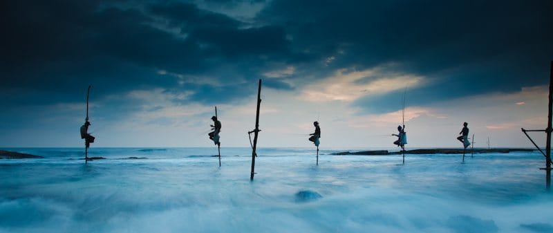
And the winner of the January assignment was a very deserving Christopher White, with “A Simple Life”. Here’s what Chris has to say about the image.
This past February, my family (myself, my wife and two young daughters) traveled to Sri Lanka for a 5 day vacation. As always, I did my photography research on subjects and locations to shoot. The Sri Lankan stilt fishermen are the iconic symbol that I knew I had to find no matter what it took. The desire continued to build as I read about their traditions and methods. Apparently the practice was in declining existence prior to the Tsunami of 2004 and is in very minimal existence after that disastrous event devastated this particular coast of Sri Lanka around Galle. Sri Lanka lost over 35,000 lives in the worst known human disaster to have hit the island in its history. After a long flight and drive, we arrived at our first hotel in Galle. I had already planned for sunrise and sunset trips to the coast between Galle and Weligama where the stilt fishermen continue to practice this old tradition. Without any issue we arrived at a few different areas where men were perched, but normally only a couple of them. I had an objective of finding five or more together and luckily enough after about 30 minutes of driving, I found five men all perched in a nice row. I spent a couple of hours at sunrise and sunset shooting at different angles and exposures. I felt that the ideal shot would be one rather low to the water with the men off-set against the sky with some dramatic clouds and taken at a slow enough speed to allow the water to blur while trying to keep the men sharp. With myself and my tripod perched about 3 feet into the water, I used a circular polarizer to cut the glare off the water, add contrast to the clouds and to allow a slower shutter speed. I also bracketed most all of my exposures. Caught up in getting the photo, it took me awhile to realize that these men use no bait and were simply pulling fish from the water with a lone hook. Stilt fishing is said to be one of the most sustainable fishing methods . . . at least for the fish and environment . . . I’m not so sure for the fishermen 🙂
To my delight, this particular image jumped out at me once I sat down to start editing in Lightroom. This one was exposed to the right two full stops to attempt to provide some light on the fisherman while holding the highlights. I first cropped the frame to my favorite wide dimensions of 27×64 as this was my plan when setting up to take the image and it is perfect for a two page book layout (it fits a blurb large book 2 page spread perfectly). I then pulled the overall exposure down -15 and added two graduated filters: one for the sky pulling it down 2 stops and one for the water adding a half stop of light and reducing the clarity. My objective was to emphasize the mood with the drama in the sky and highlight the motion of the water while drawing your attention to these truly unique fishermen perched on their stilts. The other primary adjustments were bumping the vibrance +33, saturation +7 and the blue, red and orange channels by approximately +10 to +20 to get the mood as I remember it that evening during sunset. I also have some other images of these fishermen that I was quite happy with from my trip posted on my website. Unfortunately like you Martin, I am consumed by a full-time job that doesn’t allow me to shoot as much as I would like. Luckily, I have had the opportunity to visit and shoot in some wonderful locations throughout Southeast Asia.
As a little critique for myself, I wish I had paid slightly more attention to get a very tiny extra inch on the right side of this particular frame to allow the entire empty pole to be surrounded by sky. I experimented in post with cropping it out and chose not to do so as it just isn’t the same. For me, it adds a sense of the solitude by seeing the empty pole up close on the edge of the frame and helps provide further insight into what they are sitting on another 15 yards out into the ocean. Regardless, I still love the image, the experience and the memory that goes along with the photo. Shot on a 5D Mark II with a 24-105L lens at 24mm, ISO 200, 1.0 sec at f8.0
Wow! Thanks Chris for an amazing photo, and an amazing back-story to go with it! The image jumped out at me from the gallery as soon as I saw it. It really is incredible. Kudos too, for doing your homework and knowing exactly what you wanted here. It worked out perfectly. I think the post production work you did on the image has enhanced it a lot, though I haven’t of course seen the original. It just works though, so well done. I agree with your self-critique about the stilt to the right. I think also, if you hadn’t gone a little wider, you could have also gone longer, and not included the right stilt at all. You have a second, third in from the right to provide context, so I think you may be able to improve on perfection by cropping in just a little more after all.
Congratulations though, really. It’s a masterful, incredibly well executed image. Thanks for getting involved.
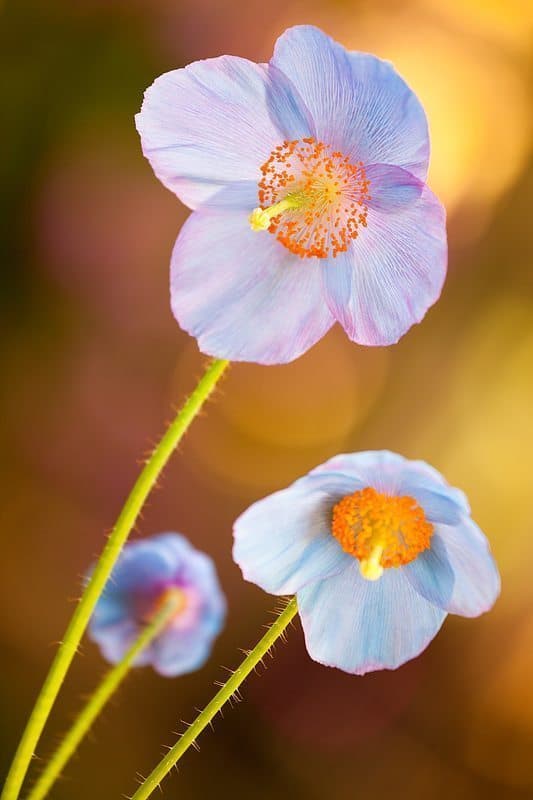
Let’s take a look at the winners of the March assignment now, which was on the theme of Dutch Angle. In third place we have Dennis Brennan with “Peekaboo Poppies”, and here’s what Dennis has to say about it.
It was getting to be towards the end of the month and I hadn’t made much time to get out shooting. Even worse, I didn’t have anything compelling to submit for the Dutch Angle Assignment. I figured I would take a Sunday morning ride over to the local gardens to press the shutter a few times. Maybe I’d even find something there I could use to submit. I wasn’t sure exactly what I would see that would be suitable for the assignment, but I knew the gardens had been featuring a display of beautiful Himalayan blue poppies and I didn’t want to miss a chance to shoot them. I arrived just as they opened at 9:00 a.m., set up and started shooting. I wasn’t looking hard for a Dutch Angle, more keeping an eye out and an open mind for the possibility. I came across the three blooms you see in the image and studied them for a bit. The subtle colors and light in the distant background were creating a bokeh that looked nice through the viewfinder. I was initially a bit frustrated trying to line up a shot straight on. There were some stray leaves and stems to the left that were fairly distracting in the composition. I just couldn’t get the shot framed right and then realized that if I tilted the camera, it could work. And there they are as framed in camera – 3 little peekabo poppies. So, ashamedly, the angle was more about getting rid of distractions than creating a preconceived Dutch angle, but it seemed to work out OK I guess. There wasn’t much to do in post – just saturation, a touch of vibrance and some very mild curves in Lightroom. Thanks again to those that gave me a vote and, as always, thanks to Martin for putting it all together!
I’m pleased those distracting leaves got in the way Dennis, as I’m sure you are too. I love the angle here, albeit almost accidental, and that background light is great, as you say. This is actually something that I look for a lot with flower shots, with the flowers in the shade, but a nice bright background. You utilized it very well. The composition works great too, with the largest flower in the top of the frame, and then the middle one on bottom right, and the smallest, looking the other way, a little further down on the bottom left. Great work!
Next up in second place is Super Digital Girl with “The Potter”. Leslie didn’t give a backstory, so here’s my two yens worth. I think the Dutch angle has been employed very well here, and cropping of the spinning turntable, as well as having it titled over like this adds a lot to the image for me. The aperture was very wide, at F2.2, with a 50mm lens, and Leslie did well to get both the face of the potter and the hands, which are so important to the craft, sharp. The sepia tone is masterful too probably matching the tone of the clay. Congratulations on a great second place.
UPDATE: I actually got a back-story the day after I recorded this podcast. Here it is:
This was a difficult assignment because I never have used the Dutch Angle technique before. I tried shooting several different subjects, but they just looked crooked. I stopped at “Old Sturbridge Village” (a New England historical community) one day without any idea how I might achieve an image in this setting for this months theme. I found this cooperative gentleman at the pottery wheel nicely lit by window light and shot several images at different angles. It was a challenge at first to compose the Dutch Angle shots in camera and it wasn’t until I reviewed the images at home that I could decide which ones were successful. I hope to use this technique in the future now that I have become more familiar with it. Congratulations to all of the entrants. I enjoyed seeing how everyone interpreted the theme.
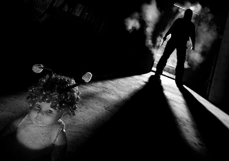
Finally, steaming towards another win in the grand prize, sponsored by our sponsors Web Spy, we have Mr. Nikon, or Dan Newcomb, with another classic, “3:27AM”. Dan starts his back-story post with “Just before the back-story, I want to thank everyone for all the votes, WebSpy for sponsoring and Martin for making it all possible”. Well Dan, you’re very welcome, and I want to thank you for getting involved each month, and for providing such detailed and interesting back-stories too. Here’s the rest of it.
When I heard the theme for last month I wasn’t sure what a Dutch Angle was. Upon looking up the definition I realized I was more familiar with the film term, Canted Angle. This technique conjured up scenes from Twilight Zone and scary movies. So right out of the gate I knew I was going to do a black and white photo and I had the basic composition worked out. I wanted to have a human silhouette in the upper right corner holding some kind of weapon with something in the lower left corner. I wanted to use a human hand possibly holding something but I couldn’t be in two places at once and I’m not allowed to do a composite. So I thought about it over the next two weeks.
Early in March I started what I thought was a two week work trip to Northern British Columbia. This meant I could be home for the last week to complete the assignment. As usual the trip went a little longer, 6 weeks and counting. So I had to make do with what I could find in this small town of 4500 people. I decided I could use a doll for the lower left of the photo. I’ve always been a little freaked out by dolls, especially the antique ones. I couldn’t find an old doll so I ended up buying this one at the only dollar store in town. It was dressed in a bee outfit. I removed its striped coat for the photo but kept the antennas because they just looked strange. I of course told the cashier it was for my niece. I didn’t want to even try to explain the photo to the lady.
The next challenge was to find a location and work out the lighting. I didn’t bring my flash on this trip so I had to come up with something else. Luckily I noticed some lights my coworkers were using in the warehouse where we store our equipment. These are the dual flood lights on a stand that can be purchased in any big box hardware store. I needed a doorway for the figure to walk through and the warehouse door seemed to fit. I waited until everyone went home and set up the flood lights outside pointing in the door. I wanted a low camera position for the doll and used a clamp to secure the camera to a wooden shelf leg about 8 inches from the ground. I decided to use my 24mm tilt shift lens. With the camera on the Dutch Angle, I leveled the lens and shifted the lens up. This gave the effect of bringing the background closer. I decided to go with 800 ISO and f9. This did a few things; it gave me close to ½ of a second shutter speed as I thought I could move slightly to show motion. Since I was focused so close this still gave me a shallow enough depth of field so the figure in the doorway was out of focus. I placed the doll a foot or so in front of the camera and lit it with a LED headlamp that I put on the ground. I walked over to the door and triggered the camera with an infrared remote set to delay. I was holding a large knife that I borrowed from my hotel room and pulled up the hood on my coat.
I did a few test exposures and wasn’t happy that I was blending into the door frame. I decided to light a few pieces of crumpled paper on fire and blew them out. I placed them in the shadow on the left side of the picture and the smoke slowly drifted out the door. I also lit a cigarette to add more smoke. I took a number of shots and finally decided I probably had a keeper. I was relieved that none of my coworkers stopped by because I didn’t want to explain what I was doing after hours with a knife, doll, camera and smoke was coming out of the warehouse. I was also happy the smoke detectors didn’t go off.
For post processing I converted it to black & white and played a bit in Silver Efex Pro. I also did a little burning and dodging. As usual I forgot to bring my monitor calibration device on this trip so I was a little worried how the final image would show on other people’s monitors. Overall I was satisfied with the photo’s feel. It seems to have a strange mood to it. I think an old possessed looking doll may have worked a bit better. Sometimes you just have to make do with what you have.
Dan, you take making do with what you have to a whole new level. Once again, you went to great lengths to come up with an awesome, amazing, totally incredible shot. The back-story really helps to understand how you initial perceive the shot, then build on it with props and the use of gear in ways that most people would simply never come up with, myself included. There’s really nothing I can add comment-wise to this, other than I really do love this image. I actually think the doll adds so much as it is, and I’m pleased you didn’t find anything else. Congratulations on yet another first place.
Thanks to everyone that participated in both of these assignments, and thanks to all of you that took the time to vote. Thanks also to WebSpy, our sponsors, for making the funds available to get some great prizes for the six monthly grand prize that we’ll be closing off with the May assignment. Note that from next month, we are going to reduce the voting time from two weeks to just one week, on request from the MBP community. This means that you’ll have until the end of the 7th of May to vote for the April assignment, so try not to miss that.
Podcast show-notes:
Music from Music Alley: http://www.musicalley.com/
Audio
Download the Enhanced Podcast M4A files directly.


0 Comments