
Visit Library for MBP Pro eBooks |
A couple of episodes back I talked about a selection of images from our local park, the Jindai Botanical Park and Gardens. I’ve been watching the updates for some autumnal color, and this morning went for a walk to see what I could make of it. As with the previous episode, these photos are really just everyday shots, nothing special, but I’ll share some points on what I was thinking as I shot them, to hopefully make this useful to you. I plan to go back again next week, as the color in the maple leaves becomes a little more widespread. I rarely shoot the wider scene, preferring to get in close and find little intimate corners of the woods in the park to isolate, often against a dark or colorful background, as you’ll see.
To set the scene though, here is a quick iPhone shot of the maple garden, to give you get a sense of the bigger picture, as it were. You can see that the colors are still patchy, and it might turn out that this is as good as it will get this year. The conditions for really good color have been a little off the mark, and I have a feeling, especially considering the number of fallen leaves already visible in this shot, that we might lose too many of the early colored leaves before the remaining green ones change color. That will result in a bit of a flop for the larger picture, but as that isn’t what interests me, I’m not too concerned.
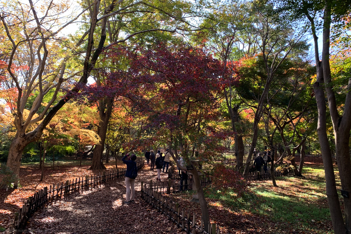
We’ll jump towards the end of my shoot in this corner of the park, so that I can share a shot made from the same spot as my iPhone photo, to give you an idea of how I frame my shots to make what I do. This is not quite as intimate as the rest of the shots I’ll share, but I like the overall mood of the image, so think it’s worth sharing.
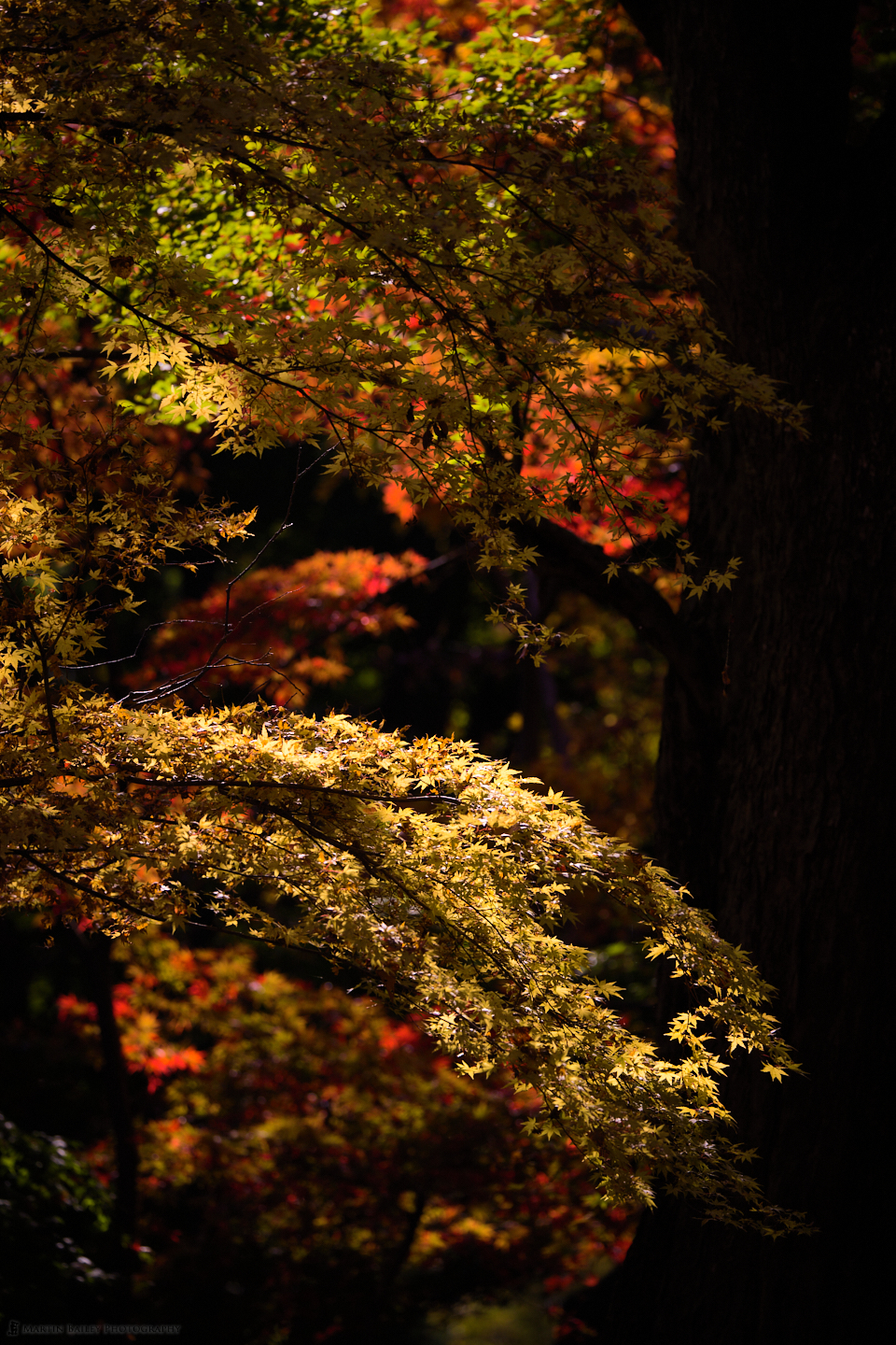
First, in the iPhone shot (above), look at the tree to the left of the leftmost person in the shot. The tree is on the left third intersection. This next shot (left) is the yellow leaves framed from just above the top of the steps that you can see in the distance in the iPhone shot, below the yellow leaves, to the left of that tree’s trunk, which runs down the right side of my second image here, shot with the Canon EOS R5 and the RF 100-500mm lens.
As you can see, the play of the light as it hits some of the leaves against the deeper shadows can be quite effective. I find this contrast very appealing, and actually added a very subtle S-curve to the Luma Tone-Curve in Capture One Pro to enhance that slightly, as well as adding an also very subtle vignette, darkening down the corners by one stop, which helps to guide the eye to the middle of the frame a little More.
This isn’t as zoomed in as most of the other shots I’ll share, as I wanted to show a little more of the scene here. I went to a vertical orientation to show the stacked layers of leaves, and I also wanted to have that tree trunk running up the right side of the frame, as I like the way that closes off the line of sight, keeping the eye in the frame after running down the diagonal lines that the leaves form.
Getting Intimate
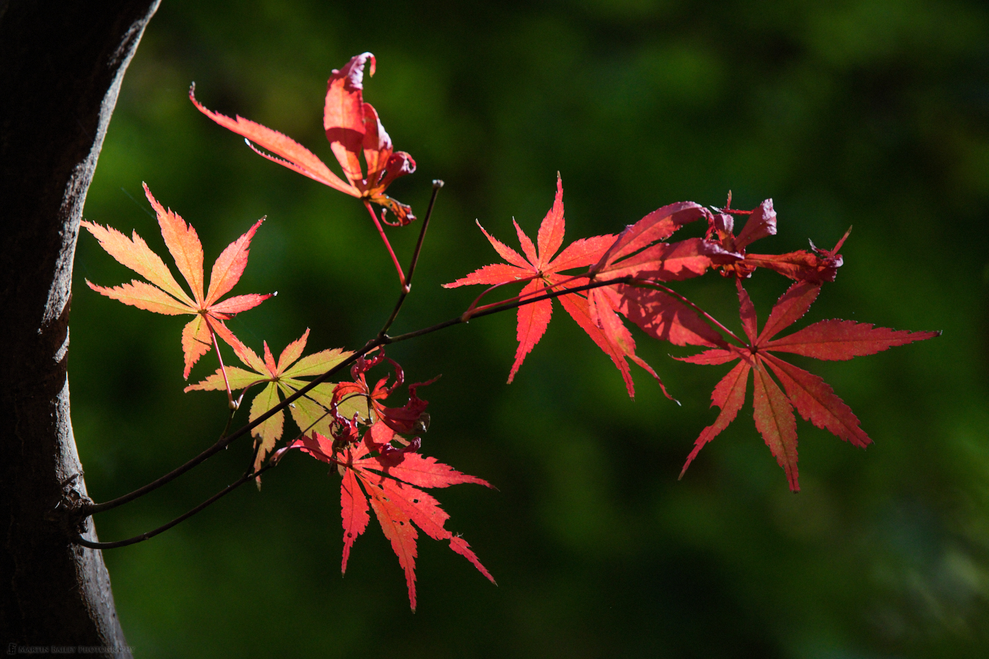
Let’s wind the clock back an hour now though, and take a look at one of the first photos that I took when I arrived at the maple garden, and this time, it’s a much more intimate scene. I find the larger scene too busy and generally look for small sections to isolate, and this shot was made at 500mm. The fallen red leaf is what caught my eye, so my j ob here was really to find a place in the frame to position the leaf for what I consider to be the optimum composition.
The leaf is pointing to the right, so placing it on the left seemed like an obvious choice. I was hand-holding the camera but still very careful to frame the shot in a way that didn’t really dissect anything important, and I was also conscious of the placement of that smaller out of focus maple leaf just to the right of the center of the bottom center of the frame. I opened up the aperture as wide as it would go, which is f/7.1 at the full extent of 500mm. I wanted as little of the scene in focus as possible, to stop us being able to see too much, which would make this look more cluttered.

The light hits the ground in patches, as the sun shines through breaks in the tree canopy. You can see that the bottom left corner is slightly dark, as the sun’s light was filtered by the edge of some higher leaves. This means that I had to be aware of what was happening with the light for each of the subjects that I chose. This is also why it took me an hour to walk the fifty paces or so that it takes to get from one end of the maple garden to the other.
In this next shot, you can see that I caught the light hitting a few red and green leaves against a relatively brightly lit distant background. I moved around until I got that dark patch behind the main brightly lit red leaf, to again add contrast, which I think is an important element of these images. You can see that the light from the leaves in the distance is forming balls from the effect of the lens’s aperture. This again was shot at 500mm and an aperture of f/7.1, so it’s great to see that this lens can give us such nice bokeh in these conditions.
Still hand-holding at this point, I was once again very conscious of the positioning of the edges of the frame. I went back to vertical or portrait orientation because the twig with the leaves was dangling down into the frame, and there was also a tree trunk or branch to the right and something else to the left that I didn’t want to include.
As I’ve said before, one of the most important jobs of the photographer is to decide what to leave out of the frame. That can play as important a role in the success of a photograph as what we decide to include.
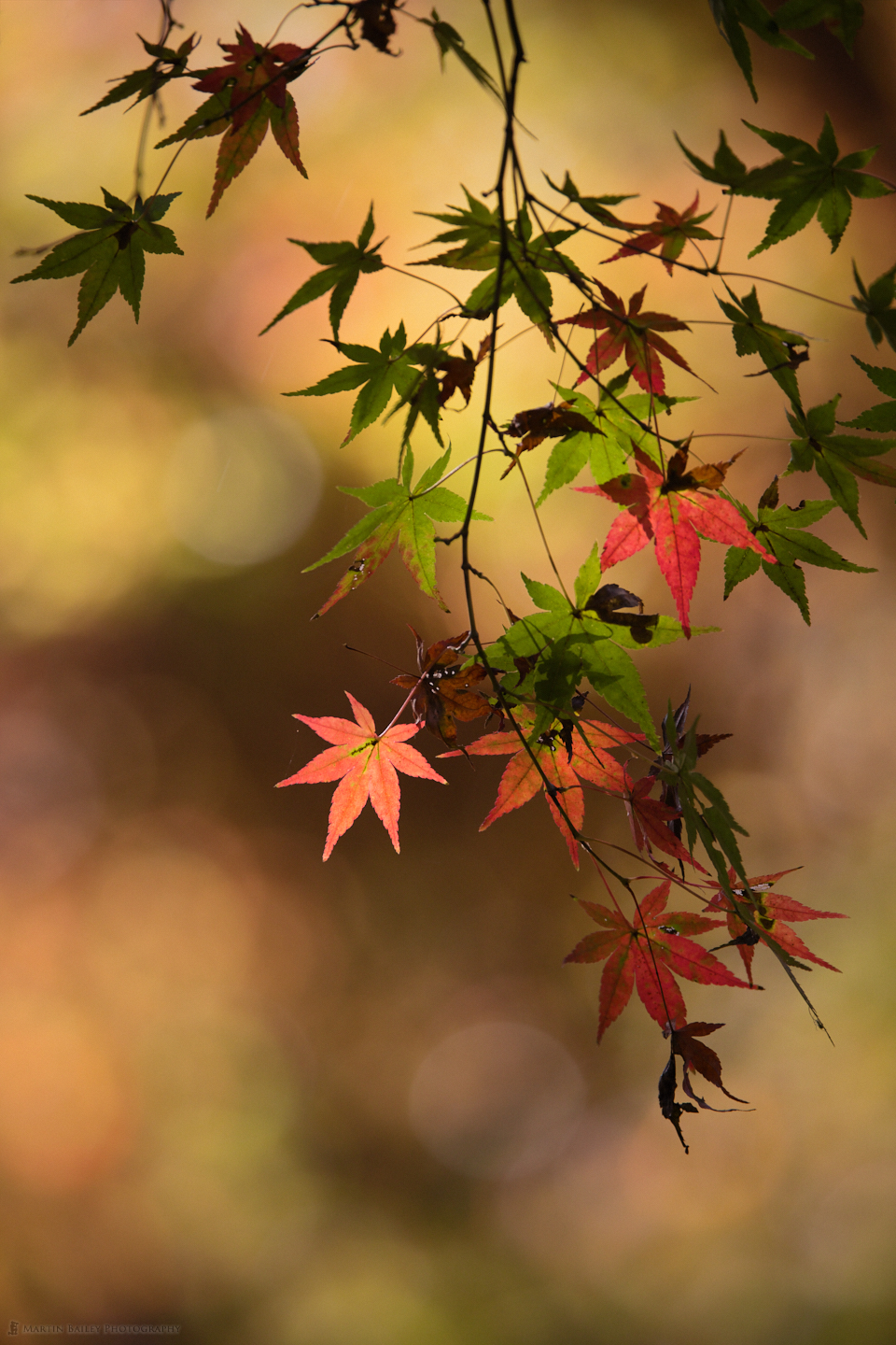
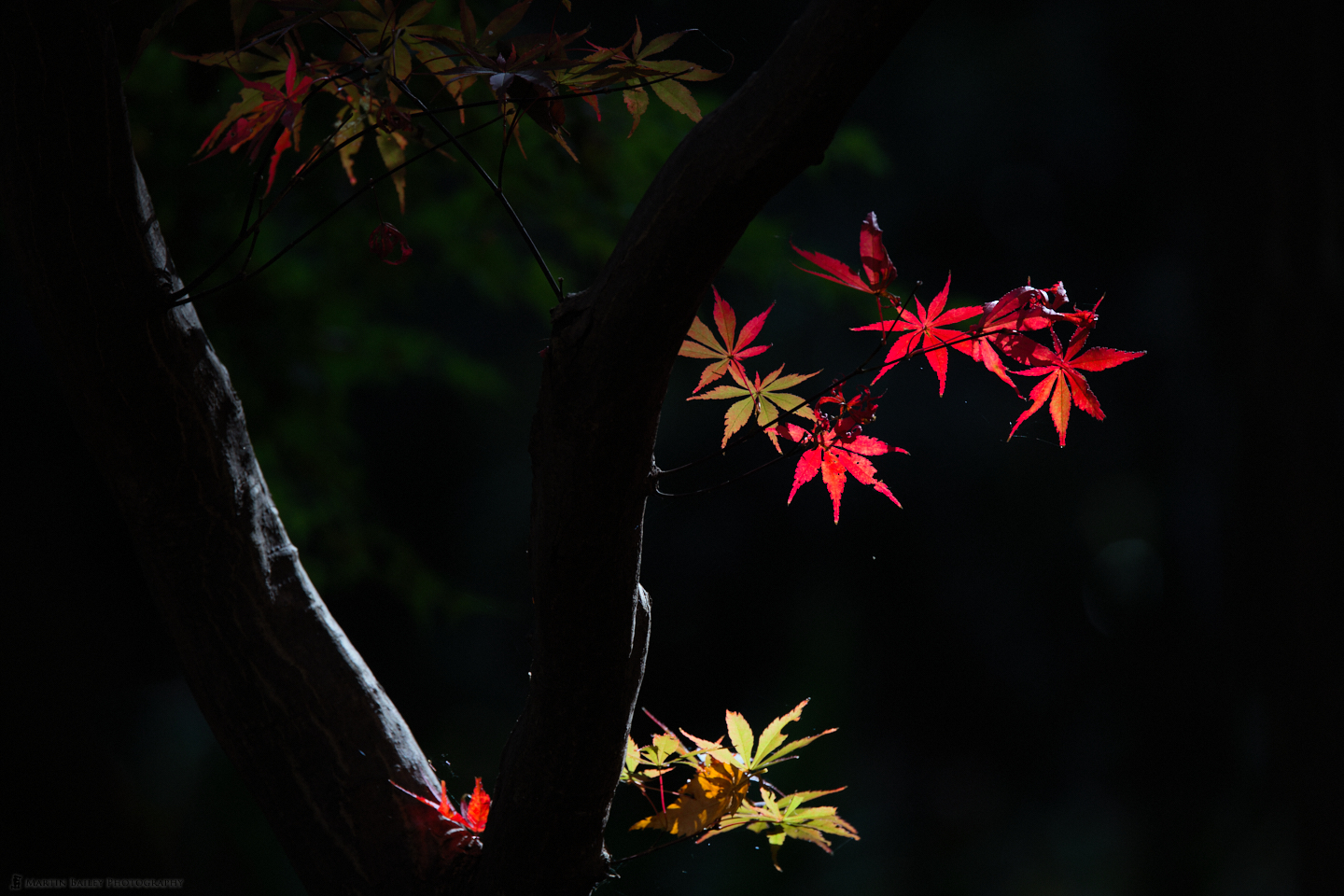
Although the red leaves in the next shot (below) are getting a little bit tired, it’s one of my favorite shots from this short shoot. I love the shape of the tree trunk as it forms an arch along the left side of the frame.
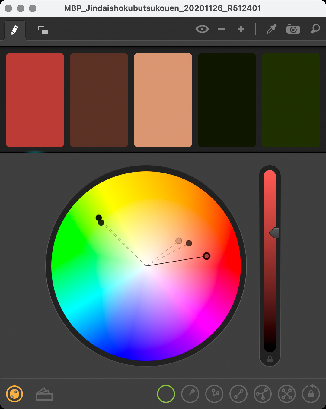
I also find the color palette very pleasing. I suspected that the reds and greens were complementary colors, which I confirmed by opening up an application I use called Spectrum, and imported the photo to find the key colors. Here is a screenshot, in which you’ll see that the main reds and greens fall approximately one-third apart on the color wheel. This means that they are two parts of a triad, which makes them complementary and aesthetically pleasing to look at.
I also just like that deep green as a solitary color, which is why I chose this angle to align the leaves with this patch of background. Moving just a little to the right or left gave me an almost completely black background which was nice too, but I think I prefer the dark green in this. Note too that I used the RF 2X Extender and shot this at 944 mm to get that framing. I also started using my tripod to ensure that I got the framing right and increase stability.
Mellow Yellow
For many years now I’ve been a big fan of the yellow maple leaves that form on some of the trees in the maple garden. I was pleased to see this tree in good color, although I’ve seen it with richer yellows in the past. I’m happy with this next image though and find myself drawn, in a good way, to that brown leaf from a different tree that has gotten lodged between the yellow maple leaves. There are some little jewels of light shining through holes in that brown leaf too, which I also find appealing.
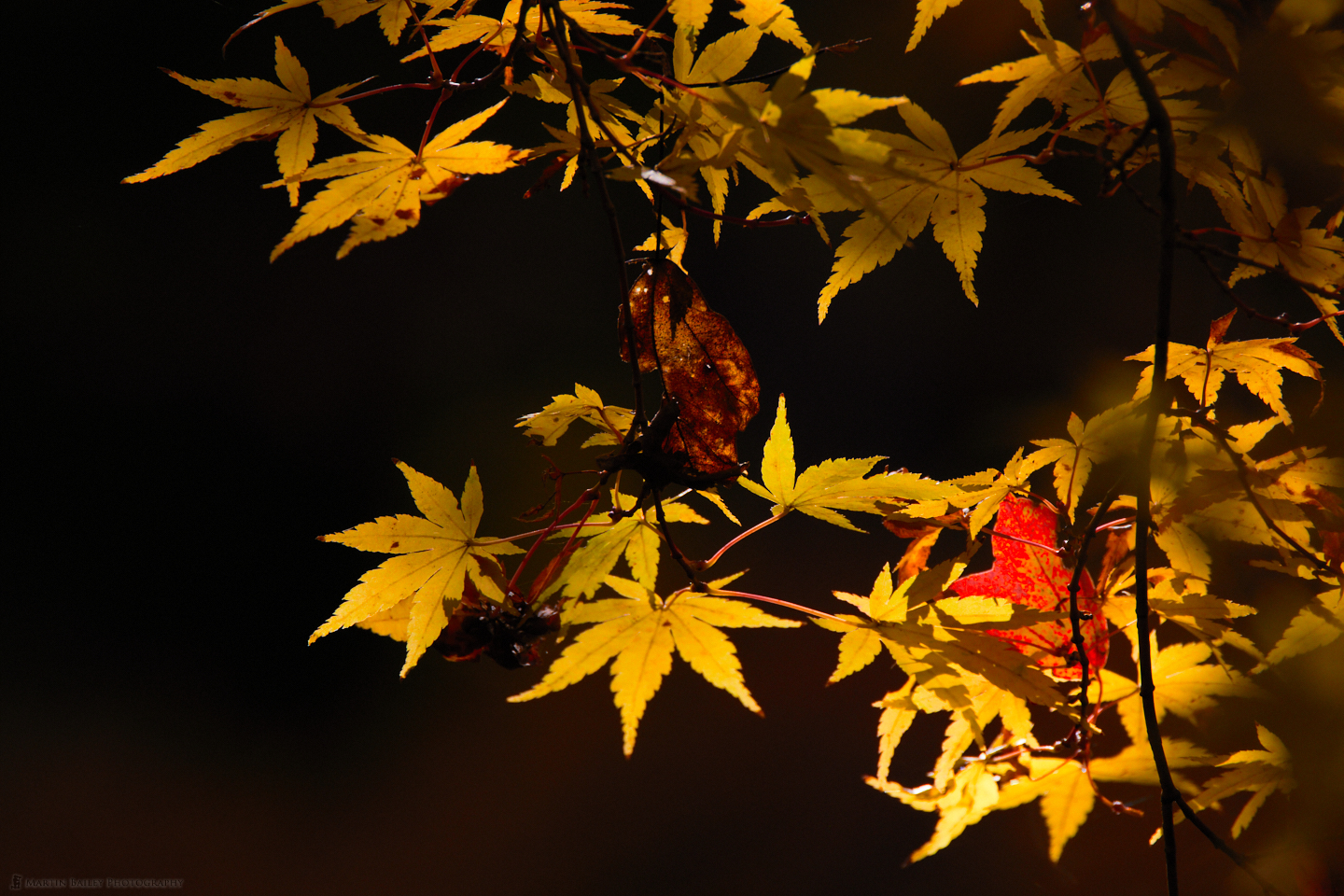
There’s also a wash of golden light across the bottom third of this photograph that I am not exactly sure where it came from, but I like it. It matches the out of focus leaves over on the right from a bow that was between me and the main subject. They’re sufficiently out of focus to not be distracting, and I hope that the viewer will find it relatively pleasing if they notice this. I zoomed out a little to 856 mm for this frame and was still using my tripod.
In this next shot, again, of the yellow leaves, we can see a little more form in that golden wash in the background, and the foreground out of focus leaves are a little bit more of a distraction this time, but I am still relatively happy with this. I also included those balls of red in the bottom left of the frame, which I think add a little something, rather than being a distraction. I think it kind of adds to the autumnal feel of the image.
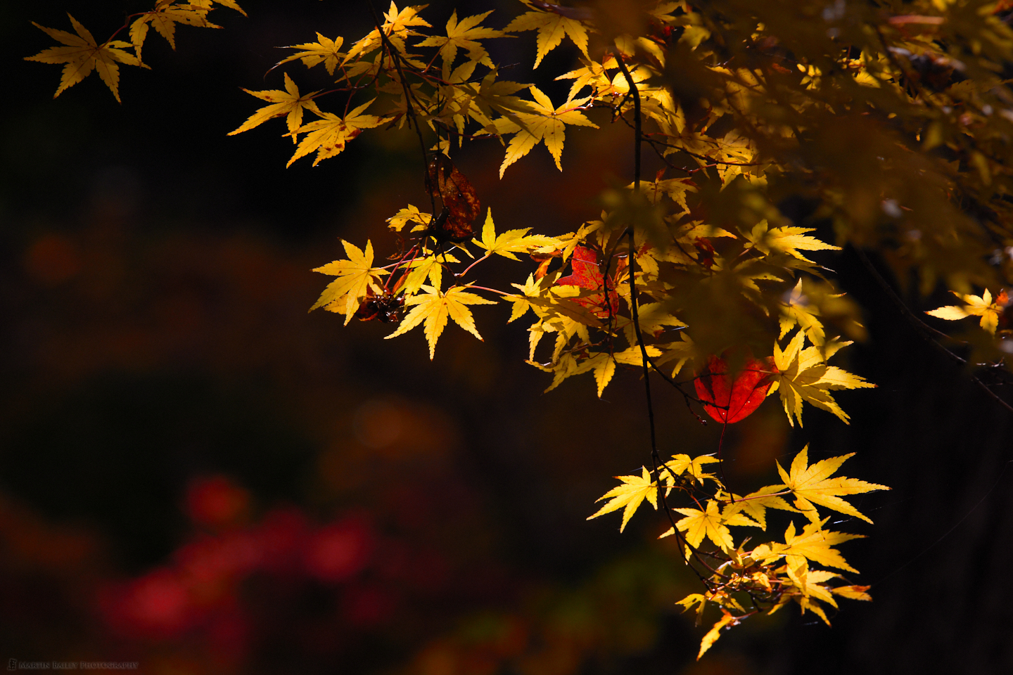
Depending on how big your screen is, you might also be able to make out a creepy eye looking at the camera from the center of the right edge of the frame. It’s obviously just the light with a highlight catching something, but I can’t help thinking that this is someone looking at me, and I find that somewhat creepy.
On a hopefully more soothing note, here are the same leaves from an earlier photograph, but including a second bow of the tree, with a fallen leaf in the fork between the bows, which was catching the light now. This wider view also enabled me to include the leaves in the top left, which I thought added a little extra element of interest. I also feel that this has a more Japanese feel to it. There’s just something about the shape of the tree bows and the overall subtleness of the colors. Almost as though this were painted onto the lid of a lacquerware box or something.
Shortly after shooting the last image, I shot the iPhone photo and the wider scene of the leaves that we looked at to begin this episode with. After that, I left the maple garden for a while and had a walk around the park, when I found two gingko trees, one almost completely bare and one still fully clothed with yellow leaves. This final image for today is of the dew or rain droplets that were sitting on some of the fallen leaves.
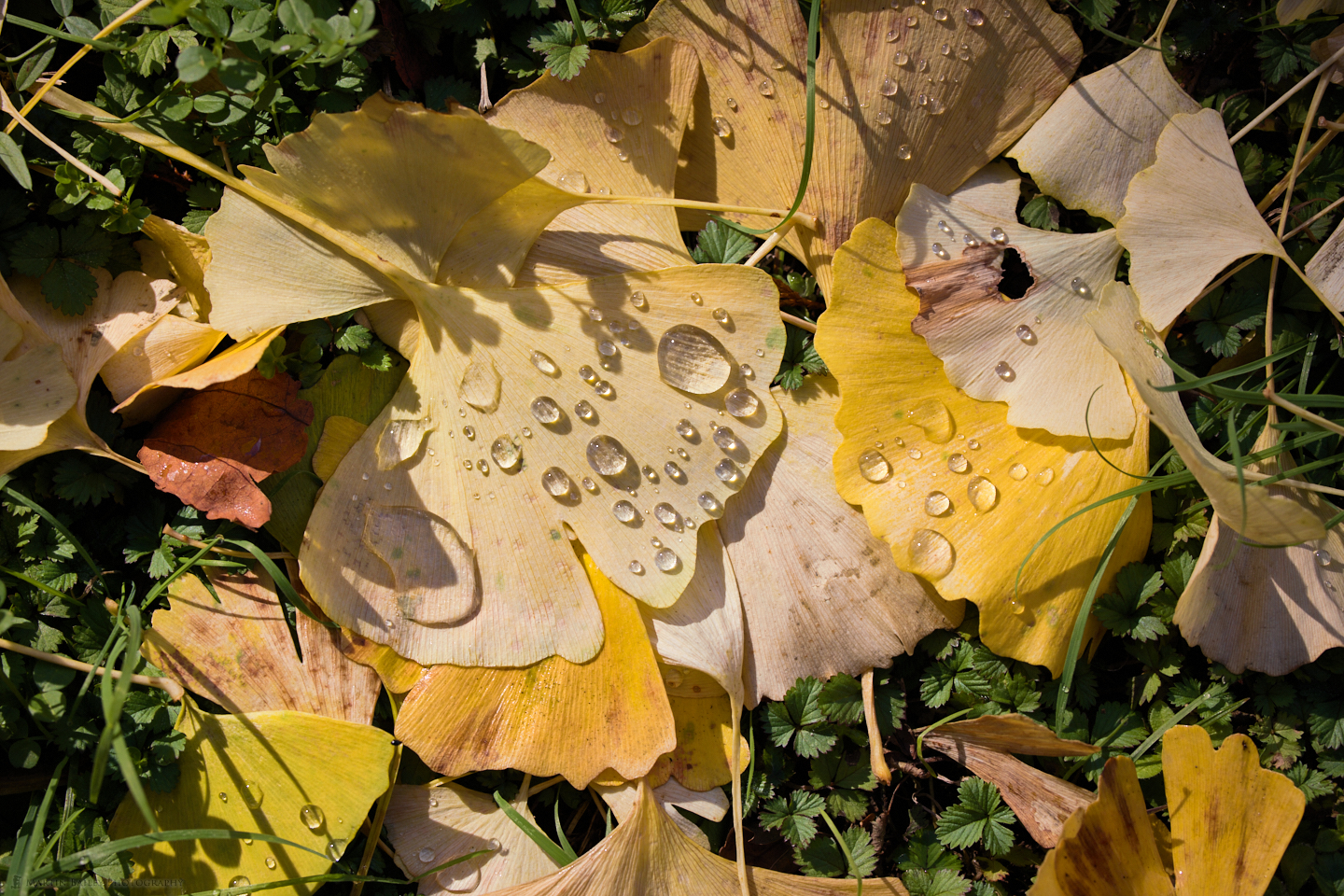
I shot every image that I’ve shared today with the RF 100-500mm lens, except the iPhone shot, of course, but this is probably the widest as I pointed the camera straight down at the leaves, and opened up the lens to 159 mm. In case you hadn’t noticed, if you click on the images on the blog, they’ll open up in a lightbox with the EXIF data displayed, so you can check all of my settings that way if you are interested.
We’ll wrap it up there for this episode though. I hope you found that at least a little bit useful. Next week I’m going to share a number of hardware items that I find incredibly useful, again, in the hope that it will be useful to you too.
Show Notes
If you are going to buy any of the gear I mentioned from our friend at B&H Photo, please use my affiliate links to help support the podcast.
Canon EOS R5: https://mbp.ac/EOSR5
Canon RF 100-500mm lens: https://mbp.ac/100-500
Audio
Subscribe in iTunes to get Podcasts delivered automatically to your computer.
Download this Podcast as an MP3 with Chapters.
Visit this page for help on how to view the images in MP3 files.

Enjoyed this a lot. Do you ever use the RGB curve in addition to or instead of the LUMA?
Hi Monica,
I’m pleased you enjoyed this.
I have played with the RGB Curve in the past, but I am not a fan of how it changes the color saturation. I generally want more control over the color, and therefore generally go to the Advance Color Editor for color changes, and use the Luma Curve when tone curves make more sense, as it only affects the luminance, leaving the color alone.
Regards,
Martin.