This week I’m going to answer a question from listener Doug Shoemaker, about photographic print viewing distances, and I’ll explain about minimum print resolution theory and my own standards that I use when printing.
Thanks for your questions Doug! I can give you some pointers, based on my own experience, which I hope will help. Doug asks…
Would you at some point comment on the relationship between the size of a print and it’s complexity? I was disappointed last year when I printed my top ten photos, and most were not impactful on the wall. A relatively simple color-block style composition looked pretty good at 12″ X 12″, but a photo of a wooded glade looked positively boring at 11″ X 16″.
Then I heard Joe Brady in a TWIP “Your Itinerary” podcast, and he mentioned that detailed landscapes need to be printed really big in order to look good. As printing is a real investment, can you offer any rules of thumb as to the best size to print a given photo?
OK, so let’s consider the various aspects at play when we think about how large an image needs to be printed for optimal impact.
Print Detailed Images Large
Without doubt, an image that contains a lot of detail has to be printed large enough to view that detail at a reasonable size from any given distance. Doug went on to mention that the images which were printed at 12 x 12 inches and 11 x 16 inches could not be viewed at closer than around 1.25 meters (which is about 49 inches) because of furniture.
For a relatively abstract image with simple shapes and texture, we don’t necessarily need to see into every detail, because there really is none to appreciate. For an image containing fine details though, there are some calculations that can be used to find the optimal viewing distance.
Viewing Distance
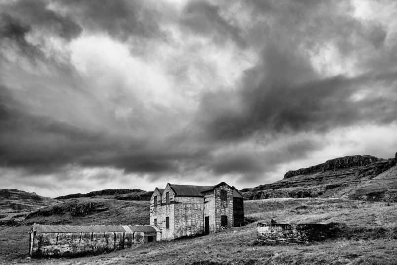
The viewing distance of a print is somewhat subjective. Common theory dictates that the optimal viewing distance for a print is between 1.5 and 2 times the diagonal length of the print. For example, the largest print of my work that I own is a 32 x 48 inch gallery wrap of the below photograph. The diagonal length of the print is just over 57 inches.
If we use this method to calculate the optimal viewing distance, we get a distance of between 85.5 and 114 inches. I chose this size print to go on a large wall in our living/dining room. When I’m sitting at our dining table, I’m about 100 inches from the print, right between the 1.5 and 2X multiplier.
At this distance, I can appreciate the print, but when I stand at the distance that I feel I naturally want to view the print from, I actually stand at around 57 inches, the same distance as the diagonal length of the print. This enables me to appreciate the entire image, and also appreciate the details.
Before sending this image to the printing company, I enlarged it using ON1’s Perfect Resize, so that I had a resolution of 300 ppi at the print size of 32 x 48 inches. Of course, I’m increasing the resolution from an image of much lower resolution, but the result is an image that you can also view very closely and appreciate the details, as well as from a distance, to appreciate the image as a whole. We’ll look at this enlargement process briefly a little later.
Doug’s Minimum Viewing Distance
If we consider the print sizes that Doug quote in his question, we can calculate the minimum viewing distances for these as well. A 12 x 12 inch print has a diagonal length of 17 inches. If we use my personal preferred viewing distance, this means that the viewer would need to be able to view the image at a distance of 17 inches to be able to appreciate it.
Even if we go with 1.5X the diagonal length, we need a distance of 25.5 inches, but that for me is too far. Doug tells us that his viewing distance was around 1.25 meters, which is 49 inches, and that is obviously much too far away to view an image of this size.
The diagonal length of the 11 x 16 inch print is 19.5 inches, which would give a viewing distance of just over 29 inches at 1.5X or the same 19.5 inches at my preferred viewing distance. Both still much shorter than Doug’s viewing distance, so the answer really is that the prints needed to be much larger to really appreciate at the viewing distance.
Calculating Print Size from Viewing Distance
Of course, if we decide on our viewing distance first, we can use this to calculate the print size that we need for any given image. For my preferred viewing distance using the diagonal length as the viewing distance, at 49 inches, you’d need a print of around 28 x 42 inches, using the standard 3:2 aspect ratio for the sizes. If we use 1.5X the diagonal length, it needs to be around 32 inches, so the print would need to be around 18 x 24 inches, which is a standard frame size.
Photos in a Collage
Of course, in Doug’s case, he was printing many images and hanging them as a set. I’ve not done this myself, but I do have a little bit of general advice. Firstly, if you are creating a collage of prints, by all means, to save space, you can make the less detailed images smaller, because they don’t need to be printed large to appreciate.
Also, maybe consider canvas gallery wraps, as these look beautiful without a frame, and the frame around multiple images in a collage can add a lot of space. This breaks down of course when you have frames that you want to use for the collage, but if that is the case, you’ll need more wall space if you really want to be able to appreciate more detailed images fully.
Border Size
Doug continued to ask about the size of the matte border in his question. I have a spreadsheet available for download that explains how I calculate my border sizes. You can find this at https://mbp.ac/borders
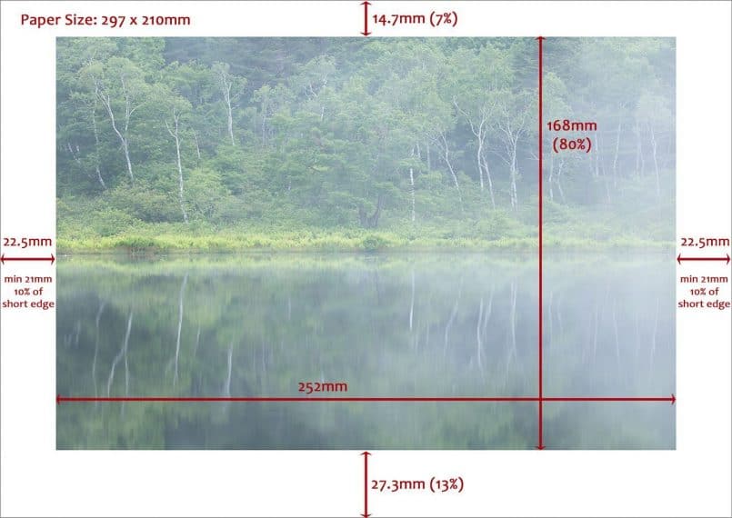
Basically I use 10% of the length of the short edge of my image as a border, so using the dimensions in my example image (below) which is based on a sheet of A4 paper, the short edge is 210mm, so the border size will be a minimum of 21mm wide, even on the long edge.
I offset this, using 7% of 21mm for the top border, and 13% of 21mm for the bottom border, as this gives me space to sign the photograph below the printed area, but also if an image is printed smack in the middle of the sheet, it can appear a little bottom heavy. Raising the image slightly feels more aesthetically pleasing.
Wall and Lighting Color
Doug also asked about wall color and the color of his lighting. I think the main thing to keep in mind is that most galleries have white walls, so this is probably a good place to start if you are really serious about creating gallery space in your home. I have seen galleries with dark walls too, but if I recall, it was a very neutral dark color. This is probably the key for being able to view the images as neutrally as possible.
As we know though, there are no rules in art, so there is always scope for finding even bright, vibrant colors that match your art collection, although you would really need to know what art you are going to hang, before selecting your color.
As for lighting, I personally just have daylight balanced LED lighting in my rooms, and I think this provides a nice neutral light without splashing out on gallery lighting. If you are going to move away from daylight balanced lighting, you might consider creating an ICC profile for your printer and media combination using a reading of the color balance of your lighting, to ensure that the images are viewed as close to the original color as possible.
Personally, I never adjust the color balance of my ICC profiles, because I have no control over where most of my images are hung and viewed. I might consider this for a very important gallery exhibition, but for my 2010 solo exhibition in Aoyama here in Tokyo, I didn’t do this, and I didn’t feel it necessary. The images looked perfect under the gallery lighting.
Also, bear in mind that most gallery lighting has a color temperature of 3000K, so it’s slightly on the warm side. My LED lighting measures at around 4,750K, so it’s a little cooler, but I find that to be fine for both light to live by, as well as viewing images on the wall.
For me of course, another limiting factor is that I live in a rented apartment, so I can’t add any dedicated lighting. If I owned my own home, and had the space to create a dedicated gallery area, I would probably invest in lighting from a company called ETC. They seem to be doing some nice gallery lights.
Minimum Print Resolution
OK, so as you start to create larger prints, we do need to keep the available resolution in our images in mind. Before I go on, I’d like to point out that I’ll explain some of this theory but this is one of those subjects that I have decided that I really just don’t care to follow the so-called rules.
There are areas of photography theory that some people spend countless hours discussing, worrying and arguing about, but I personally don’t have the interest, time or inclination to concern myself about these discussions. If I can simply my thinking on certain areas, I do, and my work doesn’t suffer for this. In fact, it might even benefit from it, because I generally set my standards higher than the results of the stressful calculations. Let me explain…
Calculating Minimum Print Resolution
There is a calculation that is commonly quoted, to give the minimum print resolution for an image based on viewing distance. Basically the minimum ppi (pixels per inch) is 3438 divided by the viewing distance. If we use my earlier large print size and the popular viewing distance of 1.5 times the diagonal length of the image, our calculation is 3438 / (57 x 1.5 = 85.5 inch) = 40 ppi.
Now, although the image would be recognizable at 40 pixels per inch, when viewing from 85.5 inches, it would be noticeably soft, and if you walk closer to the image to view the detail, there would not be any detail to view. Of course, photographers tend to be more critical of image sharpness than regular viewers, but at such low resolution, you really can’t appreciate the image at all.
The problem with using a calculation such as this, is that you have no control over how close a person will view your image. Of course, if you are printing an image for a billboard, which is viewed only by people driving along the highway, you have an idea of how far away they will be, and no one expects a billboard to be critically sharp when viewed from a few feet away, but they always look pretty good from the highway.
If you are printing your work to hang on a wall though, people will often try to get close enough to enjoy the detail, as well as looking at the image from a comfortable viewing distance, which for me, is approximately the same distance as the diagonal length of the image. Even if we recalculate the minimum print resolution based on my preferred viewing distance, we get a resolution of 60 pixels per inch, and that really doesn’t cut it for the critical viewer.
Checking Resolution in Lightroom
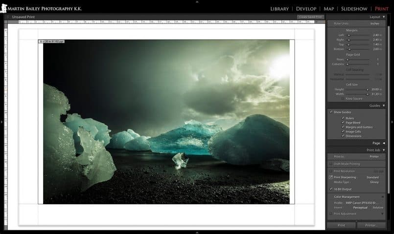
So, what standard calculation do I use when printing? I use the same rule of thumb when printing, regardless of the viewing distance. As I prepare to print an image, I check the resolution in Lightroom. You might have to click on the below image to view the details in the larger image.
As you can see, under the Guides panel, I have Show Guides turned on, and below that I have Dimensions checked. This shows the print area size and the resolution in the top left of the image preview. If you don’t see this in Lightroom, uncheck the Print Resolution Checkbox under the Print Job panel.
For this particular image shot with my Canon 5D Mark III camera, for a 24 x 36 inch print with borders, giving me a print area of 20 x 30 inches, I get a native resolution of 192 ppi. The diagonal length of the actual print area is 36 inches. If we divide 3438 by 36, my personal viewing distance preference, we would get a minimum resolution of 96 ppi, so I could print this as it is, and be well within the guideline.
My Rule of Thumb
In my own printing, my rule of thumb is that if the native resolution of the image, as seen in Lightroom, drops below 200 ppi, I start to consider upsizing in onOne Software’s Perfect Resize, to give me 300 ppi at the print size. I have printed 5D Mark III images out at this size with the native resolution, and they look OK, but are very slightly soft, and lacking in fine detail. If the resolution drops below 150 ppi, I definitely upsize the image before printing.
Calculating Native Resolution
If you don’t use Lightroom or just need a quick way to calculate the native resolution for print, it’s pretty easy to calculate. For example, for the print area in our example, which is approximately 20 x 30 inches, you simply divide the width of your image in pixels by the number of inches you will be printing at. My image is 5760 pixels wide, which divided by 30 gives us 192, the pixels per inch that we saw in Lightroom earlier.
Enlarging in ON1 Photo 10 Resize
If you feel that you need to enlarge your image for print, say for example, in my case, if the native resolution drops below 200 ppi, ON1 Perfect Resize is a good choice for this. Perfect Resize used to be a stand alone product, but now it’s a module called Resize in the ON1 Photo 10 suite, available from the onOne Web site.
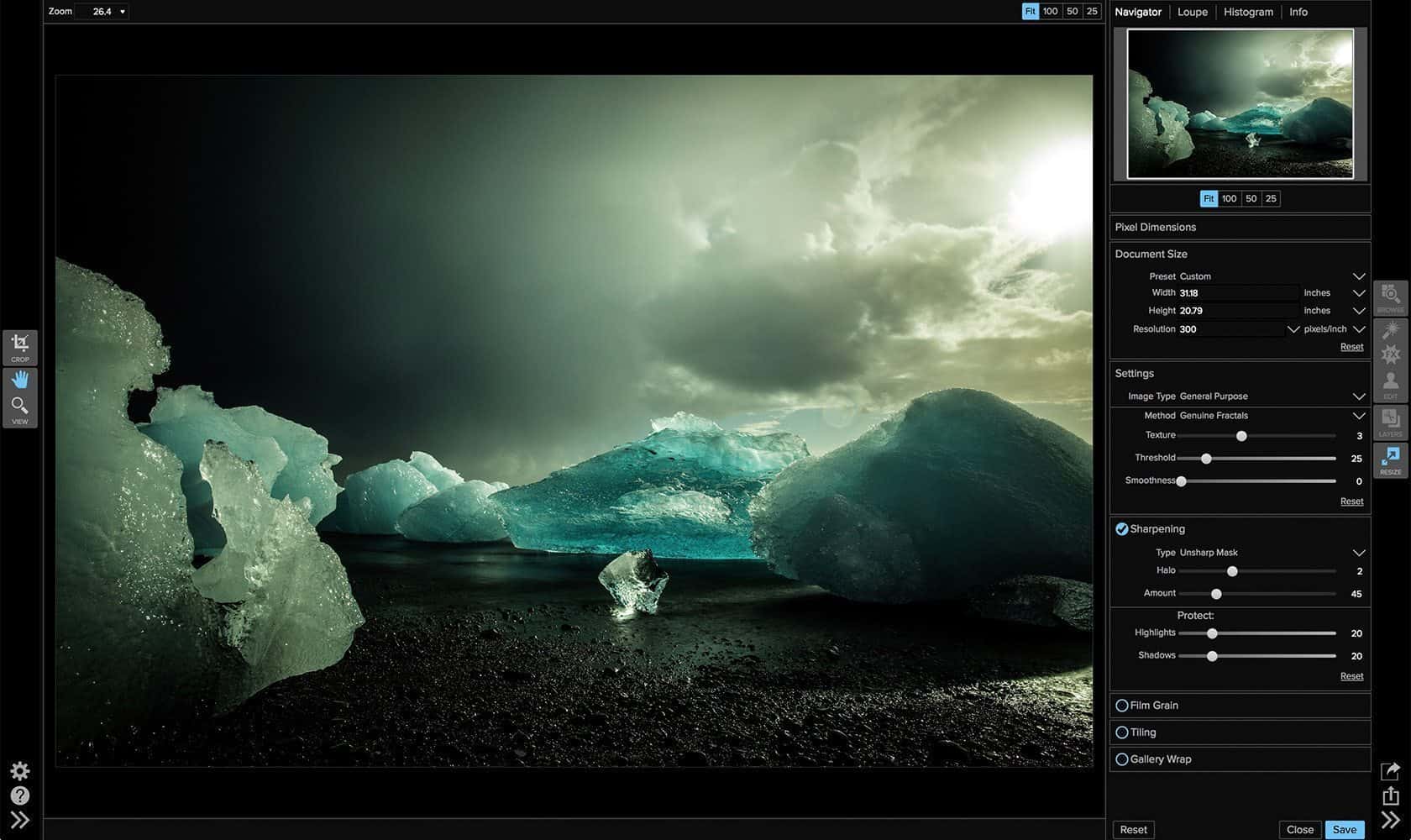
I’m not going to do a tutorial on this today, but here is a screenshot to show you the application, and the sort of settings that I select when enlarging an image for printing at just over 20 x 30 inches, for a 24 x 36 inch print with borders (below).
As you can see, it’s really just a case of entering the dimensions of the print area into the Document Size panel, and ensuring that your Resolution is set. I generally print at 600 ppi, which requires an image resolution of 300 ppi. I use the Genuine Fractals method as the actual enlarging algorithm, as I find this gives the most natural and pleasing results.
I also apply a little bit of sharpening here, but not a lot, as I also apply sharpening set to Low when sending the print job to the printer from Lightroom, and I don’t want to over-sharpen. Once you’ve selected your settings, hit the save buttonb and the image will be saved back to Lightroom, if you are round-tripping that is.
Once you have your image back in Lightroom, or Photoshop, or whatever program you print with, you can print away now, and enjoy very high quality prints that stand up to much closer scrutiny than they would if you printed at a native resolution of under 200 ppi, and definitely better than if you were to print using the commonly passed around viewing distance based resolutions.
Protect Your Wild Photographs
You might consider this overkill, and for sure, if you know that your images will be viewed from a certain distance, say for example you are going to hang the print behind a sofa, so people physically cannot get any closer than my preferred viewing distance of 1X the diagonal length of the print, then you could certainly print away at 150 ppi, and the print will still look fine.
The main reason that I don’t settle for this though, is because the majority of my prints leave my control. When I create a print for a customer, I have no way of knowing how far away from the print the viewers will be. I also imagine that some people when they receive the print will view the detail at close range, and the last thing I want to do is to disappoint a customer.
OK, so to wrap this up, I’d like to once again thank Doug for his question. I’m sorry it took me so long to do this episode for you, but I hope you find it useful now that it’s here.
Have a Question?
If you have a question of your own that you’d like to ask, note that there is a Voice Mail button at the side of all the blog pages, a link to our Voice Mail at the top of the sidebar, and there’s a recorder embedded in the Podcasts Audio Archive page. You can record up to five minutes, so you can relay your message in full, and I’ll play your message in my reply episode when appropriate. Of course you can send your question in text format via our Contact form as well. I look forward to hearing from you.
Show Notes
Ask your own questions here: https://mbp.ac/voicemail
Subscribe in iTunes for Enhanced Podcasts delivered automatically to your computer.
Download this Podcast in MP3 format (Audio Only).
Download this Podcast in Enhanced Podcast M4A format. This requires Apple iTunes or Quicktime to view/listen.


I really enjoyed this podcast Martin. It forced me consider technical details I usually don’t think about. I tend to enjoy small prints that give a more personal feel. But I always get the urge to try and print one to a larger size once in a while.
That’s great Charlie. Thanks!
For sure, small prints have their place. I love holding small prints, and even on the wall they can look great, as long as you can get close enough to them to appreciate the beauty. But when the viewing distance has to be greater, the print really needs to match that distance.
Cheers,
Martin.
Thank you Martin for sharing this information. Print has always been a gray area for me that is a little scary to venture into because I didn’t understand. This has helped me a great deal
Thanks for the comment Cheryl! I’m pleased this has helped.
Printing can be a little bit daunting at first, but with a number of links in the chain solidly in place, it’s easy and can be a lot of fun. I hope this and my other print related content help you to print your work and enjoy the process!
Regards,
Martin.
Being a regular at the massive Scotia Contact photo show staged all over town in Toronto every May, in venues from large public and small private galleries to little restaurant and retail store walls, the exhibition issues you raise are very interesting. One finds oneself calibrating behavior at different venues and voting for distance with one’s feet, depending on how many other viewers might or might not be in the way.. In many cases this one-month show is not the final destination for the prints and that can be a challenge in itself.
I never miss a chance to say, overwhelmingly, the very worst thing for displaying a print has to be a reflective glass sheet over it – nothing is worse than finding that perfect vantage point and then seeing myself alone or in a sea of faces, or even worse, seeing the image contaminated with two or three competing images on the opposite wall of the gallery. It’s a combination of the glass itself and the arrangement of illumination around it. Unfortunately, even when it’s not reasonably necessary to protect the print, a lot of them are shown behind a glaring and distracting glass surface.
Hi Albin,
Although I was thinking more about hanging prints for viewing at home, the math is still valid for exhibition. If the photos move between a number of venues that you have no control over, I personally generally just go with a size that I would like to see the print displayed at. I generally go as large as possible, unless there are restrictions, but if there are venues where people are guided to view the prints quite close, maybe around 13 x 19″ is a good size. Of course, depending on how many prints you will display, cost is also an issue.
There are some great glassless frames available, although that does of course leave the prints more vulnerable. The main advice that I often give people buying my prints, is to avoid a gloss finish, if the print is going to be displayed under glass or acrylic board. The gloss of the media along with the reflectivity added by the glass is usually too much. Good quality museum acrylic is often not as reflective as regular glass, but still, a matte print works better in this situation.
Cheers,
Martin.