This week, TWiP co-host Don Komarechka and I hook-up again to talk about printing, a passion we both share.
Here are the points discussed:
– Why print?
– A photo isn’t truly done until it’s printed
– Helps to hone your craft
– How big can you print an image from a typical digital file?
– Choices of paper: discuss our favourites and why
– Do it yourself or get someone else to to do it?
– How much does a good printer cost? Paper & ink?
– How big do you go?
– Expect to waste money and consumables while learning
– Colour Management
– Screen & Printer
– What does spending more on calibration gear get you?
– Why it’s necessary – prints come out too dark!
– Soft-proofing
And here are some of the images that I mentioned during our conversation…
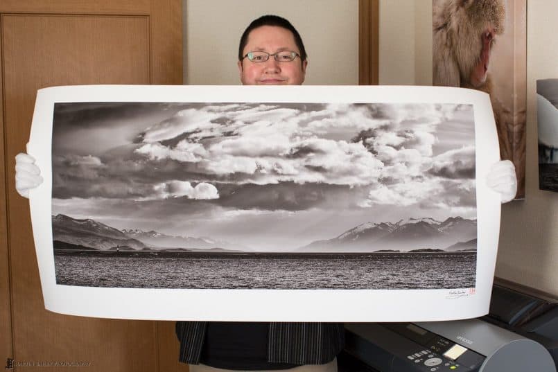
Here’s a photo of me with that 24×48″ print that I mentioned. This was from a 10 megapixel image, embiggened in Perfect Resize.
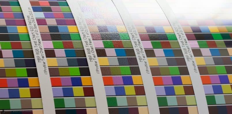
Here’s the comparison between five of Breathing Color’s papers — All excellent papers, but reflectiveness is something to bear in mind, especially if you’ll be framing under glass or perspex, which adds another layer of reflectivity, unless you go for anti-glare glass. I actually just really like matte prints anyway, and Optica One, on the very left here is my favorite. Just look how deep those blacks are and how rich the rest of the colors are!! From left to right these are Optica One, Elegance Velvet, Vibrance Rag, Vibrance Luster and Vibrance Gloss . My favorite gloss paper is Vibrance Rag, the middle one.
By the way, if you buy anything from Breathing Color, use the code MBP20 for a $20 discount off any order of $20 or more.
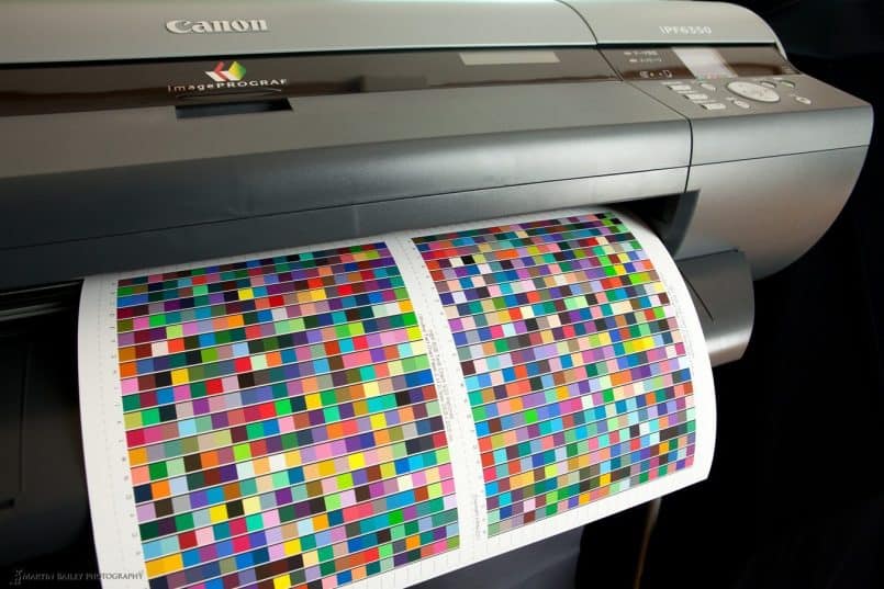
And I thought I’d throw this in for good measure. My Canon imagePROGRAF iPF6350 printing out a couple of profile charts.
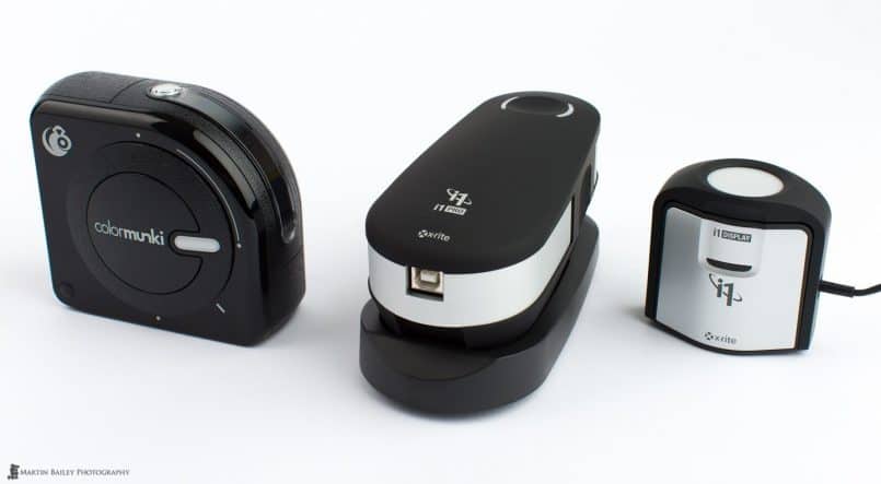
Here are the three main tiers in X-Rite’s line up – from left to right, the ColorMunki Photo, the i1 Pro 2 and the i1 Display Pro.
Support Don’t Snowflake book here, and more importantly get your own copy, or one of the other great value packages!
You can pick up my Craft & Vision ebook, Making the Print – Printing Techniques for the Digital Photographer – A MASTERCLASS here.
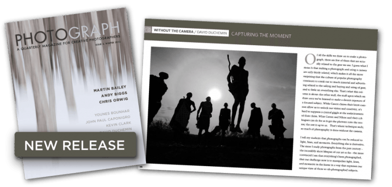
You can also read the article I mentioned, “Why Resolution Matters, But Doesn’t Matter”, in Craft & Vision’s digital magazine, PHOTOGRAPH Issue #2.
Show Notes
See Don’s work here: http://www.donkom.ca/
Help fund the Snowflake Book: http://igg.me/at/skycrystals/
Music by UniqueTracks
Subscribe in iTunes for Enhanced Podcasts delivered automatically to your computer.
Download this Podcast in MP3 format (Audio Only).
Download this Podcast in Enhanced Podcast M4A format. This requires Apple iTunes or Quicktime to view/listen.




Thanks for the great podcast. A bit off topic but when getting a framed matted do you like to have the paper showing? Like a 1/4″ or 1/2″ “paper boarder” within the matting or do you have the mat right up against the picture edge?
Good questions Charlie.
Whether I leave some paper showing depends on whether or not the image is signed. If it’s signed, I leave enough space around the printed area to show the signature. If not, I matte right up to the edge of the print.
I’m pleased you enjoyed this Podcast!
Thanks Martin 🙂 So when signed you just leave a bit of space on the bottom or is it an equal amount on all sides?
Very informative, first-rate podcast, as always. Thanks!
As a D2HS shooter (not my only body, but tends to be with me), Perfect Resize has been a godsend.
http://www.strangelyindifferent.com
Thanks Robert! I’m pleased you enjoyed this.
Hi Martin,
Great podcast. I have been using an iPF6350 printer for about a year now and have never heard about the ” Lightroom driver setting for new versions of LR4″ as you discussed in the podcast.
If you could point me to some info regarding this I would be very greatful, or if it’s in your “making the print” e- book, I will purchase that.
I’m on a PC using LR4 and PS CS5 if it is platform specific.
Thanks again Martin.
Hi Rick,
I’m pleased you enjoyed this!
I should have been more specific, in that the double profiling issue only affects Mac users, so you’re off the hook. 🙂
For any Mac users, information on this is here: http://canonipf.wikispaces.com/message/view/FAQ/40389067
Cheers,
Martin.
Great show, 2 of my favorite photo geeks!
I too love printing. A question about signing images. When I mat and frame my printed work. Is it appropriate to sign the print on the photo or is it better to leave white space and sign there. A different story with Canvas wraps.
I have been using a Gold or Silver ink type gel pen with nice results.
Keep up the great work.
Thanks Terry!
I personally sign on the white, and leave a border around the image in the matte, but this is entirely up to you. Some people sign over the photo, and if required to do so, I’d be OK with that too. And yes, as you say, I sign directly over the printed area for gallery wraps. I use white, silver or black, depending on the colors I’m signing over.
Cheers,
Martin.
Probably one of the best shows since I’ve been listening to you.
Don verified something I always suspected; that is as ISO goes up, Dynamic Range goes down.
Although very subjective, would you be able to elaborate, on a future show, when we might choose a matte paper over a lustre, or canvas, etc?
Keep up the great shows. Your podcast is like a weekly visit from one of my photo friends. 😉
Thanks Larry!
As a quick guide, I choose matte by default, basically because I love the look of matte photos. Reasons to consider though are as I mentioned in this episode, that matte paper under glass actually looks quite glossy anyway, but if you frame gloss paper under glass it can be highly reflective.
If I go for a gloss, it’s usually the slightly textured Vibrance Rag from Breathing Color. It’s a beautiful baryta coated paper. And I personally rarely use a fully smooth gloss, but they can look nice.
I use canvas of course when creating a gallery wrap, but unlike Don, I use the matte Lyve Canvas, rather than gloss. Again, I just prefer matte and low reflections. It’s really just personal preference.
Cheers,
Martin.
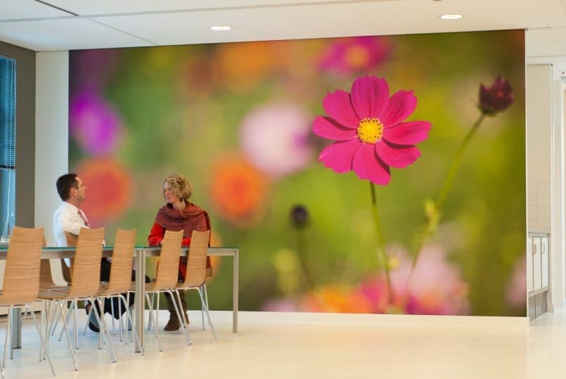
You’ve talked about those giant prints you made for the lunchroom before but actually seeing them that big is…wow. How fun!
embiggened? Love it. Thanks for the podcast. It’s helped us a lot.
You’re welcome Shane. Thanks for listening.
Embiggening; it really is a word! 🙂
http://en.wiktionary.org/wiki/embiggen