Today we’re going to take a look at the five winning images from the December 2011 assignment, on the theme of “Organic”. It was great to see a still more people get involved in our assignment for the January assignment that is about to close! Thanks to those of you that uploaded your resulting images, and please do continue to try and get involved if you don’t already.
So, let’s jump right in and take a look at the five images that got the most votes from the MBP Community for the Organic assignment. In fifth place is Morton Goldberg, with “Not a Pumpkin”, and here’s Morton’s back-story…
My idea for this assignment was simple: use the same lighting setup and depth-of-field stacking technique as I used in last month’s assignment to photograph a fruit or vegetable. I thought the visual contrast between the two subjects photographed with the same lighting and perspective would be interesting. There was a risk with this idea: it assumed the viewer would make the connection with my Machinery assignment entry, at least subconsciously,
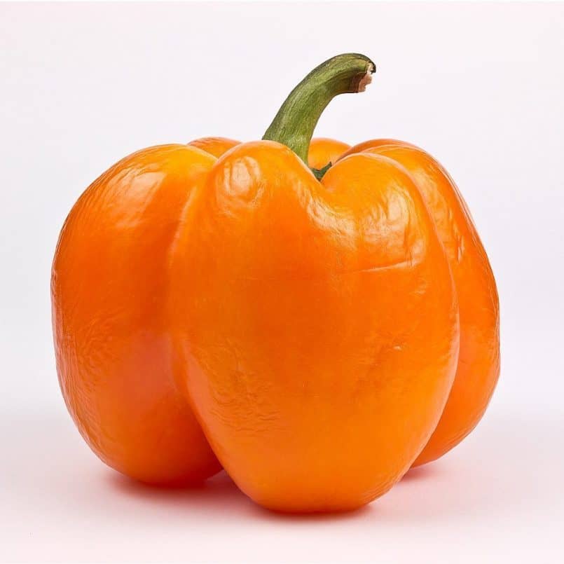
I first looked in my fridge, but wasn’t inspired by what I found there. A trip to a produce market presented me with a wealth of colorful subjects despite it being December. Although tempted by a variety of exotic squashes, I decided to focus on bell peppers (pun intended). They were available in green, red, yellow, and orange. I was much taken with a little orange one which looked to be a miniature pumpkin.
Beside being intriguingly photogenic, the orange bell pepper appealed to me because I had never tasted one and because it was very much the same size as my last month’s machinery subject. This sameness in size meant, when photographed with the same studio setup (including the same camera to subject distance), I would get precisely the same lighting and perspective, which is what I very much wanted.
The only difference in photo technique between my Machinery assignment entry and this image was that I used a five-frame DOF stack for the bell pepper rather than an eleven-frame one. Post processing was exactly the same.
After serving as a photographic subject the pepper contributed to a fine salad. It was very tasty.
Well done on fifth place Morton! I like the shot, and the obvious link between your two shots. The appealing thing about your subject to me, and why I think it was successful in the assignment, is the fact that the bell pepper seems to be a tad past its best. The wrinkles in the skin and the slightly wizened stalk emphasize the feeling of this being a living “organic” object. I’m pleased that this little guy made a nice salad too. Congratulations Morton.
In fourth place, we have Landon Michaelson, with “Bio”, and here’s Landon’s back-story…
That was a great assignment. Really got me thinking. Congrats to all the great entries, ideas and [thanks for] the resulting votes. Now on to the back story for “Bio”.
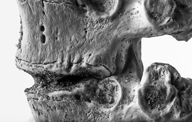
My first idea was to get out a bag of compost. The great soil that comes out of the process of composting organic waste. Then I recalled I had part of some vertebrae I found washed up on an ocean beach years ago. They have been sitting above my workshop bench on a shelf beside the radial arm saw for a long time. It still has beach sand on it within the crevices. I figured bones are foundational and so different than machines made by humans.
So I started with the idea of shooting down the inside of the vertebrae where the spinal column would be. Thought of what camera might get me the right angle of view. That turned out to be an iPhone and I took some test shots. The next idea was to run some fiber optic cable through it to simulate nerve impulses and some dramatic lighting. But that idea got put on the back burner as the month progressed.
Ultimately I wound up taking some time on the last day of the year to try shooting the object with a “big boy camera” by mounting my 105 VR macro lens on my D700 and having a go at framing the subject various ways looking for a compelling angle.
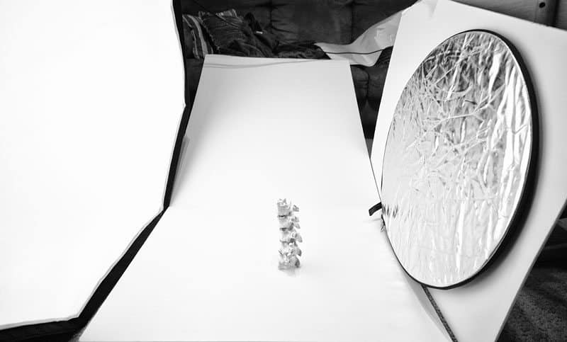
Photo number one (above) shows how I grabbed some hunks of white foam core, setup an Alien Bee B800 on a boom arm light stand, mounted a 47-inch octabox to the bee and set it with the face of the octabox vertical with the edge of it touching the floor. Placed a couple of hunks of white foam core on the floor ramped up and resting on the front of the couch. I used various bounce sources on the opposite side of the bones and wound up with a small circular collapsible 5-in-1 reflector using the silver side. It gave the right look to my eye. I triggered the strobe with Pocket Wizard Plus II units. I thought the large diffused light source and the texture of the object combined with some processing would provide a compelling image in the final outcome.
Then after taking a number of shots at various angles I dropped them into Lightroom to have a look.
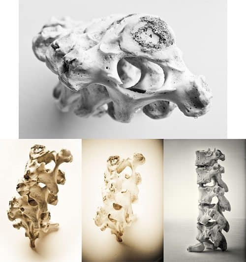
Photo number two (above) shows a couple of the other angles I had tried. I tried some processing ideas as well. Some black and white and some toned to look like bone color. It did not take me long to find that a closeup instead of the whole object was more compelling subject matter and pure black and white was my processing choice. I tried a tight crop in Lightroom with what I had shot and that is when I noticed the sand texture showed up much better as well as the small barnacles on the bone surface in many places. So I went back out into the living room and concentrated on framing in some full frame closeups of what I thought was an interesting section to photograph.
Camera settings were f/20 for depth, 1/250 to nuke any ambient light at ISO200.
I then selected one file that stood out as the best. Some base processing in Lightroom followed by passing it through Silver Efex Pro 2 provided me with a photo that met my goals. With a few minutes left before midnight I uploaded the image to the assignment gallery. It was a good sendoff to finalize 2011.
Well, thanks for the thorough back-story with a great behind the scenes photos too Landon! It was a great idea of course, and I can totally relate to how you noticed the tiny barnacles when viewing the image zoomed in on screen. A lot of time when I’m shooting things up close like this, it’s how it looks on screen that drives me back to the subject with a new idea or two.
I agree that your winning image was probably best for the Organic assignment, but I also really like the other examples that you posted too. Masterful use of your gear and subject matter, as usual. Congratulations on fourth place Landon!
And in joint second place is Melanie Lebel-Potter, with “Promise of Spring to come”, and here is Melanie’s back-story…
A bit of boredom on a rainy day between Christmas and New Year. That’s what’s behind my picture.
I have been thinking for a while about this assignment and was planning to take a picture of some of my Christmas baking (either finished or un-finished items). I have got few nice shots but nothing that felt organic enough. Christmas came and went and no organic-looking picture…
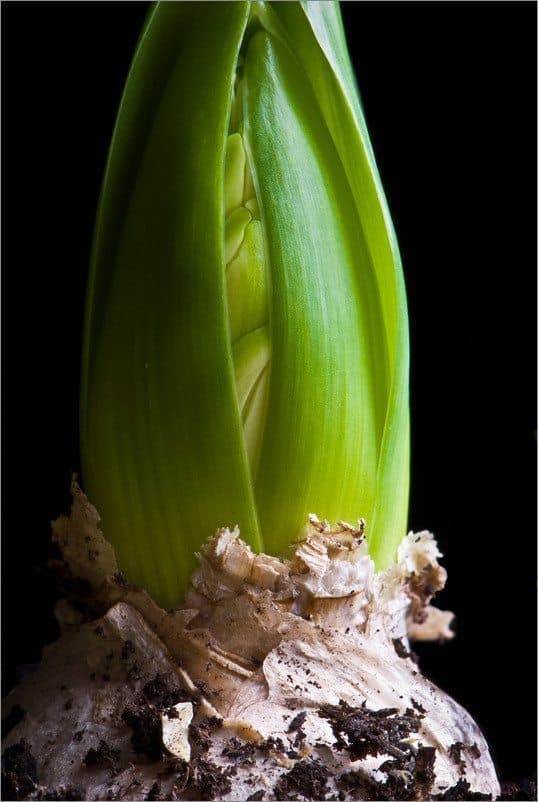
December 29 was our last day up north before coming back home to the London area. Our plans for a nice country walk got thwarted by horrendous weather so I resorted to take pictures of my mother in law’s hyacinths instead. I noticed a few pots of them around the house at different stages of growth and thought they would make a lovely photographic study.
The pots were placed on a coffee table near a large window in the living room. I used my deflector (black “reflector”) as a background and kept moving it up and down during the exposure so we couldn’t see the wrinkles on it. (It worked better than placing it further away, which could not be done easily anyway.) The camera was on a tripod and a cable release helped a lot!
It is only when explaining to my mother in law what I liked about this particular bulb (“It is both elegant and earthy. No, earthy is not the right word… what would it be?.… elegant and… organic. Yes, organic is the word … Oh, Wait!…”) that I realised that I had my shot.
I almost forgot to upload the picture and did it in the middle of a New Year Eve’s party….

I am not only amazed that I have placed for the assignment (co-second with my favourite picture!
) but also that I entered the picture correctly in the first place…
You did great Melanie, on the upload and the photo! The fact that it’s obviously a shoot of new growth coming out of the bulb was a great idea, but I think the soil that it left around the base adds a lot to the organic feel. You chose an interesting way to remove the creases in the background too. With it being totally dark and black, you might have gotten away without doing this, but it’s certainly an ingenious way of dealing with creases when using a relatively long shutter speed. It looks like the EXIF data was removed so I can’t see exactly how long the exposure was, but I imagine is was probably over half a second or so to make that possible. Congratulations on joint second Melanie, and thanks for the kind words about my image, which shared second place with yours. Here’s my back-story…
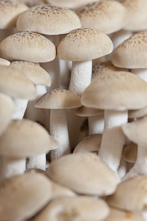
There actually wasn’t really a lot to my shot, “Bunashimeji”. The lighting here was just the ceiling light in my studio, which is two circular florescent tubes with a white dome shaped shade. I placed the mushrooms as far away from the light as possible to get a good angled shadow, and I taped a bit of black velvet to the wall behind them to stop light from bouncing back and filling in the slight shadows. The white balance was adjusted slightly, and I ran it through Color Efex Pro 4 to give the detail/texture a subtle boost.
I took the most time looking for the best composition to give the mushrooms a bit of character, and eventually I only shot about five frames with a few different apertures for shallower depth of fields. When shooting macro though, even f8 gives a relatively shallow depth of field, and this was the one that I liked best, as it gave us nice amount of texture and detail in the spots on top of the mushrooms, which are called bunashimeji in Japanese.
And finally, in first place is Aviv with “The Organic Market”, and here’s Aviv’s back-story…
WOW – Thanks so much to all who voted. 🙂
I have been a huge fan of the MBP Podcast pretty much since picking up photography some year and a half ago. Watching the monthly assignments I was constantly blown away not only by the wonderful images but also by the commitment and effort put into the creation process. Being placed among the winners in my first submitted assignment is extremely humbling, and I will only take that as a sign that I should commit more to the future assignments and to the MBP community.
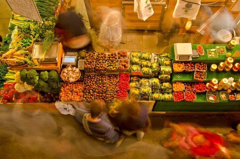
Since I am not much of a studio photographer and do most of my work in the street. I took the topic of “Organic” as an inspiration to where I want to shoot and what ambiance I’d like in the image. I love farmers’ markets and since I recently became more oriented towards organic growth, I thought the newly established Organic Market in the old Tel-Aviv port would be a perfect location.
It was a great morning for photography and the market offered many subjects to photograph. After covering the little booths, the merchants and the produce I searched for a view that shows the entire market atmosphere. I have to give credit here to a fellow photographer who joined me that morning on a last minute decision and she spotted this restaurant overlooking the roofed market. We set ourselves and our tripods there and the combination of the limited light and the desire to capture motion, lent itself nicely to slow-exposure. I put on the darkest ND filter I had to not over-expose the lit areas while shooting slow enough to get the moving crowd.
I experimented with various compositions and exposures to show people standing still at a booth while others are rushing through the market. I liked how the vendors were constantly buzzing to serve customers and it was nice to capture the baby stroller in there as well; all surrounding the beautiful Organic vegetables in their lively colors.
Thanks again and congratulations to the other winners and to all who submitted really stunning work. Wishing everyone the best for the New Year, and especially to Martin – may 2012 be less dramatic for you than 2011!
Thanks for the well wishes Aviv, and for the great back-story! It sounds like you also put a lot of effort into your shot for December, and it really paid off. The view from above really makes this, and the movement you captured in the customers and market stall owners really enhances the image and does somehow give it a more organic feel.
The bright colors and giving us a title to recognize this as an Organic produce market probably clenched it for you. Great stuff! Thanks for getting involved, and congratulations on making such a splash in your first month!
Thanks to all the winners, and to everyone that got involved with this assignment. As of the time of recording we already had more images uploaded to the January 2012 assignment album than the Dec album finished with, so it looks like more of you have made an effort in January too, which is again very nice to see. Remember the deal I made with you last month, that if we can reach 100 entrants to the monthly assignments during the first half of 2012, I promise to spend the time to approach potential sponsors and line up some prizes for the second six months of this year.
The February assignment is “Intimate Landscape”. This idea was originally from Morton Goldberg with actual theme name tweaks for us by Nancy Lehrer. The idea is that you would single out just a tiny part of the landscape but still depict a somewhat grand scene. I for example tend to shoot lanscapes with long lenses, as long as 600mm in fact, to just single out a small area, and I find this approach quite effective. A landscape doesn’t necessary have to be a wide angle or even standard focal length shot. In fact, I think that many landscape shots would benefit from being shot much closer, so let’s give this a try. Thanks for the idea Morton and for your help with the wording Nancy!
You will be able upload your images until the end of February, anywhere in the world, regardless of your time-zone, so don’t forget to post your images.
Show Notes
Music from Music Alley: http://www.musicalley.com/
Audio
Subscribe in iTunes for Enhanced Podcasts delivered automatically to your computer.
Download this Podcast in MP3 format (Audio Only).
Download this Podcast in Enhanced Podcast M4A format. This requires Apple iTunes or Quicktime to view/listen.

0 Comments