As with last month, we have another tie situation, with two people in joint fourth place. First let’s take a look at Landon Michaelson’s photo “Kokanee Trail”, with Landon’s amazing back-story (below).
 Most bookmarks can wind up being upside down, so the idea was to make one that works either way. I have taken a few “up and over” vertical panoramas with sky and tested some 180 and 360 vertical panoramas that include a sweeping foreground and two horizons on a vertical viewpoint. So, on a recent trip I had this idea in my mind. We visited the in-laws at a local resort lake and while taking portraits of us together I took note of the creek that we were next to. We came back the following weekend for an apple cider pressing event, so I packed up the appropriate equipment to pull off a panorama over the creek.
We were at this location all day, so I had lots of time to be with the kids, shoot the cider pressing and events, have lunch, scout the creek and then plan the actual shoot. My wife and I got some time to break away so we drove to the bottom of the creek, parked, grabbed the gear and went for a hike.
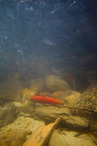 I brought two tripods, backpack with bodies and lenses, belt system with more lenses, aluminum extension pole, super clamps, panorama head and accessories, as well as an underwater housing to attempt some other perspectives. I put on chest waders and water shoes to make walking in and around the cold water much easier and more comfortable. You can actually sit in the water if you need to, something you cannot do with boots, knee waters or hip waders. I took shots at the mouth of First Creek, in and beside the creek as we worked our way up the trail to a spot I had scouted. The fall colors were pleasant, the wind had stopped and the small land-locked Kokanee were heading up the creek to spawn.
Shot #1 (right) shows a grab shot of a Kokanee shot with the homemade underwater housing. Since the Kokanee use the creek as a trail, that was the name I gave this assignment entry. We spent about an hour and a half walking and photographing as we went.
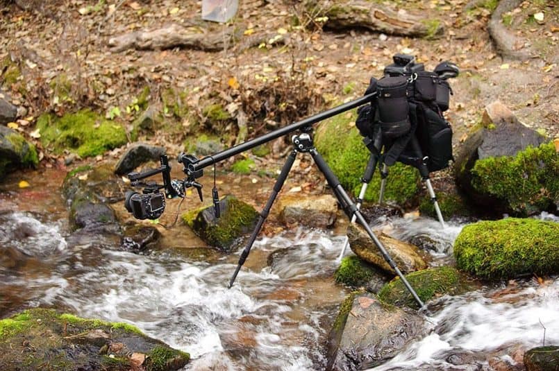
As we proceeded up the creek the terrain on this side of the lake makes sunset earlier and it was starting to get darker and colder. So I knew it was time to setup for the real reason I was here. I picked my spot where the creek makes a slight “S” shape as it flows through and the flow and fall color is nice. I put the old aluminum tripod close to shore with the top of it about 3 feet above the creek. I then placed my carbon fiber tripod further out into the creek and attached the aluminum extension pole between the two. The far end of the pole was in the middle of the creek and this is where I attached the second super clamp and attached the pano-head. I removed the vertical grip from the D300, mounted it to the pano-head and used a bubble level in the hotshoe to level the rig. Tested the setup, then I was ready to make exposures.
I bracketed each sequence to account for the dynamic range in the scene from the sky and clouds to the dark shadows of the rocks. 5 exposures one stop apart was enough for each sequence of the panorama. The light was dim enough so I did not need any ND filters to get to my desired look, just a polarizer for reflection control.
Shot #2 (below) shows the whole setup with the horizontal support arm, camera and pano-head, on one side and camera bag and belt system used as counterweights on the other side all attached to two tripods. The purpose of this setup is to get the camera out past the tripod legs so they don’t show in the resulting shot. The aluminum pole is an extension section from a Manfrotto Auto Pole borrowed from my studio in case you were wondering.
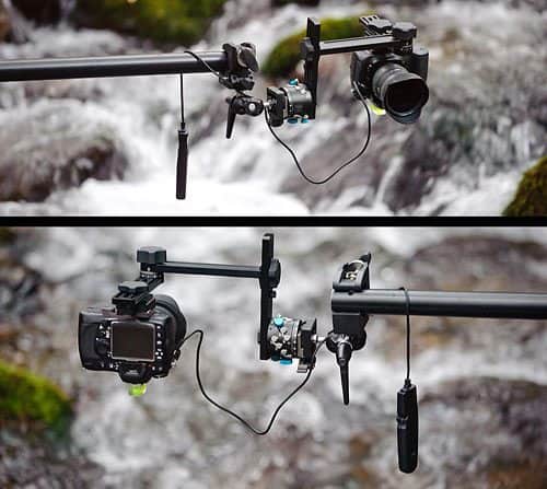
Shot #3 (below) shows the business end of the setup from two different angles. I used the 24 degree setting on the RD-16 rotator, locking the rotator at each click stop to keep it in place, lens set at 10mm (15mm equivalent) f/13 and a manual focus setting for focus near-to-far and started taking the exposures. For each of the 8 camera positions I allowed the camera to settle from the slight bounce introduced by the weight of the setup on the aluminum pole after adjusting each time. Then I took the exposures using a cable release to reduce any movement to the shots. Each time I repeated the rotation of the pano-head and bracketed exposures I also used a rocket blower to blow water droplets off the front of the lens and kept doing so during the exposures.
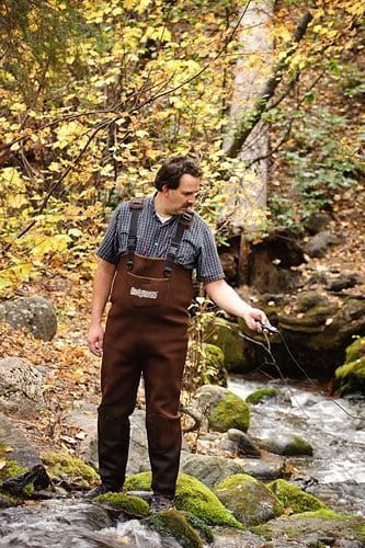 Shot #4 (left) shows me (Landon of course) working the actual exposures and standing well away from the super wide angle viewpoint of the lens. My wife took this shot and others with my full frame D700 as it offered great ISO performance in the fading light to help with shutter speeds. From setup to exposures to tear down took about 30 minutes.
In post I merged the exposures through my HEC workflow then merged those results into a horizontal panorama as I find the stitching works better this way with Photoshop. I then rotated the pano back to vertical and applied a slight crop to clip away the raw edges and frame in the resulting aspect ratio that felt right with this scene.
Phew! What a back-story Landon! Thanks so much for all the insight here. I always find it so cool reading how you go about making your wonderful images and this is no exception. The idea that bookmarks often end up upside down is the initial bit of genius here in my opinion. Then the gear you used for this is pretty cool. You have a lot of guts too hanging your belt system over the river like that.
The end result is beautiful, with the silky water running through, and the nice bright green moss on the rock in the middle of the image really pops! I feel as though I can almost reach out and touch it, and even dip my fingers into the cool water. The thought that went into keeping your tripod legs out of the shots is pretty cool too. Thanks so much for sharing all of these details Landon, and congrats on a totally well-earned joint fourth place!
Moving on now, also in joint 4th place is Marcus Perkins with “I won’t forget your page”. Here’s Marcus’ Back-story:
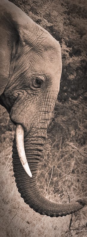 I was in Kenya heading out on safari when the Bookmark assignment was announced. I had made the decision to capture the shot in Africa and wanted to find a willing Giraffe to stand tall and pose. By the end of the trip, I had taken 2000 pictures and was struggling to find a Giraffe pic that lent itself to the crop factor. In the end I went with this Elephant pic and the name seemed to fit better as elephants never forget!
This elephant was with a group of 8 just grazing through the brush and he stopped fairly close to our truck. As with all the animals I saw on the trip, I was moved by the sight of such wild animals so close by. Elephants belie their size with a graceful nonchalance.
I used Lightroom to crop and rotate the head to fit the bookmark format. I converted to B&W and toned. This assignment made me look at number of pics from the trip and put them in bookmark format, horizontal and vertical. I have now kept them in this format which I would never have considered doing before….
I’m pleased the assignment got you thinking about new stuff Marcus. This is always good to hear. What an amazing shot though too! This one really jumped out at me when I started looking through the album. It’s beautifully toned, and works very well as a bookmark, but there is of course an amazing subject and well executed photograph behind that. The expression in the eyes of the elephant is very thought provoking, and I think the overall somewhat forlorn feel to the expression is probably enhanced by the rotation to make it fit the bookmark theme.
I really envy you going to such a wonderful location, and coming back with such great shots too. Thanks so much for sharing and congratulations on being placed too.
In 3rd place is Dennis Brennan with “Reading Buddy”, and here’s Dennis’ Back-story:
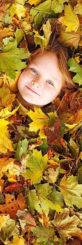
It was the last day of the month and I had nothing to enter for the assignment. When the day started, I figured I’d go back through the month and just try to find something to crop for an entry. There wasn’t much there. A new job with a lot of new work has kept me pretty well away from the camera lately. I luckily found the idea (and time) for this shot while raking in the yard on the last day of the month. Since it was Halloween that day, I started goofing off a bit and raking the leaves into the shape of a ghost. My youngest daughter and her friend were out in the yard playing. I started thinking it would be neat to get one of the girls completely buried under the leaves and have her face appear as the face of the ghost. I mentioned the idea and they seemed to like it. I grabbed the camera and a step-ladder from the garage. After helping to place the leaves carefully around their faces, I headed up. A few frames and I realized quickly that it wasn’t working. I really liked the idea of just seeing a face in the leaves. I ended up moving in much closer – just shooting their heads surrounded by the leaves, with much better results.
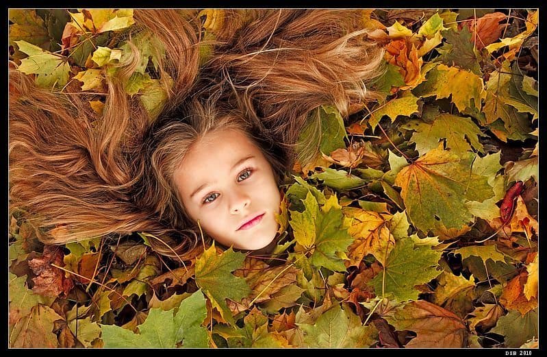
I finished with a few good shots – the one here of my daughter (below) that was an instant favorite.
I ended up using one of her friend for the assignment as the crop there fit the assignment best. I guess it worked out well enough to place which thrills me of course! Thanks again for the votes. Congratulations to the other winners and all that found time to participate.
I love both photographs Dennis. The one of your daughter that you posted in the forum, and that I have included here has a much more classical feel to it, with her hair spread out across the leaves like that. The fact that you didn’t try to fit all of her hair into the frame also adds a lot in my opinion. It would have been very tempting to frame this wider, but I’m pleased you didn’t. The autumn colors also work very well with your daughter’s hair of course, as it does with the slightly redder hair of her friend in your winning image. I love the freckles on the face of your daughter’s friend, which somehow seem to match the autumnal feel of the image too.
This was a great idea, and resulted in some great shots to end the month with Dennis. Well done, and congratulations on third place!
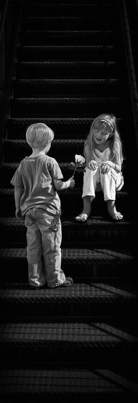 In 2nd place is Steve Martin with “Meet Me Halfway”, and here’s Steve’s Back-story:
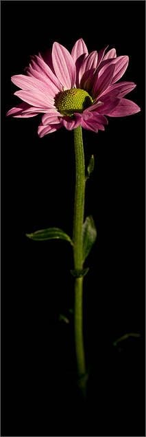
Early in the month I started thinking of subjects that might lend themselves to making a suitable bookmark crop. Stairs came to mind, but that didn’t seem interesting in of itself. Then, I thought about two people meeting on stairs (which, perhaps, happens a lot). I thought this could work, and initially I was going to get some friends to act as models. But, as I thought more about it, I figured that my kids might also work and be easier to get out to a site for the shoot (they are at an age where going out with daddy is still an adventure). I quickly decided on doing a black and white image, and knew of a commercial building in a nearby town that was up for lease and had the perfect black metal staircase. For the shoot I dressed the kids in rather neutral clothes (no eye catching patterns) and purchased a pink rose (as I wanted it to stand out in black and white). I drove out to the location with the kids and positioned my daughter on one of the steps. Then, I told my son to walk up and hand her the rose. I fired off a series of shots during the encounter hoping to get something that would look natural, making sure I shot wide enough to allow for an elongated crop. This was difficult for me as I tend to frame shots in camera. Below is the un-cropped version.
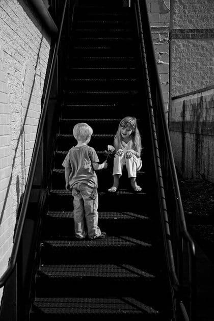 A problem that did arise by the time I had everything setup for the shoot is that the sun started to peak out through the clouds, and there was no shade on the kids or staircase. Initially I thought that the harsh light would not work and we’d have to return another day when it was cloudy. Fortunately, once I got home and pushed the images through post (using Silver Efex Pro) the images seemed OK despite the harsh light. The final image I choose for the assignment was the one that I thought really stood out because of the expression on my daughter’s face, so I went with that one.
Wow! Another classic image here Steve! I love the fact that you set all of this up, and yet it actually seems so natural, probably thanks to, as you say, the expression on your daughter’s face here. Shooting wide just for the bookmark must have been tough too. I can totally related to that, as I usually crop pretty tight too.
The light did become quite harsh as you also mentioned, but this works very well with the black and white. I often add a little more contrast when doing black and white than I will with color, so you were probably achieving this naturally here, instead of having to add it in post. Everything comes together so well here, so well done on visualizing your scene and locating the right place to capture it, as well as having the forethought to dress your kids appropriately and buy the rose etc. All of this was very well done indeed. Congratulations!
So, I’m a little embarrassed to say that in first place, with “Grass is Greener”, is erm, me, so here’s my backstory:
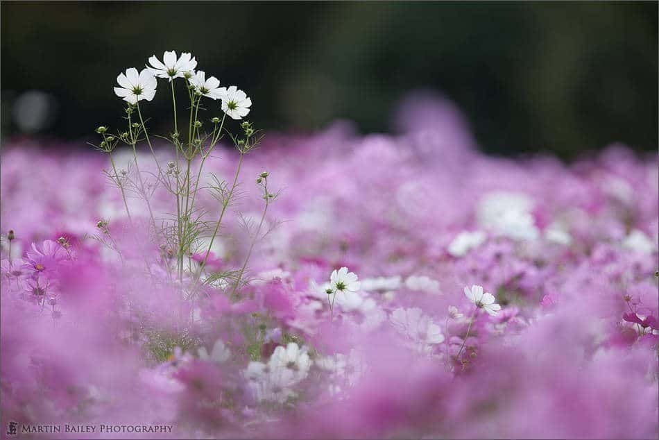
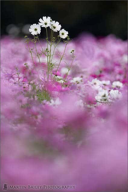
I’d actually bagged an image on October the 2nd that I figured I could upload if I couldn’t come up with anything better. Here’s my first attempt (left), which I quite like as a bookmark, but I wasn’t over the moon with it as a photograph. Since giving up my day-job, and putting so much time into setting up my new company, I’d continued to have a relatively dry month photography wise, but luckily I got out to a local park a couple of times, as the cosmos flowers were in bloom, and while I was there, I shot this image, and from the start it seemed to me that the four white cosmos that were facing away from the camera were reaching up out of the field of flowers, peering over at some other flowers on the other side of the field.
I shot the original in portrait mode as well as horizontal, to make it useful as a possible stock image, but the vertical portrait mode image was my initial instinctual orientation, due to this stretching and peering that I was getting from the scene. It is of course in my signature Flowerscape style with lots of foreground bokeh, so I was in two minds as to whether or not to upload it, as I didn’t want to sway peoples’ judgment as you voted, but I just couldn’t go back to my original shot, and went with this. I do hope that people didn’t vote because they’d figured it was me, but I guess it’s possible that there were people that didn’t vote, because they’d figured it was me too, so I’m going to be happy with my decision. It also felt great to win, even though it is my assignment, so thanks to everyone that did vote for my image.
The October Assignment was the fifth of six assignments from which the five entrants with the most accumulated votes will receive one of the five prizes that our sponsors WebSpy and I have made available. The prizes include a Sony Alpha NEX-5 camera, some X-Rite Color Management tools and my own fine art print and a folio of your choice from my collections. I’ll put a link to the prizes page in the show-notes for you to check them out if you are interested. I’ll also put a link to the scores in the show-notes, but note that the links to this and all previous assignment results are also on the top page of the members’ galleries Web site at www.mbpgalleries.com. [link no longer valid]
Thanks to all of you that took part in this assignment, and for those of you that took the time to vote too, and remember that it’s more about the thought process and learning new skills than it is winning, so please do get involved if you can, and there are still a few weeks left to get your Forced Perspective entry in for the November assignment.
Podcast show-notes:
If you noticed that this week’s Podcast is a few days late, sorry about that. I actually put my shoulder out pretty badly at the start of the week, ironically by going to the gym for the first time in seven years, trying to keep myself in shape! It forced me to spend a fair amount of time in hospital waiting rooms etc. though using up the time I would have used to do this episode, so things got a little bit stacked up for a while there. Thanks for your patience though.
Music from Music Alley: http://www.musicalley.com/
Audio
Download the Enhanced Podcast M4A files directly.



I searched your blog and the web and could not find a definito of “HEC workflow”. Maybe I missed it, but could you post a link or an explanation of “HEC workflow?”
Thanks
Hi John,
I thought this would be easily locatable on the Forum, but I couldn’t search it out either, so I asked Landon for an explanation. He wrote this blog post explaining more about his Hybrid Exposure Control Workflow.
http://www.bksecret.com/photography/?p=599
There’s also a good post on Landon’s views on HDR here:
http://www.bksecret.com/photography/?p=579
I hope this helps.
Cheers,
Martin.