last week we started this two part series to update a 5 year old forum post on the fundamentals of photography, which was revived by Chua Kim You, from Montreal, Canada. Thanks again Chua for reviving that thread, and I hope you are enjoying these Podcasts.
If you are just tuning in, and didn’t catch the first episode, it’s not essential to listen to these in order, but if you are really just starting out, and looking for some basic tips, we will be building on last week, so it might be better to go back to Episode 216 first.
It turns out that once again, as I prepared for this week, I ended up writing about twice as much as I can fit in one week’s episode. We’re going to finish up the basics series with this, but I’ll be releasing a Next Steps episode/post, probably in two weeks time, so stay tuned for that.
The Composition Toolbox
As we know, in art, as with most things, rules are made to be broken. In fact, some of the things that we even call rules, like the “rule of thirds” (that we’ll discuss shortly) aren’t really rules at all. They are guidelines that you can think of as tools to keep in your toolbox, and pull out from time to time while making images. I often find that when I come across a good subject that I want to make a photograph of, I’ll work through a number of compositional possibilities before I move on. Sometimes I know instantly how I want to shoot it, and nail that straight away, but even then, there’s always another angle or another way to frame a subject, so experimenting and working a scene or subject is a great way to improve your photography. So, although this is not a comprehensive list of compositional guidelines, here are few things to keep in mind when shooting, or a few tools for your compositional toolbox.
The Bulls Eye!
OK, so rather than something to do, the first thing I want to tell you is what not to do. Almost always, you’ll want to avoid composing your shot with your subject smack bang in the middle of the frame. Beginners tend to photograph people with their face in the middle of the frame for example, with lots of dead space above their head. This is often the most uninteresting compositional style. Our eye is drawn to the center of the frame and may not escape from there, so we don’t feel involved with the image. Our eyes don’t explore it. The confusing thing is that it will sometimes work, as in I believe it does in image 2366 (below). So don’t totally remove this from your toolbox, but most of the time, avoid the bulls eye composition.
The Rule of Thirds
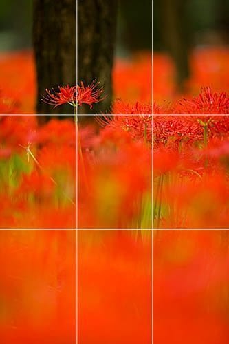
The rule of thirds is always a good place to start when deciding how to compose your shot and avoid the “bulls eye” composition. As in the example to the right, imagine you draw a line one third into the frame from the left and right, and from the top and bottom of the image. If you put your main subject or elements of the image along these lines, or at any of the four intersections, your composition will be worlds better than placing the subject in the center of the frame. You can see here how I aligned the equinox flower head along the left vertical third line, and I aligned the multiple flower heads to the right along the top horizontal third line. Also note how I aligned the center of the tree trunk in the background with the left vertical third line. I did this of course in camera, without the help of the lines as we see them here.
Bear in mind too that is an old and proven concept. Artists for centuries have used the rule of thirds as a compositional guide. According to Wikipedia, the rule of thirds appears as early as 1797 as a rule for proportioning scenic paintings.
How you place the elements in your image will change the story you tell. Generally if a person is facing the left, you’ll put them on the right third line, to give them space to look into. This is a safe and comfortable composition. You can create a sense of drama though, by putting them on the left third, so that they are looking or moving out of the frame with little actual space in the image to look into. This is more dramatic, and makes the viewer wonder what the person is looking at. It could make us feel as though the subject were troubled, or deep in thought. With lots of room behind them, we might wonder what they left behind etc.
In landscape photography, the horizon should almost never be along the center of the image, unless you are trying to create a mirror effect or balance the elements of the image in some other way. Again, it will be much safer to put the horizon along the bottom or top third line. A lone tree might work in the middle of the shot, but putting it on the left or right third will likely be a more pleasing composition in most situations. Also, remember to keep your horizons straight. A wonky horizon line can be very disconcerting, unless it’s obviously intentionally wonky. A spirit level to go in the flash hot-shoe on the top of your camera can help, and many newer DSLRs actually have levels built in, so make use of these to keep your horizons straight.
Break the Rules
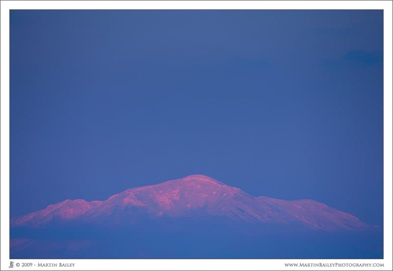
In image number 2200 you’ll see that I positioned the mountain very close to the bottom of the frame. You could argue that the tip of the mountain nears the bottom third line, but that’s not really what it’s about. What I did here was took the rule of thirds, and broke it. All of these rules of composition are more like guidelines to help you, rather than rules. Experiment, have fun and break the rules as much as you like to see what you get.
Negative Space
You’ll also note in this image that there is a lot of what we call negative space above the mountain. Apart from a tiny bit of dark cloud in the top right, the blue sky is almost featureless, but it adds a lot to this image in my opinion. When I view this image I actually feel my eye coming off of the mountain and drifting upwards into the negative space, giving me an even greater feeling of the scale of things than another shot of this mountain that I made with little space above the mountain.
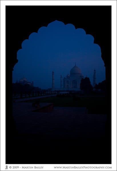
Another example of negative space might be image number 1177 (right). Here we have a silhouette of an archway which is one of the entrances to the grounds of the Taj Mahal in India. We can’t actually see the archway, because it’s totally black, negative space, but because of the shape it forms, framing the image, we can tell that it’s a stone archway all the same.
 Leading Lines
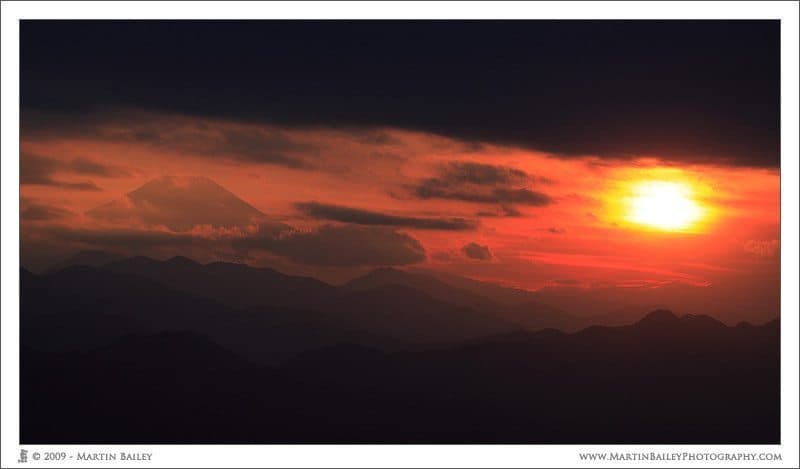
Finding lines in your scene or landscape can help to lead the eye into the shot, sometimes even towards a small feature that might not be noticed without the leading lines. In image 1549 (left), the river leads the eye into the image, and although our eye initials stops at the cloud bank, to explore the detail there, that gets us close enough to the top of the image to make us peak over the clouds and find Mount Fuji in the distant background.
Insinuation/Suggestion
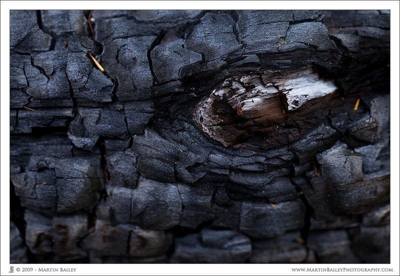
Image 2396 (below) looks a lot like the eye of a reptile or even God Zilla, but it is in fact a knot on a burnt tree trunk, in the ashes of a camp fire. Look for things that when framed right will look like something else. This can lead to eye catching images.
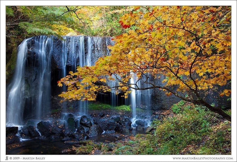
Layers of Interest
Image 2392 (below) has two definite layers of interest. The first being the foreground tree, in its yellow and red autumnal colors, and the second is the waterfall in the background. You could also say there’s a third layer in woods behind the falls. Adding too many points of interest to an image can over-complicate and ruin an image, but adding two or three complimentary elements juxtaposed like this can be quite effective.
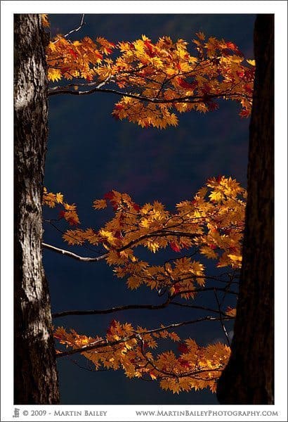 Repeating Patterns
More than two of the same thing is repetition. Repeating elements can be a strong form of composition. I’d say that three is about the minimum you can work with, as with these three sets of leaves in image number 2390 (right), but often with repeating patterns more is actually more.
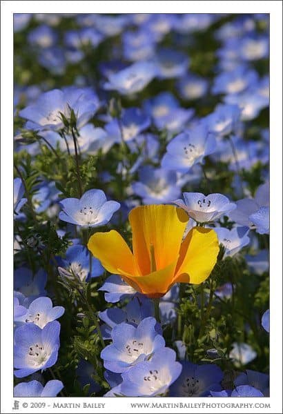 Contrasting Colors
Look for contrasting colors, such as red and green, or bright colors amongst dull. Most of the things that I’m mentioning today I have podcasted about in the past. I did an episode on contrasting colors way back in Episode #31, when I kicked off with probably still my best example of this, which is image number 56 (left). Here we see a bright orange poppy amongst a patch of baby-blue-eyes flowers. I also discussed the Color Wheel that I placed on my site as a tool to experiment with this, but if you select these two colors in a color wheel, you will see that they sit exactly opposite each other, so there’s a reason why we find this contrast pleasing. Colors separated by one third also work well. Just look for contrasting colors or bright colors against a dark background etc. and you may be on to a winner.
Perspective
Your choice of lens changes the way the scene looks in your photograph. If you use a wide angle lens, say between 10 and 24mm, and get in close to your subject, you’ll get a very different perspective than you would say shooting the same subject from further away with a 100mm or 200mm lens. This can be difficult to grasp at first, but is easy to see what I mean with a little experiment. If you have a standard zoom lens, say an 18-55mm or a 24-70mm lens, shoot the same subject, first at the widest focal length, 18 or 24 using the same examples, then zoom out to 55 or 70mm, and move away from your subject until the subject roughly the same size in the frame as it was with your wide setting. If you have an even longer lens, say up to 200mm, try that too, again moving away from your subject to keep it the same size in the frame. Doing this will help you to see how the focal length of the lens changes your perspective.
Also note that wide lenses tend to make elements in your scene look further away from each other. If you photograph a person for example standing in front of a building, the building will look much further away from them with a wide angle lens that it would with a long telephoto lens. The longer the lens, the more you’ll get a stacking effect, like the mountains in image number 827 (below). You can see how all the mountains in the foreground all seem to be stacked up on top of each other in layers. That is because I shot this image with a focal length of 135mm.
You can also use perspective to effect as I have in image number 2353 (below). If you use a wide angle lens and point it up at tall buildings, the building will appear to be falling in on you, and this can give quite a dramatic effect.
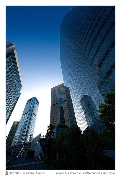 Look Up, Look Down, Get High and Low
Don’t shoot everything standing up and at your eye level. When shooting small children or pets, kneel or lie down on the ground to get to get to their eye level or even look up at them. Try shooting trees or building from a low perspective. Try shooting down into a valley from a mountain, or across the city from a tall building. Shooting from above or below your scene is fun and helps to get great images. As with the last image we looked at, be sure to look up and down as well while out and about. You only notice scenes like the one in image 2308 (right) for example by looking up into the tree canopy. Without looking up and down into the undergrowth for that matter, you might miss a lot of great photographic opportunities.
Watch Your Backgrounds and Edges
It’s very easy when you find a great subject to concentrate so much on that subject that you forget to look at the other elements in the frame. Do keep your eyes out for things like lampposts or trees in the distance that can appear to be sticking out of people’s head. Also, even when you are using a shallow depth-of-field to make the foreground and background out of focus, you still need to look out for what’s in that blurry bokeh. If you have patches of color, bright or dark spots in the blur, you need to make sure that these not only don’t distract from your main subject, but as you learn to use them, they can actually be used to enhance your main subject.
You also want to keep your eyes on the edges of your frame. Especially with beginner or mid-range cameras that typically don’t allow you to see the outer 5% or the photograph through the viewfinder, be aware of what’s creeping into the edges. If you are using a zoom lens, zoom out a little to check before zooming back in again, or if you are shooting hand-held, just wiggle the camera around a little so that you can see if there’s anything unwanted that’s too close for comfort.
Use a Tripod
Whenever possible, use a tripod. I know that when you first start out the thought of shooting from a tripod can be a bit daunting, but this will improve your images more than anything else you can do. This is not just because it holds the camera steady, but because when you use a tripod, you think about the composition more. You take your time and think about the whole process more in fact. Using a tripod is not always practical. Some fast paced shooting, like for some sports and some wildlife photography, as well as fast paced portraiture work will be much easier without a tripod. It’s your call, but my rule of thumb and guidance to you is to use a tripod unless there’s a reason not to.
Get It Right In-Camera
There’s a tendency these days to be sloppy in the field, because you can fix any errors in exposure or composition in Photoshop, by adjusting the exposure or cropping, rotating, and you can always clone stuff out later. Granted, you can do a lot in Photoshop, but it all takes time, and you will never develop good photography skills if you are sloppy in the field. Remember that when you have to save highlights or shadows in post processing, you are never going to get quite as good an image as you would if you nail it in the field, and it just feels better! I have nothing against Photoshop, and do save the odd photo myself too, but it’s always a last resort. I’d much rather hold my head high and say that I feel I’m a good photographer, than that I’m good with Photoshop.
In Closing
So, although I’ll do a follow up with some next steps advice in a few weeks, I’d like to leave you with a few thoughts from these two back-to-basics episodes.
Photography is both technical and artistic. Remember that you need to at once be both left brained and right brained. This comes easy to some people and not so easy to others. Whichever you are, please don’t lose sight of the fact that photography is supposed to be fun. By all means spend time on the Internet, in forums, reading books and magazines and view lots of other peoples’ images. It will all help. But the single most important thing for improving your photography is photography. Shoot as much as you can, and look at your resulting images. If you like what you see, think about how you achieved that result, and repeat it. If you don’t like what you see, check the shooting data, and recall what you did in the field, and try to learn from it, so as not to repeat it.
Really though, you have to enjoy yourself. If you get so caught up in trying to figure out all of the details before you get started, you’ll be getting in your own way, and that’s not good.
Podcast show-notes:
Music from Music Alley: http://www.musicalley.com/
Audio
Download the Enhanced Podcast M4A files directly.

Amazing tutorial, detailed, backed up with examples. Love it
I really like this blog. Please continue the great work. Regards!!!
Thanks Jim! I’m pleased you like it.
I’ll certainly be keeping this up, and hopefully introducing content more regularly than once a week in 2010.
Stay tuned!
Cheers,
Martin.
Whoops! It seems I missed Alan’s comment here. Thanks for the comments Alan! Sorry for the late reply!
Cheers,
Martin.
I was researching bulls eye composition for a competiton im entering , when i came across your blog , i like it so i may keep tuned.
Thanks
Daniel