I’ve rarely seen an easy to understand explanation of how the aperture and distance to the subject affect the depth-of-field in our images. When I started to think about how I would explain this, I started to understand why, because it wasn’t easy to do this in a simple way, and I still am not sure if I’ve succeeded. I’m sure you’ll let me know. Anyway, I’ve created six diagrams to help me explain this. I’ve not attempted to draw scientifically accurate diagrams, rather just created them in Microsoft Word to help me explain more easily with words. So let’s jump right into it and attack what should be a very simple subject, though it never seems to be.
I’ve included the diagrams below, but I also published a rough PDF of the diagrams, as it might be easier to compare the diagrams by just flicking through the pages of the PDF. If you move page by page rather than scrolling, you see the next chart an instant after the first, so it’s very easy to see the changes.
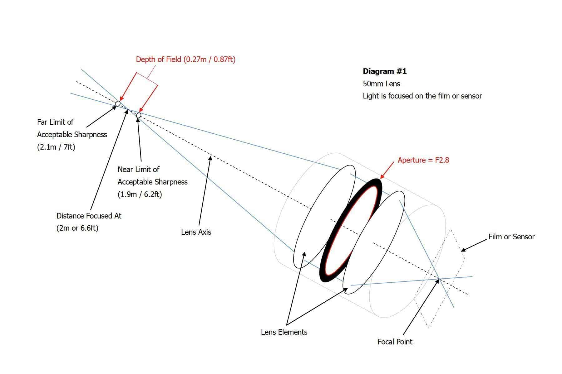
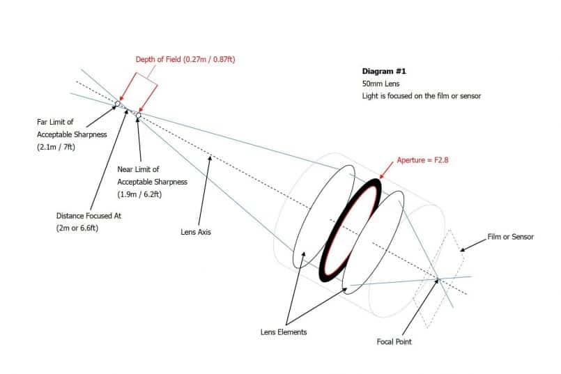
Anyway, let’s go ahead and look at Diagram #1. You can see that I’ve basically drawn a mock-up of a lens, with a few lens elements, and an aperture ring. The dotted line running through the center of the lens is the lens axis, and the thin blue lines that make their way through the lens from the film plane to the point we are focusing on in basically representing the light coming into the camera. I’ve used the actual metrics associated with a 50mm lens, and for now, we are focusing at 2m, or around 6.6ft, and I’ve made the aperture f/2.8, which I’m imagining is pretty much wide open for this 50mm lens.
(Note: click on the images to enlarge, and use your keyboard arrow keys or click either side of the image to move between them.)
What I want you to take note of right now is the X that the blue lines make as it intersects at the point at which we have focused the lens, two meters in front of the lens. Either side of the X I have drawn a circle. You can think of this circle as the circle of confusion if that helps. If you don’t understand what the circle of confusion is, take a listen to Episode #65 when I discussed Hyperfocal Distance. It’s not important that you fully understand what the circle of confusion is right now though. Just think of it like this. As we move away from the point that we are focused on, the elements in the frame start to become less sharp.
The point that we are focused on is the sharpest, but even before we leave what we call the depth-of-field, things start to get closer to being what we’d consider out of focus. These circles represent the nearest and furthest points at which the subject or elements around it will still be perceived by us as being in focus. In the diagrams, I’ve called this the far limit and the near limit of acceptable sharpness.
So, the light travels from the scene, into the camera through the lens, and the elements within the lens move around when we focus to make sure that the image comes into focus at the focal point on the film or sensor that we can see as a dotted line on the bottom right of the diagram. Although some of the lens elements do move around, in reality, it’s not important to understand this concept, so I’ve not changed them in the diagrams.
Before we move on to the next diagram, let’s note the size of the depth-of-field when focusing at 2 m with a 50 mm lens. The depth of field is 27 cm or just over 10 inches. Also visually note the angle of the intersecting lines that make the X at the point at which we are focusing. Let’s now take a look at Diagram #2.
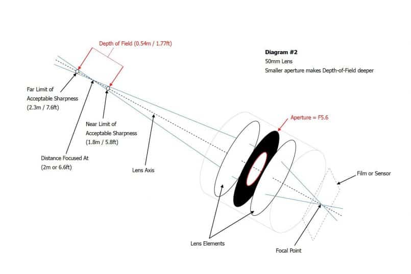
The only difference between diagram one and two, is I’ve stopped the aperture down by two stops from f/2.8 to f/5.6. You’ll see that the angle of the intersecting lines making the X at the point we are focusing on, still, 2 meters, is now much closer. So that we are all thinking the same way, imagine you are looking at the X from the front of the lens, so the lines just got closer.
Now, the circles that represent the near and far limits of acceptable sharpness have to be moved further out so that they fit between the lines. With just two stops smaller aperture, the depth-of-field widens from 27 cm to 54 cm, almost double. This is because we are focusing at 2 m, just over six feet from the film plane.
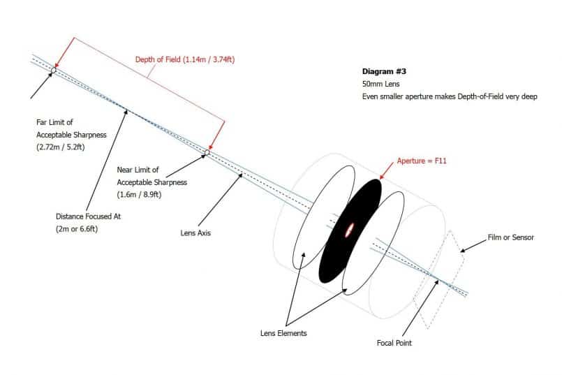
Let’s look at one more diagram while focusing at 2m. In Diagram #3 we will close the aperture by a further two stops to F11. Look how close the two intersecting lines of the X at the point we are focused on are now. We can also see that the depth-of-field has increased greatly. Now to get the two circles of acceptable sharpness between the lines, we have to move them much further apart.
The depth-of-field increases to 1.14 m, or 3.74 ft. Compared to the 27 cm we had with an aperture of f/2.8 focused at 2 m, we now have over four times more depth of field. So, we have seen here that even at the same distance to subject, we can greatly increase our depth-of-field, just by making the aperture smaller.
In addition to the aperture though, distance to subject, even at the same aperture has a huge effect on the depth-of-field. Obviously, because the lines of the X that we’ve been looking at continue to move apart, and the further away from the depth-of-field, or the area of acceptable sharpness they get, the more blurred the foreground and background gets.
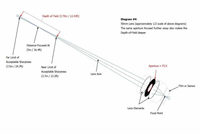
This is why the acuter the angle of the X the more quickly we start to see lots of out of focus areas or bokeh. In Diagram #4 I’ve scaled the diagram down to around 1/2 size so that we can get it on the page, but if you look at the numbers and the size of the camera etc. I don’t think this will be too confusing.
Anyway, what we’ve done now is kept the aperture at f/5.6, which is of course relatively wide, but now we’ve focused on something 5 m or 16.4 ft away. Look how much closer the lines of the intersecting X are now compared to diagram #2 when we were focusing at just 2m. The depth-of-field has also increased from 54 cm or 1.7 ft to a whopping 3.8 m or 12.5 ft. This is seven times more depth-of-field, just by focusing at 5 m instead of 2 m. So now we can see how focusing further away increases the depth-of-field even with the same aperture.
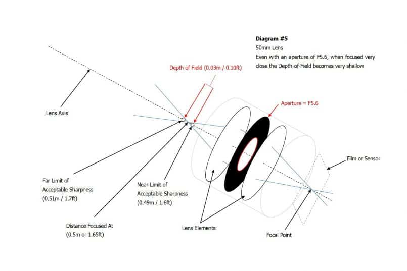
Just to reinforce this, let’s now look at Diagram #5, and focus much closer to the lens. Let’s imagine we focus at 50 cm or 1.65 ft in front of the film plane. All focusing distances are measured from the film plane by the way, so it’s not a problem thinking about the distance from the film plane instead of from the front element of your lens. Still with an aperture of f/5.6, see how wide the lines of the intersecting X are now, and how close the circles of near and far acceptable sharpness now are. We have a depth-of-field of just 3 cm or just over an inch.
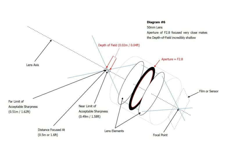
If we open the aperture up to f/2.8, as in Diagram #6, we can see that the lines of the X get even wider apart, and the depth-of-field is reduced to 2 cm or just over half an inch. If we compare this to Diagram #1, when we focused at 2m with the same f/2.8, the depth-of-field has reduced from 27 cm to just 2 cm, by changing the focusing distance from 2 m to 50 cm, or one-quarter of the distance.
I think we’ve probably had enough of diagrams now, so I didn’t make any more, but I’m sure this will help you to appreciate why the depth-of-field gets so much shallower when doing very close macro work. Sometimes we’re focusing on things just in front of the lens, literally, if working at magnifications larger than life size. Say I’m using a short macro lens, and focusing on something very close to the lens, at about 20 cm from the film plane, my depth-of-field is reduced to 2 mm because the lines of the X intersect at such a wide angle. When you do go larger than life size, it is not uncommon to have a depth-of-field of less than a millimeter, and have to stop down to f/11 or f/16 to get more than a millimeter.
The other thing to bear in mind is that focal length has an influence of depth-of-field as well. The reason for this is because if we still focus at 2 m, say with a 100 mm lens, instead of a 50 mm lens, the subject is magnified to twice the size. This, in turn, means that we are magnifying the circles of acceptable sharpness, so they go out of focus twice as much. To counter this we have to half the size of the circle for it to still be acceptably sharp, and that means that the circles move closer to the intersection of the X, and the depth-of-field decreases. Basically the longer the focal length of our length, the smaller the circles of acceptable sharpness get.
Anyway, I hope this has helped if you didn’t really understand why aperture and subject distance affected the depth-of-field the way it does. If you are still confused, how about grabbing a small object, and a tape measure, and setting up your camera on a tripod and put the object 2 m away from the camera, and take three photos. One with your lens wide open, then stop down by 2 stops, so if you start at f/2.8 you’ll go to f/5.6 and a third having stopped down by 2 more stops, so f/11. If your lenses widest aperture is f/4, try f/4, f/8, and f/16. Then move the object you shot to 50 cm, or as close as you can focus on it, if your lens doesn’t focus as close as this, and shoot three more shots with the same three apertures. Then move the object out to 5 m, and repeat the three shots. Then take a look at your images on your computer, and you will be able to see the difference very clearly.
Another very simple trick you can try is to hold out your finger, at arm’s length, and focus on it. Notice how blurred the background is using your peripheral vision. Don’t actually focus on the background, just see it while focusing on your finger. Then move your finger towards your eyes, while continuing to focus on it, kind of like in AI Servo or continuous focusing mode. As your finger gets closer, you’ll notice that your surroundings go out of focus even more. Move the finger back out, and the surrounds become more focused. You can do this with both eyes open or just one and see the effect, but bear in mind that your camera only has one lens, so closing one eye should help you to see very much as your eye does.
Podcast show-notes:
Here is the PDF file that contains the six diagrams I use to explain this topic.
Here’s a link to Mikkel Stegmann’s Barnack utility that I reference so much, and mentioned in the Podcast:
http://www.stegmann.dk/mikkel/barnack/
Note, since releasing this Podcast, I also released an iPhone app with a very nice Depth-of-field calculator built in – check it out here: https://martinbaileyphotography.com/mbp-podcast-companion-app/
Audio
 Subscribe in iTunes for Enhanced Podcasts delivered automatically to your computer.
Download this Podcast in MP3 format (Audio Only).
Download this Podcast in Enhanced Podcast M4A format. This requires Apple iTunes or Quicktime to view/listen.


This is my favorite blog. The diagrams are great and I appreciate you taking the time to make them. Now it’s in print version for easy reference. Thanks Martin!
Rob
Thanks Rob. I’m pleased this was useful.
Nice job Martin – It’s fun to see what I think I know about depth of field in a new light. Help’s me to understand it even more. And by the way, nice diagrams for MS Word…
Oh dang, I clicked submit before I checked the gravatar box.
Thanks Rick. It was a lot of fun creating those diagrams in MS Word, I can tell you. 🙂
Those Gravatars are pretty cool, but take a little bit of setting up initially. Once done though, you start to pop up all over the Internet! 🙂
Martin,
You are the man. Seriously. And thanks for making it so accessible. This is the best explanation that I have seen on the web. Thanks for your time and effort to put this together.
Cheers,
Steve
Thank you so much for the explanation!!
Your diagrams made it very clear!
Cheers!
Mayline
Thanks Mayline! I’m pleased this was helpful.
Thanks Steve too for the comment! I’m sorry I missed this for so long. It somehow slipped off my radar.
Cheers,
Martin.