Welcome to this week’s Martin Bailey Photography Podcast. Although including similar colours makes for well balanced images, using contrasting colours can make for dramatic and often pleasing images. We’ll take a look at a colour wheel to find the reasons why some images work. I also wanted to say congratulations to Forrest Tanaka, long time member and contributor to the MBP forum, for winning the April MBP Member’s Prize. This is the prize I’ve been awarding until now, basically randomly picking one active member from the previous month and awarding them an original print of the shot of their choice from my online gallery at martinbalieyphotography.com. From this month though, listeners are going to have to work a little harder for the prize. We are starting a Photography Assignment. Listen out at the end of the Podcast for details of the theme and the guidelines for participation in the assignment.
Remember that you can now stream this Podcast to your desktop and click on the images that will change automatically in the player as we progress through the Podcast. To do this, go to martinbaileyphotography.com and click on Podcasts from either the top menu or the small Podcasts section then select the episode from the list, and click the Stream Podcast button for this episode. You can also click the thumbnails in the table or enter the number of the image that I will give for each image to the field on the top page or Podcast page and click the orange button to display it.
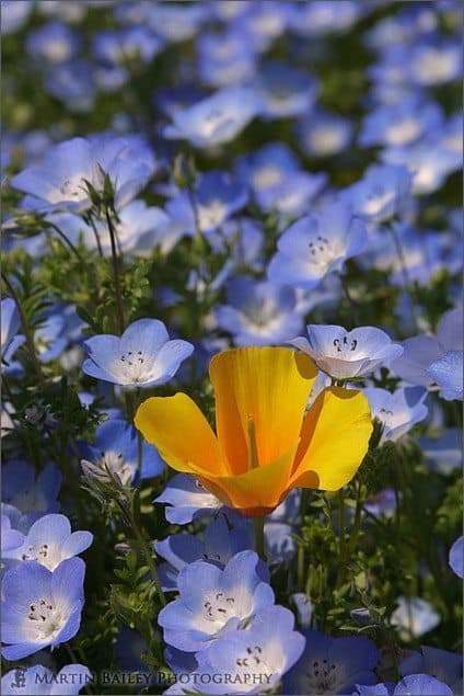
So as I said in the introduction, today I’m going to talk about using contrasting colours in your images. Let’s first take a look at image number 56 in which you can see a bright orange poppy in a bed of Baby Blue Eyes flowers. This image was shot at the end of April 2002 with my D30, the first DSLR that I owned, and my old EF 28-135mm F3.5-5.6 IS lens. It was shot at F11 for a deepish depth of field, and a shutter speed of 1/320 of a second, at ISO 100. I had exposure compensated to the tune of minus 2/3 of a stop, and used a circular polarizer filter, both to increase saturation in the colours and maintain a good exposure in this high contrast shot.
The thing that prompted today’s Podcast though was not the contrast in light that we can see by the hard shadows in this image, but the contrast in colour. I want to try something now if you are at a computer with Web access to backup what I’m talking about. I’ve added a colour wheel to my site that will allow you to click and add colours to a list for comparison. There is a link to the page in the show notes, and also you will be able to see “Colour Wheel” under the Quick Links section on the top page at my Web site. [No longer available.]
Open the colour wheel in a new windows, because what I want you to do is position one browser window with the colour wheel visible and another window with poppy image, number 56 that we just took a look at, visible in another part of your screen. You don’t need to be able to see all of both windows. Now place your mouse over the colour wheel and move it around until you see an orange, similar to that of the orange poppy. It doesn’t need to be exactly the same. If you look at the three vertical rectangles below the colour wheel, you’ll see the colours changing and the numbers in the boxes also changing. Once you get something close to the orange of the poppy, click the colour wheel. Each time you click the wheel, the colour will be added to the list of colours that starts off grey at the left of the screen. The hex value for the colour will also be added to the list. A couple of the oranges I’ve just added are #ffbb33 and #ffaa00. Now, with your mouse still over the wheel, draw an imaginary line diagonally across the wheel to around the same position on the opposite side of the wheel and then move your mouse across to that point and take a look at the colours in the three strips below the wheel. You’ll now see a light blue, similar to the colour of the Baby Blue Eyes flowers in the Poppy shot. Click the mouse again to add the blue to the list on the left of the Colour Wheel page. You should now be able to see the two contrasting colours and be able to appreciate why the Poppy with Baby Blue Eyes shots is so eye-catching.
Now, I can’t pretend that I had this in mind when I was making this image. I was pretty excited last night when I started preparing for this episode and adding the colour wheel page when I realized just how perfectly opposite these two colours are. I’d say that the gardener’s at the Showa Kinen Park were aware of this colour contrast when they planted these two patches of flowers. Lucky for me, a few of the orange poppies from one patch had found their way into the patch of Baby Blue Eyes.
To go into just a little detail about the chart we’ve just looked at, it is what’s known as an HSV or HSB colour wheel. HSV stands for Hue, Saturation and Value, and HSB stands for Hue, Saturation and Brightness. The Hue is the colour itself, the saturation is how vibrant the colour is, ranging from black to the colour at it’s strongest, or purest value, then going out to white. You can see this by moving your mouse in a straight line from the center of the colour wheel to the outside through any single colour. You can also click on a colour such as pure red, seen by the value #ff0000 in the vertical rectangles below the colour wheel, and having clicked it, the square to the right of the colour wheel will change to red in the top right, going down to black as we move down to the bottom right or diagonally to the bottom left, and changing to pure white as we move across the top of the square to the top left. Once a colour is selected, you can also use the J, K and L keys to rotate through all the hues in the colour wheel. J will rotate slowly counterclockwise, K will rotate quickly clockwise and L will rotate you through the hues slowly clockwise. You can also click enter or P to add the colour to the list on the left as you move around the wheel.
There are two commonly known colour models, the RGB and the CMYK colour models or colour spaces. RGB is additive and is what is commonly used with computer monitors or televisions. You TV screen with no light passing through it or turned off is black. As you add light in varying degree for each colour you can create all of the other imaginable colours. That is if you add nothing but red, that is what you’ll see, but if you add equal amounts of red and blue you will create magenta. Likewise, equal amounts of red and green make yellow, and equal amounts of grean and blue make cyan. Equal amount of all three make white. In this model, Red, Green and Blue are known as the primary colours, and as most of us are viewing our images on computer screens this is the model I’ll use to continue discussing this topic.
The other colour model I just mentioned is CMYK. Most of you will know this from the colour of the inks you put into your printer. Paper has no light source as a rule so we are laying colours onto the white base. The opposite of RGB where we start with black. CMYK stands for Cyan, Magenta, Yellow and Black. Now I don’t know for sure why black is K and presume it’s because B is used for Blue so the last character K was used. But also, in Japanese the word for black is Kuro, starting with a K, so I sometimes wonder if this has anything to do with this, being that the Japanese have been at the forefront of most of these technological advances.
Anyway getting back to the explanation, with the CMYK model, which is a subtractive colour model, if you add equal quantities of Cyan and Magenta, you get blue. If you add equal quantities of Yellow and Cyan you get green, and equal quantities of yellow and magenta gives you red. Equal quantities of all three give you theoretically get black, but as true black on paper is not quite achievable due to a limitation of the inks, the true black was added to the model. As Cyan, Magenta and Yellow are also the colours created by mixing Red, Green and Blue in the RGB model, I’m going to call these secondary colours as we get further into today’s Podcast. One last thing to note is that although I’m calling this Episode Contrasting Colours, I do not mean clashing colours. In an artistic sense, the colours that sit opposite each other in the HSV colour wheel are called “Complementary Colours”. I’m going to stick with Contrasting Colours as a title though, as there is a lost of contrast between them. Indeed, contrast means two extremes in brightness, and complementary colours when appearing together tend to appear brighter than they might by themselves.
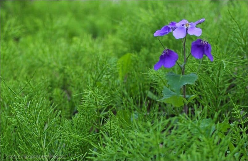
Let’s now take a look at image number 220 that was shot about a month before the last image in 2002 with my old EF 17-35 F2.8 L lens, at F4.5 for 1/20 of a second and the ISO set to 100. If I’d shot this more recently, I probably would have gone about it a bit differently, but let’s do the colour wheel thing again here. First let’s move the mouse over the colour wheel until we find a purple or violet colour the same as these Wood Violet flowers. I’ve just added #8855ff to the list on the left side of the colour wheel page. Now once again, move your mouse to the opposite side of the wheel, and you’ll see that you have a green similar to that of the surrounding foliage. Once again, I hope this helps to understand my point. Like the last shot, this too was not a conscious thing. I was not carrying around a colour wheel looking for contrasting colours. What I would say did happen though is that this scene appealed to me because of the contrasting colours.
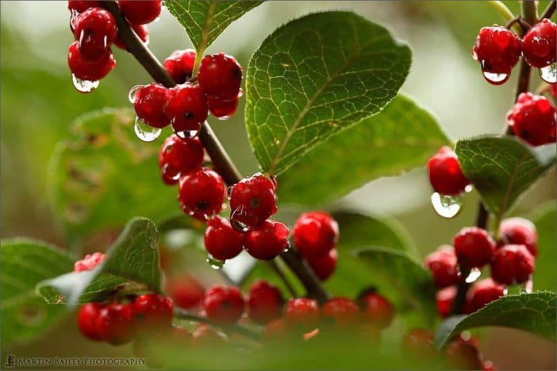
Let’s also think about using the primary colours, red, green and blue in composition. Everyone knows that these colours are striking when mixed together and also have a certain amount of contrast when used together, if not as striking as the previous examples. Lets look at image number 714 in which we can see a whole load of red berries in lush green leaves. The berries are set off by the rain-drops, and the general overcast conditions help bring out the saturation in both the berries and the foliage. I shot this at minus 1 stop exposure compensation as it was quite a dull day, and I didn’t want the camera to normalize the exposure, making it too bright. This was shot at ISO 400 because of the low light, using my 100mm F2.8 macro lens, with the aperture set to F4 for a shallow depth of field. The shutter speed was 1/100 of a second, the slowest shutter speed advisable for hand holding, which I was doing here as my better half was getting impatient and wanted to move on.
Getting back to the colour though, we can see what happens when using red and green, two primary colours in the same shot. Not quite a contrast as the last two images, but still this amount of colour contrast helps to give your images a boost.
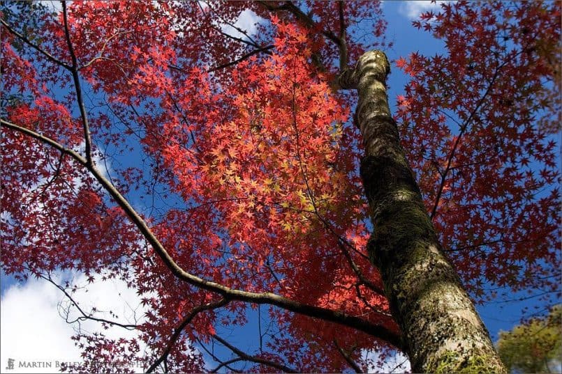
In the next shot, image number 510 we can see an example of red with blue, with these bright autumn leaves against a bright blue sky. This was shot in Kyoto, the old capital of Japan, with my 20D and again the 17-35mm F2.8 L lens. I used a circular polarizer to saturate both the leaves and the sky, and an aperture of F5 for 1/100 of a second, with the ISO set to 100. F5 is enough to get a reasonable amount of depth of field at 26mm which is what I shot this at. I was lucky enough to have some nice fluffy white clouds in the frame here too, to stop the blue sky from becoming to overbearing.
If we take a look at the colour wheel, we can see that red, green and blue are positioned at equal thirds around the wheel. In between those thirds are the secondary colours yellow, cyan and magenta. So as we skip around the wheel in thirds, we can find more patterns of colours that contrast.
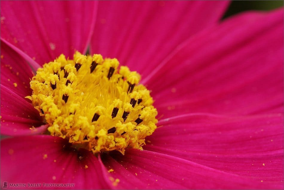
Let’s look at image number 479 which shows a close-up of a Cosmos flower. This was shot with my 100mm F2.8 macro lens, again with the 20D at ISO 200. The aperture was F8 to get the central yellow area in focus and the shutter speed was 1/20 of a second. Needless to say I was using a tripod. The bright magenta colour of this flower can be found around #bb0088 in the colour wheel. If we then skip one third around the colour wheel, anticlockwise or counterclockwise over the red, we can find a yellow similar to that of the stamen and pollen at around #ffff11.
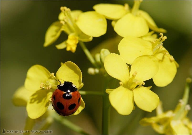
Let’s take a look at image number 619 of a ladybird, or ladybug for our listeners in the US, on some bright yellow rape flowers. Once again the 100mm F2.8 macro lens on my 20D, with an aperture of F5.6 for 1/1250 of a second. I was using ISO 400 as if I recall correctly it was a little breezy on the day I shot this, so I was trying to freeze and movement. Here we can see a nice red, and bright yellow, which we can see are neighbours in the colour wheel. Red is a primary colour, and yellow is a secondary colour, so we have identified a third pattern of combinations that works quite nicely.
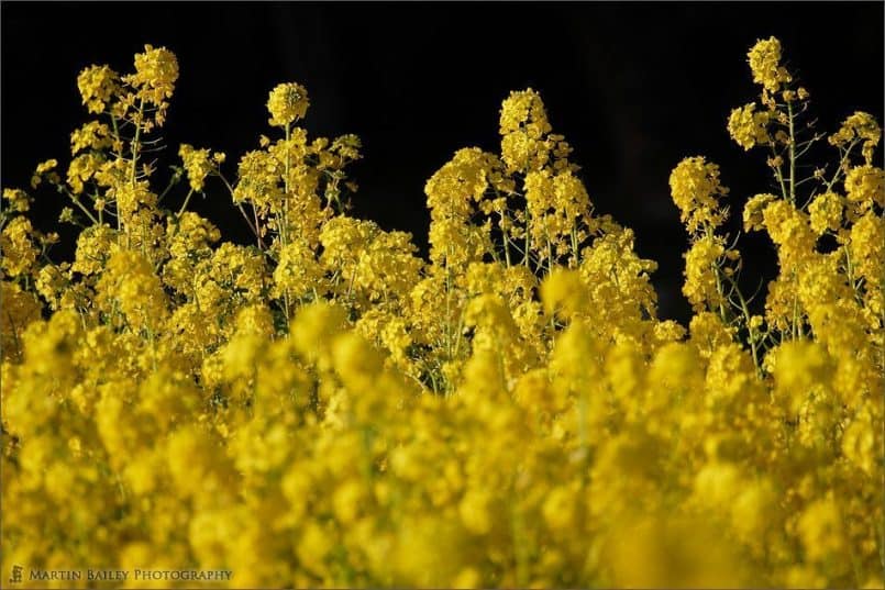
The last image for today shows us another way to get contrast in our images, though not truly between multiple colours. In shot number 603 we can see some very bright yellow rape flowers against a black background. It is arguable whether black and white are colours, as all colours go to black or white if their brightness is lowered enough. But putting a bright colour against a black background is also a good way to show contrast in the colour of the subject, and so should not be ruled out.
So there you have a few examples of colour contrast. I hope playing with the colour wheel has helped to get some of this into perspective. It sure did for me.
As I mentioned at the beginning of this episode, today I’m launching a Photography Assignment. Submissions will be posted to the mbpgalleries.com Web site, so if you want to participate, go ahead and create an account at mbpgalleries.com. Now although I’ve been waiting until I linked the main site and the mbpgalleries site before starting the assignment, I just have not had time to complete this work, so I’ll have to ask you to register twice for now. Sorry for the inconvenience.
The rules for the assignment are as follows:
1) Only ONE image per member, per assignment. Right now, it is possible to upload more than one but all but your last upload WILL be removed at the cutoff date. Right now I’m thinking to make this April 30th, 2006.
2) Only NEW images please. The idea of the assignment is to shoot with a purpose. Going through old stock and finding something appropriate will not help you to grow as a photographer. Wherever possible ensure that you Save As in Photoshop, not save for Web, as Save As preserves the images EXIF data, so that you can prove that you shot the image after today, April 3rd, 2006.
3) At a certain date, as I say, probably the end of April, the album will be locked to prevent further uploads and the voting function will be turned on for a set period. Probably one or two weeks. Comments and voting will be off until that point.
4) All members are able to vote once for each image and voting will be possible for a week or so. It is also possible to vote low for images to lower other members’ images overall rating. Please don’t do this. I can see member’s voting trends and will take this into account when deciding the winner.
5) I will decide the actual winner while bearing the vote counts and trends in mind, and my decision will be final and not negotiable. I don’t want loads of flame mail from member’s that think they should have won. I expect deciding to be very difficult and I will give full reasons for why I have chosen one particular image.
6) The prize for the winner will be an original print of your choice on the paper of your choice from my online gallery at https://martinbaileyphotography.com/ worth over a hundred dollars.
Following today’s main topic, the theme for this first Assignment is Contrasting Colours. Remember that in artistic terms, this can also be thought of as Complementary Colours. Also, we can think of colours that are one third of the way around the chart or even right next to each other, but they’ll need to be well saturated to appear to contrast. As an assignment theme, this is a pretty open to individual interpretation and a relatively easy theme to shoot for. The subject can be anything you want. Today I’ve used nature photos to illustrate my point, but you can find colours that contrast in many everyday subjects. It might be a line of cars, bottles or jars lined up on a shop shelf, or shelves full of various fruit. Just about anything colourful could be a subject, but one last piece of advice is that the closer the colour is to a true primary or secondary colour and the higher the saturation of the colours, the more contrast the viewer will perceive. The important thing is that you get out and shoot with a purpose. I too will be shooting with this assignment in mind this month, and might post my own attempt, though I will not be in the running for the prize, of course. Good luck, and I can’t wait to see your submissions. If you have any queries about the assignment, please post it in the forum. I’ll probably start a new forum for this if necessary.
Finally, and I’m sorry for starting to sound like a broken record, but if you haven’t already completed the listener’s survey and you can spare 5 minutes please locate the link to the survey in the small Podcast section on the top page or linked with a larger graphic on the Podcasts page and complete it for me. I’ve also posted an announcement in the forum about this, with a link, so I’ll put a link to that post in the show notes. Completing the survey will enable me to learn more about you and hopefully help me to find a sponsor for this Podcast at some point.
So, once again good luck with the Assignment if you are going to give it a bash, but whatever you’re doing this week, I hope you have a great time doing it, and keep shooting too. Bye bye.
Show Notes
Music from Music Alley: http://www.musicalley.com/
This Colour Wheel was developed by Jemima Pereira though I’ve modified it slightly such as adding one more colour to the main list, so that you can see four full pairs of colours etc. Thanks Jemima for your technical skill in putting this together and your generosity in making this available for others to learn from. http://jemimap.ficml.org/style/color/wheel.html
Subscribe in iTunes for Enhanced Podcasts delivered automatically to your computer.
Download this Podcast in MP3 format (Audio Only).
Download this Podcast in Enhanced Podcast M4A format. This requires Apple iTunes or Quicktime to view/listen.


0 Comments