
With all the great fine art inkjet papers available today, it can be difficult to find “your” paper. The one paper, or maybe even two or three types of paper, that you turn to for your high quality, fine art prints. Testing papers can be costly, in terms of both time and money. Until now my method has been to print my favorites at the time, and a few prints that I know are troublesome, but it can be difficult to judge how good or bad a paper is based on photographic images alone.
Last week I described what I decided to do about this, which basically is to make test image contain both photographic images and scientific charts, that I would can to build an archive of the various papers that I’m interested in, and that I have available to me. Last week we I went into much more detail about the test itself and how I am bringing the results to you, but I won’t repeat all of that this week. If you didn’t listen to episode 192, I suggest you go back and listen to that first, as much of what I will say today won’t make much sense otherwise.
 Here is the standalone PDF document including the text and images that I mentioned last week, and there’s also a zip file with loose JPEGs for you to take a look at. I’ve also made the test image that I created available, so that you can use the same image to test your own printer and papers if you want to. It’s around 8 megapixels, so should be good for tests up to 13×19″ and still look great. There are links to all the downloadable files in the show-notes. Let’s jump right into it now though, and see how I got on with my Fine Art Inkjet Paper printing tests.
To me there is nothing quite as satisfying, after capturing the image in the first place, than printing it out on a good quality fine art paper. Inkjet printing technologies have improved to the point where now, in 2009, photographers are able to make archival fine art prints in their homes, that arguably surpass traditional dark room prints in both ease of production and quality. As the printing technology has improved, the number of fine art print papers on the market has also increased, making it difficult to really nail down one or two papers for your own workflow. I buy and try different papers, and often use my favorite print at the time, but that doesn’t really give me a consistent image to compare to my previous papers. I end up printing out the same image again on my original papers as well as the new ones, and with printer ink being as expensive as it is, as well as the paper of course, I decided to standardize my test, to give me a more objective look at the capabilities of new papers as they come out, as well as being able to file away my previous tests for future comparison. Of course, if I change my printer, I’ll have to do this all again, but again, having a standard test devised will make that whole exercise a lot smoother than just randomly picking prints of the day.
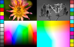
I do have a few prints that I really like to try on new paper, and I’m guilty of having printed out a few of these over the last week as well. But in my standard image to print, I decided I wanted to incorporate a couple of images that I have used a lot for testing purposes, and I also created and included a Granger Chart and a Gamut Chart, that I found out how to create on the Luminous Landscape web site. I’ll put a link to the page with the instructions into the show notes, but it literally takes just a couple of minutes to create both charts. I guess it would be easier to understand if you can at least see the chart, so I’ve put the original graphic into the enhanced podcast and the mp3 version, so you can at least see what I’m talking about. For the results, please do grab either the PDF file or the individual images, to which you’ll also find links in the show-notes.
I created my test image with the ProPhoto color profile. I did this because it has the widest gamut, compared to sRGB and AdobeRGB, and it’s also what I specify as my color profile throughout my workflow. If you want to convert this to AdobeRGB for your own tests, do so in Photoshop, using the Convert Profile command, not assign profile. Convert Profile will calculate the colors for you correctly so you’ll still get good results using the image. I inserted two images into my test image, above the Granger and Gamut charts. The flower shot to the left is a good image to print as a test because it is not only nice and colorful, but I’ve found the gradations in the background bokeh to be challenging for some papers to reproduce. Some compact the gradation too much, almost forming a line between the color and the black, but other papers can handle it much better, and I wanted to see this in my tests. The black and white flower to the right is there for three reasons. Firstly, it has a nice neutral black and white tone, so if there is any color cast in the image, I can see it here. Secondly, I find the gradation in the grey background a nice reference point, and finally, I want to see how much punch the paper can reproduce in the white flower with black spots, as well as the rest of the plant. As we’ll see, the results can be very different for some papers.
I put a range of colored cells up both the left and right side. This is a computer generated version of the cells that you’ll find on a Gretag Macbeth Color Checker chart. Now, the thing to note about these cells is that they are a reference. The Granger and Gamut charts as well contain images that your printer will not be able to reproduce fully with today’s technology. The point is to have something standard to compare from paper to paper. We know that the color cells on either side should be a pure red, green and blue, as well as cyan, magenta and yellow for example. I also wanted to see just how close the printer and paper could reproduce the Granger and Gamut charts, because there are some pretty subtle gradations and hues in there. Being able to take one paper and look at it against another is the main point of all this and I’m not that worried that this is not a 100% scientific methodology.
A final word on the test graphic is the boiler plate text. I’ve included this because one of the main reasons for my doing these paper tests right now is because I’m trying to nail down one or two papers for a fine art print project that I’m working on, and I wanted to see how each paper reproduced this text. If you download the test image, by all means, remove the text and copyrights etc for your own tests. All text is on a white background so it will be easy to get rid of. But, if you are going to redistribute the graphic for any reason, please use the one that contains my site address and the copyright notice, or create your own image from scratch. Thanks!
The printer that I used for my tests is a Canon PIXMA Pro 9500. In Japan this is called a Pixus Pro 9500, not Pixma, and it’s the now old version, not the Mark II that Canon has recently brought out to fix banding issues which I personally just don’t see and so won’t be upgrading. For the sake of time, I won’t go into details about the profiles I used for printing either, other than that I used a paper manufacturer’s profile for all papers except the Bergger Fine Art Rag PN62. They don’t have a profile for this paper and my printer combination. The paper that I bought had an insert though that says to print using the Canon profile, which is what I did. By the way, I’m not going to go into details on how to print with a color profile today. I’ve talked about this in the past, and I can go into this again if people want, but right now, let’s assume that you know how to print with a paper/printer profile.
One last word on the process before we start to actually look at the test prints is how I re-digitized the printed pages to show you here. I used my old Epson flat bed scanner, and turned off any and all processing that the scanner drivers would usually do. This means that the resulting images are a little bit flat, but I wanted them to have been scanned under exactly the same conditions, which is what we have here. I saved the originals with the AdobeRGB profile, and then converted to sRGB when I output the JPEGs. I compared the colors and quality, and on a high end Eizo monitor, there’s no difference. Of course, you can’t fully appreciate what I saw when looking directly at the prints, and it is the original prints that I used for comparison and which I will be commenting on here. You can though see the difference pretty well, and much better than I thought you would be able to, so you’ll be able to see close enough what I’m talking about.
I’ve split the papers into three groups, which are gloss and satin papers, fine art rag papers, and textured fine art papers. For my project I really wanted to identify my best choice for a gloss or satin finish, as I’m expecting the prints I release in a paper folio, will be picked up and looked at in the viewer’s hands, rather than hung on a wall in a frame. Of course, I want a paper that will be good for both, but really the tactile feel of the paper and its weight, as well as the look of the face of the paper is important.
Canon Pro Platinum PT-101
The first paper that I printed to in the Gloss and Satin group is the Canon Pro Platinum paper. This is a nice heavy 300gsm, which is grams per square meter, paper which looks and feels very much like a traditional wet darkroom print. This hasn’t been out very long, but I have had very good results with this paper so far. The thing that struck me straight away with this paper was how beautiful the photographs looked. They are reproduced very faithfully, with lots of punch in the black and white flower, a beautiful gradation in the grey background, and the color flower is vivid and the ball of bokeh to the top right of the flower has a very nice gradation to black. Also, the Granger and Gamut chart reproduction is among the best of my tests. To be honest, as I really like the feel of this paper in the hand, I wanted this paper to be perfect in every way, but one thing let it down, and that is the paper’s ability to reproduce a brilliant red. The third cell down along the left side of the test image is basically an FF0000 full RGB red, yet the reproduction here is somewhat orange. Some of you will probably already be thinking to yourself that this is fine, because printer’s never product perfect reds, but remember, the Pixma Pro 9500 has a red ink cartridge. It should be perfect, and I’m disappointed that Canon’s profile doesn’t cash in on the huge advantage that this printer has over one’s without a red ink. Apart from that though, everything else is perfect. I am still very much in love with this paper, but let’s see how it fairs against the others.
Museo Silver Rag
Next up, is the Museo Silver Rag, which is a 100% cotton almost semi-gloss or satin paper with no optical brighteners, and just look at that red. It’s almost a perfect red. In fact, color reproduction is just amazing on beautiful paper from Museo. If you flick between the Pro Platinum image and this one, you can see a number of subtle differences. In general, the silver rag is punchier, though it does make a bit of a mess of the Granger chart on the left, particularly in the middle of the green area. The black and White flower is very punchy too, though the background is significantly darker, but still a very nice gradation. The ball of bokeh on the color flower is also slightly better than the Pro Platinum, which surprised me. Again, this is a 300gsm paper, so very thick and beautiful to handle – a strong contender.
Harman Gloss FB Al (Al for Alumina)
Next I tests Harman’s Gloss FB Al, which is a Baryta coated gloss paper, with a very similar feel to the Pro Platinum from Canon. It’s very smooth, not a satin paper, and again feels very much like a traditional wet darkroom print. It even smells like one, because of the Baryta coating. Again, Harman have made a nice job of utilizing the red, and the colors are actually slightly subdued across the image, compared to the last two papers. There are a few patchy areas in the Granger Chart, but the hues in the Gamut chart are simply beautiful here. Very nice gradations in the grey behind the black and white flower and that ball of bokeh in the color flower. The general feel is not quite as punch as the last two images, but in my opinion this paper realizes a perfect balance in many respects. With this also being just slightly heavier at 320gsm, it is a very strong candidate for a paper to be appreciated held in the hand and because there’s no texture to speak of in the surface of the print, it’s simply beautiful to look at.
Hahnemuhle Fine Art Pearl
I double checked my settings after printing the Hahnemuhle Fine Art Pearl paper, as it was just so dark, but everything seems to be correct. Very rich colors here, and the red is red, but it’s just over the top for me with those over saturated colors. The black and white flower is so dark that you really can’t appreciate it, and the color flower is also very dark compared to the original. This paper is actually from a box that I bought a few years ago, and although it has been stored correctly, I do wonder if the current Fine Art Pearl from Hahnemuhle performs in the same way. It’s very different from all of their other papers which I generally like a lot.
Canson PhotoGloss Premium RC 270gsm
The next paper in the gloss and satin section is Canson PhotoGloss Premium RC 270gsm. I bought a Canson Discovery pack, which included 9 of their fine art papers, and printed out all nine of them for this test. The PhotoGloss Premium is actually very close to the Harman Gloss FB Al, in its ability to reproduce subtle gradation and beautiful hues, and it even messes up the Granger Chart in very similar areas, but unfortunately, the reds are a little on the orange side, like the Canon Pro Platinum. This is my opinion puts it slightly behind Harman on color accuracy, and slightly under Pro Platinum for punch. Still, a very nice well balanced paper and definitely not one to rule out.
Canson PhotoSatin Premium RC 270gsm
The next paper in the gloss and satin section is Canson PhotoSatin Premium RC 270gsm. This is actually very similar in performance to the previous Canson PhotoGloss, so in general, it’s a great paper, again, but with a slightly textured finish, which is just a little too perfect for my liking. I’d prefer a more random pattern in the satin look, though you have to really get up close to see this. Again with slightly off reds, I’m thinking that this would be a great paper, if only I could use the profile out of the box.
Conclusions for the Gloss/Satin papers:
So, that’s all of the gloss or satin papers that I have tested this time. I know that there are others out there, but there are limits to what I can do, both in terms of time and money. If any paper manufacturers that are listening would like me to compare their papers under the same conditions, just send me some and I’ll be happy to do so.
I’ve initially narrowed my selection down to the first three, though this in itself was tough, as many of the papers just look great. For my fine art folio project, I’m probably going to go with the Harman GLOSS FB Al, though it’s very difficult to rule out Museo Silver Rag, or Canon Pro Platinum. It will almost definitely require some tests of the actual images for the project to make a final decision though.
Let’s move on to the rag and matte papers now.
Museo Portfolio Rag
The first one I want to look at is Museo Portfolio Rag. This is an extra smooth matte finish paper, and you’ll be able to see from the scanned image that these rag papers are nowhere near as dynamic as the gloss papers. Rag papers do compliment many types of image, and also pretty much anything printed on them looks good if you frame the print under glass. It’s as though the glass or Perspex adds the gloss back that the paper doesn’t have. Even with that in mind though, I’m not all that impressed with the Museo Portfolio Rag. It’s overall a little too washed out for me, and again that red cell on the left is not red. The black spots on the flower lack punch too. The hue separations in the Gamut chart are nice, and the ball of bokeh to the top right of the color flower is good, as well as pretty smooth transitions in the Granger Chart, but it lacks overall punch, even with the fact that it’s a matte rag paper in mind.
Hahnemuhle Photo Rag
By comparison, I was pleased to see that one of my old favorites, the Hahnemuhle Photo Rag, came through very well. Now, that Granger Chart is wacky, I know, but you can see that this paper has a lot of punch in both flower shots, with very smooth gradations, and a relatively dark black for a photo rag, and again, one thing that I keep coming back to is that red cell. Here again, it’s red, which is a good thing. If anything, for a rag paper, the Hahnemuhle Photo Rag is maybe a little too punchy, but it holds this well in both black and white and color images, and so for this kind of paper pretty much remains my favorite, except for when held in the hand because it’s a very thin paper.
Harman MATTE FB Mp
I also tested the Harman MATTE FB Mp paper, which I found to be a very close contender to the Hahnemuhle. The red is very close too, and the Granger and Gamut charts are definitely better. The overall look is very slightly muted compared to the Hahnemuhle Photo Rag and the grays seem a little too dense, but when you think that the Hahnemuhle is perhaps even a little too punchy for a rag, Harman may be on to something with this Matte FB Mp.
Canon Fine Art Premium Matte
The Canon Fine Art Premium Matte was very nice for the black and white flower. I love the look I got here, and the Granger and Gamut charts are very nice. I was disappointed with the separation between the color flower’s bokeh ball and the dark background though. That’s too sharp a line there, and again, Canon missed the mark with the red, and the green and blue for that matter. It’s not so expensive though this paper, and for a black and white image, I would still give it a try.
Bergger Fine Art Rag PN62
Next up is the Bergger Fine Art Rag PN62 paper. Now this paper I like in many ways, especially the black and white flower and the Granger and Gamut charts are beautiful, though perhaps a little pale. I’m not so happy with the red cell again, and the gradation of the bokeh ball in the color flower shot is pretty harsh, which is not surprising because I had to use the same profile. In general though, this is a very nice rag paper. If they come out with a profile that maps the reds better and improved the gradations, this will be a serious contender. It looks great and feels really nice too.
Canson Rag Photographique 210gsm
The Canson Rag Photographique 210gsm is a beautiful paper when it comes to the black and white flower, and the Gamut Chart looks great too, The profile maps some of the green area to yellow, as we can see with the Granger chart, and the line between the background and the ball of bokeh in the color flower is a little bit harsh. A little on the thin side for hand holding the print, and the red is a little off, but all in all a nice paper.
Conclusions for the Photo Rag papers:
I still very much like the Hahnemuhle Photo Rag for image quality, and my tests have reinforced this, but as I touched on earlier, the problem I have with the Hahnemuhle Rag is that it’s really flimsy at 188gsm. In the hand it doesn’t feel much thicker than a sheet of cheap copy paper. On the other hand the Bergger Fine Art Rag is 315gsm, so you can really feel the quality when handling the print and with those very subtle colors and overall quality I’m thinking this is a contender for the more subtly toned folios that I’ll put together. I didn’t like what the Bergger paper did to the gradation in my ball of bokeh, and the red was slightly off, but if they make a profile for this paper, I’ll review the decision again. I’d say that if I need a Photo Rag for a project that will be hung behind glass, I’ll use the Hahnemuhle Photo Rag. If the print is to be held in the hand, my decision would be the Harman MATTE FB Mp paper. This is not a Photo Rag, but it is archival quality Baryta paper, and very nice to hold, at 310gsm.
Textured Papers
Museo MAX
Museo MAX is a rich paper with great color and black and white image reproduction, and we can see from the Granger and Gamut charts that is is well balance. It’s reproduced the bokeh ball top right of the color flower very well, and the black and white flower image is beautiful, with really wonderful tonal qualities. The red is a little weak, but overall a very balanced paper. I could probably overlook that red for the benefits that the rest gives me. The only downside is that this paper is a tad on the thin side at 250gsm, at least compared to the other papers.
Hahnemuhle Museum Etching
The Hahnemuhle Museum Etching paper is heavy at 350gsm. The heaviest I have tested. In fact, I’ve been using this paper for some time now. This paper is so heavy that I had to source wider tubes to ship fine art prints on this paper, because it didn’t like being rolled tightly enough to fit into my regular shipping tubes. Color reproduction is great and this paper has those rich reds as well. The Granger Chart is a little wacky again, but you can see how rich this paper prints it’s colors and the gradation of the bokeh ball is although a little hard as it goes to black, a very smooth gradation. This paper remains a favorite.
Canson BFK Rives 310gsm
The next six papers are all from the Canson Discovery Pack. The Canson BFK Rives 310gsm paper blew me away coming out of the printer. The black and white flower is beautiful, and great charts, as well as the bokeh ball, though it has a slightly harsh transition to black. The red is a little on the week side. Compared to the Hahnemuhle I did feel that it lacked punch to a degree, overall it’s a very nice subtle paper, worthy of consideration for a project.
Canson Arches Velin Museum Rag 250gsm
The Canson Arches Velin Museum Rag 250gsm paper looks very similar to the previous BFK Rives paper. It’s a little thinner at 250 gsm, but that is about the only difference. Again, the black and white flower is beautiful, and great charts, as well as the bokeh ball, though it has a slightly harsh transition to black. The red is a little on the week side, but again, overall it’s a very nice subtle paper.
Canson Edition Etching Rag 310gsm
The Canson Edition Etching Rag 310gsm and the last paper, the Velin Museum Rag, have a texture similar to the Hahnemuhle Museum Etching paper. This paper has a slightly sharp line around the bokeh ball on the color flower shot, but again, very nicely balanced, subtle tonal ranges and colors. If that red was there, it would be a firm winner.
Canson Arches Aquarelle Rag 240gsm
The Canson Arches Aquarelle Rag 240gsm paper is a very similar paper to the last as far as color and tonal reproduction is concerned. There’s still a slightly sharp line around the bokeh ball on the color flower shot, but again, very nicely balanced, though the red is off a little. The thing that really hits you with this paper though is the very heavy texture, almost like a canvas. Not a favorite, but would definitely have a place in the workflow of a photographer looking for something different texture wise.
Canson Montval Aquarelle 310gsm
The Canson Montval Aquarelle 310gsm paper is again similar in color and tonal reproduction ability to the other Canson papers. This paper has a deep texture but smooth, not harsh. The dimples that make the texture are big and smooth. There’s a strange transition to the black background around the bokeh ball that doesn’t really show well in the scanned image, and again, the red is a little on the week side.
Canson Mi-Teintes 170gsm
The last paper in the Canson Discover Pack and the last one that I looked at this time is the Canson Mi-Teintes 170gsm paper. This in my opinion has slightly richer colors and tonal qualities. The black and white flower here has more punch than some of the other Canson papers. The gradations are nice and the red is actually a little closer to a true red than many of the papers that are off. This is a specialist paper though, with a honeycomb style texture that you can see in the scanned image pretty well. This will have a place for some work, but I personally think this texture is too ordered. I prefer a texture to be more random than this.
Conclusion for Textured Papers
It’s really a very close call here for me between the Hahnemuhle Museum Etching and the Museo MAX. The Hahnemuhle has that wonderful rich red, but the Museo MAX is overall better balanced. Both have a very similar texture, though the Hahnemuhle is heavier. When it comes to price, Hahnemuhle Museum Etching is $100 for 20 sheets of 13 x 19” paper, which is $5 a sheet, compared to the Museo MAX at $63 for 25 sheets or $2.50 per sheet, so it’s about half the price. I would do a few test prints on each paper of actual images for a project, and if the lack of the rich red was either unimportant or unnoticeable, I would almost certainly go with the Museo MAX for my choice of Textured Fine Art paper.
Finishing comments
So that’s it for my recent printer tests. Now that I have decided on my testing process, and done my first batch of prints, I’m really excited that I have this reference to guide me when trying to decide what paper to use. With most of these papers being absolutely wonderful, I really don’t want to rule any out fully. The projects I jump into will always dictate the paper to select, and the paper may in turn guide my decisions as to what images to include in the project. Having this reference to build on though puts me in a much better position to make the right decisions that before.
I hope you enjoyed walking through my tests with me and that it will help you in some way to either decide on your papers or to help with similar testing. Remember that I’ll follow up this Podcast with a PDF document containing both the text and the images, as well as publishing the test image and scanned test print images for you to look at and compare for yourself. Links will be in the snow-notes. Remember also though, that these are my own tests based on my semi-scientific approach, and so if you are in doubt, you really should run your own tests before making any decisions or ruling out any of the papers I’ve talked about here.
Before we finish, just a quick word about the MBP Photography assignment. I just locked the May Nothing in Focus album and turned on the voting system for the next two week. Please take a moment to vote, as there are some great images in there again this month. The June Assignment is courtesy of Morton Goldberg, and it is Everything in Focus! This is the opposite of the May Assignment of course, and a great idea, so thanks very much for that Morton. So, let’s get out there and see what we can shoot with Everything in Focus, and in the meantime, you just have a great week, whatever you’re doing. Bye bye.
Show Notes
You can download my test chart for your own testing here (it’s a big file though, so please only download it if you intend to use it.):
https://martinbaileyphotography.com/downloads/Martin_Bailey_Inkjet_Print_Test_Image_ProPhotoRGB.tif
Martin Bailey Inkjet Print Test Image
By all means, remove the text and copyrights etc for your own tests, but if you decide to redistribute the graphic, please use the one that contains my site address and the copyright notice. Thanks!
You can also download the loose files in JPEG form here:
https://martinbaileyphotography.com/downloads/Fine_Art_Inkjet_Print_Test_JPGs.zip
You can make your own Granger Chart and Gamut Chart very easily in Photoshop. I found the instructions for this on the Luminous Landscape here: http://www.luminous-landscape.com/essays/test-charts.shtml
The music in this episode is from the PodShow Podsafe Music Network at http://music.podshow.com/
Subscribe in iTunes for Enhanced Podcasts delivered automatically to your computer.
Download this Podcast in MP3 format (Audio Only).
Download this Podcast in Enhanced Podcast M4A format. This requires Apple iTunes or Quicktime to view/listen.

0 Comments